Inspiring Responsive Web Design in 2024
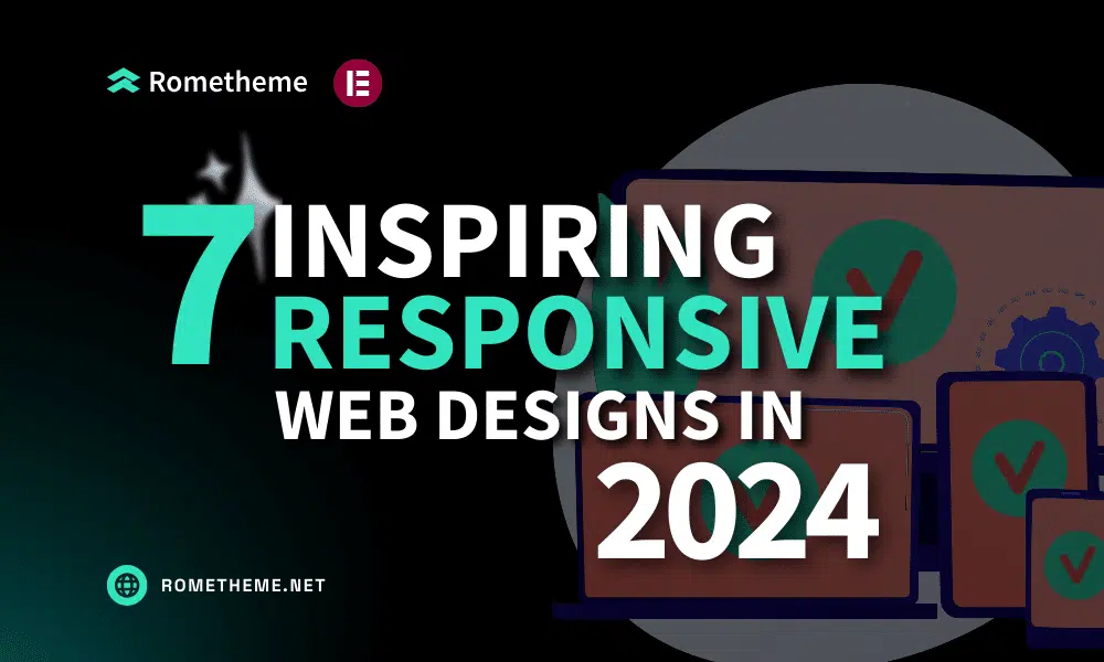
Ever wondered why some websites look amazing on any device? The secret is responsive web design, a strategy that ensures your website adapts easily to a variety of screens. Responsive web design refers to the approach of making web pages display well across a variety of devices and screen sizes. As more and more people […]
Struggling with the responsiveness of my WordPress site
In the digital age, a responsive website is paramount for success. If you’re grappling with the responsiveness of your WordPress site, worry not. This comprehensive guide unveils the key to a solution – Rometheme’s Elementor Kit. Explore how this tool can transform your website’s viewing experience across all devices. Why Rometheme for Responsive Design? Understanding […]
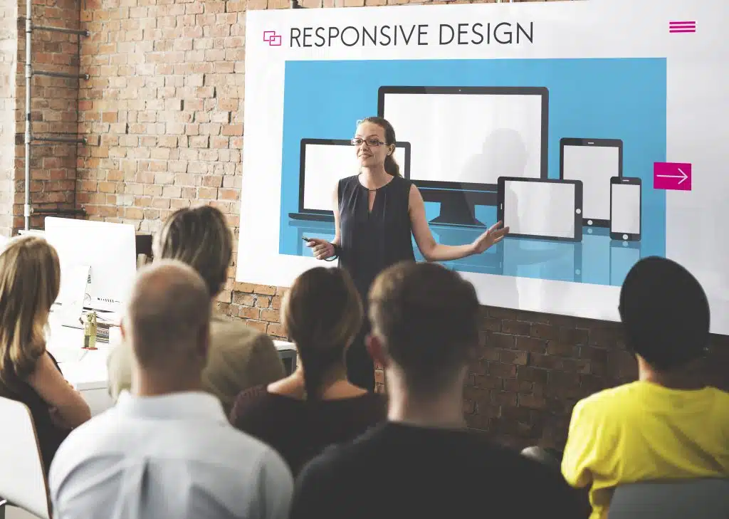
Responsive Revolution: Mobile-First Approach with ELEMENTOR KIT TEMPLATE
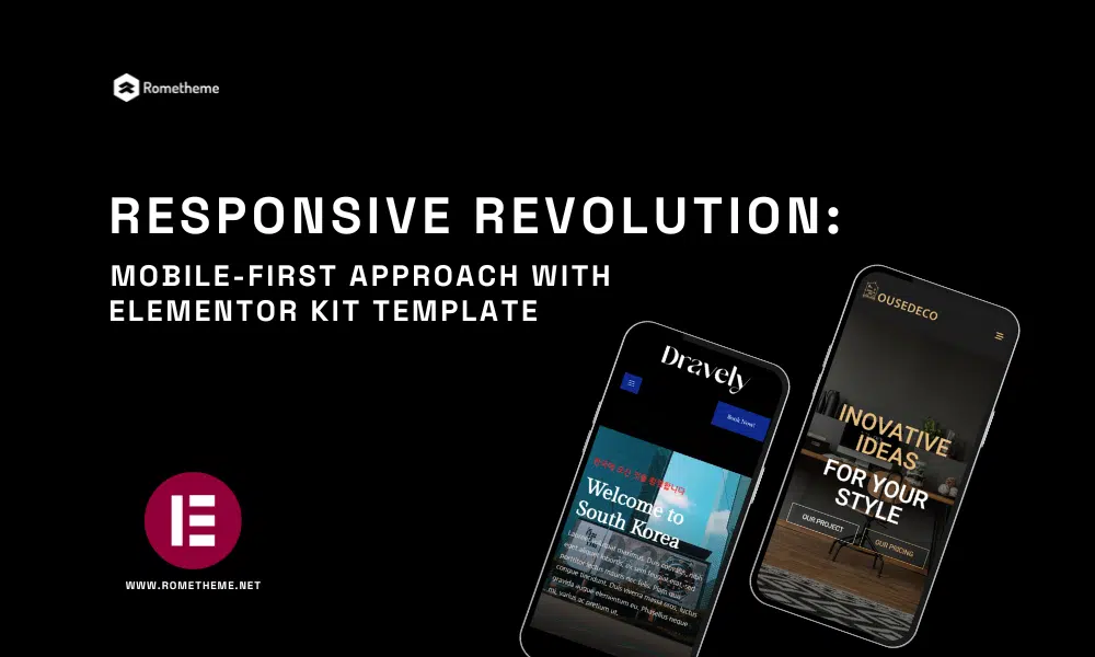
In today’s digital age, where the majority of online interactions happen on mobile devices, having a responsive website is no longer an option—it’s a necessity. The mobile-first approach has become a pivotal aspect of web design and development, ensuring that websites not only look great but also function seamlessly on smartphones and tablets. In this […]
Mobile Icon Menu to Boost Conversions
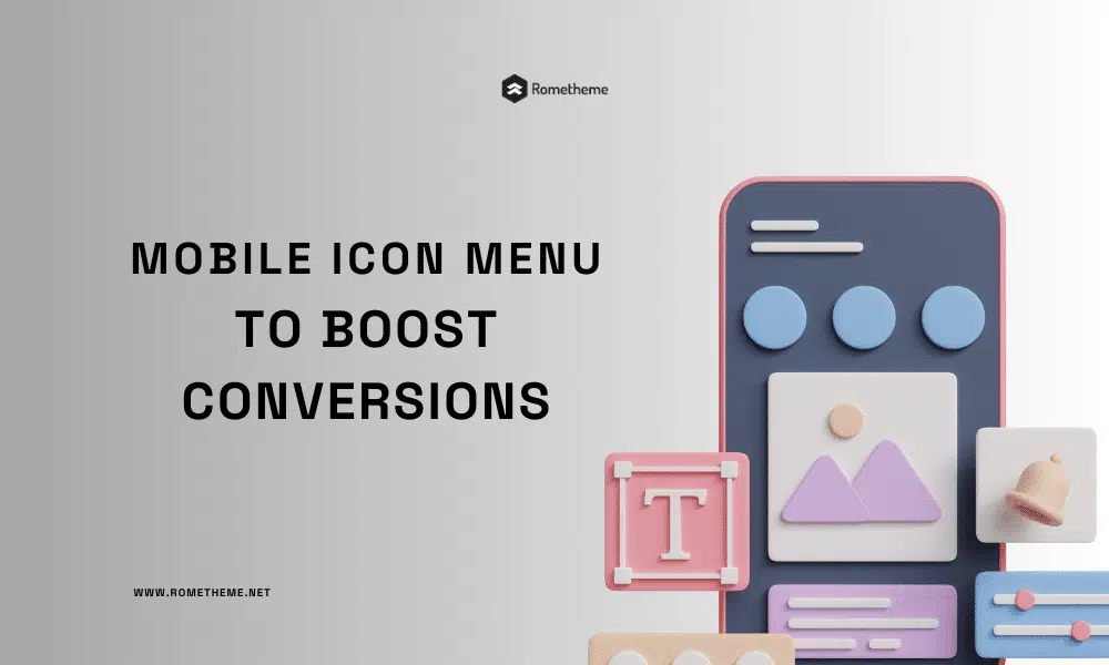
In today’s digital age, mobile devices have become an integral part of our lives. With the rapid growth of mobile users, businesses need to adapt their websites to cater to this growing audience. The mobile icon menu is a crucial element that can significantly impact user experience and conversions on mobile devices. In this article, […]
Best Menu Navigation Widgets for Elementor
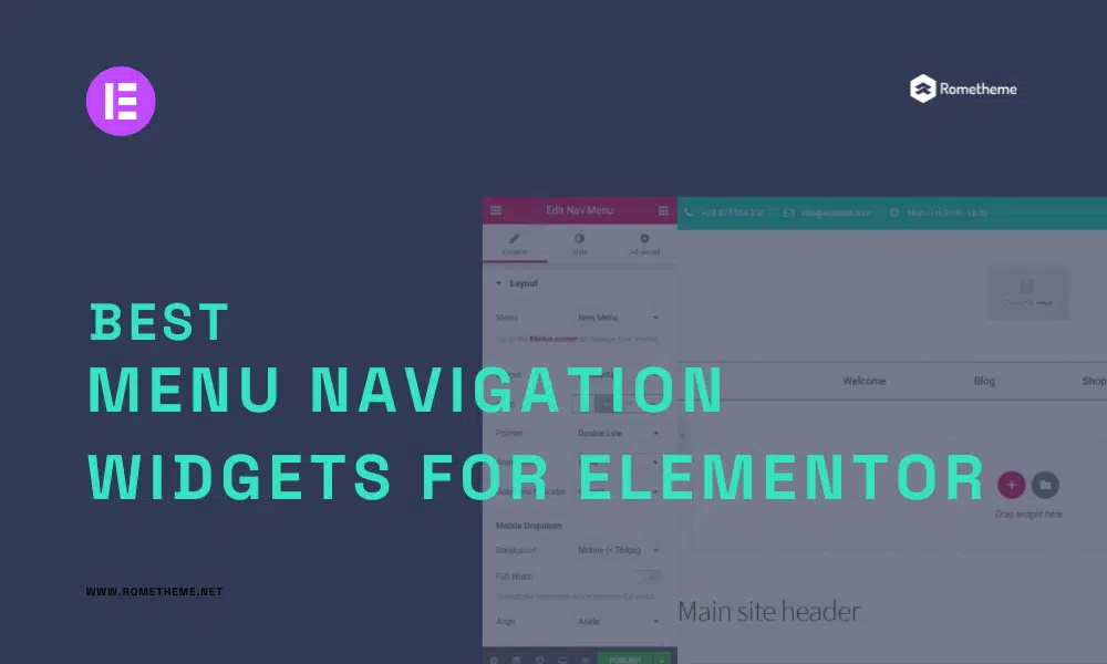
Are you looking to enhance the navigation experience on your Elementor-powered website? Look no further! In this article, we will explore the best menu navigation widgets for Elementor that can elevate the user experience and make navigation a breeze. Whether you’re a web developer, designer, or business owner, these widgets will help you create stunning […]
How to Make a Mobile-Friendly Website

As we said in the previous article, mobile device users have greatly increased at this time. Followed by website visitors who also switch to using mobile devices or smartphones to open the website they are looking for. We as website owners are also required to provide a mobile-friendly website so that visitors are not disappointed […]
Why Should your Website be Responsive?
Mobile users will leave the website if loading content takes too long. Therefore, having a responsive web design is a must for website owners. Moreover, most internet users currently use smartphones to access it. Therefore, if your website design is not responsive, you will potentially lose traffic and even consumers. When it comes to promoting […]
Website Header Design: Best Practice

1. Use White Space Wisely We often focus on how to use white space to improve the design and content on the page. But white space is also a valuable asset in website header design. You can control spacing by creating custom headers with Elementor: You can edit the margins and padding around each element […]
What Is a Website Header? – 8 Types of Website Headers
Many of us see website headers as a way to help us achieve our goals. Like their use, headers are very important for a website because they make navigation easy, showcase the brand, and present a CTA. One other important reason is that our eyes are naturally drawn to the very top of the page. […]
Web Design Basics for Fantastic Websites
Understanding the basics of web design can help improve the reputation of your brand or business by building credibility and building trust with your visitors. There are several key elements to consider, such as the purpose of your website, identifying your audience, design, usability, and branding. Whether you’re creating a website for a small business, […]