


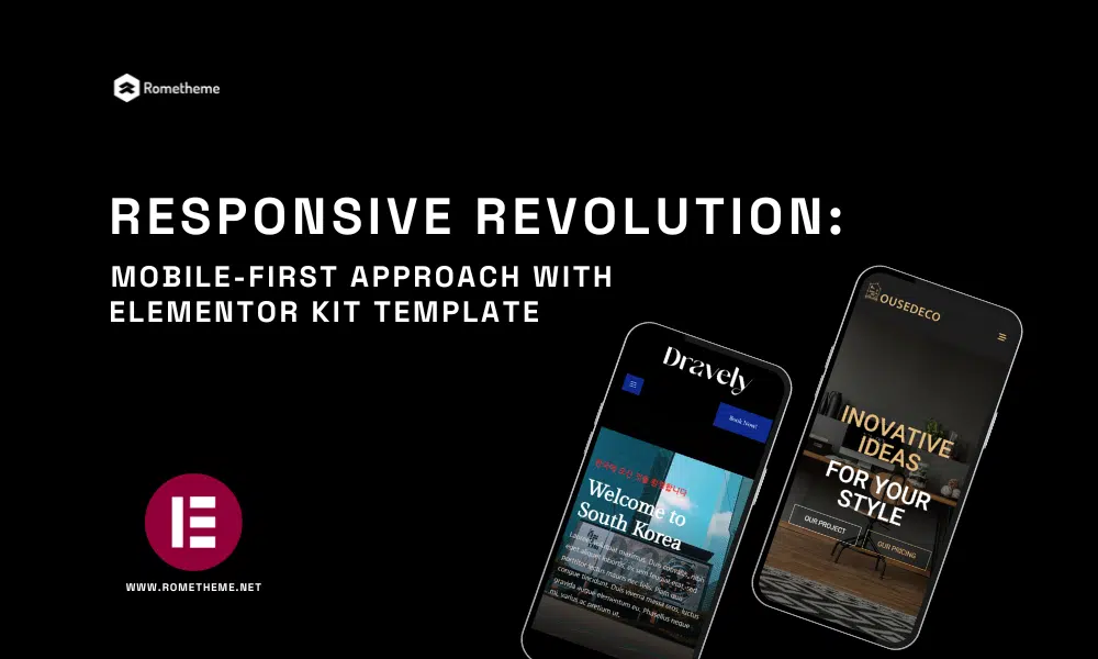
In today’s digital age, where the majority of online interactions happen on mobile devices, having a responsive website is no longer an option—it’s a necessity. The mobile-first approach has become a pivotal aspect of web design and development, ensuring that websites not only look great but also function seamlessly on smartphones and tablets. In this article, we will explore the significance of the mobile-first approach, particularly when using the ELEMENTOR KIT TEMPLATE, a powerful tool that empowers web designers to create mobile-responsive websites effortlessly.
Understanding the Mobile-First Approach
What is Mobile-First Design?
Mobile-first design is a web development strategy that prioritizes designing for mobile devices before considering desktops. It starts with creating a responsive layout for smartphones, and then progressively enhances the design for larger screens.
Why is Mobile-First Design Essential?
Changing User Behavior: With the increasing use of smartphones, users expect websites to perform well on mobile devices. Slow or non-responsive sites can lead to higher bounce rates.
SEO Benefits: Search engines like Google prioritize mobile-friendly websites, making them rank higher in search results.
Improved User Experience: Mobile-first design focuses on user-centric design, resulting in improved user satisfaction and engagement.
How ELEMENTOR KIT TEMPLATE Supports Mobile-First Design
Responsive Widgets: ELEMENTOR KIT TEMPLATE provides a wide range of responsive widgets that automatically adjust to different screen sizes.
Mobile Preview: It offers a built-in mobile preview feature, allowing you to see how your website will look on various mobile devices.
Mobile Optimization: ELEMENTOR KIT TEMPLATE prioritizes mobile optimization, ensuring that your website performs seamlessly on smartphones and tablets.
The Benefits of Using ELEMENTOR KIT TEMPLATE for Mobile-First Design
1. Simplified Design Process
With its drag-and-drop interface and pre-designed templates, ELEMENTOR KIT TEMPLATE streamlines the design process. You can easily create responsive layouts without delving into complex code.
2. Speed and Performance
ELEMENTOR KIT TEMPLATE is optimized for speed, which is crucial for mobile users. Faster-loading websites result in lower bounce rates and better SEO rankings.
3. Customizability
While ELEMENTOR KIT TEMPLATE offers pre-designed templates, it also allows for extensive customization. You can tailor your website to match your brand’s unique style and requirements.
Tips for Implementing Mobile-First Design with ELEMENTOR KIT TEMPLATE
1. Start with Mobile Layout
Begin your design process by creating a mobile-friendly layout. This ensures that your website’s core functionality is optimized for smaller screens.
2. Use Responsive Widgets
Leverage ELEMENTOR KIT TEMPLATE’s responsive widgets to ensure that all elements on your website adapt seamlessly to various screen sizes.
3. Test Across Devices
Regularly test your website on different devices to identify and resolve any responsiveness issues.
Also read: Responsive editing for mobile and tablets by Elementor
FAQs (Frequently Asked Questions)
Q: What is a mobile-first approach in web design?
A: The mobile-first approach is a web development strategy that involves designing and optimizing websites for mobile devices before addressing desktops. It ensures that websites perform seamlessly on smartphones and tablets.
Q: Why is mobile-first design important for SEO?
A: Mobile-first design is essential for SEO because search engines like Google prioritize mobile-friendly websites in their rankings. Having a mobile-responsive site can significantly improve your search engine visibility.
Q: How can ELEMENTOR KIT TEMPLATE help with mobile-first design?
A: ELEMENTOR KIT TEMPLATE simplifies mobile-first design by offering responsive widgets, mobile preview features, and optimization for mobile devices. It streamlines the process of creating mobile-responsive websites.
Q: Do I need coding knowledge to use ELEMENTOR KIT TEMPLATE?
A: No, you don’t need coding knowledge to use ELEMENTOR KIT TEMPLATE. It features a user-friendly drag-and-drop interface, making it accessible to both beginners and experienced web designers.
Q: Where can I get access to ELEMENTOR KIT TEMPLATE?
A: Incorporating a mobile-first approach with ELEMENTOR KIT TEMPLATE can revolutionize your website design and ensure that your online presence caters to the ever-growing mobile audience. You can get the Elementor kit template on Themeforest or Envato Element, or on our website at www.rometheme.net
Conclusion
In a world where mobile devices dominate internet usage, embracing the mobile-first approach is paramount for website success. ELEMENTOR KIT TEMPLATE simplifies this process by offering a user-friendly platform that fosters mobile-responsive design. By prioritizing mobile users, you not only enhance user experiences but also improve your website’s visibility and performance.
Visit our website to browse our stuff and follow our Instagram for great content!
Website: www.rometheme.net
Instagram: rometheme_studio
Share This
Facebook
Twitter
LinkedIn
Pinterest
Email


You might also enjoy

Important Parts of A Website
April 24, 2024

Color psychology works with your brand
April 19, 2024

Knowledge About Mode vs. Light Mode in Web Design
April 4, 2024

Font Pairing Guide for Stunning Web Design:
March 28, 2024
