


Mobile users will leave the website if loading content takes too long. Therefore, having a responsive web design is a must for website owners. Moreover, most internet users currently use smartphones to access it. Therefore, if your website design is not responsive, you will potentially lose traffic and even consumers.
When it comes to promoting and marketing your business, a well-designed website can be your most valuable asset. However, if you want to be truly effective, an attractive design alone is not enough. Your website must also be responsive.
The main reason why you want a responsive website is the fact that the use of mobile devices for browsing the Internet has been steadily increasing for several years now and shows no signs of slowing down.
From a business standpoint, this means that if your website doesn’t respond well to smaller screens and is difficult to read and navigate, your visitors will be more likely to switch to a competitor’s site.
Simply put, responsive web design isn’t a luxury, it’s a necessity, and now is the perfect time to make sure your website is responsive.
Responsive web design or responsive web design is a technique or method for web designers to create a website layout that can adjust according to the user’s screen size.
The font size, user interface, images, and layout will adjust to the screen’s width and the device’s resolution. Visitors will easily read without having to zoom in or zoom out and enjoy various content that is displayed according to the device used.

To have a responsive web design sourced from Tutsplus, make sure that your website adheres to the following principles:
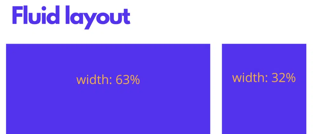
The fluid layout works like any other design grid – they allow you to arrange elements on a page in a visually attractive way. However, unlike a traditional layout, a fluid layout will resize based on the screen size and can adapt to any width because it uses relative units of measurement such as percentages or eir units, instead of fixed units such as pixels.
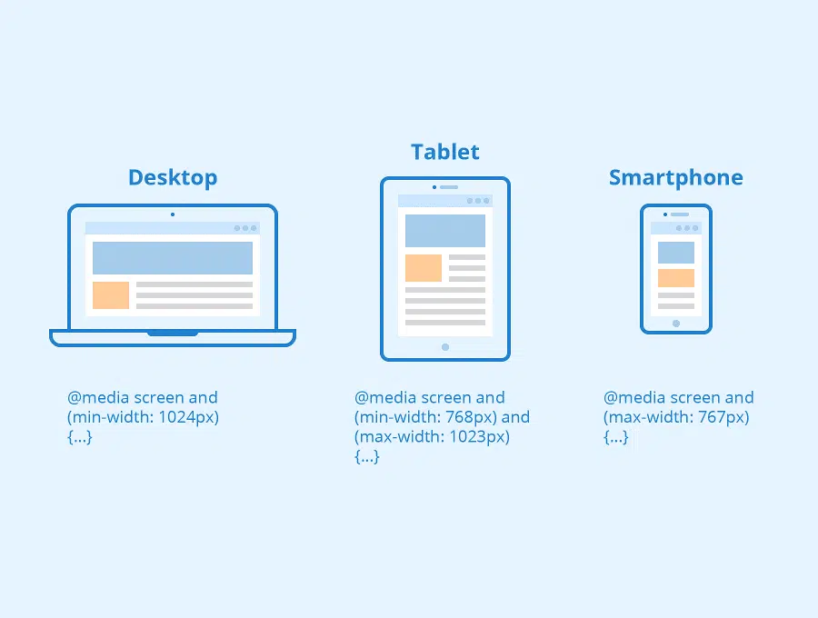
Media queries allow you to get even more specific with your responsive design and adjust it accordingly based on a particular screen size. In layman’s terms, websites use media queries to gather data that helps them determine the size of a screen and then load the appropriate CSS styles.
The third core principle of responsive web design is responsive or flexible media. Given that modern websites use a lot of images, videos, and other media files, it’s imperative that those types of content respond to different screen sizes.
Normally, designers would include the image dimensions in their CSS stylesheet. But, this doesn’t work for responsive design due to the fixed units of measurement mentioned above. Instead, you’ve got to make use of the max-width property for image files, videos, and other media types. To ensure media files don’t go past their container and scale nicely based on the screen size, the max-width property should be set to 100%.

Responsive web design isn’t just about following the latest web design trends. Adopting a responsive layout for your website has many benefits for your business that can impact your traffic, SEO, and revenue. Here are the top five reasons why you should consider responsive web design for your website.
The most important reason to adopt a responsive web design is the fact that you’ll be providing your visitors with a better user experience and improving the usability of your website. If visitors aren’t forced to immediately scroll in all directions, pinch and zoom to read your content, they’ll be more inclined to stay on your website for a longer period of time. They’ll be able to easily navigate from one page to another as well as have no problems filling out a form or clicking your call-to-action button.
As we mentioned earlier, statistics show that more than half of all world web traffic comes from mobile devices, which means that once your website is responsive, you’ve got a much better chance of attracting those visitors. If they land on your website and are met with a website that looks and works great even on smaller screens, they’ll have no reason to navigate away so your business is bound to see an increase in leads and customers from mobile devices.
Aside from responsive web design, another Internet trend that has become a must is a fast-loading website. And thanks to fluid grids and responsive media, responsive websites have better loading times than unresponsive websites. This leads to visitors spending more time on your site, which leads us to the next point – conversion rates.
Once visitors spend more time on your website, you’ve got better chances of converting them from visitors into leads and then into subscribers and buyers. According to research, the average conversion rates for smartphone devices are up by 64% than desktop conversion rates. This is a direct result of improved user experience that comes from having a website that is easy to use across various screen sizes and faster loading times.
Lastly, a better SEO rank is definitely one of the top five advantages of responsive web design. After all, if you cannot be found in search engines, then getting organic traffic for your website will be nearly impossible. According to Google, since April 2015, the responsiveness of your website is one of the ranking signals that determine how your website is displayed in the search engines. However, Google isn’t the only search engine that recommends it. Bing has clearly stated on its blog that building websites optimized for all platforms is key to a successful SEO strategy.
Responsive web design isn’t going away anytime soon. In fact, it is the way of the future and does have a number of advantages that impact the bottom line of any business owner.
Start paying attention to your web design to make it more responsive and provide browsing comfort for your visitors.
Source: envatotutsplus.com, kinsta.com