


We often focus on how to use white space to improve the design and content on the page. But white space is also a valuable asset in website header design.
You can control spacing by creating custom headers with Elementor:
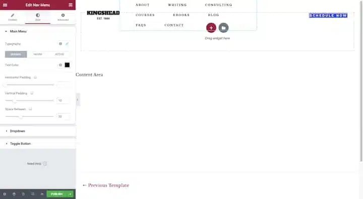
You can edit the margins and padding around each element in your header as well as the padding around each element within the block (as in the navigation example above).
Generally, Google recommends that the mobile and desktop versions of websites contain the same content. Headers on the desktop should have the same logo, links, and info as those on mobile.
You can use Elementor’s custom header builder to do this:
Just switch your Responsive Mode to your smartphone or tablet view and adjust the layout, alignment, animation, and whatever else you need for this smaller screen.
There are several reasons why someone would use a header on a website. Instead, make them pause and consider their options when they set the header so it’s easy to find what they’re looking for — and quickly too.
Here’s a great example from the East Bay Inn website:

The main header bar is the largest and brightest of the bunch. The font is also bolder and larger in size than the others. By designing like this, the main focus will go to the header and then visitors can refer to other banners for additional information as needed.
A handwritten font — or a very stylized font, to be honest — would be hard to read in a space as small as a header. So, it is best to choose a web serif or sans serif font for your text and callout links.
Two other things to keep in mind:
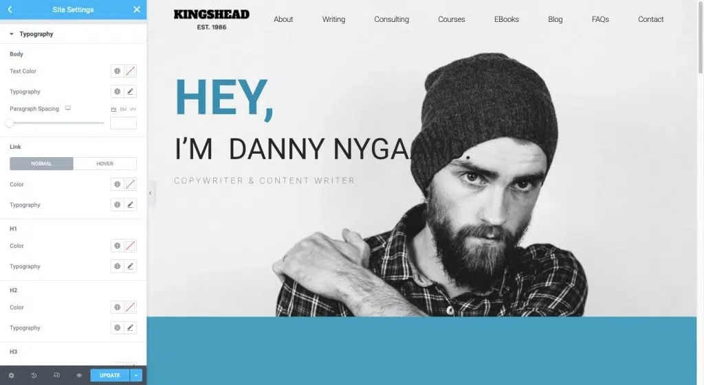
If you are creating a completely custom header, you can set this font under the Style editor in Elementor. If you just want to adopt typography and colors from the rest of your site, make sure your Global Settings have it defined exactly how you want it:
Handwritten fonts are a great choice for logos. It’s unique, and memorable and tells you a lot about the handcrafted nature of the work found on the website.
When using visual elements such as icons, images, and videos in navigation, you must have a good reason to do so.
Icons can be useful for website header elements like a search bar, shopping cart, location finder, language switcher, and so on. Be careful about using icons that are not common or have ambiguous interpretations.
For images and videos, you’re probably better off without this bulky element. If you’re already struggling to keep your website loading at high speed, adding image files to your header (apart from the logo, of course) might not be the best idea.
Nonetheless, there are some use cases where images can actually increase how quickly visitors can get what they need from the header and, in particular, from the navigation.
Some other good use cases for imagery in navigation are mega-menus and blogs or news sites.
One thing to avoid is videos. Videos are meant to be watched and the header isn’t the ideal location for long interactions (even if it’s only 30 seconds long).
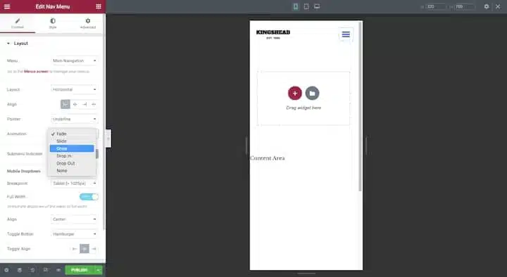
Animation doesn’t always have to be over-the-top to be effective. Small animations applied to navigation, for example, can actually increase focus and engagement if done the right way.
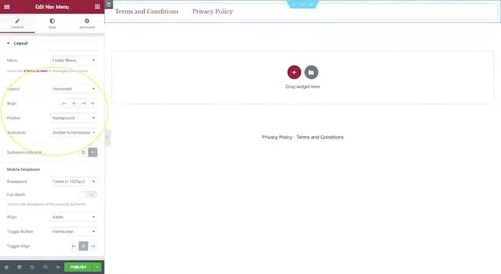
You can easily apply animations to your navigation whether you’re designing a custom header template or inserting a Nav Menu into a page from your Elementor page builder:
Unless you’re designing web pages with very little content, adding a sticky header to your website might be a good idea. Long one-page websites, as well as websites with long feeds (such as news and e-commerce sites), will definitely benefit from it. This way, visitors will always have the header within arm’s reach, no matter how far away the page is.
NNG has some useful tips on how to design a sticky header so it doesn’t get in the way of your visitors or ruin their experience:
NNG has some great things to say about vertical navigation:
But there is a matter of space to think about.
Horizontal headers are usually designed to be thin. Regardless, many sticky headers will shrink as visitors scroll down the page, so they don’t take up a lot of real estate.
A transparent header is one in which the elements are still there — the logo, navigation, CTA, and so on — but don’t have a solid background behind them. As you can imagine, this can be a tricky design choice to make with multiple sites.
One of the main reasons why is that text can be very difficult to read if it appears against a busy background or with low color contrast. So unless the header completely disappears from view as the visitor scrolls, you risk the navigation and other text within it becoming unreadable when they scroll to a certain section.
Those are some practices that you can try to make your website header. Some of our previous articles have discussed what headers are, the types of headers, and what is included in them. After you read this article, please practice what we have provided to create your own website header. Spirit!
Source: elementor.com