


Understanding the basics of web design can help improve the reputation of your brand or business by building credibility and building trust with your visitors. There are several key elements to consider, such as the purpose of your website, identifying your audience, design, usability, and branding. Whether you’re creating a website for a small business, a product, a service, or your own portfolio, it’s important to know the basics of web design.
The first stage of creating your website is determining the purpose of your website. Whether you’re creating a digital portfolio, showcasing your business services to potential customers, or selling products online, Clarity is key: if users don’t understand your website, they’ll leave. The purpose of your website should be clear and direct.
Once you have established the intent of your website, the next step is to define your target audience.
Who is your website for? Designing for your intended users is one of the foundations of classic web design. If you’re a product designer looking for a new job, your target audience for your portfolio site will be hiring managers and recruiters. This will help shape what to prioritize on your website and how to direct users to the right places.
To identify your target audience, do user research on demographics, location, and target users. Consider looking at competitors’ websites and their social media pages to analyze who their target audience is and compare them to your website’s needs. Also, try to research your target audience by customizing your website content according to their needs. This increases their chances of remembering your site.
Now that you know your website’s goals and audience, it’s time to make a plan. Are you building a website by hiring a developer or trying to understand HTML, CSS, and Javascript? If you don’t, don’t be discouraged. There are services like Squarespace, Wix, and WordPress that offer a no-code way to build websites that support both desktop and mobile platforms. Once decided, figure out your budget for web hosting and domains. And decide when you will launch your site.
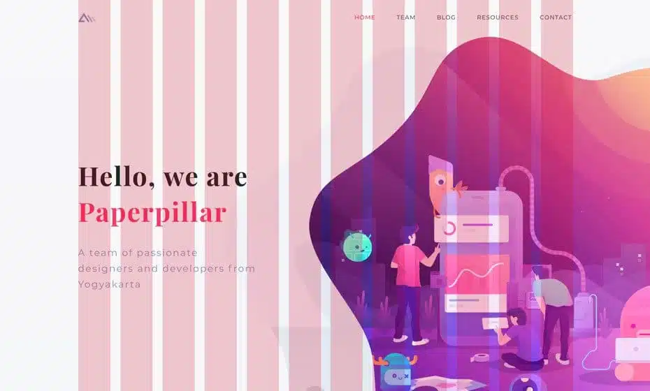
Generate ideas for your website by seeking inspiration from other sites! If you’re feeling stuck, unsure where to start, or not sure how you want your website to look, there’s a wide variety of websites that can satisfy your palette.
You can start by looking at Awwwards, a source of inspiration for all kinds of designers. They feature dozens of award-winning and dazzling websites.
One of the basics of web design involves designing with a grid. The grid system is a layout based on measurements and guidelines. The grid consists of columns (the space defined for the placement of content) and chamfers (the empty space between columns). They break the page into sections to organize content and hierarchies.
When thinking about grids and layouts, it’s important to think about how they will affect your responsive design. This means how your web design will adapt to different screen sizes. Here are some of the types of layouts:
Your website should incorporate extensive use of information architecture and a strong visual hierarchy to create a seamless experience for your users. If your website information is easy to digest and aesthetically well structured, it will help your visitors complete their user tasks faster.
There are many ways to increase the visual hierarchy of your site. Some ways to increase the visual hierarchy are to use color and contrast to draw attention to specific text and buttons, adding more negative space around the elements you want the user to focus on, and having balance and symmetry in the layout can keep things simple and easy. used.
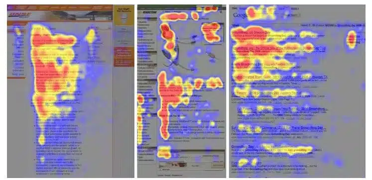
Understanding reading patterns can also help determine where to store information. Research has shown many visitors scan websites in an F or Z pattern. Typically, users will scan text-heavy pages in an F pattern.
That’s why the most important and relevant information is at the top left and at the top of the page. Simple landing pages that don’t have too much text often scan in a Z pattern. But over time, this can change as screen size changes, or if mobile usage becomes the primary device. To avoid this, always keep your users in mind and do some research on your users and how they use your website.
The basics of making good website navigation are logical hierarchy, simplicity, and versatility. Good navigation is key to helping users find what they need and go where they need it.
There are several types of navigation that you might encounter on any website. Some mobile apps and sites will use a combination of the two.
Branding is an integral part of how users identify your website. What kind of image do you want your website to display? What do you want your visitors to say about it? Branding determines the answers to those questions. Be sure to pay attention to the color scheme and typography. Your website’s color scheme and font choices should be consistent with your brand.
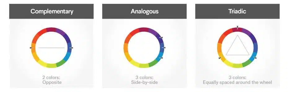
Familiarizing yourself with the basics of color theory will go a long way in building your brand and website. Here are some common color schemes that use the color wheel to get started:
Typography encapsulates your brand without compromising readability. And choosing the right font adds to the overall style of your website and brand.
Be sure to check if your font is web-safe. This means making sure the browser supports the font. If the font is not web-safe that may cause your website text not to display properly in that browser.
there are just a few things to keep in mind when choosing your font:
Your website content, which consists of a copy, images, videos, and other interactive elements, is the core of your site. It attracts people and keeps them engaged. It gives your site a purpose and inspires users to take action, whether it’s to contact you or buy a product.
Some marketers and web designers are trying to reinvent the wheel by trying to stand out from the crowd or focus heavily on trendy content. Instead, I recommend doing your best to make your content authentic. It should feel like you and be true to your brand. Talk about your products, services, case studies, or what you have to offer.
Another powerful tool from the basics of web design is the use of imagery. It can captivate your audience and guide them toward your website content.
Imagery is a great way to captivate viewers, so use this tool to your advantage. Bonus points if you include a demonstration, video, or product configurator. Make sure your image file size is small for better page load time. Your image must have a resolution of 72 PPI, which is the standard for the web. If you must use a high-resolution image, consider using a thumbnail that links to the original image.
Interactivity is a basic element of attractive web design. How will users interact with your site? Adding interactive elements such as examples in images, will make your website more fun and stand out. It also benefits user engagement. These elements may pique a visitor’s curiosity, inspiring them to explore other aspects of your website. What hidden secrets will they uncover?
Interactivity offers users the opportunity to learn more about your product. Implementing interactive elements on your website can save users time, increase engagement, and educate visitors about you, your products, services, or your business.
As a UX designer, I firmly believe that usability is the most important aspect of web design fundamentals. It takes time to invest and research your website’s user experience, but it’s worth it. Usability will make or break your website. Users may form an emotional connection with your site, creating an unforgettable experience for them. If your website is difficult to use or visitors get lost, they will leave.
Make sure your website follows 5 usability principles: availability, clarity, recognition, credibility, and relevance. Make it as easy as possible for users to complete their site goals and tasks. Before launching your website, it’s a good idea to do some usability testing. What are the biggest problems users have with your site? Solve as many problems as possible before spreading your site worldwide.
To reach a larger audience, design your website for desktop, tablet, and mobile devices. Worldwide, mobile traffic has been steadily increasing since 2015. It accounts for more than half of all global traffic. Therefore, it is very important to avoid alienating mobile users. Create a responsive design that adjusts automatically based on the device, like the example image below.
Responsive sites automatically adapt to different devices without sacrificing usability or removing elements. A mobile-friendly website is based on a desktop site, (desktop designed first), which is scaled down for mobile. Mobile-optimized sites are specifically designed to prioritize mobile devices.
It’s a good practice to offer a consistent experience and the same features across multiple devices. Designing for multiple devices ensures your website reaches as many visitors as possible and can also reduce unnecessary clutter.
Your website must be accessible and pass accessibility standards. This helps build better usability, includes a wide range of users, and is inclusive.
There are many tools out there for testing colors and fonts for accessibility, such as a color contrast ratio analyzer. Another thing you can do is add alternative text to the image explaining what the image is. It can also be helpful when images don’t load or get corrupted. Providing captions and transcriptions for audio and video recordings is also another way to create accessible content.
There are various accessibility things you can do, some websites start with alternative text, captions, and transcripts. And other websites may provide full accessibility functionality, where you can tweak and modify your settings. By designing with accessibility in mind, you maximize the potential number of visitors interacting with your site. It will also improve the user experience.
Optimization is a great example of web design basics. It is the foundation of web design because it is something you have to do to keep your website up to date. And knowing what you need to consider when optimizing your website will go a long way toward the success of your website.
There are many different types of optimization: page load, content, SEO, user experience, device optimization, and more. If your website takes a long time to load, your bounce rate will skyrocket. It’s not 1999 anymore: visitors won’t wait for websites to load. Reducing page load time also makes your website more accessible to those without a fast internet connection.
Find the right keywords for your website to improve your SEO. Optimizing your site’s content can increase leads, instill trust, and strengthen SEO. Regardless of whether your website is for a business or a portfolio, optimizing it in various ways will bring in more visitors, improve the user experience, and make it more accessible.
Visitors should always have a convenient way of contacting you or your business. Include contact pages and social media links so they have the means to engage with you, your products, or your services. If you run a business, offering a contact form can improve relationships with existing customers and even gain new ones.
Visitors can call to inquire about your services, ask questions before purchasing your product, or even seek advice or support. Communication is also a great way to gather feedback and improve not only your website, but also your portfolio, products, or whatever else your business has to offer.
Now that you know the basics of web design, it’s time to put it to good use! Aren’t you excited to make your website even more fantastic?
Originally published by 99designs.com