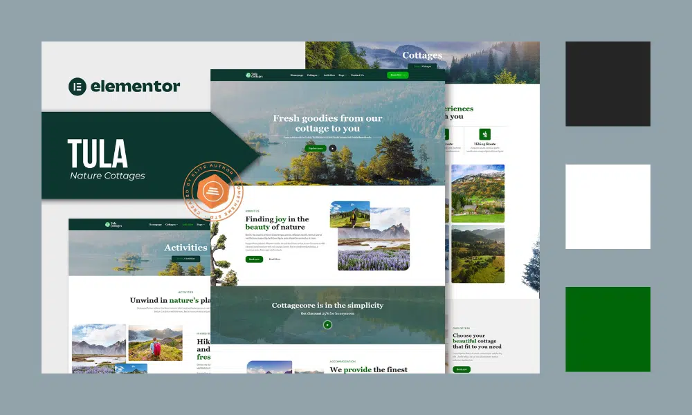
Color is an important part of any interface design. Improper use of colors can easily overwhelm your users. If you don’t want to annoy or confuse your users, you should try to achieve harmony in your design. And this happens only when you have a balance in the visual experience.
The 60–30–10 rule will help you do that!
A good color scheme relies on contrast and harmony. The 60–30–10 rule is a useful tool for creating balanced interfaces. The idea is simple —when you choose a new color palette, 60% of the palette should be dedicated to one color (usually, these are neutral colors), other (complementary) colors make up 30% of the palette, and one-third (accent) colors are used for the remaining 10% of the design.
Step 1
60%
It is the dominant or primary color. That’s what stands out the most. When choosing this color, it is important to know what it means. It should reflect your brand message.
Also know that color gives its own impression and meaning and is called color psychology. Color psychology can help you choose colors more effectively — the resource from Envato that might be useful in learning about color psychology is:
Step 2
30%
These are secondary or complementary colors. You will use half of this color as your main color. It is used on main elements such as text, carousels, and other important features. The secondary colors support the primary but are still different enough to create contrast.
10%
This is an accent color. This color can be used on buttons, pop-ups, highlights, etc. Bright, vibrant colors are a great way to add visual interest. They can help draw attention to certain areas of the page or make it feel more alive overall.

Tips & Tricks
- Grayscale first. You can lose a lot of time by applying colors too early. Focus on spacing and laying out elements before
- Contrast the text. Make it readable by contrasting it with the background
- Don’t use pure gray or black. It is more natural to add some saturation. We rarely see pure gray colors in real life
- Use color generators. They will simplify your search for a well-balanced color palette. We listed the most popular for you below
You can use tools or color generators that provide color generation if you feel confused. We had summarized it in 10+ Best Color Tools For Web Designers In 2021
One more thing that you must remember in determining your color, don’t use more than 3 colors!
“Don’t wear more than three colors in clothes otherwise you will look like a clown or a parrot” — this is common advice that private stylists give to their clients. Unless you are an expert at mixing colors, it is better to limit the total number of colors you use in your design.
If you think your design needs more colors, try using darker & lighter color variations of the colors you’ve already selected.
Conclusion
- Before adding color to your design, focus on the layout and spacing between elements.
- Using color generators can cut down on the time needed to find a good combination of colors.
- You can create a pleasing color scheme with the help of a color wheel.
- You should also consider black and white as colors that have their own significance.
Hopefully, this short guide will help you choose colors for your project.
Source:


