
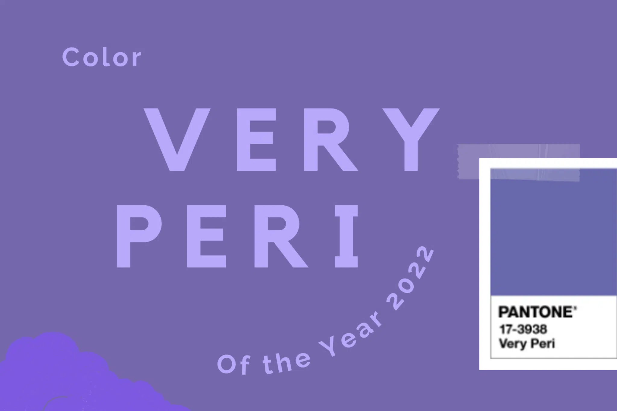
We thought Veri Peri would be the perfect color to help us start 2022 with a fresh new look. These new Pantone colors encourage inventiveness, creativity, and empowerment.
Shaken tested and redefined. These words capture our collective journey over the past two years, as many of the habits and lifestyles we rely on were suddenly questioned by the global pandemic. This period of intense personal and social reconstruction is the backdrop for Pantone’s latest color forecast for 2022. Very Peri, or PANTONE 17-3938, is a bold periwinkle in red/purple tones.
Unlike the practical but hopeful tale of yellow-gray in 2021, the Pantone Colors of 2022 are all about fluidity, innovation, and change. A captivating periwinkle blue with a vibrant purple-red hue, the PANTONE 17-3938 Very Peri exudes a cheerful, playful demeanor and dynamic presence to inspire imagination and creative expression.
As the world begins to emerge from a period of intense uncertainty and adjust to a new normal, PANTONE 17-3938 Very Peri is about embracing a changing landscape, opening up to new possibilities, and redefining our future.
The first new color in Pantone’s 22-year history, Very Peri is all about reframing the calming and dependable qualities represented by blue and blending the passion, fire, and creativity of red to drive progress and change. Displaying carefree confidence and courageous curiosity, PANTONE 17-3938 Very Peri promises to empower us for whatever lies ahead.
According to Pantone, Very Peri “encourages personal inventiveness and creativity” and helps us “embrace this changing landscape of possibility”.
“Pantone Colors of the Year reflect what is happening in our global culture, revealing what people are looking for that color can answer,” explains Laurie Pressman, Vice President of the Pantone Color Institute.
“Creating new colors for the first time in the history of our PANTONE Color of the Year educational color program reflects the global innovation and transformation that is taking place. As society continues to recognize color as a critical form of communication, and a way to express and influence ideas and emotions and engage and connect, the complexities of this new violet-infused hue highlight the vast possibilities that lie before us.
Go to Pantone’s Color of the Year page to retrieve RGB and HEX values for reproducing Very Peri on different media. While they don’t list CMYK values, we do include approximate approximations in the code below. They also offer.ASE files for use in Adobe applications and a complementary set of palettes to get you started.
Very Peri Color Values
Pantone: PANTONE 17-3938 TPG
RGB: 102, 103, 171
HEX/HTML: #6667AB
CMYK (approximation): 40, 40, 0, 33
We live in a transformative age. PANTONE 17-3938 Very Peri is a symbol of today’s global zeitgeist and the transition we are going through. As we emerge from a period of intense isolation, our ideas and standards change, and our physical and digital lives have merged in new ways.
Digital design helps us expand the boundaries of reality, opening doors to dynamic virtual worlds where we can explore and create new color possibilities. With in-game trends, the widespread popularity of the metaverse, and the growing artistic community in the digital space PANTONE 17-3938 Very Peri depicts the fusion of modern life and how color trends in the digital world are manifested in the physical world and vice versa.
The Pantone Color of the Year selection process requires careful consideration and trend analysis. To arrive at each year’s pick, Pantone color experts at the Pantone Color Institute™ comb the world for new color influences. This can include the entertainment and film industries in production, traveling art collections and emerging artists, fashion, all areas of design, popular tourist destinations, as well as new lifestyles, playstyles, and socioeconomic conditions.
Influence can also come from new technologies, materials, textures, and effects that affect colors, relevant social media platforms, and even upcoming sporting events that catch the world’s attention. For 23 years, Pantone’s Color of the Year has influenced product development and purchasing decisions in a variety of industries, including fashion, home furnishings, and industrial design, as well as product packaging and graphic design.
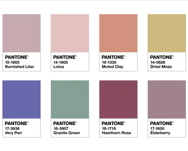
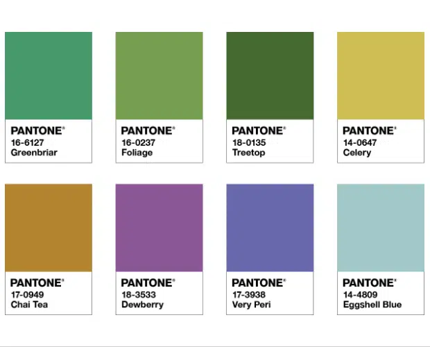
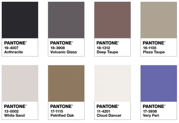
There are four unique color palettes featuring PANTONE 17-3938 Very Peri to help you bring this special color of the year into your designs. Each palette conveys a different mood, illustrating the versatility of the PANTONE 17-3938 Very Peri. Each palette also features three suggested color combinations that integrate the PANTONE 17-3938 Very Peri.
Balancing Act is a complementary color palette whose natural balance of warm and cool tones supports and complements each other. The brilliance of PANTONE 17-3938 Very Peri is intensified in this artistically calibrated palette, injecting a feeling of liveliness and visual vibe.
A holistic and harmonious blend of infused natural shades, Wellspring highlights green’s compatibility with the benevolent PANTONE 17-3938 Very Peri and the health-giving properties of this subtle and nourishing color.
The dynamic presence of PANTONE 17-3938 Very Peri comes to life in The Star of the Show, as we surround this happiest and warmest blue with a classic, neutral palette whose essence of elegance and understated style convey a timeless message. sophistication.
The fun, whimsical color tale of irresistible fun and spontaneity is amplified by the exuberant confidence and exuberant demeanor of PANTONE 17-3938 Very Peri, a shimmering blue hue whose cheerfulness encourages expression and unimpeded experimentation.
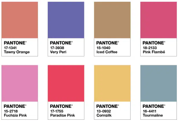
We summarize several sources about this Very Peri. We think this color has a good color definition in 2022. Are you ready for your project to use the Very Peri color? Of course, you have to be wise in choosing your project to use this color.
Source: envato.com, creativemarket.com, pantone.com


