


We took an article from designshack.net with 5 tips that you can use to make your presentation design look minimalist.
In a minimal design, your goal is to display your message using less content and more white space. This may sound strange but it actually gives your content the spotlight it deserves and grabs the attention of the audience. Therefore, the heavy use of white space is a key aspect that defines the term minimalism.
Whether you’re designing a home interior or a minimally designed PowerPoint slideshow, you need to layout your content around white space. That way the audience will only focus on your content without being distracted by other views caused by the use of many elements in your design.
With plenty of white space around your slide design, your audience’s eyes will go straight to the title and paragraphs of your slide. But there’s no point in creating a minimal presentation design if your content is unreadable.
Make sure to choose a good pair of fonts for your headings and paragraphs that not only make the content easier to read but also enhance the user experience. The use of the right font will also help the audience to receive the message well.
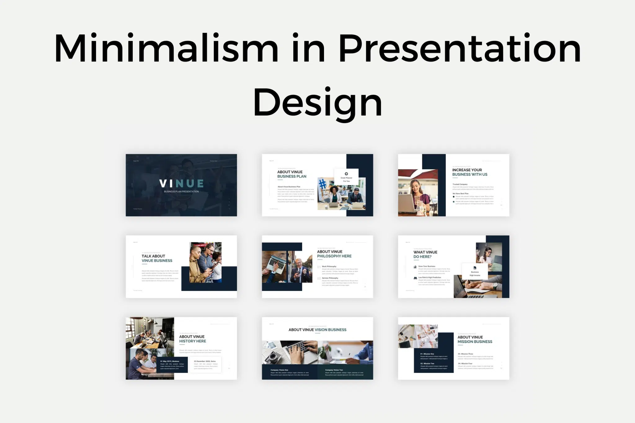
In a minimal design, you are limited to using fewer colors. Most of the time you can only use one or two colors throughout the design. This actually provides a great opportunity for you to take advantage of color.
You can use color in a minimal presentation design to highlight specific parts of your slides such as the main points of your speech, slide titles, metrics, and more. When used properly, it will make your entire presentation more effective and interesting at the same time.
Depending on the type of presentation you are creating, you should also use large images and image backgrounds to create a more visually minimalistic slide design.
For example, if you’re creating a minimal presentation for fashion design, photography, or displaying a portfolio, you can use large images to create a unique slide design.
A presentation design content layout consists of all the elements you use on each slide, including text, images, shapes, diagrams, and more.
Since you’re creating a minimal presentation design, focus on formatting your content in a way that demonstrates professionalism. Be careful with the use of elements in your designs, as well as with the layout and content of the elements themselves. For example, use shorter sentences, use fewer shapes and colors, and avoid adding multiple images on one slide.
Your presentation slides are your visual aid. It should enhance your message and make it easier for your audience to understand what you are trying to say. When you go overboard with your design and throw out a hundred elements on one slide, it doesn’t bode well for you.
But with minimalism in presentation design, your audience will no longer need to outline anything on the slide. They can see your message as clearly as the day on your slide. And it makes it easier for them to retain the information you share with them. When you clear the clutter, you give them the ability to focus on what you have to say. Use minimalism to guide your viewers’ eyes where they need to be.
When there aren’t a lot of unnecessary elements on your slides, you can give your presentation a much cleaner look. No additional shapes, images, text, etc. which has nothing to do with what you are trying to convey.
For example, some people like to add borders or frames to their slides. But does it add value to the slide? For the most part, I don’t think so. Borders will only make your slides look more cluttered because they will basically make the slides look smaller.
The minimalist design is pleasing to the eye because there is a lot of open space, aka white space. While borders or frames aren’t strictly necessary, they can still be effective, provided, of course, there are only a few elements to start with.
The minimalist design embraces white space. Instead of trying to cover as many pixels as possible on your PowerPoint slides, you should maximize the use of white space. The elements occupying those pixels all contribute to the effect you want to achieve. They’re not there just to make a slide look pretty or busy or just plain, bustling.
Now, white space doesn’t literally mean empty space on a white background (the default PowerPoint blank layout). It means unused space, i.e. no elements occupy that space. So, in short, it will be a space not occupied by text, icons, lines, shapes, images, etc.
When there’s a lot of white space on a slide, the tendency is for the eye to go straight to the element on the slide. You can think of white space as a guide. This will guide your audience’s eye to the section with the element above it.
For example, if you just have a blank slide with a logo in the bottom right corner, where do you think people’s eyes will be? Well, if you answered in the direction of logos, you are absolutely right. This is obvious because there’s nothing else to see on the slide – just the logo. The absence of other elements leaves you with no other choice but to look at whatever is on the slide.
This may be common sense. The more elements you add to your slides, the longer it will take you to organize and make sure all the elements really look good together. it will take much longer than if you only work with a few elements.
This is why it is better to use fewer elements which, in turn, shortens your design time. You can finish your slides faster so you can work on your speech!
In terms of animation, the simpler the better. When using a minimalist approach, try to avoid using complex animations, especially if they won’t add any value to your presentation. Usually, a simple fade or fade to black animation will suffice. Use as little animation as possible.
Despite its growing popularity, there are still many people who are not fans of the minimalist design trend. Some still feel obligated to use every available pixel on a slide. Others aren’t too sure how much white space each slide should provide. Some presenters may wonder how many colors they should use in their slides.
Fortunately, there is no single rule that defines what is minimalist and what is not. As long as the design follows the basic characteristics of minimalism, then it is acceptable. So, this means you can have a slide that has only text on it, but with beautiful typography used. Or you could have a text + icon combination or maybe one visually stunning image in the center of the slide.
Minimalism in the presentation design process is highly subjective. What may look clean and minimal to you, may look mundane and boring to others. Remember to always put the needs of your audience first. Make the experience good for them, and you will be fairly rewarded.
Source: designshack.net, 24slides.com


