


While there are several ways to make your website stand out, choosing the most effective color scheme can be one of the most important because, on a psychological level, color makes quite an impact, with 85% of people choosing products based on their color.
A website color scheme is a color combination that you strategically choose to convey your brand vision and connect with your audience. Leaving a good first impression is very important, which is why choosing the right color is very important, as this is the first thing customers see when they discover your brand.
Each color has a specific meaning or evokes a certain emotion, and the wrong color pair can cost you far more than the time you invested in choosing it. By choosing the right colors to display on your website, you can strengthen brand awareness and influence how people perceive your brand. Here are some trending website color schemes in 2022 that you can use in your web design to attract more audience attention.
Although bright colors have become a trend in recent years, the existence of neutral colors never goes away and can even go hand in hand with these bright colors. Neutral colors can include everything from browns, creams, and greens to blacks, whites, and creams. Carefully choosing calming colors, the Evania website follows the website’s theme, namely yoga in order to give the audience a calm impression.
In 2022, many brands are turning to soft pastel colors. Soothing, cheerful, and aesthetically pleasing, pastels make stunning website backgrounds, accents, or even just a pop of color.
While pastels aren’t the boldest color choice, designers are finding new ways to bring the pastel palette to life – combining it with geometric shapes, strong lines, and neon colors.
Using bright colors is a great way to stand out from the +200 million websites online and draw users’ attention to your brand. The bright colors are fun and cheerful, making for a memorable and eye-catching design.
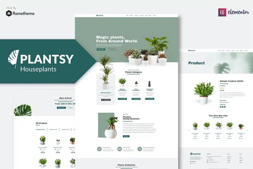
While simplicity may not seem like the most appealing approach to designers, it is definitely the key to creating an elegant and sophisticated look. Like a Plantsy website display that displays simple images and unobtrusive colors.
Retro has become a big trend over the last few years. While some seek sleek modern designs, others crave the comforts of the past.
Inspired by the changing environment caused by the pandemic and global warming, many brands are shifting their focus to more organic and natural shades.
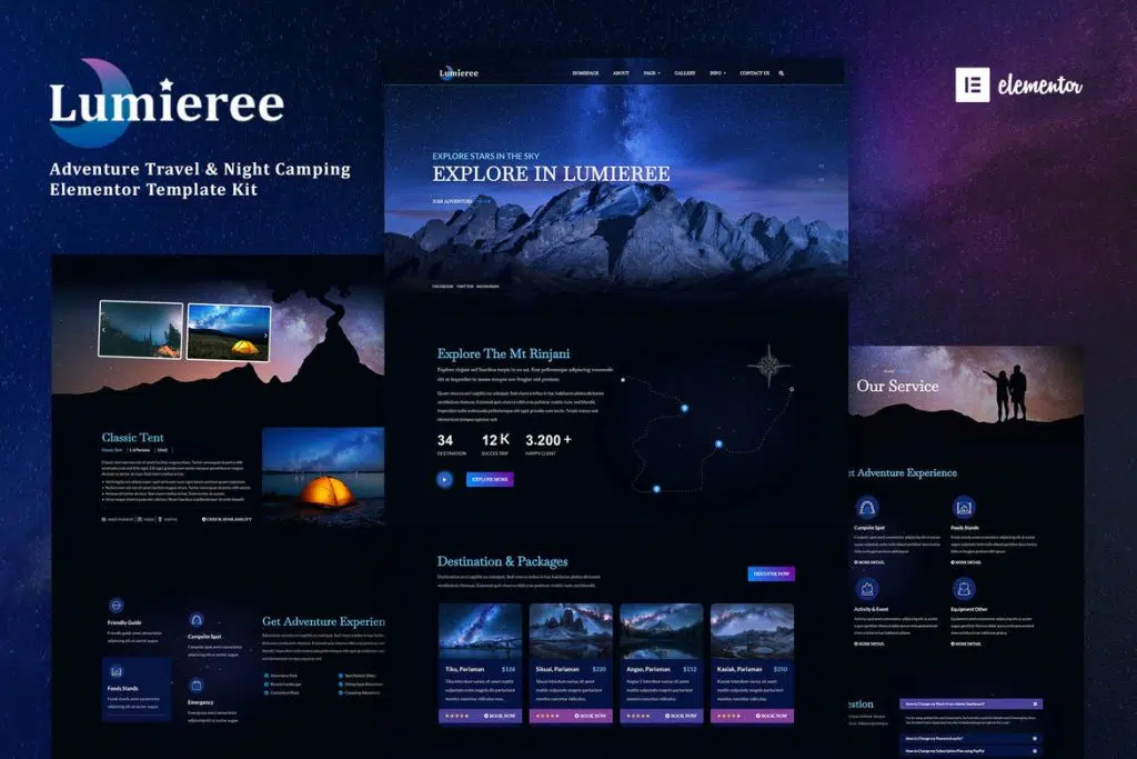
Creating an interesting visual effect, combining dark colors with bright blues and purples is perfect for creating a mystical and futuristic atmosphere. Comparing these colors can help build a hierarchy on your website, shifting attention to the important parts – like this example from Lumieree.
It’s hard to go wrong with bright and cheerful colors – they create a fun and vibrant atmosphere. Bright colors trigger positive emotions and leave a positive impression on your users. Using bright colors like supernova and pomegranate combined with shades of blue creates an impactful yet balanced effect – as in this website design from Gucci Burst.
Using metallic colors in your web design is a great way to create contrast and draw attention to important elements.
While some brands can go overboard with their color choices, it can be beneficial to choose a simple primary color. When combined properly, these colors can be great for evoking certain emotions. For example, blue symbolizes trust and stability, while red symbolizes strength and joy. When combined, they can be an effective tool for building trust and creating calls to action.
If you want to grab the user’s attention, the yellow and black color scheme is an excellent design choice. black can symbolize simplicity and elegance, while yellow add energy and creativity to the design.
As the world slowly recovers from the pandemic, people are starting to realize that less is more. Minimalist web design is a great way to emphasize the simple things in life, and on your website. Including natural colors, simple lines, and subtle typography, a minimalist design can create a unique and long-lasting user experience.
Understanding the basics of color psychology, combined with various online tools will help you find the perfect color scheme in no time. When choosing a color palette for your website, think about your brand vision and the message you want to convey to the world.
Sorce: envato.com


