There are three stages of web design evolution. In the image below, we’ve colored in each stage and added the year to the timeline.
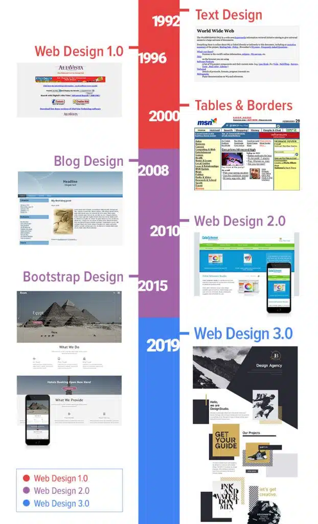
The first websites were text-based. And it is hard to say that they had any web design.
Several graphic elements appear on the website, which becomes more attractive. Web pages have tables. Then, the table is changed to Layout and Grid. Tables provide some flexibility, but are not mobile-friendly, and when they are unnecessary.
Many people build their own Content Management Systems (CMS). So, webmasters don’t need to edit HTML files or upload them to the server. But it is possible to modify online content in real-time.
The evolution of web design and the spread of mobile phones is causing new changes.
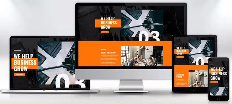
The next transition is to Web Design 2.0. Web pages have Grids, and web designers can arrange elements with Layouts. Bootstrap accelerates Web Development speed. This simplifies the process and makes it more convenient. Bootstrap supports mobile devices from the start with Grids. Bootstrap’s Grid stretches automatically to the full width of the screen. This significantly reduces the time developers spend coding to support desktops, laptops, tablets, and mobile phones.
The Birth of Web Design 3.0
Starting in 2016, we started seeing ideas from Print Design appear regularly in web page designs on Pinterest, Behance, and Dribbble. The new web design is different by:
-Free positioning.
-Element overlap.
-Breaking Grid boundaries like Bootstrap.
That means the birth of Web Design 3.0!
Then, How are Web 3.0 websites different from previous years?
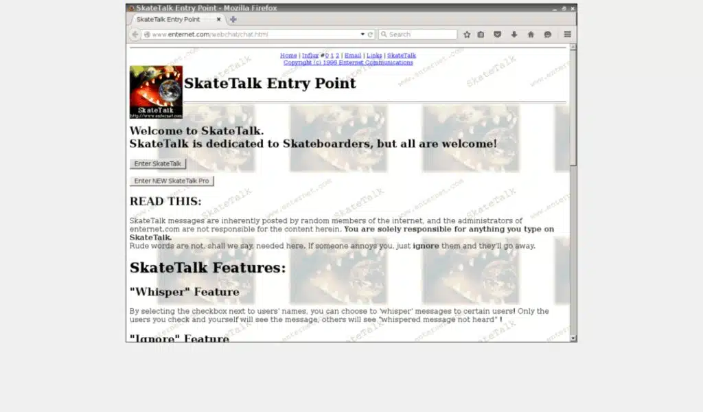
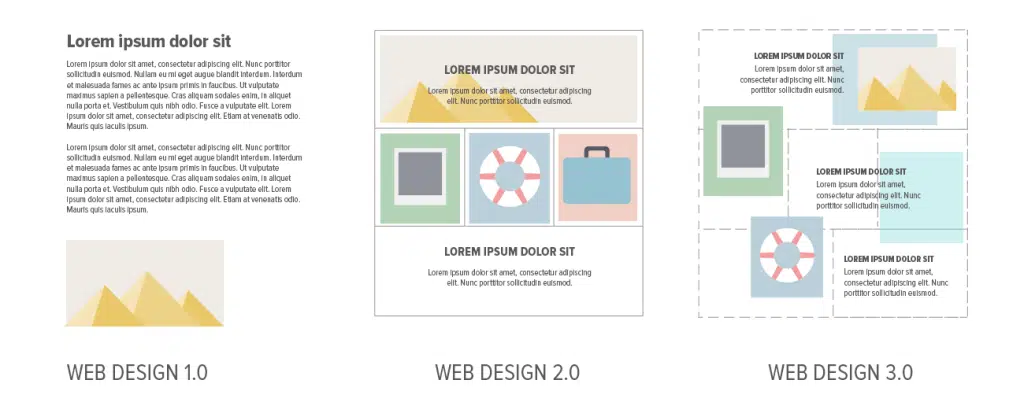
This is what the Web used to look like:
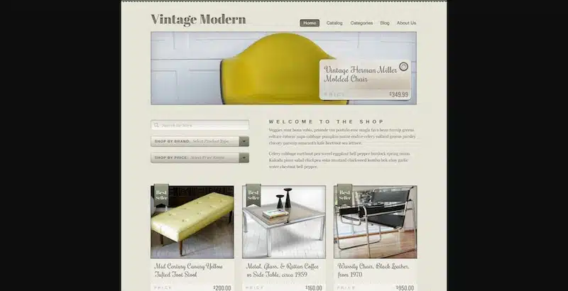
And in the mid-2000s, we started to see the emergence of Web 2.0 — which looked something like this:
But, this pales in comparison to what we see in Web 3.0 design:
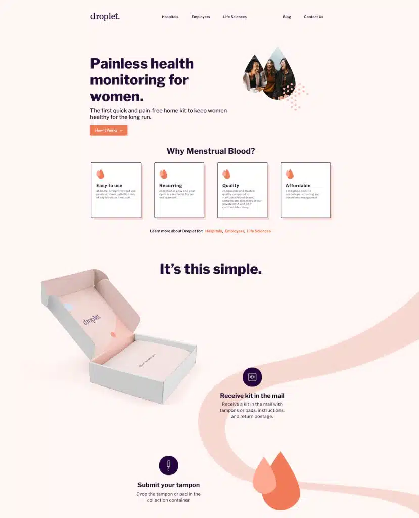
The most significant change in recent years is the addition of a creative element.
Designers are increasingly comfortable using background elements such as shapes and curves to apply specific design navigation paths. When used properly, shapes and blobs can help highlight valuable content while providing a pleasing UI (User Interface).
In addition, Web Design 3.0 uses more illustrations and visual content. Not only to enrich the page but often to illustrate a particular product or cause.
Here are the top 3 reasons why you should consider using illustrations:
- Turning complex into simple. Traditionally, web designers will rely on headlines to describe their products. These days, illustrations can do most of the hard work for you. You can design entire sets of illustrations around your product and its features. After all, visual learning is a thing!
- Brand image. The illustration style you use can help promote a positive brand image. Illustrations can showcase a brand’s different values, strengths, and qualities. Not something you can describe with copywriting alone.
- Visual character. Every brand is different. And with visuals, you can convey an identity that sets you apart from the crowd. This also applies to things like Icons and Animations. Both require slightly more individual work—preferably by a graphic designer—, but it comes with a payoff!
And the third most significant change is the typography.
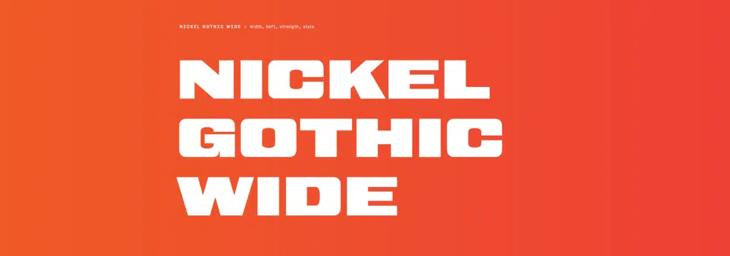
Typeface is always a big part of any design. And if you’re unsure, I challenge you to change the font on your website to something completely random.
The difference that good typography makes is enormous. And since Web 3.0 websites went mainstream, so did typographical variations.
Element placement has also evolved.
Web Design 1.0 is “one dimensional”. Most of the design elements are arranged sequentially one after the other.
Web 2.0 design is “two dimensional”. There is a Grid for placing elements in cells, which gives more freedom.
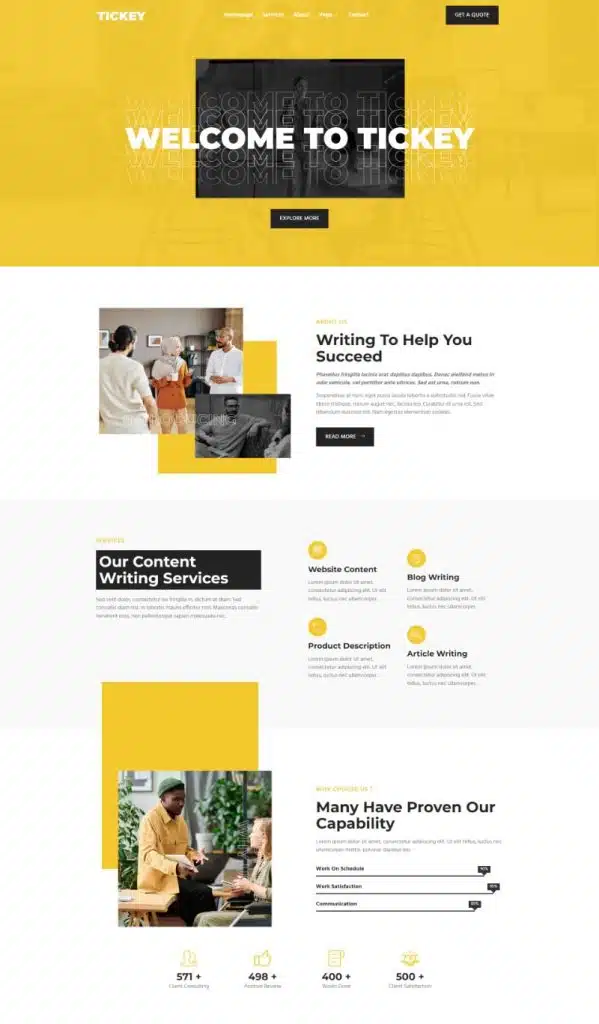
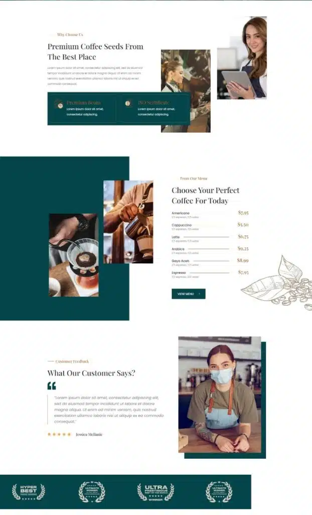
Web 3.0 design is a new dimension. It has free element positioning, overlapping, and layers like in Graphic Design tools. This opens up new prospects for web design. And it was the start of a new web design era.
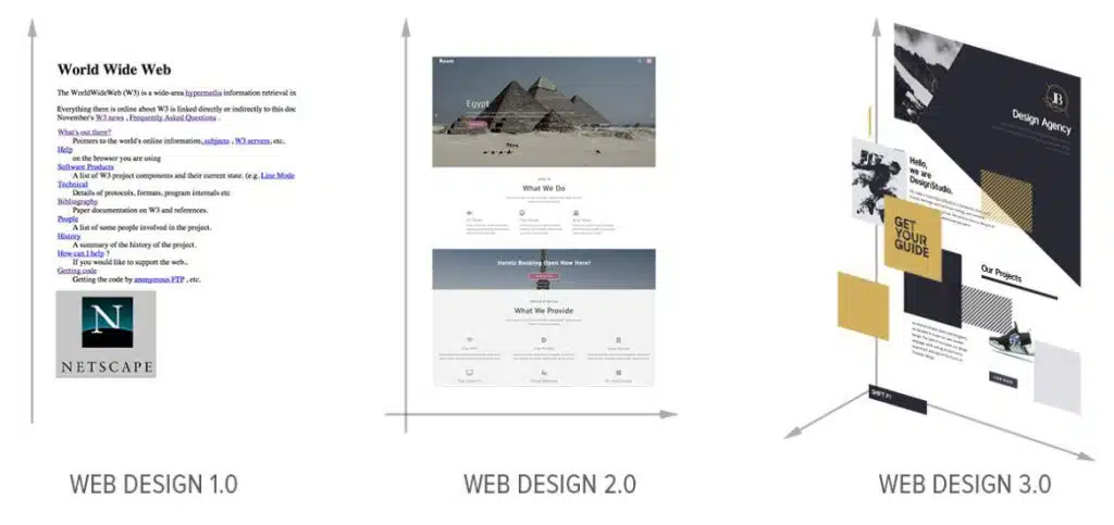
In Web Design 3.0:
-You can position elements freely. You can leave white space if needed.
-You can resize elements freely.
-You can overlay Grid elements and cells. Of course, your web page must be mobile-friendly.
Why are designers using so many shapes and other design elements?
It’s not only websites designed by professionals who are taking advantage of this new trend. Most modern WordPress themes and frameworks are also built to implement this trend.
But, why shapes and how can they benefit website design? The two main factors are aesthetics and minimalism. Shapes and other geometric elements help unify the entire design, ensuring smooth flow and a consistent user experience.
Are page builders keeping up with the trends?
It’s not just page builders like Visual Composer and Elementor that help you create better landing pages. Brands like Squarespace, Webflow, and Weblium are also making significant strides in the website builder space. And sure enough, all these design tools keep up with the latest trends in web design.
Elementor, which has been downloaded more than 25 million times, is constantly evolving its component library to include elements that complement the modern web. And Weblium uses AI to help inexperienced webmasters create visually stunning websites.
The best part is that you don’t have to write a single line of code. Modern page builders provide Grid-based layouts without all the technicalities.
You can create new lines, and sections, and resize individual components using the drag-and-drop tool. Or, you can avoid it altogether, and use a pre-built template.
Needless to say, learning HTML & CSS is still highly recommended as is learning vector art and general graphic design. Page builders are prone to inefficiencies that can only be resolved by getting down and dirty with the code.
Here are some web designs that have implemented web design trends 3.0:
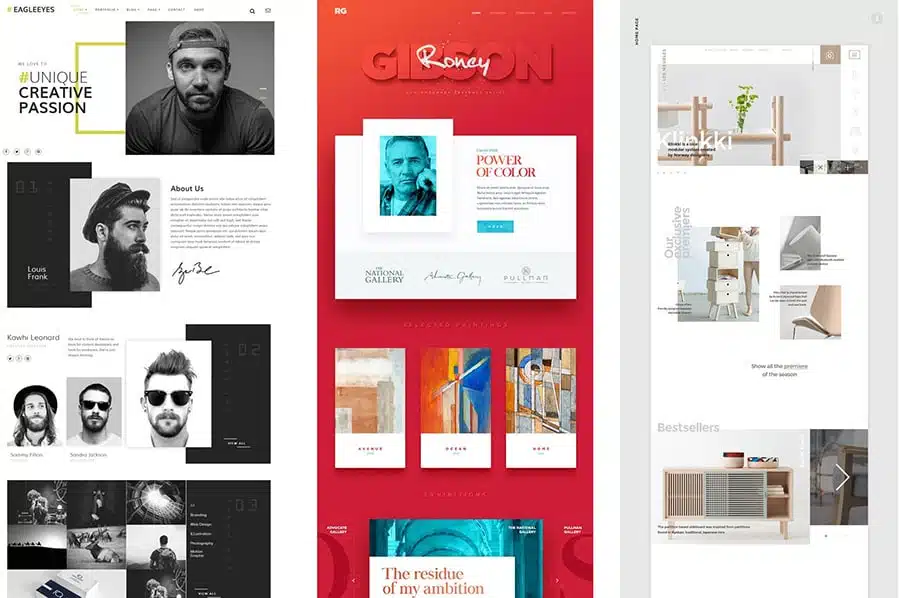
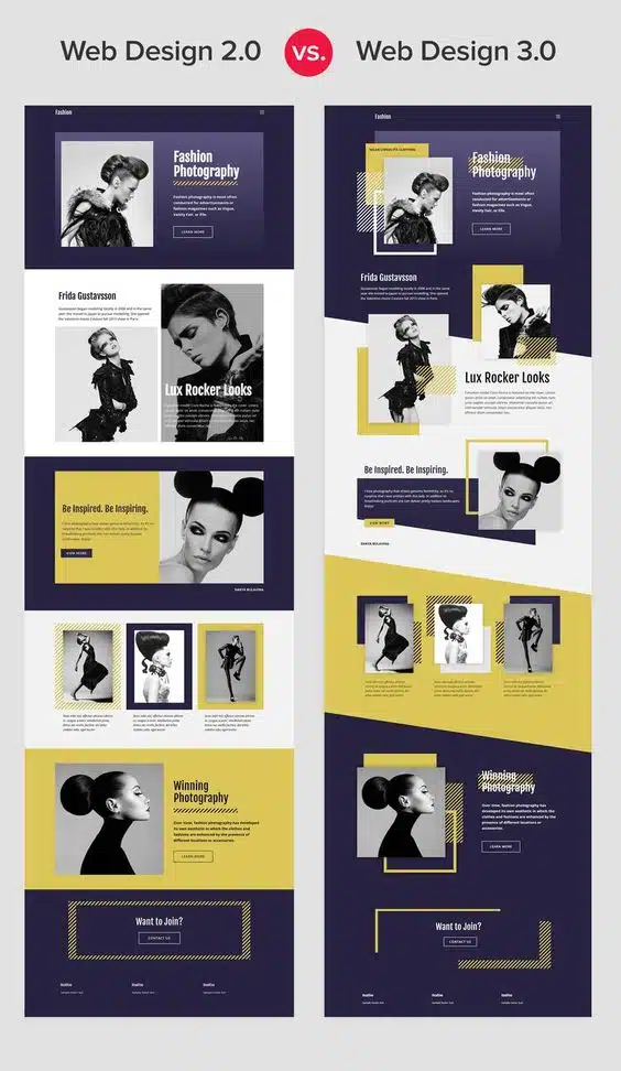
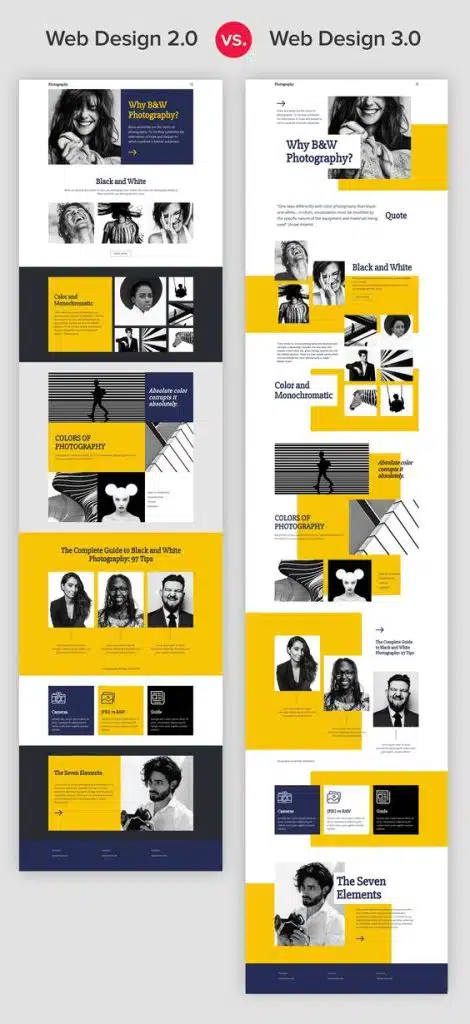
Source: nicepage.com, geekflare.com
Also read: The Trend Of 2023: Interactive Web Design

