


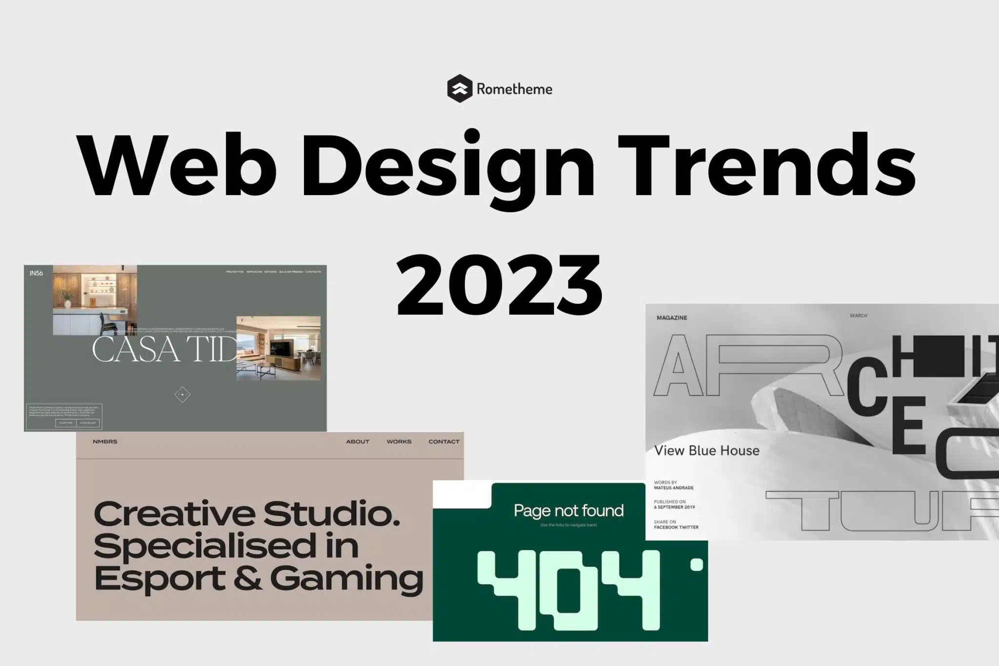
As always, these digital trends are a reflection of emerging technologies and their impact on society, and the last year gave designers plenty of material to work with.
There have been major advances in AI—to the point where it can create its own art—and the Metaverse has pushed VR even further into the mainstream. Web design trends featuring immersion, simulation, and cinematic techniques have followed suit. At the same time, the global recession has inspired a retreat from luxury and a drive toward a joyous escape experience. And all of this is happening against the backdrop of Big Flat Now, where the internet and mobile phones have reached their peak of worldwide availability. The result is a web design trend that is less limited to the immediate and local, as aesthetic innovation becomes a fast-moving global endeavor.
With all these factors in play, these web design trends for 2023 are ready to shake up the very foundations of the World Wide Web. Let’s see what happens!
Hover animations are always useful for subtle micro-interactions, keeping the visitor passively engaged. But in 2023, web designers are going even bigger with hover animations, turning ordinary page elements into stunning product displays.
This trend achieves several goals at once. It supports fast browsing, as visitors can quickly review products without clicking through to another page. It animates the product, providing a teaser of how it can be used. It supports a minimal interface, displays photos one by one, and keeps the page free of image clutter. It can introduce a new foreground dimension to sites, animating product photos on top of existing pages.
And finally, like most surprise interactions, this hover animation creates a feeling of discovery, making visitors want to keep exploring to find more revelations.
Last year, many websites loved the immersive scrolling experience that drew viewers to the page. Thanks in part to the continued interest in VR technology, this trend has now evolved into truly immersive websites—fully rendered 3D worlds.
Immersion gimmicks are nothing new but rarely go as far as taking the user on a journey through digital space with the smooth tracking of a camera crane. And while audio engineering was once considered a tacky relic of the early internet, smooth music makes a comeback to add a cinematic touch. Since audio still has accessibility challenges, most websites will ask permission to play music before loading the page.
This trend requires a lot of effort to succeed—sometimes requiring 3D modeling and sound mixing—so it’s particularly useful for one-off campaigns, as seen in the Coach x Tom Wesselman product line. While the worlds of these websites tend to be more stylistic than realistic, that’s what makes them interesting—they’re imaginative escape rooms that make users want to get lost. Best of all, they challenge a lot of stale layouts that orient the page around CTA buttons. This website relies on visual experience to leave a lasting impression on visitors.
Or like Gucci Burst below
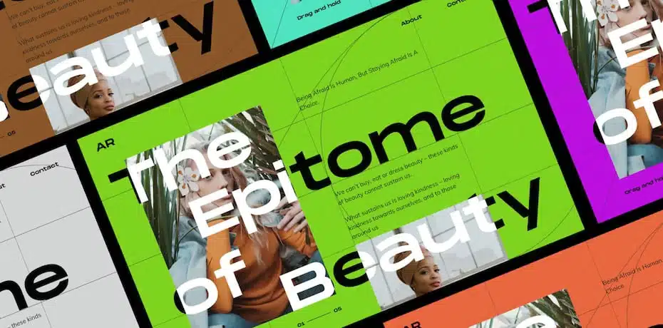
“Less is more” has been a digital law for decades now, mandating that websites should be intuitive to the point that users don’t have to think. In the past, many designers have rebelled against these constraints through anti-design and reinvention into the flashy interfaces of Web 1.0. But for 2023, the rebellion against UX minimalism is digital maximalism—a design that aims for complete overstimulation.
This trend declares an all-out war on white space, customizing almost every page element. A single web page may have animated backgrounds, animated foregrounds, large typography, hover and click effects, flashing images, and color splash all at once. The effect is to create websites that are not only rebellious but also expressive, new, and unashamedly whimsical. It takes engagement and entertainment to impressive new heights, prioritizing experience over intuitive navigation to encourage exploration.
At the same time, this trend comes with obvious accessibility barriers, and businesses subject to accessibility laws may find it impractical to design WCAG-compliant pages in this style.
The parallax effect is an animation technique in which foreground elements move faster than background elements, creating a sense of realism and depth. This has been a popular web design aesthetic for a few years now, but 2023 websites specifically support parallax zoom scrolling.
Instead of scrolling horizontally or vertically, this parallax scroll takes the viewer in or out of the horizon line, creating sudden, three-dimensional movement. As a zoom effect, it reflects the ease of zooming that apps like TikTok provide to video creators. It also has clear ties to immersive worlds and the trend of over-stimulation: one simple reel makes the visitor feel as if they are taken on a journey into the unknown.
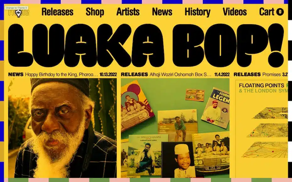
’90s retro became a big theme in web design trends last year—an expression of a collective longing for the innocence of the early internet. In 2023, the trend shows no sign of abating. Designers are now stepping up their creative interpretations of nostalgia, with particular emphasis on navigation.
Explaining its record store-themed navigation design, 99designs by Vista designer Marijn B says, “Because visitors understand how objects work in the real world, they will more quickly understand how to interact with objects on a website. Browsing it feels as easy as flipping through a record or reading the back of a record, looking at the vinyl all around you, and being mesmerized by the marquee of commercial banners. It gives the user this familiar and warm feeling
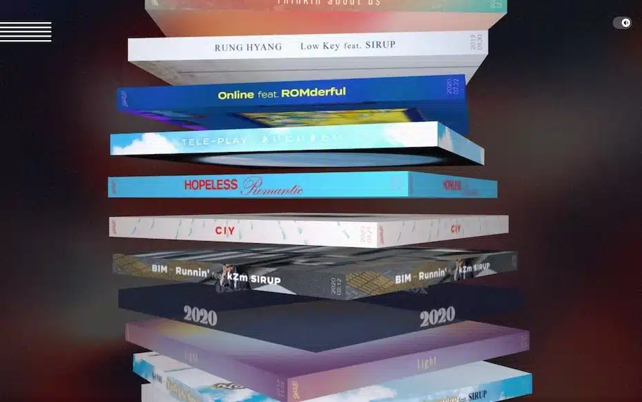
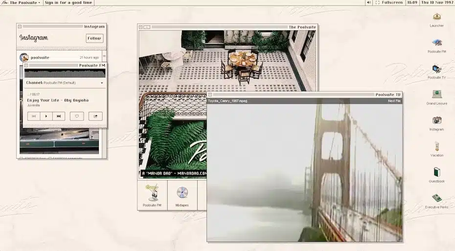
Nostalgic navigation can manifest in very literal 90s design techniques, such as pixelated desktop icons or bright menu color blocks. It can also incorporate past artifacts from the 90s, as seen in the clever SIRUP CD tower navigation menu. Both styles rely on common sense memory, i.e. sorting through stacked cases by hand or clicking through outdated, yet familiar, interfaces.
But even in the absence of sensory memory, the trend can still captivate younger users, creating digital facsimiles of worlds they cannot experience. In general, nostalgia is always useful to give a warm impression to the audience, especially when facing difficult times. But its inclusion in navigation may also indicate that we are moving forward by taking cues from the past.
These web pages often include doodles, handwriting, sticker graphics, and cut-and-paste collages. These handcrafted elements not only recreate the tactile experience of browsing old-school zines but instill a sense of intimacy and imperfection in lieu of automated precision. But while the handcrafted aesthetic defies the gimmicks of high-tech trends, it doesn’t live on in denial of our technological realities. This design simply embraces both sides, physical and digital coexist as one.
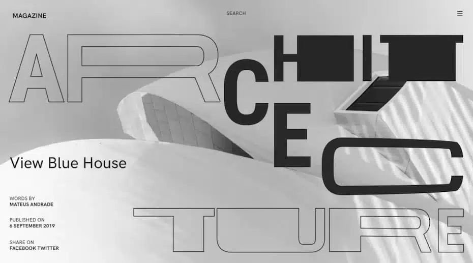
Web design has long been held hostage to the grid, where layouts are neatly arranged, spaces are even and everything is in its right place. Web designers have defied this imposed structure through rule-breaking techniques like last year’s Neo-brutalism, which toned down the avant-garde qualities of traditional brutalism. These efforts appear to be paying off, as one of the more common characteristics of brutalism—namely overlapping and dense text—appears consistently on websites in 2023.
Even major websites now overlap their page elements, placing typography over imagery to the point of being almost unreadable. Often, websites will maintain a polished aesthetic throughout, and only certain title text will overlap, creating a slight brutalist effect. This is what gives trend its main appeal: it breaks uniformity without letting the whole page descend into experimental chaos.
Even if the trend does sacrifice some immediate readability, the sheer scale of titles makes their effect only temporary. Instead, this trend grabs attention with stylized headlines reminiscent of magazine covers. Overall, this trend is a sign that rule-breaking is becoming more widely accepted as almost everyone seems to get bored with the same, well-organized layout.
One of the best advantages of digital design is its capacity for multimedia, where text, images, videos, animations, and interactive elements can coexist in the same composition. Despite this, many of the web designers of 2023 are leaving multimedia altogether in favor of textual layouts.
The result is a decline in the print magazine aesthetic, and this may be a by-product of the fact that many publications are turning digital to avoid rising printing costs and environmental damage. Whatever the case, typographic layouts promote efficient minimalism: these websites have something to say, and they don’t waste the visitor’s time saying it. They also provide an intellectual reward for their visitors, understanding that impactful words and creative text arrangements can be as eye-catching as attention-hungry visuals.
The 404 error page is the dreaded destination of any website, where you are sent when you can’t find what you’re looking for. While web designers have long seen the page as an opportunity for cute graphics or fun copy, 2023’s 404 pages are all used for entertainment. Through eye-catching animations and interactive mini-games, this 404 page actively encourages visitors to stick around.
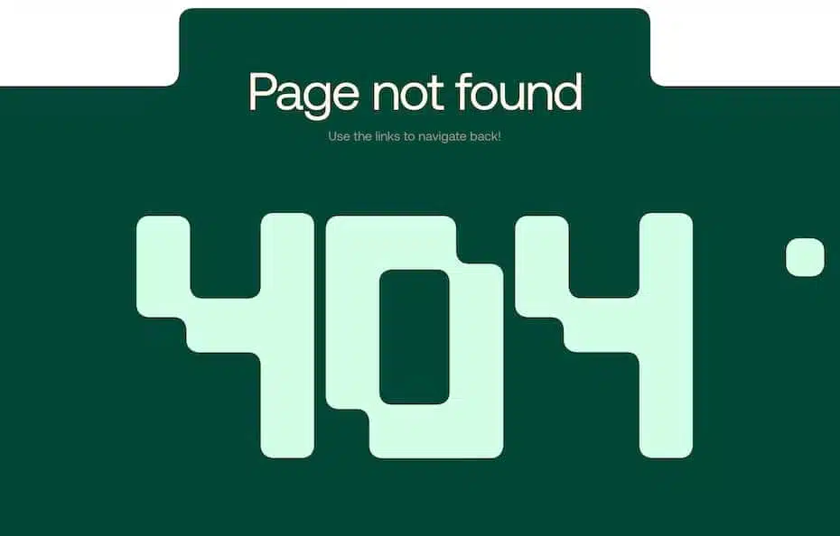
Like the overstimulation trend, this aesthetic ensures that unwanted but necessary pages are geared toward entertainment. But it achieves more than that. This is part of a wider push to create positivity in times of frustration. When there are so many sad events happening in the world every day, web designers naturally want to do their part. A fun 404-page design might not change the world, but it can be a small gesture of kindness—digital fun replaces human error.
What do you think? Did this trend surprise you or have you already guessed the above trends will appear in the next web design?
Source: 99designs.com


