

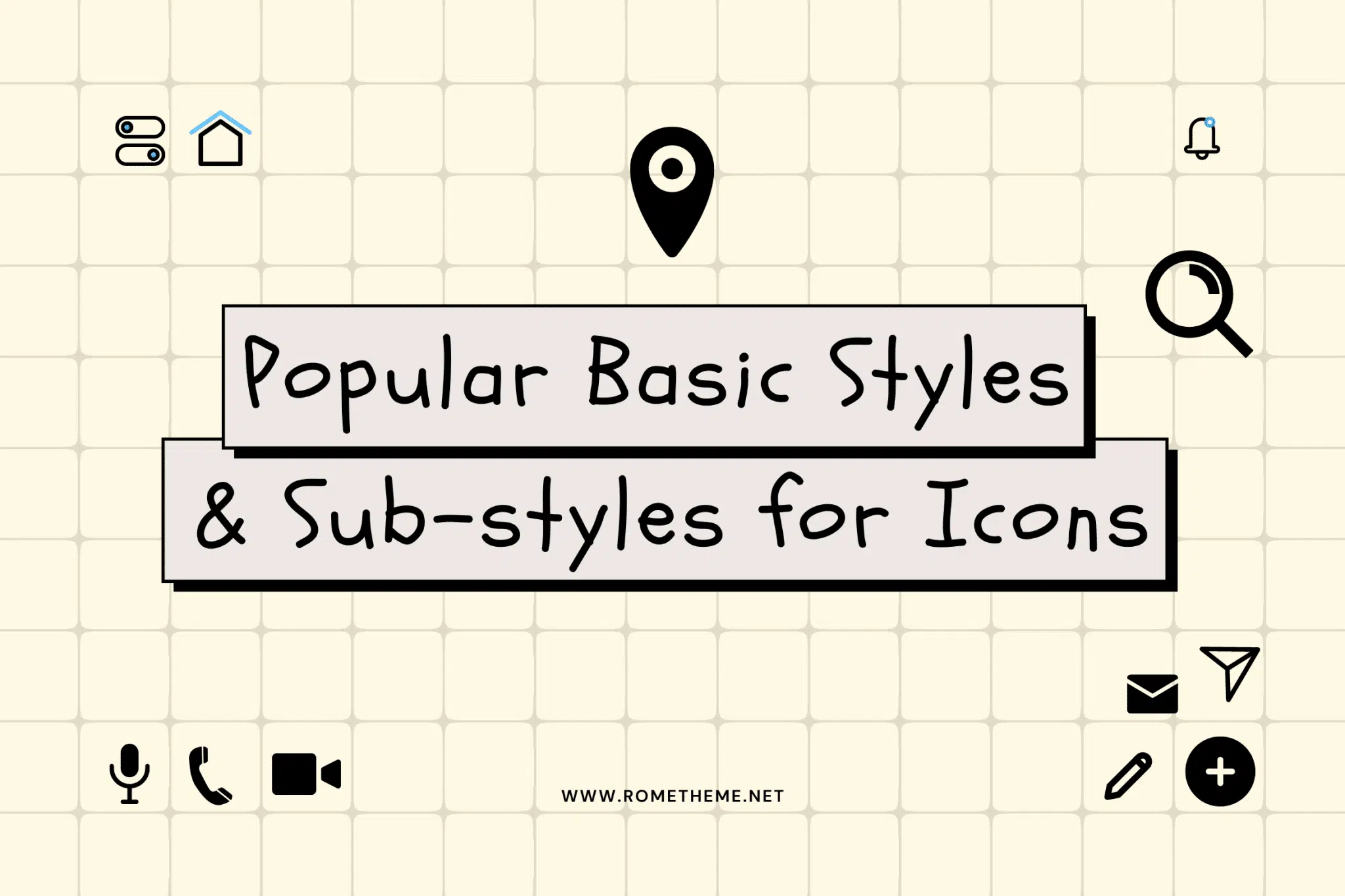
Icon styles make up a big part of visual content – they work on a variety of interfaces to communicate ideas, objects, or actions. Not only does it enhance the overall design, but it can also provide end users with greater clarity, readability, and personality when navigating a website, or understanding items such as signage.
Today, we encounter icons every day – on roadside signs and even in shopping malls. Also, icons are great for visually amplifying the overall message to supplement or amplify content. This is especially useful for explaining steps, or even as a way to show off a brand identity.
Outline, glyph, colored and flat. outline, glyph, colored and flat. outlined, flat, material, glyph, hand-drawn, etc. Consider the interface your icon will use.
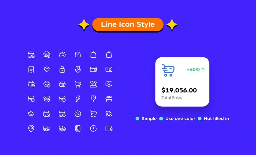
The line icon style known as general line icons is simple, uses a single color, and is not filled.
They are seen as clean and easy to understand by design. Since the line icons are outlines of common objects and actions, users can easily recognize them.
You may often see line icons used on websites, especially e-commerce stores. This is a common choice for representing navigational items across websites. Some popular uses include a magnifying glass to show a search bar, a speech bubble for a call to action, or an envelope to represent a mailing list.
However, on more dynamic websites or creative assets, the interface can be too simple and can seem boring due to the blank and one-color appearance. A tip we’ll give you to avoid looking dull is to explore two colors – one for the main outline, and a second color for the smaller details. To spice things up, you can also use a gradient instead of a solid color for the outline.
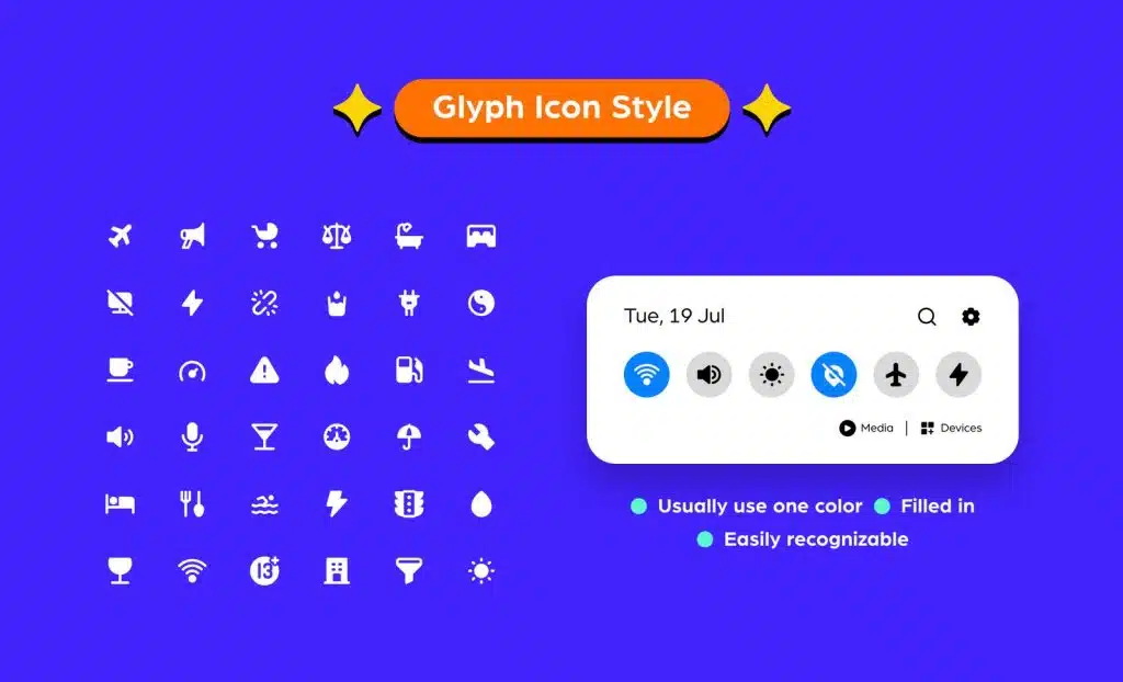
Here’s a fun fact: “glyph” comes from the Greek word “gluphē”, which means symbol. Filled glyphs – in monochromatic shapes that appear as solid shapes.
Popular glyph icon style used for main website elements in a speech bubble, mail icon, and camera shape.
Many glyphs are easy for end users to identify because they are straightforward, simple, and common to use. Just like the line icon, this icon is easy to recognize because it is used in everyday signs. Glyphs work fine even when you shrink them due to their compact shape.
However, glyphs may look better when used as favicons for websites. But because of their solid, one-color appearance, glyphs can look a bit dull and flat when used in dynamic creatives.
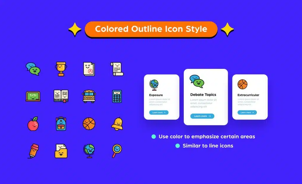
Colored outline icons are similar to line icons in that they use lines of the same thickness to draw shapes. However, colored outline icons use color to emphasize purpose and express smaller details.
Colored outlines are a great way to add some life to icons, especially brand logos.
To make it work, you just need to know where to add color to emphasize your icon, how much color each area needs, and how many different color shades to use. Using too many colors can seem too busy – the best tip is to stick with one primary color, and a maximum of two accent colors.
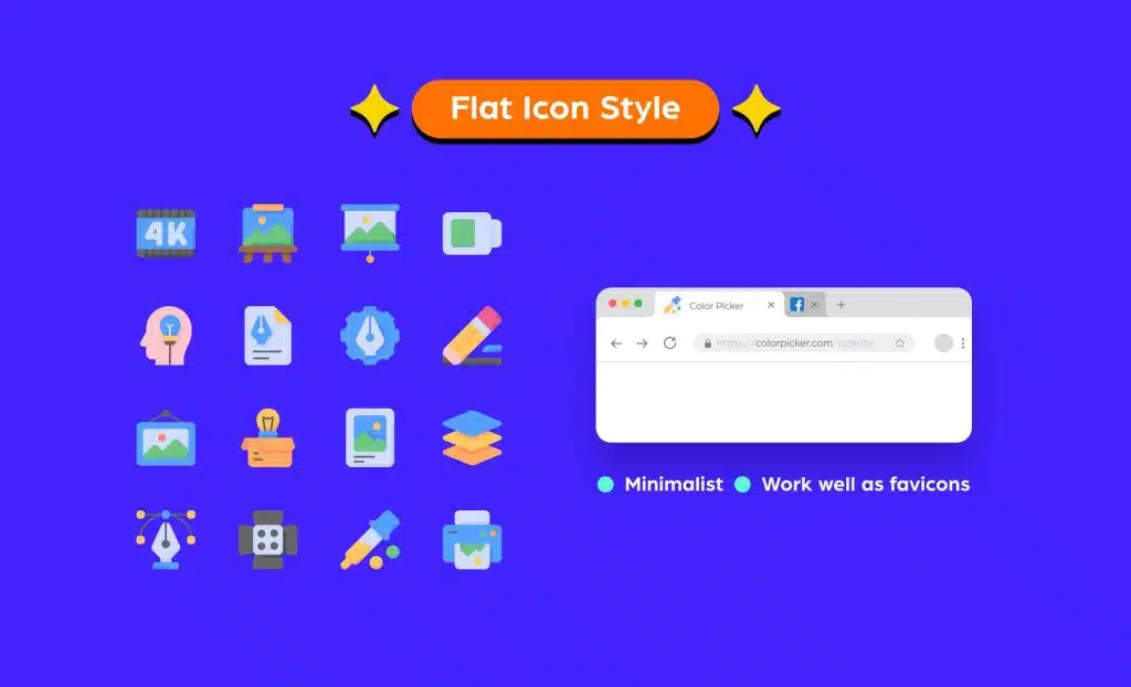
Flat icons lack depth, they’re just flat – as the name suggests – and use minimalistic two-dimensional (2D) elements.
Flat icons work well as favicons (the icons that appear in website tabs or the address bar) – simple, easy to identify, and minimal. A common use for them is mobile app icons. If you look at your phone now, most of the icons are probably flat. That’s because they have to comply with Android and iOS guidelines regarding format, style, and size.
But when used on a website landing page, it can fail, especially if you use it on interactive content. Due to the flat appearance, the user may not be able to immediately understand that it is clickable.
And these are some of the sub-styles for icons that you may have seen everywhere but you don’t know what their names are and how to use them in your designs:
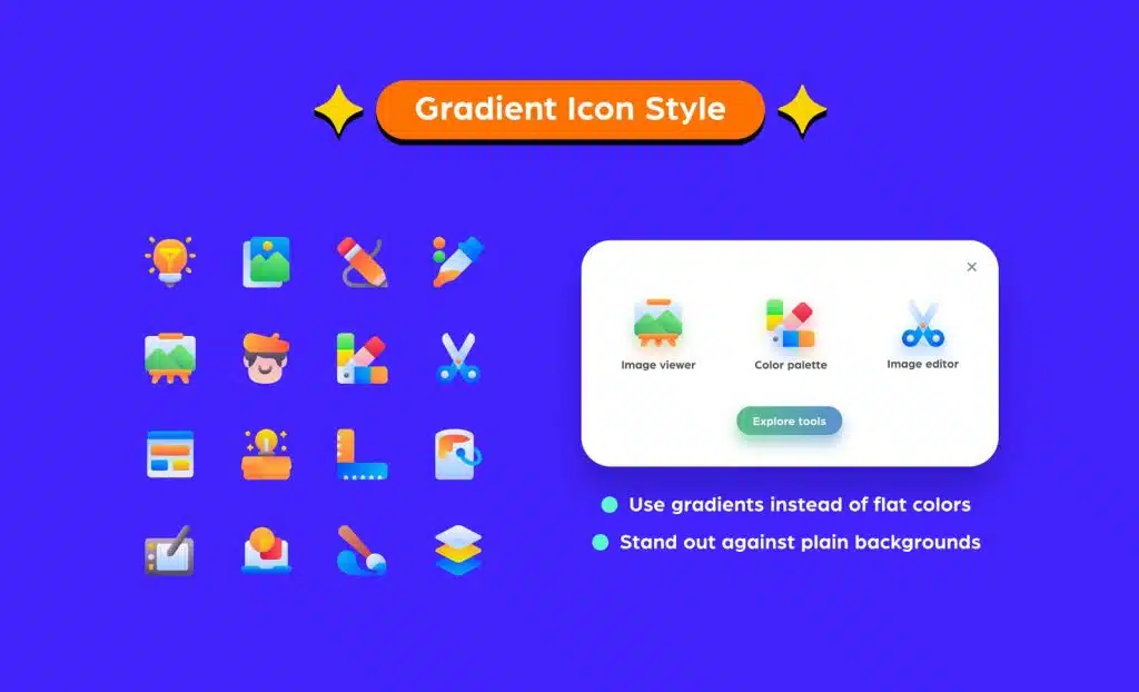
Gradient icon using a color blending technique. Colors tend to transition from light to dark, or from muted to more vibrant colors.
Gradient icons work well as brand logos, especially for mobile apps. A popular example is the Instagram brand logo, which uses a mix of colors that almost resemble a sunset.
The use of gradients encourages interest in boring designs. For example, on a plain background, the use of gradient icons brings life to the design and gives the eye a break from any monotony of color.
When using gradients, it’s all about the color combo. If you combine two colors that are too contrasting to create a gradient without proper blending, it may appear more like color blocking than a gradient. The trick is knowing what color combinations work to create smooth gradients on your icons.
The badge icon style is probably one of the most decorated icon styles that have seen many victorious fights in the designer ring. However, the badge icon seems to conjure up thoughts of texture, stitching, and other frilly things that happened in 2010.
Because names have round, hexagonal, or geometric and often monochromatic backgrounds, badge icons are usually illustrated in a flat or outline style often with a portion of the foreground protruding beyond the bounds.
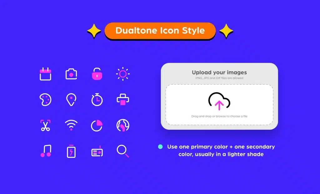
Dualtone icons use two colors throughout the design – a primary color and a secondary color. The secondary color is usually a lighter color.
This style is simple and clean. Dualtones are usually easy to spot, making them great for items like website navigation. For example, dual tones could be used on the document upload icon, with the upload arrow being the secondary color. It gives the end user better identification at first glance too, compared to sticking to a single color.
Finding itself halfway between an icon and a full illustration, the landscape icon style keeps a single subject in the foreground with a relevant but muted scene in the background.
Scene icons are quite versatile as they can be placed in relatively small or more open spaces while taking the wow factor to the next level. They are great for blank application pages where the user hasn’t added content, for instructional graphics or websites, and have the benefit of being quicker to create than full illustrations.
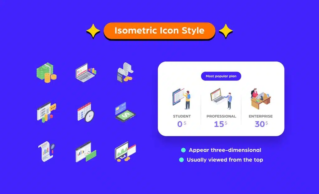
An isometric icon is a two-dimensional design that appears three-dimensional.
You can think of isometric icons as an improvement over the usual two-dimensional designs. Generally, they add more interest and personality, while also being used to better represent an action.
Of course, playing with isometric designs is all about angles. It has to be seen from a bird’s eye angle and from an angle to create a realistic view from the user’s point of view. Most isometric icons are designed with the same horizontal line at a 30-degree angle.
Most common variation of the flat badge icon style with a slightly odd and overly domineering hard shadow falling towards the bottom right of the subject onto a barely dashed circle edge or rounded rectangular background.
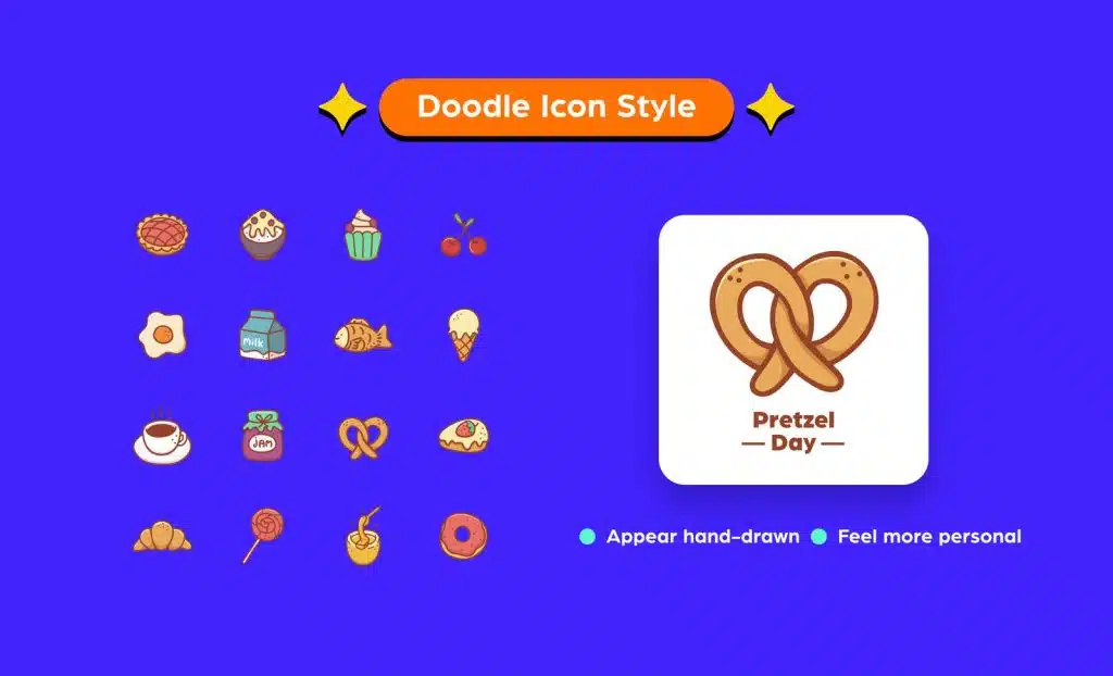
Doodle icons are hand-drawn icons that can be in color or black and white for a more authentic doodle feel. Their style can vary – they can be simple with an outline, or a more complex illustration.
The hand-drawn aspect of the doodle icon provides a more personal feel when connecting with the viewer. It sort of humanizes the design to resonate with the audience.
Doodles would look great on posters, especially brand marketing collateral, or on website landing pages. Of course, doodles are more time-consuming to create because you have to figure out the best way to draw the details so that the icon is easy to spot.
Most commonly designed in square dimensions ranging from 12 to 32 pixels, the favicon falls into this category and is used when space is tighter than a spitball in a straw. Dirty but very cool.
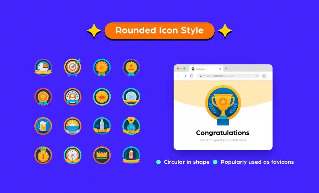
Round icons are icons that are circular in shape. They tend to work well in logos or assets like infographics.
Many brands use round logos because they match the favicon – if you look at your browser tabs now, it’s likely that most brand icons are round. Even Google uses round icons, while their homepage also uses round icons.
Their geometric shapes resonate well with users but they can be tricky to use because round icons may not work well with other shapes. So, make sure to see the entire design before using it.
Dotted. Dashed. Dotti Dots? The names degenerate as you go along. Regardless, this modified outline style mixes subtle strokes with, you guessed it, dots or dashes, in the most strategic places.
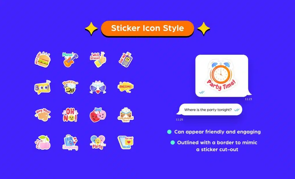
The sticker icon is just what it sounds like – made to look like a sticker. It is usually outlined with a thin border to mimic sticker cutting. There are several variations that are designed with corners or outlines that are folded inward to resemble a peeling sticker.
Vivid stickers are great as digital stickers for messaging apps or social media designs. Using them can transform designs into friendlier communications to engage audiences. It also gives designers room to get a little more creative.
While stickers are a bold choice when it comes to icons, if you use too many of them in one design, they might look too busy for one space.
A simple flat icon variation, the light, and shadow-styled icons feature a lighter part and a darker part with contrast forming a stark but subtle line that divides the icon into two distinct parts. Contrasting lines may be horizontal, slanted, or sometimes vertical.
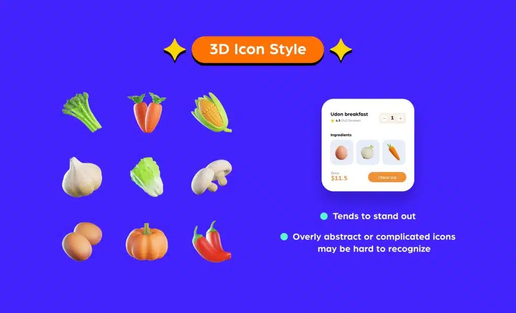
The 3D icon is the opposite of the flat icon style. It seems to pop out of the design instead of sitting flat on the page.
It works great on banners, posters, social media designs, and basically, on most marketing collaterals. They would also do well on website landing pages because the use of 3D icons can be eye-catching at first glance – if done right. They attract interest and give your designs a more beautiful and welcoming look, especially with the right use of colors.
Nevertheless, it can be very annoying if it’s overly designed. if the 3D icon is too abstract with lots of elements, it might be hard to recognize at first glance. Our tip is to keep it minimal, and the smaller it is, the less detailed it should be.
It is an icon type that is soft in nature, with soft edges, soft colors, soft curves, and soft shadows (if added). It’s a fun, playful, and cute icon. An all-time favorite for millennials and gen Z.
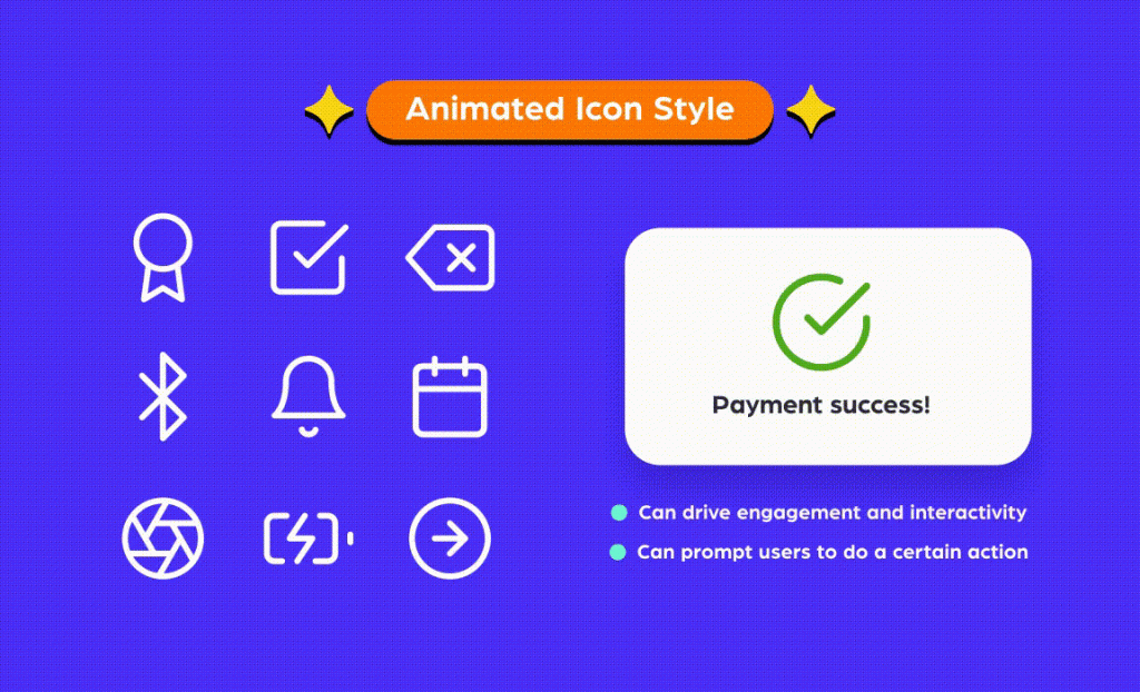
Animated icons are static icons that come to life by adding design elements that make the icon “move”.
Because animation grabs attention, it encourages engagement and presents content in an interactive way that’s great for presentations. It is also popularly displayed when a website or mobile app is loading.
Additionally, animated icons are used to indicate or prompt the user to perform certain actions, such as scrolling down a page.
When using animated icons, this – ironically – can impact page load times, especially when using them in GIF format. But this can be easily countered with the right file format. For example, Lottie animations are lightweight – they are about 600% smaller than GIFs, so you can use them as icons without worrying about slowing down your site or app.
Source: Varghese Mathai, iconscout.com