


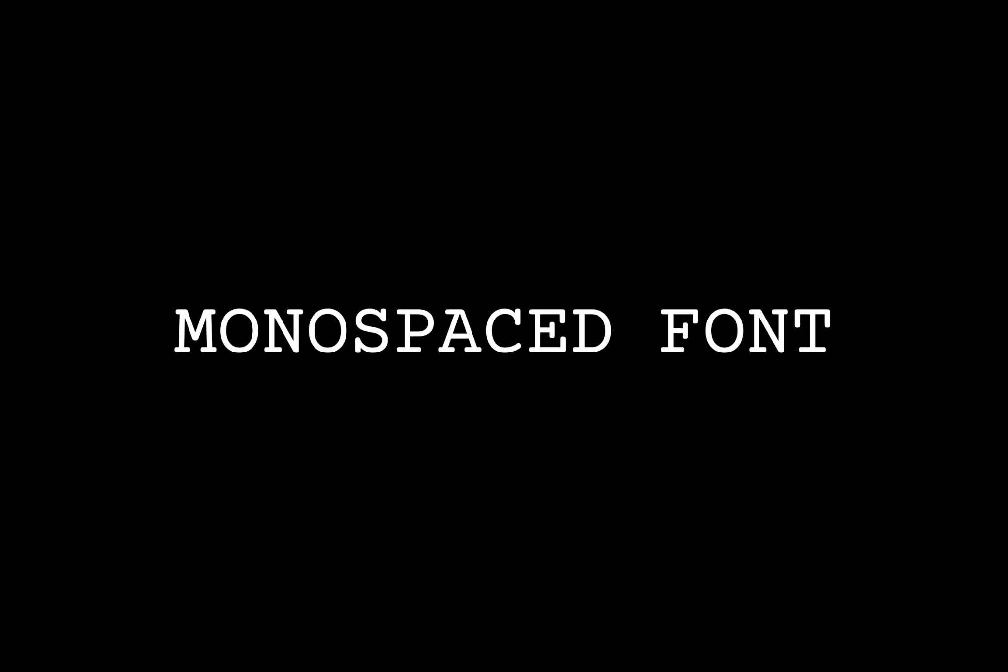
Monospaced fonts, also called fixed-pitch, fixed-width, or non-proportional fonts, monospaced fonts are unique in that all characters take up the same amount of horizontal space. Monospaced fonts ensure that the width of each character never varies, and as a result, they often look a bit more spaced or separated than the proportional fonts we’re used to.
Monospaced fonts still display variations within groups but they are easy to identify as monospaced fonts because of their fixed and consistent character width and spacing.
Monospaced fonts can be reminiscent of pages typed on a manual typewriter due to the more physical and mechanical limitations associated with typewriters. Characters on a typewriter need to take the same amount of width as each other so that with each keypress, the ribbon will move the same amount each time.
Every character in a monospaced font, including punctuation marks, is exactly the same width.
Monospaced fonts were also widely used in the early days of computers because they had limited graphic capabilities.
Monospaced fonts aim to do something very different because they only focus on the individual characters themselves.
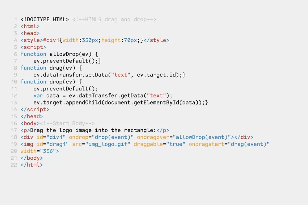
Because of this focus on individual characters, monospaced fonts have become the default font choice in products aimed at developers working with code. Many code editors and terminals use monospaced fonts exclusively. This is often because scrolling through hundreds of lines of code looking for a specific character or symbol is made much easier when monospaced fonts are used.
Another advantage of monospaced fonts can be seen when working with numbers.
If you think of spreadsheets or financial reports where there is a need for clear, easy-to-read numbers, you will often see monospaced fonts used and fixed-width numbers tend to sit more neatly in a column-style layout.
Single-spaced numbers are also called Tabular Numbers, and they allow you to arrange numbers vertically as they are arranged in columns. This is great for yearbook financial reports or math problems.
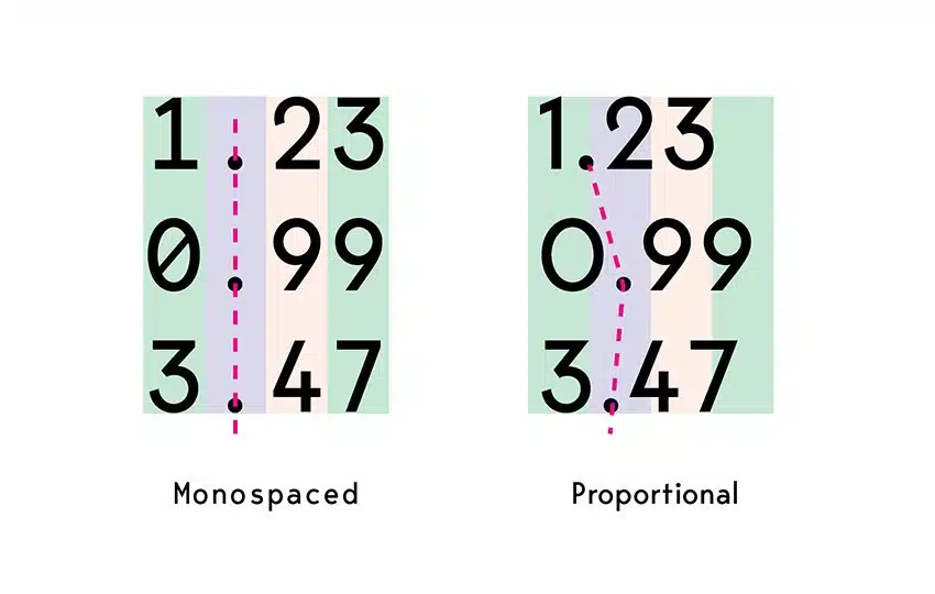
Do you see a clear difference between the two fonts above? In a monospaced font, the position of the numbers looks very neat and comfortable to look at. However, if you use a proportional font, it will be confusing and uncomfortable to look at. Therefore, the use of monospace if it is suitable for its use will be very good and even better.
source: Creative Market, Wikipedia, Envatotuts+


