What is dark mode and light mode?
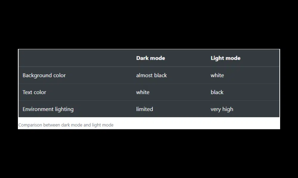
Dark mode or night theme is a way to display the screen of your device (mobile phones, computers, etc.) with white text and a dark background (almost black). And light mode is the opposite, you see the screen with dark text and a light background.
Introduction to Dark Mode
Dark mode, also known as night mode, is not a new concept in web design. It has been around for quite some time but has gained immense popularity in recent years. This design trend has become a go-to option for many websites and applications, including social media platforms, messaging apps, and mobile operating systems.
The concept of dark mode is simple, it involves reversing the color scheme of the user interface, where the background is set to dark and the text and other elements are light-colored. It not only provides a unique and visually appealing design, but it’s also practical. It reduces the strain on the eyes, especially in low-light environments, and can also save battery life on devices with OLED screens.
Benefits of using Dark Mode
The benefits of using dark mode are numerous, and it’s no surprise that many websites and apps now offer this feature. First, dark mode can reduce eye strain and improve readability, especially in low-light environments. When using a bright screen in the dark, the contrast between the white background and black text can irritate the eyes, causing discomfort and even headaches. Dark mode can help solve this problem, as it reduces the amount of blue light emitted by the screen, making it easier on the eyes.
Second, dark mode can save battery life, especially on devices with OLED or AMOLED screens. This type of screen emits light on a pixel-by-pixel basis, meaning that if a pixel is black, it emits no light at all. This can save significant power when using dark mode, as fewer pixels are lit.
Lastly, dark mode may be more aesthetic for many users. It can give a website or app a sleek, modern look, and can even help make certain elements, such as images and videos, stand out more.
Dark mode has grown in popularity in recent years due to several benefits, including reducing eye strain and increasing battery life. However, the lite mode still offers its own benefits that UI/UX designers should consider.
Introduction to Light mode
Light Mode is the default display mode in most interfaces. These interfaces usually have a white background and are very bright. Most interfaces are designed for light mode and designers can get creative with it. Showing different visual elements like colors, textures, shapes, etc. is easier than in dark mode. Light Mode provides better readability as text becomes easier to read due to contrast. Light Mode provides a light and positive mood to viewers and is better for people with normal vision in normal lighting conditions.
Light mode represents the traditional aesthetic of web design. It features a light-colored background, usually white or light grey, with text and other UI elements displayed in a contrasting dark color, often black or dark grey. This high-contrast design prioritizes readability and is reminiscent of the appearance of physical documents such as books and printed materials. It is also generally considered more visually appealing for content-heavy websites, as it allows images and graphics to appear more vibrant and real against a light background.
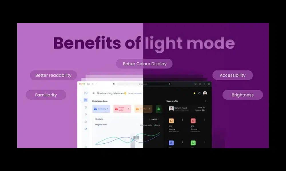
Benefits of light mode
- Better readability: It is simpler to read in Light mode thanks to the high contrast ratio between the text and background, especially for users who have vision difficulties.
- Familiarity: Usually Light mode is generally used across websites and apps, hence the users are more familiar with it. Furthermore, making your product user-friendly.
- Accessibility: It makes it more accessible for users with disabilities like color blindness
- Better Colour Display: For displaying colors accurately, Light mode is better suited. This is important for tasks such as design and photo editing.
- Brightness: Light mode can be more comfortable to use in bright environments, such as outdoors on a sunny day.
Best practices for designing in dark mode
1. Avoid pure black
The recommended thing to do is to use dark gray instead of black and light gray instead of white. You can have as many variations of grays as you need. If you want to follow your brand’s identity, you can make the grays close to the primary color of your brand.
2. Avoid pure white fonts
The best way is using opacity. Conversely, pure white fonts may be a bad idea, whether your background is black or dark gray. In the first place, pure white letters in a dark background show as blurry or distorted on most screens. This phenomenon happens because of an optic illusion: the white light emitted by the screen tries to fill the dark space. When going for fonts, try to choose dim white and light gray colors. According to Google, 38%, 60%, and 87% opacity of light gray are the ideal values for disabled, medium-emphasis, and high-emphasis texts.
3. Be careful with saturated colors on dark themes
We have to take into account that when designing an interface in dark mode any type of color will stand out much more than in other circumstances. We must avoid the use of very saturated colors since they can vibrate visually. And we cannot forget to perform the corresponding tests to ensure the accessibility of the colors.
4. Use brand colors wisely
It is better to adapt your colors to the dark theme if needed. It is recommended to use the saturated primary color on one or two elements, such as a button or a logo. And use in the rest of the interface the same primary color but desaturated.
5. Don’t lose your brand’s personality
We must adapt the tone of our brand to match the dark theme. The key is to find the balance to be able to transmit palette emotions that match the brand even with new colors. What if you try to show another side of your brand, its darker side? It can be exciting and enrich your product image with a variety of new feelings and associations.
6. Never use shadows
Do not set a shadow lighter than the object. Doing this boils down to a weird interface.
7. Communicate depth
- Use negative space in your favor. Less is more: As dark tones are less taxing for the eye but have your end-users looking for a bright object, they call for visual resting spots, layout simplicity, and scalability. If your design seems cluttered when in dark mode, maybe it’s a good time (as any) to simplify for both modes.
- Use contrast and lighting cleverly. Think of the background first: instead of a plain background, you can work your way into a degrading landscape to lighter or richer shades or gray, that draw attention to or where you want it. Furthermore, the contrast between the objects will also help you transmit that visual depth without having to use shadows.
8. Meet accessibility color contrast standards
A sound principle for theme design would be “aesthetics come second to usability”. But there is a higher priority: accessibility. You can use accessibility guidance tools such as Accessible Colors. It is based on Web Content Accessibility Guidelines (WCAG 2.0).
9. Review your imagery database
When trying to design and implement a dark mode, make sure the images on your website blend in. Don’t be afraid to adjust your images so that they look better in the dark theme. If the contrast between the dark mode and the image is too noticeable, you may use a general filter that alters the contrast and brightness of their display.
10. Allow users to switch from regular to the dark mode
Allowing the end-user to switch between modes themselves is even better for the following reasons:
- You give them control over your product. Customizability is often the preference that nets sales by giving the users both freedom and safety.
A natural development of the previous idea would be that, by enabling a user-controlled switch, the end-user feels listened to; you are showing attention to their preferences.
Best practices for designing in light mode
- Use a high contrast ratio: The suggested contrast ratio between text and background should be at least 4.5:1. This will ensure that your text is easy to read for every user.
- Use a light background: The suggested background color is light and neutral for ex: white or off-white. The advantage of using such colors is reduced eye strain, and also making your content more readable.
- Use dark text: The text color should be dark and easy to read against the light background.
- Use a balanced color palette: Your design’s color palette should be balanced and complementary. To avoid overwhelming users, try not to use too many vibrant or contrasting colors.
- Test your designs in different lighting conditions: Ensure that your designs are simple to read and utilize in a range of lighting situations, from direct sunlight to dim interior lighting.

Conclusion
Dark mode vs. dark mode bright mode. Which one is better?
Imagine if our eye muscles had to work harder when reading, this would cause greater visual fatigue. Therefore, carefully consider the theme you will apply, is it dark mode, or light mode or even use both and let visitors choose it themselves?
Source:
- Dark mode and light mode. Which is better?
- DARK UI DESIGN – 11 TIPS FOR DARK MODE DESIGN
- Light Mode: Is this the future of UI
- The Benefits And Risks Of Dark Mode Web Design
Visit our website to browse our stuff and follow our Instagram for great content!
Website: www.rometheme.net
Instagram: rometheme_studio


