One of the important aspects in web design is font installation. Let’s look at ways to install fonts so that your users get the best experience.
4 Rules for Pairing Fonts in Web Design
Once you have a good sense of which fonts are the best to use, you have to come up with a killer combination.
Here are some rules to live by when pairing fonts:
Rule #1: Use No More Than Three Fonts on Your Site
You’re going to need a font for your header text that looks great in a bigger size and does a good job of grabbing attention. And you’re going to need a font for your body text that’s both legible and readable.
Start by selecting these two and only add another if you absolutely need to.
Rule #2: Concord and Contrast Are Good; Conflict Is Bad
Your font pairing must have balance.
First things first, they have to complement one another. This means that, even if they look dissimilar, they present a united front to visitors and readers.
A good way to do this is to pair a serif with a sans-serif font, though it’s not the only way to achieve harmony in your typography.
Another thing you can do is use a header or display font with a ton of personality and then balance it out with neutrally designed body text.
Just make sure the styles don’t conflict. A rugged gothic serif font, for instance, wouldn’t work well with an uber-feminine cursive font.
Rule #3: Don’t Be Afraid of Pairing Within Font Superfamilies
There’s nothing wrong with using font pairs that come from the same font family so long as the styles don’t look too similar. They can blend well, but they shouldn’t be hard to distinguish from one another.
You’ll find some neat pairing options within superfamilies that have a couple of dozen different styles (at least) to play with. Thin vs. thick. Condensed vs. extended. Serif vs. sans serif.
It’s also important to consider how different sizes and different weights create contrast between styles within the same family. That may be enough to create an attractive pair of fonts.
Rule #4: Make Sure Your Fonts Are Properly Sized and Shaped for Their Role
One of the reasons why we need font pairs in the first place is to establish a hierarchy on web pages. But increasing your font’s size by 10 pixels isn’t necessarily going to establish hierarchy.
That’s why we need different fonts to play different roles.
For instance, you might want to use a tall, condensed style of a sans-serif font to give your header a quick and powerful punch. Your body text could then use a serif with rounder and more spacious characters that give your readers some room to breathe as they soak up the message.
The power of font combinations can really make or break your brand visually. A great type pairing alone can:
- Evoke emotion in your customers
- Build trust and faith in your brand
- Help people recognize your brand messaging
- Tell the emotions behind your copy
- Emphasize your brand positioning
What are the best font pairings for a website?
1. What are the best font pairings for a resume website?
Choose professional and readable font pairings for a resume. A classic combination is Arial (sans-serif) for headings and Calibri (sans-serif) for body text. Garamond (serif) paired with Arial or Helvetica can convey a traditional yet modern look.
2. What are the best font pairings for a business website?
Select professional and readable font pairings for a business website. Common combinations include Roboto (sans-serif) for headings with Open Sans (sans-serif) for body text or Lato (sans-serif) paired with Georgia (serif) for a balanced look.
3. What are the best font pairings for a personal website?
Choose font pairings for a personal website that reflect your style. Examples include Playfair Display (serif) with Lato (sans-serif) for an elegant look or Oswald (sans-serif) paired with Source Sans Pro (sans-serif) for a modern feel.
4. What are the best font pairings for a portfolio?
Opt for font pairings that convey professionalism and readability for a portfolio. Consider classic combinations like Montserrat (sans-serif) with Merriweather (serif) for a contemporary look or Raleway (sans-serif) paired with Roboto (sans-serif) for simplicity.
Best practices for font pairing for your website
01. Georgia, Avenir and Avenir Light
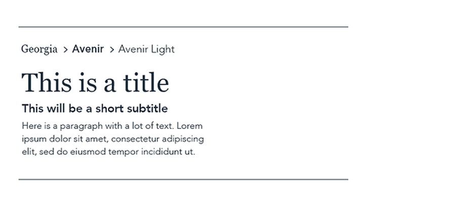
Meet Georgia, a Serif web-safe font that is both elegant and serious, like a tux. It does well accompanied by the Avenir family, a classic sans serif font that boasts easy readability and matches Georgia’s graceful simplicity.
Good for: Business, portfolios, CVs, and publications.
02. Oswald Medium and Roboto Bold
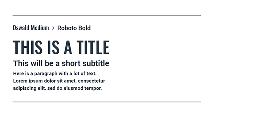
Oswald Medium communicates strength with its bold weight and clean lines. With a title font that strong, balance your page out with Roboto Bold. The neo-grotesque sans serif typeface was developed by Google as the system font for its mobile operating system, Android, to be “modern and approachable.”
Good for: Business, fitness, and technology.
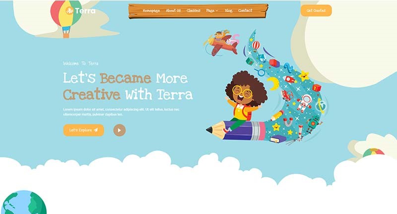
03. Reklame Script, Poppins Semi Bold and Poppins Extra Light
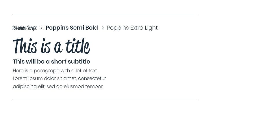
Reklame Script belongs to a family of fonts that are influenced by the hand lettering of 1940s and 1950s printed advertisements. This inspiration is reflected in the font’s friendly warmth, good for communicating your fun and personal approach. The clean and geometric look of Poppins SemiBold and Poppins Extra Light make these fonts your go-to for your subtitles and paragraph text, respectively.
Good for: Family and kids-oriented businesses, online stores, DIY, and blogs.
Check our template: Terra – Child Care & Kindergarten Elementor Template Kit
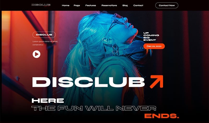
04. Monoton, Lulo Clean and Futura
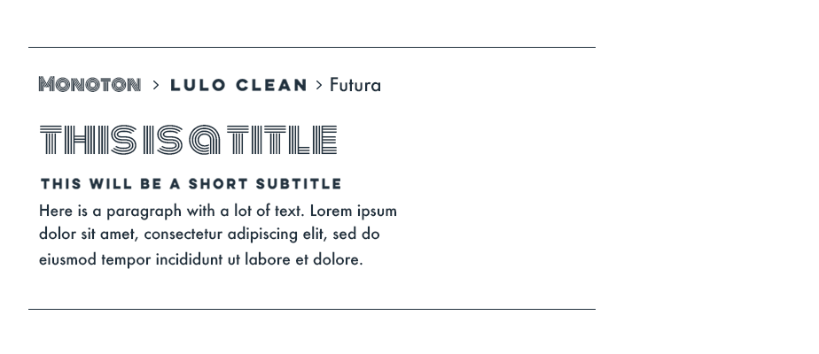
Get funky with the retro feel of Monton. This artistic font is definitely one best reserved for large headlines only. Counter its strong statement by keeping your subtitles simple and friendly with the all-caps Lulo Clean. Tie it all together with a serving of elegance by using Futura for your paragraph text.
Good for: Music, entertainment, and retro themes.
Check our template: Disclub – Night Club DJ & Events Elementor Pro Template Kit
05. DIN Neuzeit Grotesk and Avenir Light
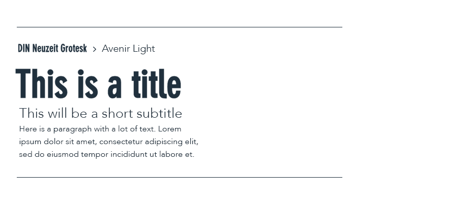
Keep your site approachable and readable with the classic geometry of DIN Neuzeit Grotesk titles. Continue the trend with the classic sans serif Avenir Light, whose simple elegance goes easy on readers’ eyes.
Good for: Business, online stores, portfolios, and photography.
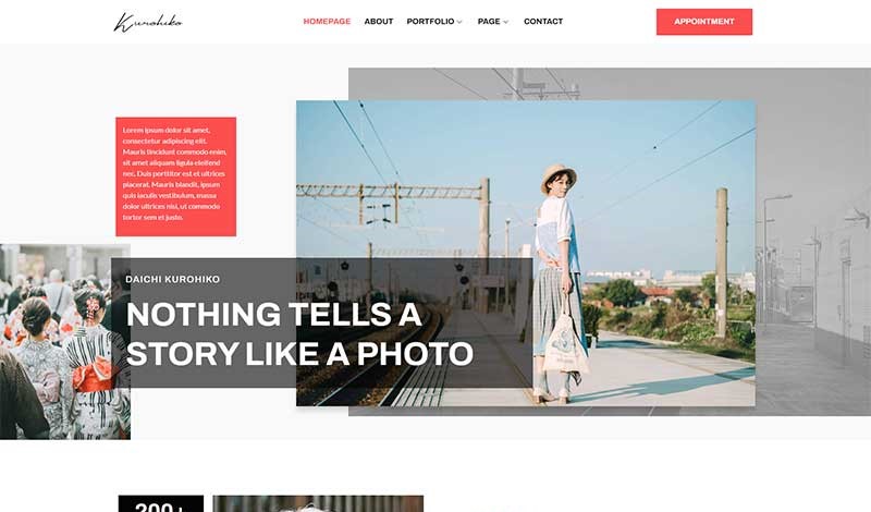
Check our template: Kurohiko – Photography & Portfolio Elementor Template Kit
06. Raleway and Helvetica
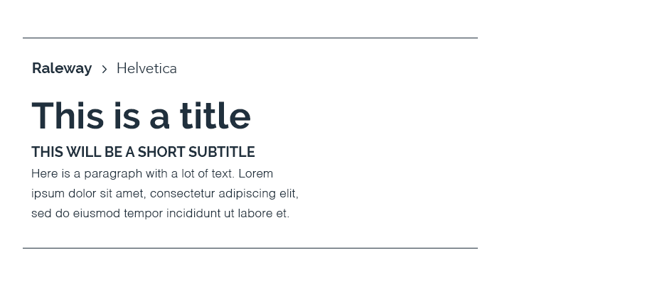
Raleway is the font equivalent of adding a statement piece to a black dress or having your funky socks poke out of the bottom of tailored suit pants. Bold yet modern. Simple with a twist. It does well with Helvetica, a sans-serif font that keeps the contemporary theme and clean appearance going.
Good for: Business, online stores, portfolios, and photography.
07. Belinda, Libre Baskerville and Brandon Grotesque
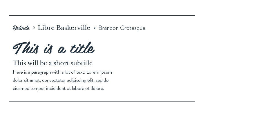
The vintage brush script of Belinda can be used to evoke an inviting, personal atmosphere. Pair it with subtitles written in Libre Baskerville, whose serif lettering is modeled after an old font to give it a more traditional look. Finish things off with Brandon Grotesque in your paragraphs. The geometric sans serif font adds a touch of modernity to the more nostalgic touches of the previous two selections.
Good for: Business, fashion, DIY, blogs, and food.
Check our template: Tlula – Spa & Wellness Elementor Pro Template Kit

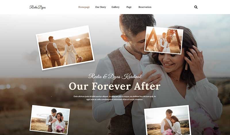
08. Playfair Display and Snell Roundhand

This combination takes elegance to the max. The modern serif font Playfair Display drips the classic design. Together with the vintage Snell Roundhand in your subtitles, your site will show you what it means to get fancy.
Good for: Weddings, invitations, jewelry, and online stores.
Check our template: Redia – Elegant Wedding Theme Elementor Template Kit
09. Sarina, Playfair Display and Proxima Nova
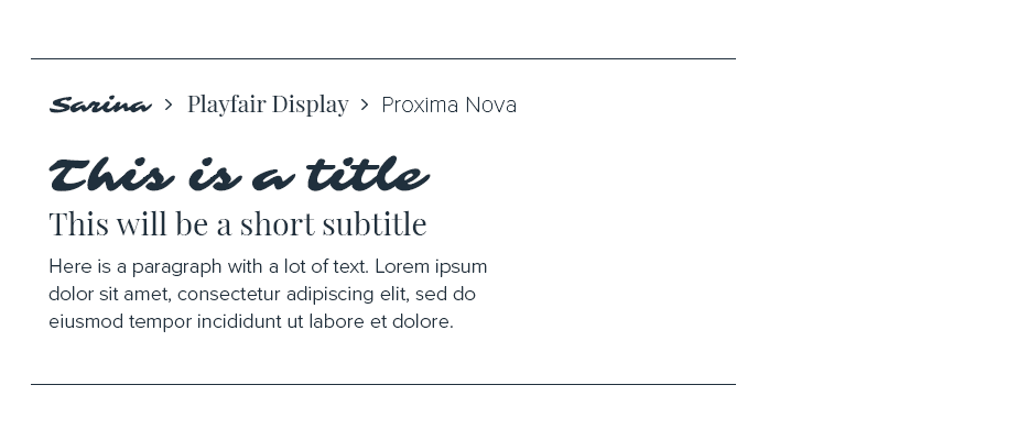
Sarina’s brush-style letterforms project the casual artsiness of the cool kids you know who went to design school. Its stylistic form is balanced well with Playfair Display subtitles, a modern serif that keeps things elegant and classic, and the simple Proxima Nova in your paragraphs.
Good for: Lifestyle, beauty, and online stores.
10. Clarendon LT, Lulo Clean and Georgia
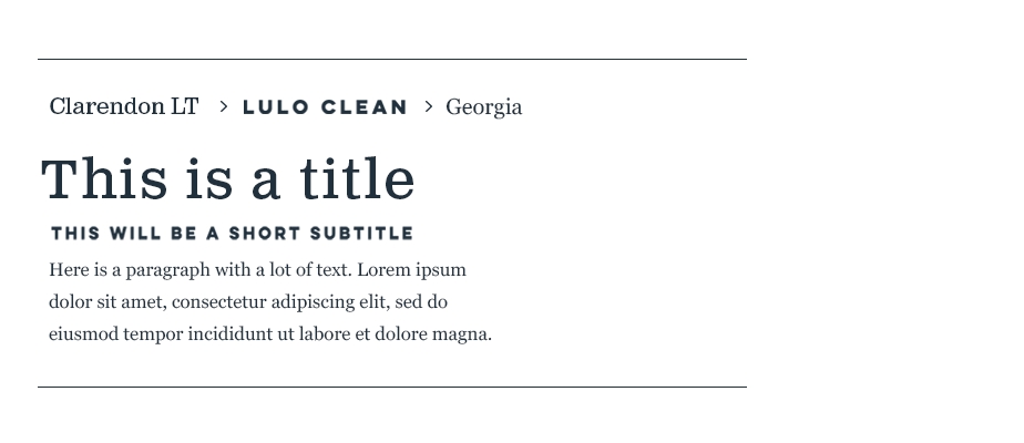
The bold structure of this slab serif font makes Clarendon LT pop off the page. Tone things down in the rest of your text with the all caps (but still friendly!) Lulo Clean in your subtitles, and the gracefully professional Georgia in your paragraphs.
Good for: Business and publications.
Source:
- The 10 best font pairings for your website
- 21 Google Fonts Combinations For Websites & Brands
- 30 Best Font Pairings & Combinations For Web Design
Visit our website to browse our stuff and follow our Instagram for great content!
Website: www.rometheme.net
Instagram: rometheme_studio