Color can be a very powerful design tool. An understanding of color and how it works helps designers enhance visual experiences from generating emotional responses and creating ambiance to conveying tone and impactful messages. Color can significantly influence graphic design trends, aesthetics, moods, and consumer behavior.
While the color trends of recent years have been subtle, muted, and subdued, in 2023, we’re expecting palettes that are bold and upbeat, bright, nostalgic colors.
The 2023 color trends are all about light and shade, giving us the opportunity to express ourselves at the opposite end of the spectrum. So whether you’re in the optimism camp or in the pessimistic (or dare we say realist) school of thought, this year’s color trends have got you covered.
Here are the top 8 color trends for 2023:
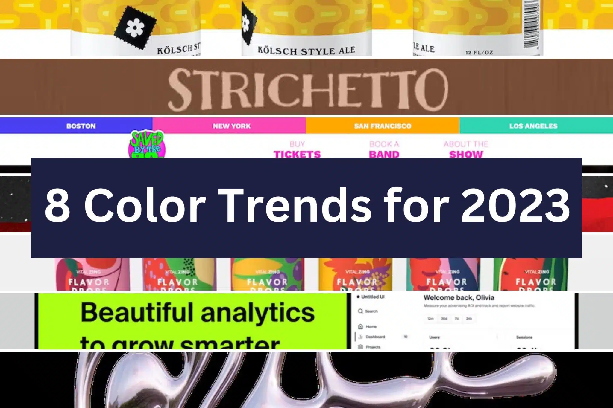
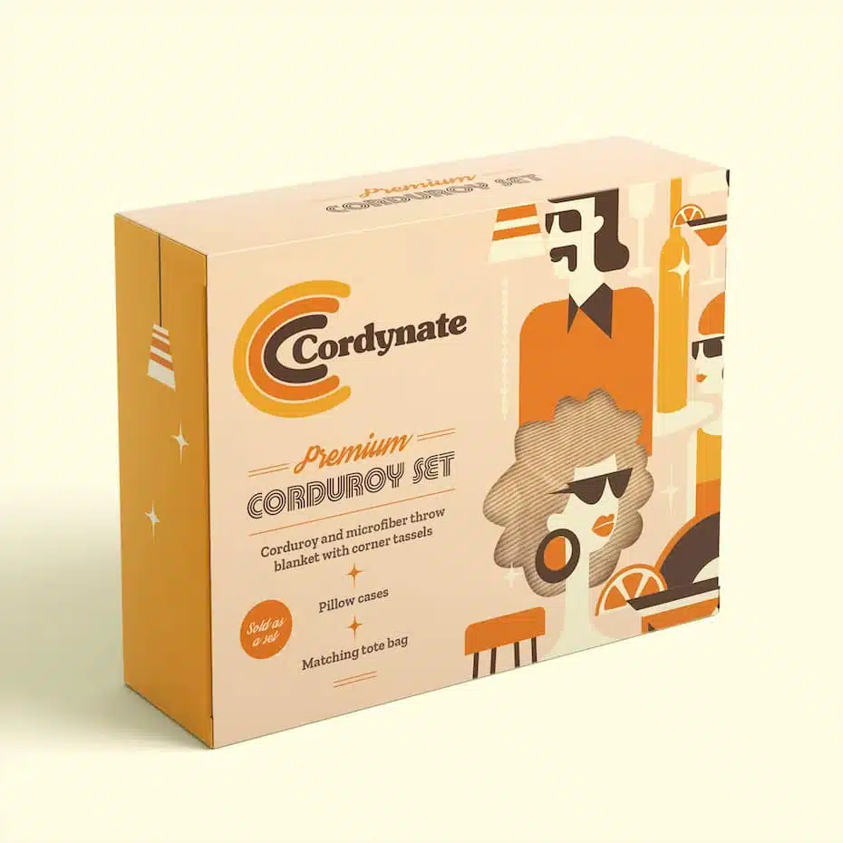
1. ’70s color scheme
Designers looked back to the calm, cool color palettes of the 70s for inspiration with earthy browns, avocado green, mustard yellow, and harvest gold taking the spotlight.
As well as creating a sense of happy nostalgia for simpler times, their earthy colors help us by creating feelings of comfort, familiarity, and approachability, some of the things we all need during these uncertain times.
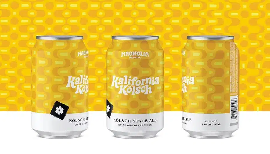
2. Acidic hues
An acid color scheme isn’t just bright and sharp colors, it’s about colors that hurt your eyes (in the most aesthetically pleasing way, of course). This trend is rooted in science, taking inspiration from acid testing. The more acidic a substance is, the brighter the color.
Completely opposite the muted aesthetic of 70s color trends, these bold, bold hues catch your eye. If standing out in a crowd is your brief, an acid color palette is definitely your answer.
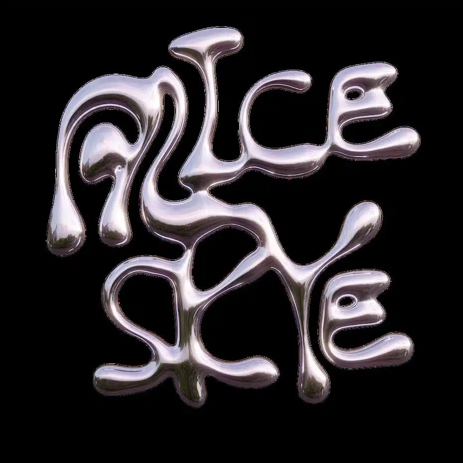
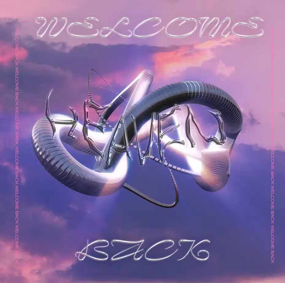
3. Silver chrome
Similar to the graphic acid graphic design trend, the silver chrome color trend fits perfectly with the dark moody, and restless crowd.
This trend is all about subverting the status quo with its distorted, melted metal look. Silver color can range from a dark or dull tone to a shiny silver metallic. This color trend fits well with adjacent styles like the acid graphic and anti-design because it’s less about beauty for beauty’s sake, and more about evoking anti-establishment expressions and pushing back on the norm.
4. Ecstatic colors
It’s easy to get overwhelmed in today’s economic and political landscape, and you only have to read the news to feel the despair immediately. It is therefore important that while we actively fight for a better world, we also inject some light into the shadows. These amazing colors do just that with vibrant hues and high saturation.
Bright and bold colors create a confident and fearless impression that catches your eye. Since these colors are cheerful and happy, they also radiate youthful and cheerful energy. In all the doom and gloom in the world, these colors break through and give us a glimmer of hope as we look to the future.
5. Millennial kitsch
The millennial kitsch color trend takes inspiration from the late 1990s to mid-2000s, when brands were marketed toward teenage girls with a playful aesthetic embellished in cheery colors like blue, pink, yellow, and green.
To some, these colors remind us of simpler times when we weren’t so attached to the internet, fond childhood memories, or a connection to something familiar. And for others, it symbolizes optimism and hope for the future, as the younger generation finds strength in expression through bright and energized colors.
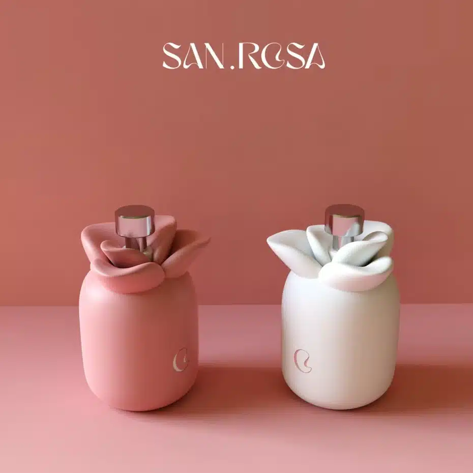
6. Warm Mediterranean
The beauty of the warm Mediterranean color palette is that it taps into the desire to escape and travel in a post-COVID world. The clay hues of dusty reds, pinks, and grays give the island a nod to your vacation bucket list, and it’s the beautiful ceramics studio in Mallorca you’ll want to visit.
The soft and gentle tones of the Mediterranean color trend make you feel relaxed and calm as if you are enjoying a vacation in a warm place.
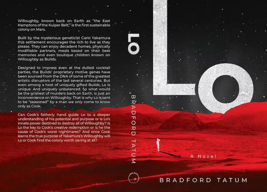
7. Dark sci-fi tones
This darker color trend reflects a darker time. This sci-fi hue gives us a bold and flashy palette that draws viewers into another world. While most colors are darker tones, such as dark browns, blues, and grays, using lighter colors such as blues, yellows or reds can add dramatic contrast to the darks. Overall, this color trend has a moodiness that allows us to contemplate these darker times when we contemplate rumblings of revolution and anti-establishment sentiment.
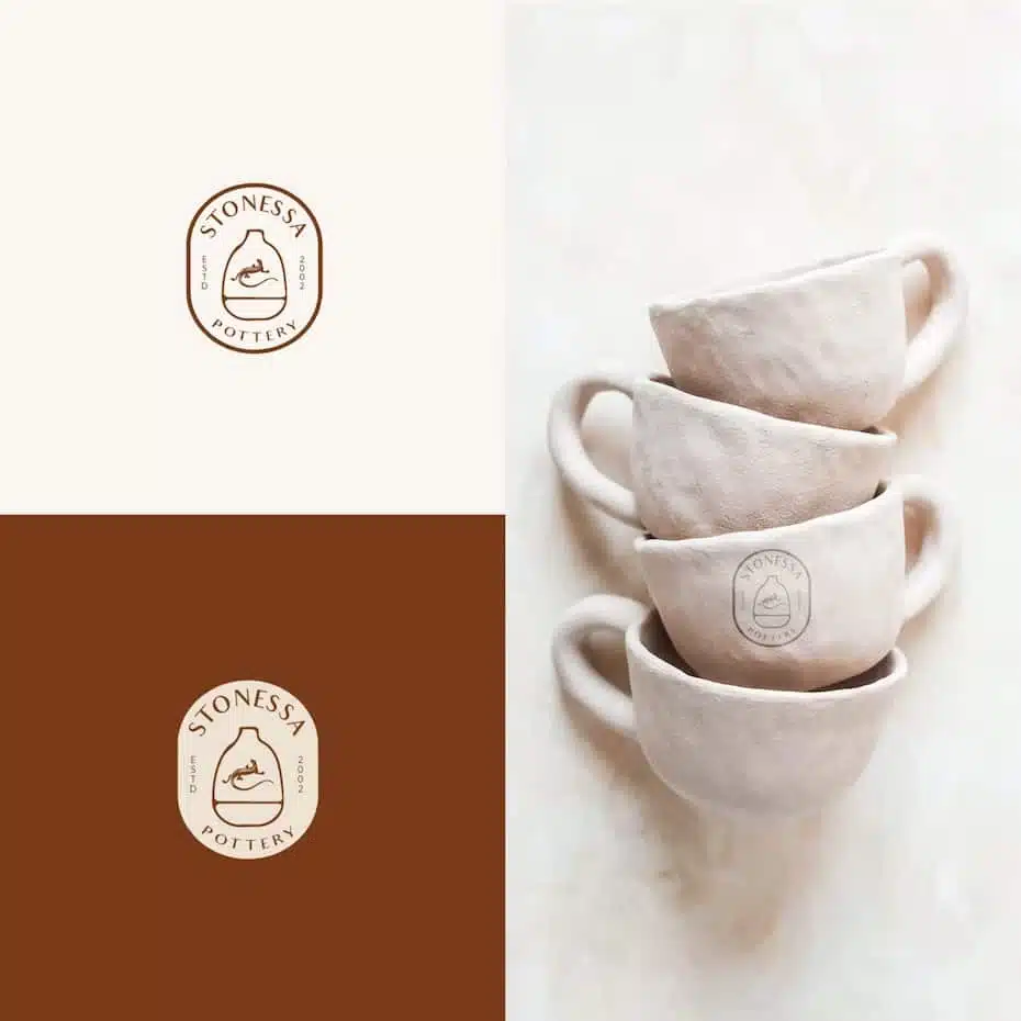
8. Undersaturated earth tones
The earthy tone color takes inspiration from nature and the outdoors. Think earthy browns, light greens, soft yellows, and soft blues combined with harmonious, soft off-white paper tones.
This particular color palette gives us a soft, comforting energy that helps de-energize the chaos and busyness of everyday life. Visually, these colors are gentle on our eyes. And they remind us to take a moment to slow down. These colors are perfect for sustainable packaging designs and baby product branding.
Just as you express yourself with what you choose to wear, this color trend gives you space to express yourself, whether with bright colors or dark colors that reflect your mood over the past few years.
Source: 99designs.com