


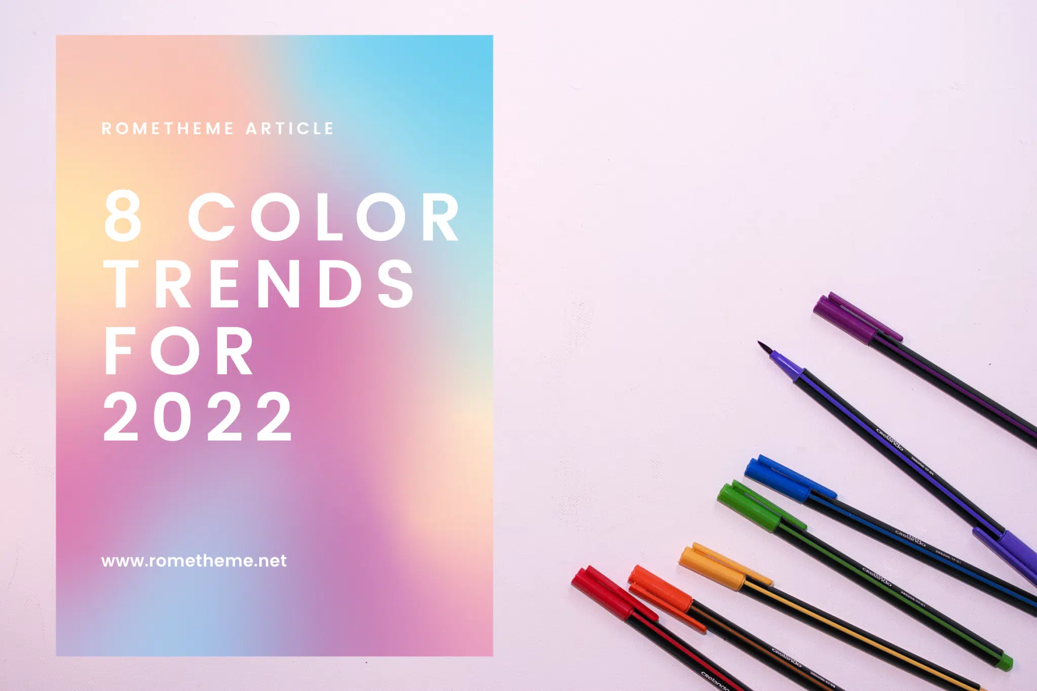
Color is a very important design tool. It plays a role in arousing emotions, influencing behavior, conveying tone, defining style, and much more. However color trends come and go, and with a new year just around the corner, designers are presented with a selection of exciting new color trends to experiment with within 2022.
Different from last year’s, the color trends for next year are predicted to encompass everything from soft tones, muted tones, and simple color palettes to soothing retro colors and nostalgic noughties, providing an innovative yet familiar palette with a modern twist.
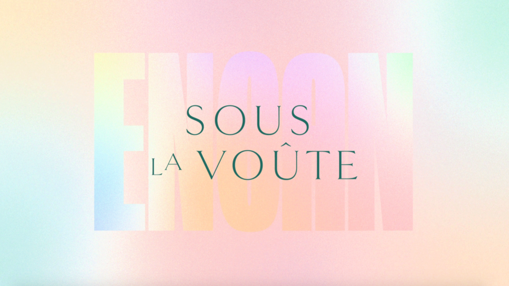
Gradients are a great way to add color, depth, and texture to a simple design. Pastels provide beautiful backgrounds for everything from web pages to branding and social media posts, so pastel gradients will add a simple, beautiful color feel to your designs.
“Who said gradient was dead?” said Envato principal digital designer Sophie Dunn. “We see a lot of dreamy, flowing gradient shifts in the pastel spectrum, and it’s hard to look away! Use radial or angular blurring to seamlessly blend the colors into each other, and try adding a fine grain texture on top to give it a bit more grit. The aim of the game is to make it stand the test of time.”
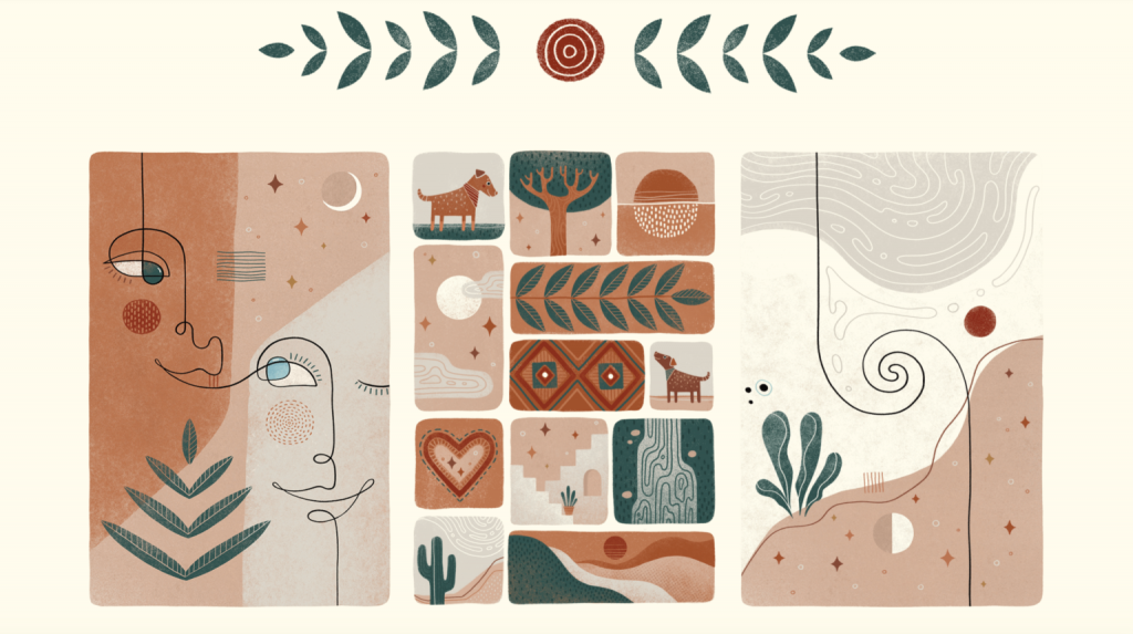
The growing global interest in sustainability and the environment, as well as a desire to get back to basics, has further encouraged the use of natural colors in many areas of design.
“With designers finding inspiration in nature and minimal spaces, earthy natural colors provide a calming tone,” explains Envato graphics specialist Kate McInnes.
With the advent of DIY and organic designs, natural earthy colors are making a comeback. Ranging from rich browns, beige, and terracotta reds to greens, ochers, and grays, these neutrals are becoming very popular for use in brand designs, social media templates, websites, and stationery.
Inspired by the organic design movement, this freeform art by Jessica Covella features natural earth tones, smooth wavy lines, and botanical illustrations. Plus, hand-drawn and collage elements offer a nod to the DIY design aesthetic. From leaves to abstract faces, every image is based on warm, down-to-earth energy.
Simple but undeniably standout, the primary colors are expected to make a comeback in 2022 for their simple yet impactful effect.
Going back to Ancient Greece, primary colors – specifically red, blue, and yellow – have been popular for centuries. Creating an atmosphere of passion, optimism, and youthful creativity, primary colors are great for making a bright and bold visual statement while avoiding clutter.
At the other end of the spectrum, muted color palettes are an option for a modern and minimalist look. Soothing and pleasing to the eye, the muted palette encourages us to reduce saturation, in favor of more subtle and subdued colors. Including everything from pale pinks and pastel purples to mossy greens and burnt oranges, muted colors are elegant, understated, and quite important when you consider the amount of content we display every day – both digital and print.
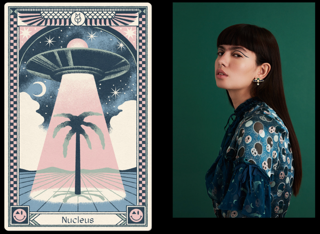
Used liberally throughout branding, social media, and web design, muted palettes are great for evoking cool, calm, collected tones. For example, this bespoke tarot card by graphic designer Max Löffler features a muted palette of pinks, purples, greens, and blues, resulting in some truly subtle aesthetic illustrations.
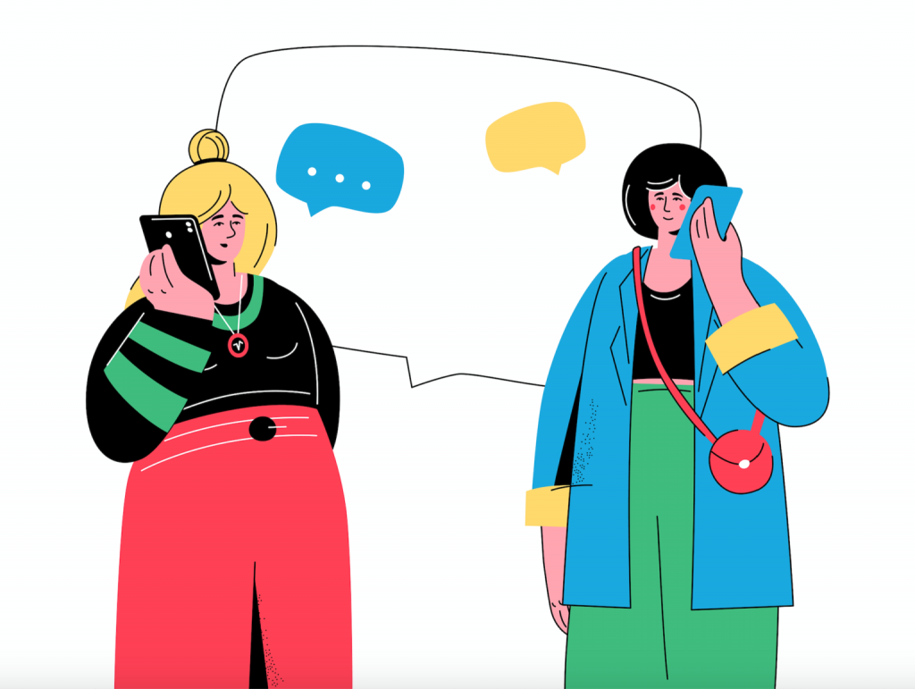
Flat designs have increased in popularity over the last few years. Focused on minimalism, functionality, and usability, often featuring clean edges, ample free space, and minimal detail. Its simple, ergonomic design makes it perfect for posters, how-to guides, instructional web pages, and applications. However, this design style is anything but boring, and we’re seeing more and more designers use bold colors to add an extra level of dimension to their flat designs.
For example, the bright colors used in this static character illustration create a dynamic and interesting visual effect. While the characters depicted fit a flat design style, the bold hues and colorful details add a lot of visual appeals.
To try a flat design with bold colors, check out this Phone Conversation – Flat Design Illustration by BoykoPictures, which combines minimal detail with a pop of vibrant color.
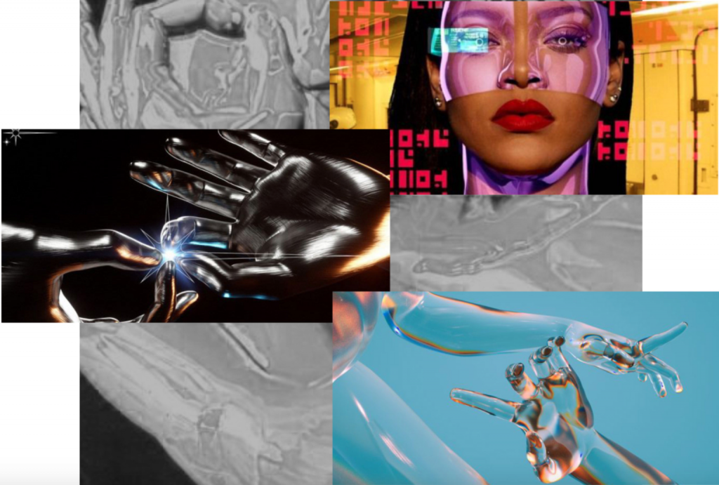
Drawing on 2000s pop culture, the Y2K aesthetic is officially back in vogue. Described as ‘futuristic with a retro edge’, the trend has begun to permeate everything from fashion and social media to branding and graphic design.
Based on cyberculture, the Y2K aesthetic is known for its glossy textures and holographic metallics, which are now a big trend in their own right.
Marking the digital revolution for graphic design, there are many ways to embrace the Y2K aesthetic. To add a bit of Y2K to your next design, try holographic textures and colors. Or, incorporate chrome effects into your text, collages, and illustrations for a futuristic sci-fi feel.
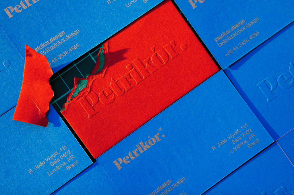
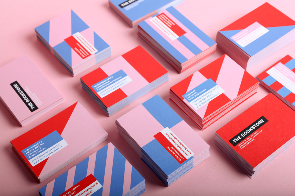
Color blocking is all about creating something exciting and bold. The art of color blocking is simple but very effective. A style created by blocking out certain parts of a design or image with a certain color, this technique is great for drawing attention to certain details or information or even just creating a visually impactful image. Whether you choose to use complementary colors or a more striking color pair.
While very versatile and suitable for all areas of design, this color trend is very popular for email designs, pitch decks, and branding. For example, Dutch designer Marta Veludo used red and pink geometric shapes in her business cards, adding splashes of muted blue to add balance and space.
Retro has become a trend in recent years, and a faded retro color palette is the latest nostalgic trend. Featuring sun-kissed tones and an art deco-inspired palette, faded retro colors are popping up everywhere from social media posts and branding to infographics and pitch decks.
Similar to the muted palette trend, retro color palettes are all about evoking a sense of comfort and familiarity.
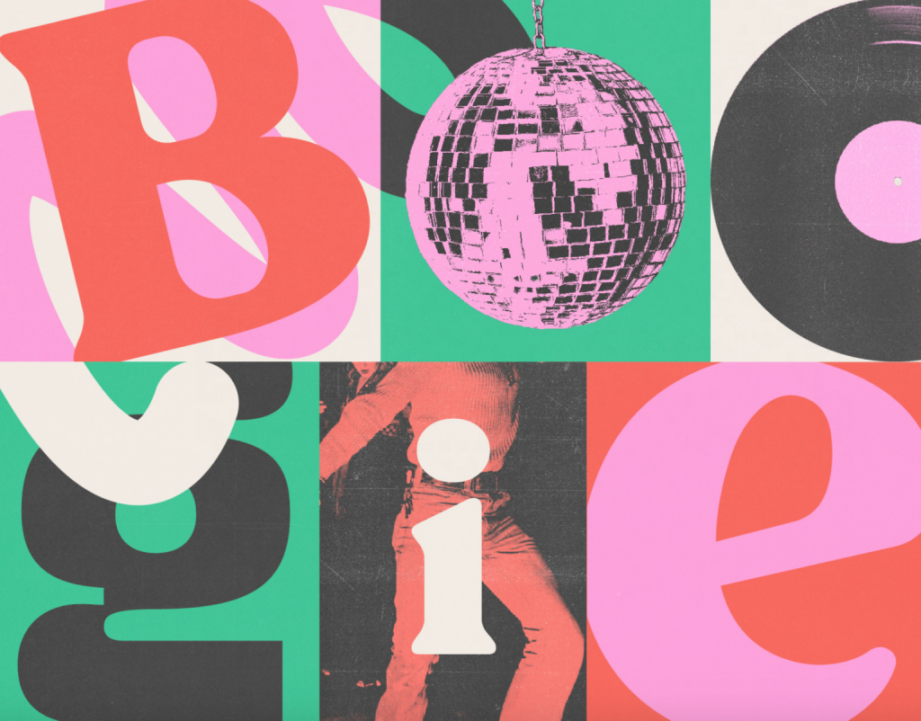
For example, this music festival poster takes us back to the disco era with faded pink glitter balls and grainy vinyl records.
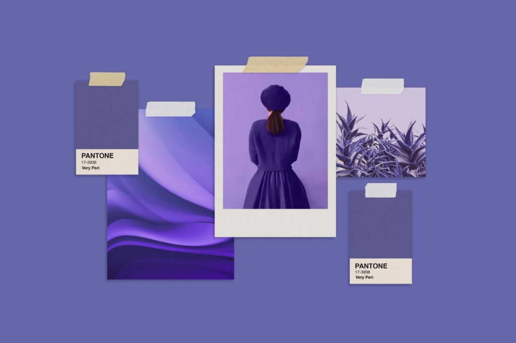
Unlike the practical yet hopeful tale of yellow-grey in 2021, the Pantone Color of the Year 2022 – PANTONE 17-3938 Very Fairy – is about fluidity, innovation, and change. A dreamy periwinkle blue with vibrant purple-red undertones, Very Peri exudes a cheerful, playful demeanor and dynamic presence to inspire imagination and creative expression.
As the world begins to emerge from a period of intense uncertainty and adjust to a new normal, PANTONE 17-3938 Very Peri is about embracing a changing landscape, opening up to new possibilities, and redefining our future.
Reframing the calming and dependable qualities represented by blue, and blending the passion, fire, and creativity of red to drive progress and change, Very Peri showcases exuberant self-confidence, daring curiosity, and creative empowerment.
“Pantone Colors of the Year reflect what is happening in our global culture, revealing what people are looking for that color can answer,” explains Laurie Pressman, Vice President of the Pantone Color Institute. “As society continues to recognize color as a critical form of communication, and a way to express and influence ideas and emotions and engage and connect, the complexities of this new blues-infused red-purple hue highlight the vast possibilities that lie before us.”
Originally published at envato.com on December 14, 2021.


