


Using illustrations in a design is something that is usually done by a designer. The goals vary, whether it’s to describe a situation, convey a message visually or provide audience appeal. However, the selection and use of illustrations must be correct so as not to damage the designs you create. Here are some do’s and don’ts when you apply illustrations in your designs.
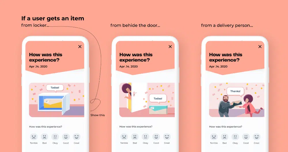
Adjust the illustration to the context of the message you create in the design. This is so that users have a pleasant experience and feel involved in it.
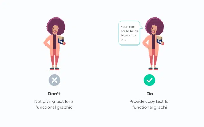
One picture can communicate many meanings. Creating text along with illustrations can avoid double reading.
Having text that slightly explains your illustration will not interfere with your design.
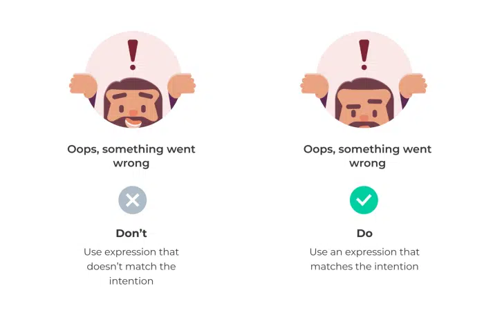
If there are cartoon characters in your drawing, make sure the faces and illustrations convey the same message. Otherwise, it may cause confusion for users. You can learn your own expressions and change the character’s face accordingly.
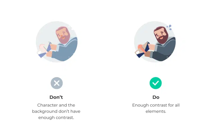
Give good contrast to your illustration so as not to make it difficult for users to understand the illustration in your design. If the audience fails to understand your illustration they will walk away. This is also to make it more accessible to users with poor eyesight.
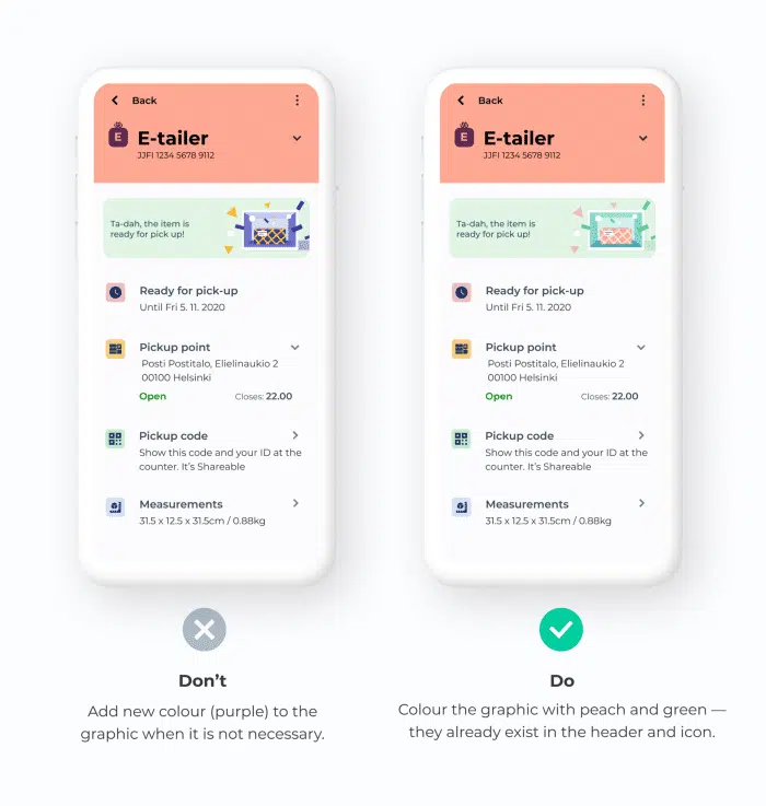
When inserting graphics into the interface, I like to recolor them with the colors that are in the current view. Reducing the color number helps unify the look and feel of the brand.
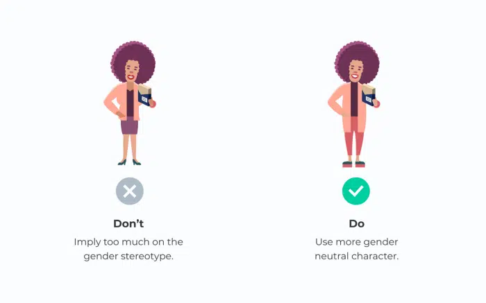
It’s a good idea not to use illustrations that show gender stereotypes in your designs. It’s possible that it annoys users and makes them misinterpret the meaning of the message you want to convey in your design.
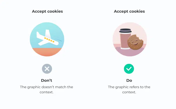
Illustrations play an important role to communicate important information. However, sometimes the designer may not find the best option and pick something that is not relevant. As a result, users may feel confused about mismatched text and graphics.
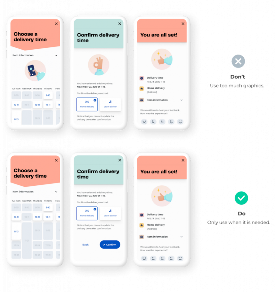
Excessive use of illustrations will weaken the festive atmosphere at the end of the trip. Also, it will add clutter to stop users from completing tasks. Only use graphics where needed.
Source : Prototypr.io


