


Digital marketing requires a good amount of visuals such as infographics, website branding, and various other visual content. To achieve this, you must implement attraction marketing, which requires branding your business in a friendly and personal way.
This marketing approach requires a professional yet personal icon set to be used in various applications. The icons you design should be attractive, trendy, and have a modern look.
Here we provide 7 basic principles that you can apply when creating your professional icon set.
1. Consistent Visual Weight ️
2. Simplicity and Minimalism
3. Create Icons With a Consistent Brand Voice
4. Design Icons With Sufficient White Space
5. Pixel-Perfect Design
6. Contrast & Color Palette
7. Geometric Shapes Are More Influential
How can you trust a brand that can’t consistently measure its icon with your hard-earned money? It’s easy to turn into a perfectionist when creating icons because inconsistent visual weight can irritate customers and cause them to drop business on social media and their websites.
If one icon looks bigger than the other, this will affect the professional image of the brand.
‘This means that the height and width are the same sizes across the icon set.’
‘If you create an app, website, or other visual content with icons with inconsistent visual weight, it will make the project look “noisy”.’
This applies even to icons that are not the same shape. All of your circles should have the same visual weight as boxes and other shapes. To get it right, use the gridlines on the design tool you’re using instead of trying to look at them.
After creating the initial icons, use their grid dimensions to maintain a neat icon set that perfectly promotes professionalism.
Before using that icon set, check all the icons to determine if they have similar visual weights. If there are some inconsistencies, fix them quickly before using the icon set on any project to avoid losing the professional brand image.
Stick to the basic design elements used and don’t go beyond what’s necessary for the icon set to be clearly understood. Many elements can make an icon look heavy and noisy.
‘Remove anything that is not absolutely necessary for a well-understood icon.’
The goal is that consumers should understand the icon instantly when they see it. If it takes them a while to understand what it’s all about, you may be headed for disaster. Try to keep it to a minimum
Try not to focus too much on details when designing a professional animated icon set. Instead, shift your focus to communicating the context of that icon with fewer design elements.
After designing each icon, take a few minutes to look at it and ask yourself if all the vectors are important, if not remove all the unneeded elements.
Each brand has a unique identifying voice or personality that must be maintained. Embedding a brand voice into this design phase is critical. All the icons you use should be very similar to yourself and your brand.
Also, consider what these icons will be used for and their intended target audience. You should make sure that your brand voice is portrayed in a modern and trendy way when designing a professional icon set.
This means that all icons used in visual content must be consistent across each type of media you publish.
Consistency is key and if customers see different types of icons at each stage of their buying cycle then it is a sign of a scam or unprofessional business. Therefore, try by all means to use a set of icons for marketing purposes.
Even within your icon set, you have to make sure that it has consistency. Don’t use animated icons and then use a different type within that set.
If you choose to use certain shadows, reflections, or lighting effects, make sure that these elements are present on all icons.
An icon that is cluttered with everything on top of everything else does not resemble professionalism and usability. Even if your app or website is easy to use, having a cluttered icon set can be frustrating for consumers.
Having sufficient white space in the designs you use for professional purposes is very important. That white space will contribute to a beautiful, inviting experience and increase usability among consumers.
In order to design an icon with enough white space, you have to plan and measure everything properly. This phase is also influenced by the point of simplicity and minimalism mentioned above.
If you’re trying to include a lot of design elements, it can be difficult to have enough white space. As a result, your set will not have enough breathing room and leading to an unpleasant user experience.
‘Most icons have a small working canvas and that is why you should minimize the elements used when designing them.’
Having a lot of unneeded vectors can look untidy and very uncomfortable once the icons are minimized, dramatically reducing white space. Another important factor at this point is to create an icon that has balanced white space on both sides.
If your design includes text, having white space is much more important to contribute to a readable icon. Don’t try to squeeze everything into one small canvas, but improvise every time you face a challenge.
Blurred icons can lead to an unpleasant consumer experience and a seemingly unprofessional brand image. On the other hand, a clear and high-definition design can create a very professional look.
That’s why you should know how to achieve pixel perfection when designing icons. There are various things to consider when performing this task, such as where your icons will be used, screen size, and size.
For example, creating an icon designed only for smartphones and using it on a large poster or even a billboard will dramatically reduce its pixel perfection.
When creating professional sets, keep in mind that these designs may be used for smaller or very large visual content.
Before using icon sets, zoom in on each icon to see when it loses quality and perform damage control before releasing.
Another trick you can use is to view all the designs on various devices from smartphones, tablets, and desktop computers. Once you’ve recognized the blur, there are several techniques to explore.
Some of those techniques include pixel hinting, mounting, smashing push and rotation, etc. Using this technique can help fix designed icons that aren’t pixel perfect, especially when zooming in.
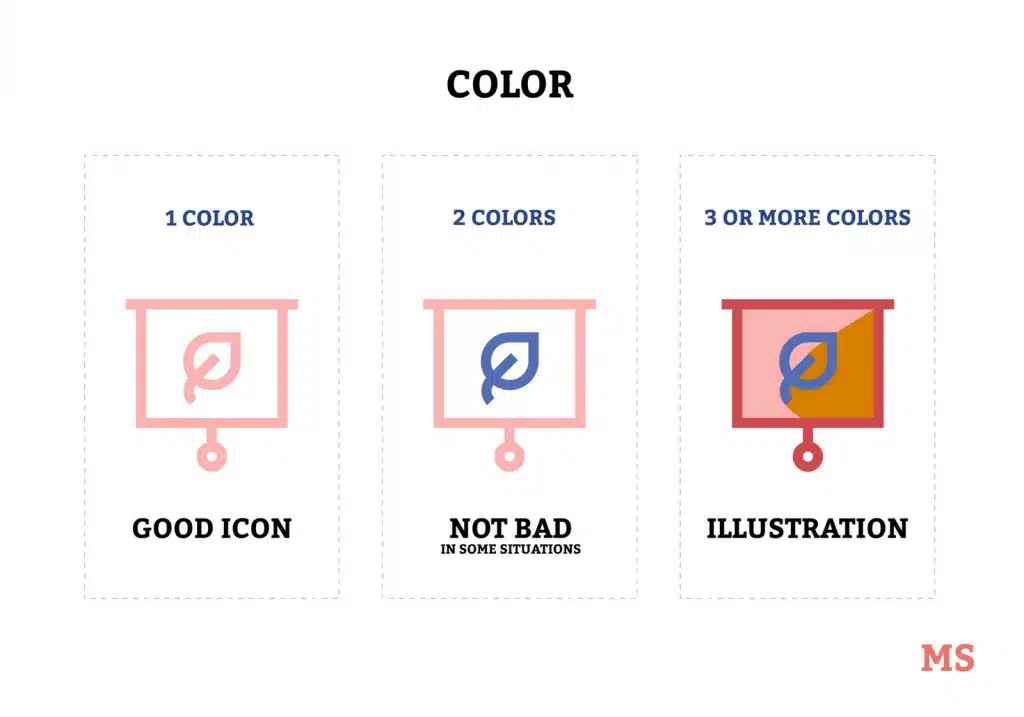
Choosing a color scheme for a professional icon set is an important aspect of designing it.
You should consider your branding color scheme and its implementation. For example, designers of mobile operating systems use colors that perfectly match all types of colors.
Consider the latest smartphone menu colors, most OS developers use gray, black, or white to match the color of other app thumbnails. Therefore, if you are going to design an icon that will be used with other colored content, using such a color scheme can be useful.
If you want to add some life by using different colors, consider using icons that match your current brand. Avoid using clashing colors as this will not provide a consistent experience.
Another thing to consider carefully is contrast. If the icon color contract is too dark, it can be difficult to identify what exactly it is. On the other hand, an icon that is too bright can weaken its appearance and reduce its professionalism.
‘A color that is too light may also not blend in with a lighter-colored website theme or background.’
You can split-test the different icons on the different apps you’ll be using to find the perfect color scheme. This step should not be taken lightly as it is an icon that you have probably used for a very long time.
Keep this in mind when choosing colors and contrasts to make the icon set professional and provide a great user experience. At the same time, don’t be bland when creating icons as this can bore users.
With that said, it’s safe to say that a color scheme for an icon set should be chosen with careful consideration of how, where, and what it will be used for.
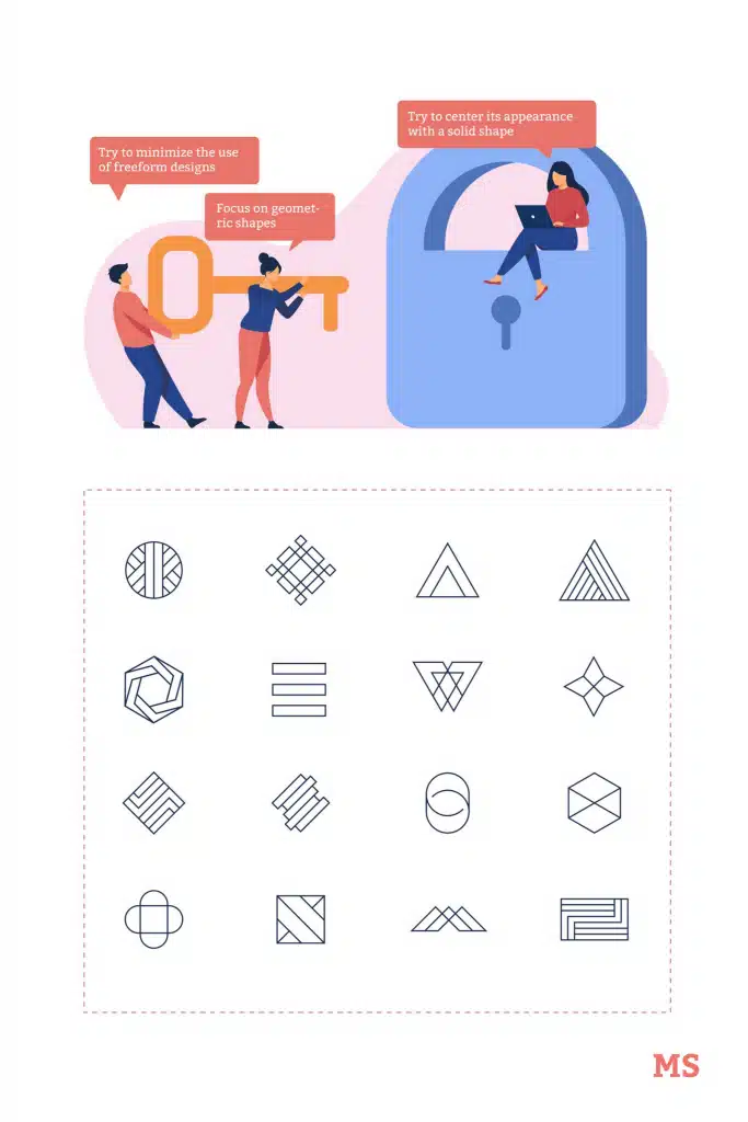
Do you want your icon to be more influential and have more authority over users? If so, try to minimize the use of freeform designs as they may not look professional or authoritative.
Instead, focus on geometric shapes when creating icons all the time. The freehand design may be sloppy and not achieve the goals and objectives you have in mind.
Even if the entire design can’t be achieved with just a few geometric shapes, try to center its appearance with solid shapes. The shape you choose to use can be anything from a circle, a triangle, a square, a rectangle, etc.
Icons centered or designed with geometric shapes look much more stable. These factors contribute to a professional and impactful design. Sloppy icons can make consumers feel insecure and reduce their trust in your website, app, or visual content.
Also, sticking to geometric shapes can help you develop simple designs that don’t have unnecessary details. In everything you do, make sure that each icon is understandable, clear, and inviting to consumers. Use geometric shapes to create icons with context instead of abstract designs.
When using geometric shapes, the alignment of icon elements can be easier and contribute to a design with fairly balanced white space. Following the gridlines will also be easier when working on that digital canvas and speed up the design process. The benefits of using geometric shapes are tenfold and there’s no reason you shouldn’t try this strategy when designing your icon set.
It’s a good idea to understand the principles above before designing icons for your brand so that your icon designs don’t run off track. In the next article, we will describe the various icon styles.
Source: marketsplash.com