

If you want to make it easier for users to take action on your app, you should choose the right words on your button labels, because what your button says is just as important as how it looks if using the wrong words on your button label causes user confusion.
Here we leak 5 rules that can help you choose the right words to create buttons that make it easier for users to take action on your app.
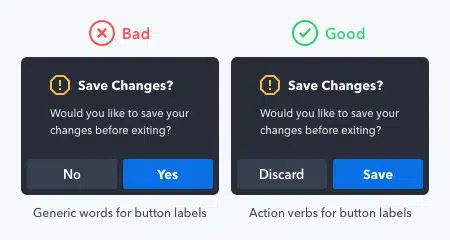
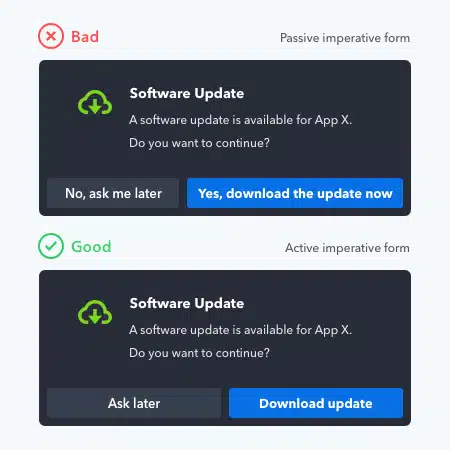
Compare that to the common “yes/no” button labels that are often used on confirmation screens. Users must read the dialog before they can take action. If they miss or misread the dialogue, they will press the wrong button. Passive labels not only make it riskier to take action but also force the user to do more work.
Action verb button labels are more task efficient because they can take action without reading supporting text such as confirmation dialogs.
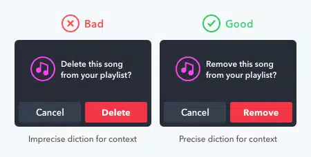
Each action verb you use has a specific connotation. If your diction is incorrect, users may misinterpret what the button will do.
For example, the words “delete” and “remove” have the same meaning, but differ in connotations. “Delete” implies that the button will remove the item from the system. “Remove” implies that the button will separate the item from the group. Using these words in the wrong context can cause users to worry when they press a button.
In playlists, the “delete” label makes users think they are going to lose their song. This diction is wrong because that’s not what happened. The “remove” label is more appropriate because it removes the song from the playlist, but doesn’t destroy it.
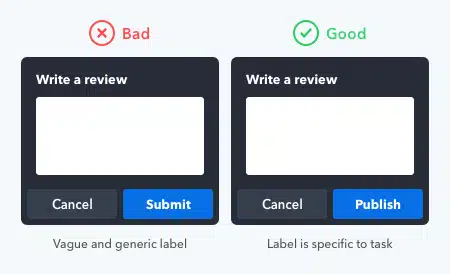
Unclear and generic button labels cause user uncertainty. They’re not sure what the button will do because the label doesn’t specify. Users need to know the results of their actions, and only task-specific languages can do that.
To illustrate, the word “submit” is a technical term you can use for most buttons. But that will make the button label unclear and generic. When the user reads it, it’s not clear what’s going on because the label isn’t specific to the task.
In contrast, the word “publish” is specific to online publishing. As a result, users get the impression that the app will post their reviews to the public once they press the button. These button labels are clearer and provide certainty for the user to take action.
Too many words on the button label make the user read more. When you use the imperative in voice-active, you minimize the word count and make button labels easier to scan.
What you need to include on your button label is a verb with an adverb or direct object.
Users trust and understand more commands on button labels. This gives them reassurance that the button will perform its intended action, which aids their decision-making.
The capitalization style of your button labels expresses your tone to the user. The tone is not what you say but how you say it. This expression creates an emotional reaction in the user that engages or rejects them.
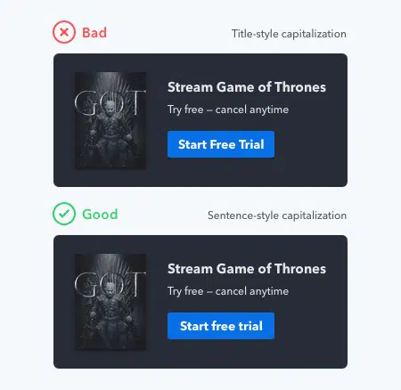
Sentence-style capitalization is best because it conveys a friendly tone that invites the user to press a button. The most reads done by users are sentences, which means they are most familiar with sentence cases. When they read it on your buttons, it feels like someone is speaking to them in a natural voice.
In contrast, the capitalization of the title style has a more formal tone. Formal tones feel impersonal and make your buttons less appealing to press. It makes the user feel like someone is talking to them in a stiff voice. The case title breaks the natural reading flow and distracts the user from the underlying message.
The all-caps style is imprecise as it conveys a harsh tone. Users feel as if someone is shouting at them to press a button. Not only that, but it also has lower legibility due to the lack of word forms. The lack of form contrast makes it less accessible to users with dyslexia.
The lowercase style conveys a relaxed and lazy tone with a mumbling voice. It makes the user feel as if no one is paying any attention or attention to the design. Users can feel the lack of professionalism and distrust the buttons.
After reading this article, make sure you pay attention to the rules that we have explained to make it easier for users of your application.
Source: uxmovement.com