


If you think you’ve never heard of glassmorphism, I’d venture a guess that you’ve seen it at some point today! As the name suggests, this UI design trend ultimately takes inspiration from… glass.
Glassmorphism is a card-based UI design that is visually minimalist like Neumorphism but differs from it in aspects related to colors and backgrounds. In Glassmorphism’s UI design, there are see-through, glass-like elements, layered on the design, which is its USP. In Glassmorphism, the UI design is presented in such a way that light or dark objects stand out from the colorful background on which they are placed.
Glassmorphism entered the mainstream when Apple introduced it in their MAC OS Big Sur in November 2020. Since then, Glassmorphism has also been adopted by Microsoft and Windows and Glassmorphism has become the UI design of choice.
While glassmorphism is not a complete set of design principles like brutalism or neubrutalism, it is a technique that has grown in popularity over the last few years.
Common characteristics of glassmorphism include:
The most important note to keep in mind when considering glassmorphism is not to overdo it. The effect looks best when used on just one or two elements! For the most aesthetically pleasing look, choose a light and colorful background.
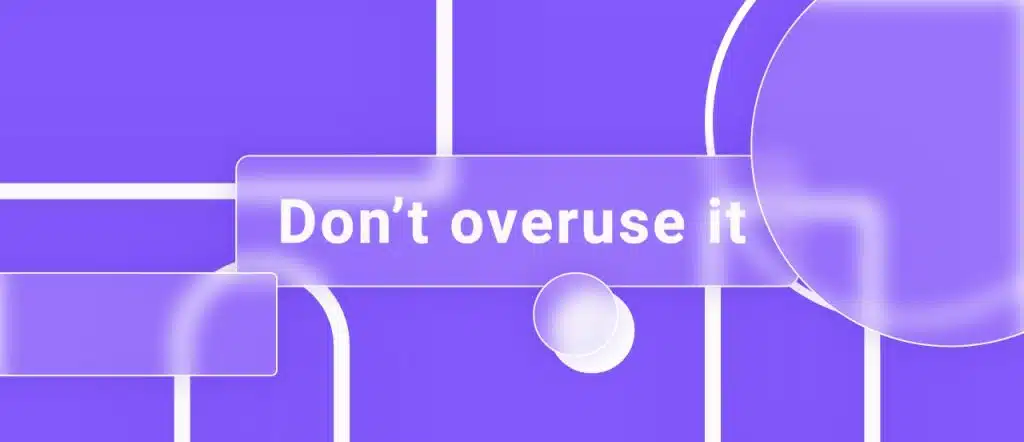
Adding it to too many parts of your UI can cause accessibility issues due to its opacity and transparency. The best practice is to add up to 2-3 glass elements. The latter can be backgrounds, buttons, and icons.
Make sure you have selected the right background before applying glassmorphism. This is an important part of getting the desired frosted glass effect.
Backgrounds should have gradients, elements, and more than one color instead of being clear and monochrome.
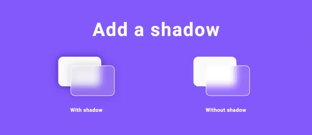
Adding a shadow to the object, which you would use glassmorphism for, will create the perfect “through the glass” look. However, the saturation of the shadows should not be excessive and black should be avoided.
When using a lighter background color, add a slightly darker shade, and don’t forget to set the blending mode to “multiply”. If the background color is darker and has dark gradient elements, add a lighter shade to achieve a light effect.
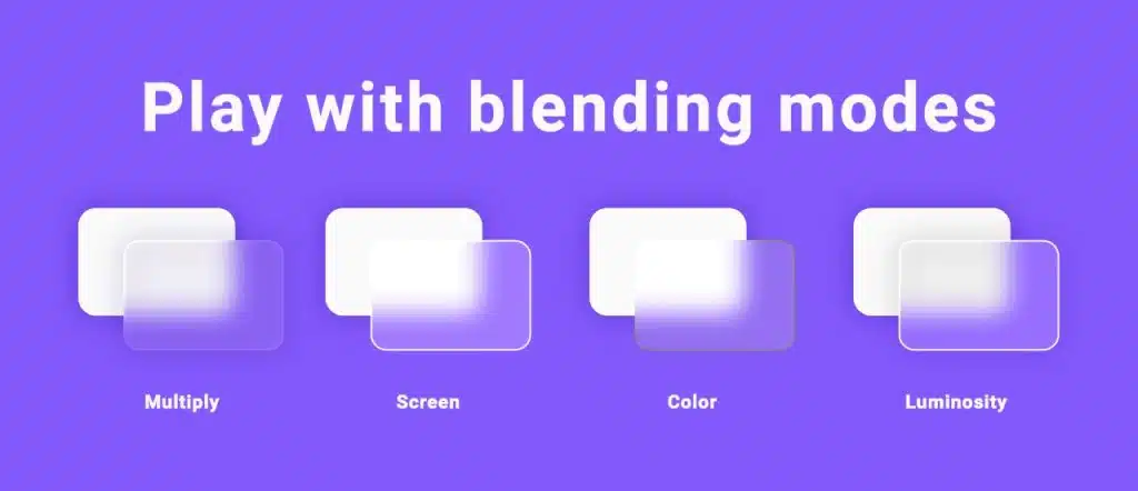
Just take a look at the different types of blending modes and see which one works best for your design! If you want to brighten the background, use normal, screen, or overlay. If you are looking for a darker tone, double and darken are for you. Other blending modes can be used to change color nuances.
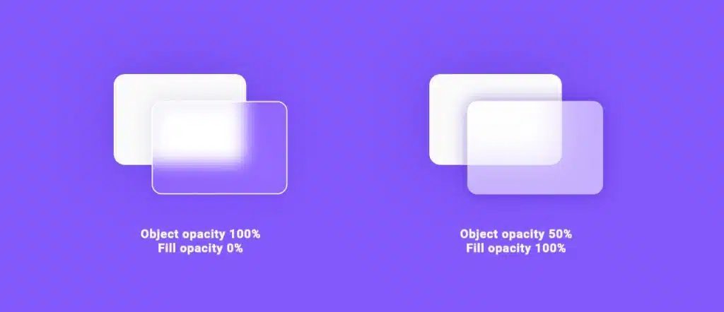
Setting the right transparency is the key to perfect glassmorphism vision. You don’t have to make the whole shape transparent, just the fill. This way you will get a truly blurred background. If you do otherwise, you won’t get the desired effect.
A final touch you can add to spice it up is a 1p semi-transparent deep border. This will enhance the glass-like effect and objects will appear clearer. However, you can try out different styles and find the one that best suits your UI design.
So how? Are you interested in applying the glassmorphism trend to your designs? If yes, save this article for your reference.
Source: envatotuts+.com, eyasdesign.com
Hurry up and visit our website and browse at your own pace!
Website: www.rometheme.net
Instagram: rometheme_studio