In today’s digital age, having a website that looks great and functions flawlessly on all devices is essential. With the increasing popularity of smartphones and tablets, it’s crucial for websites to be responsive. But what does responsive web design mean in Elementor? In this article, we will delve into the world of responsive web design, explore its significance in the context of Elementor, and provide practical tips for implementing it effectively. So, let’s dive in and unlock the secrets of responsive web design in Elementor!
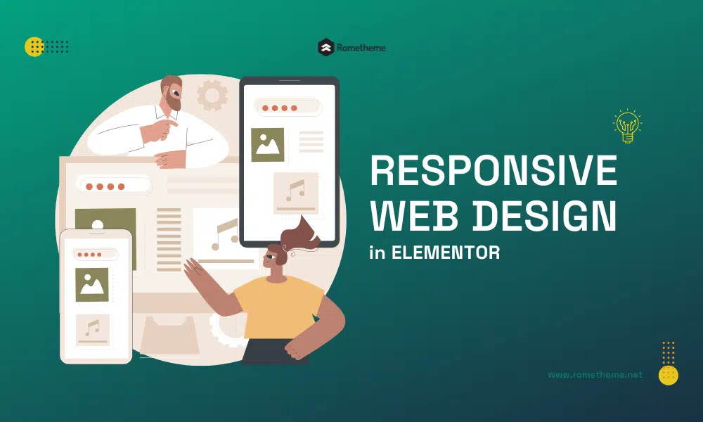
Responsive Web Design
Responsive web design refers to the practice of creating websites that adapt and respond to different screen sizes and resolutions. It involves designing and developing a website in a way that ensures optimal user experience regardless of the device being used. Whether visitors access your site on a desktop, laptop, tablet, or smartphone, a responsive website adjusts its layout and content to fit the screen size, providing a seamless and enjoyable browsing experience.
Key Features of Responsive Web Design in Elementor
Elementor, a popular drag-and-drop website builder for WordPress, offers a range of features that facilitate the creation of responsive websites. Let’s explore some of the key elements that make responsive web design possible in Elementor.
1. Flexible Grid System
Elementor provides a flexible grid system that allows you to create responsive layouts with ease. The grid system enables you to divide your webpage into columns and rows and adjust their sizes based on the device’s screen size. This flexibility ensures that your content is displayed correctly and proportionally across different devices.
2. Mobile Editing
With Elementor, you can design and customize your website specifically for mobile devices. The mobile editing feature enables you to preview and make changes to your site’s mobile version, ensuring that it looks and functions optimally on smartphones and tablets.
3. Device Visibility Control
Elementor allows you to control the visibility of specific elements based on the device being used. This feature is particularly useful when you want to hide or show certain content on different devices. For example, you may choose to display a simplified version of your navigation menu on mobile devices to enhance user experience.
4. Breakpoint Controls
Breakpoints are the specific screen sizes at which your website’s layout changes. Elementor provides easy-to-use breakpoint controls that allow you to customize your website’s appearance at different screen sizes. By defining breakpoints, you can ensure that your site looks great on screens of all sizes.
5. Responsive Typography and Images
In responsive web design, it’s essential to optimize typography and images for different devices. Elementor offers options to adjust font sizes, line heights, and image dimensions based on screen size. This ensures that your text remains legible and your images are appropriately sized across various devices.
Implementing Responsive Web Design in Elementor
Now that you understand the significance of responsive web design and the key features of Elementor, let’s explore how to implement responsive design in Elementor effectively.
1. Plan Your Layout
Before you start building your website in Elementor, take some time to plan your layout. Consider how your content will be organized and how it will adapt to different screen sizes. Sketch out the structure of your website and identify the key elements that need to be displayed prominently.
2. Use Responsive Elementor Widgets
Elementor offers a wide range of widgets that are designed to be responsive. These widgets automatically adapt to different screen sizes and ensure that your content is displayed properly. When selecting widgets for your website, choose ones that are labeled as “responsive” or have responsive settings available.
3. Test Your Design on Multiple Devices
One of the most crucial steps in implementing responsive web design is testing your website on different devices. Use various smartphones, tablets, and desktop computers to ensure that your design looks and functions as intended. Pay attention to any layout issues, distorted images, or text overlapping, and make adjustments accordingly.
4. Optimize Loading Speed
Responsive web design goes hand in hand with fast loading speed. Ensure that your website is optimized for quick loading on all devices. Compress images, minify CSS and JavaScript files, and leverage browser caching to reduce loading times. A responsive website that loads swiftly provides a positive user experience and encourages visitors to stay on your site.
5. Prioritize Mobile Experience
In today’s mobile-dominated world, it’s crucial to prioritize the mobile experience of your website. Test your website extensively on various mobile devices and ensure that it is easy to navigate, the text is readable without zooming, and the buttons are large enough to be tapped with ease. Consider mobile-specific features, such as click-to-call buttons or location-based services, to enhance the mobile user experience.
6. Ensure Cross-Browser Compatibility
Responsive web design should be compatible with different web browsers. Test your website on popular browsers like Chrome, Firefox, Safari, and Edge to ensure consistent performance and appearance. Address any compatibility issues that may arise and make necessary adjustments to ensure a seamless experience for all users.
FAQs about Responsive Web Design in Elementor
1. What are the benefits of responsive web design in Elementor?
Responsive web design in Elementor offers several benefits, including improved user experience, increased mobile traffic, better search engine visibility, and reduced development time and cost. By creating a responsive website, you ensure that your content is accessible to users on all devices and improve their overall satisfaction.
2. Do I need coding skills to create a responsive website in Elementor?
No, you don’t need extensive coding skills to create a responsive website in Elementor. Elementor’s drag-and-drop interface allows you to design and customize your website visually, without the need for coding. However, having a basic understanding of responsive design principles can be beneficial in creating an optimal responsive layout.
3. Can I convert my existing website into a responsive design using Elementor?
Yes, you can convert your existing website into a responsive design using Elementor. By redesigning your website using Elementor’s responsive features, you can transform it into a responsive and mobile-friendly version. However, depending on the complexity of your website, some adjustments and refinements may be necessary.
4. Is responsive web design important for SEO?
Yes, responsive web design is crucial for SEO. Search engines prioritize responsive websites in their rankings, as they provide a better user experience across different devices. Responsive design ensures that your website is accessible and readable on mobile devices, which is increasingly important considering the rise in mobile searches.
5. Can I create an e-commerce website with a responsive design in Elementor?
Yes, Elementor can be used to create an e-commerce website with a responsive design. Elementor is compatible with popular e-commerce plugins like WooCommerce, allowing you to build a fully functional and responsive online store. You can customize product pages, design mobile-friendly checkout processes, and ensure a seamless shopping experience for your customers.
6. Does responsive design affect the website’s loading speed?
Responsive design, when implemented correctly, does not significantly impact the website’s loading speed. By optimizing images, compressing files, and using efficient coding practices, you can maintain a fast-loading website. However, it’s important to note that certain design elements, such as large images or complex animations, may affect loading speed if not optimized properly. Therefore, it’s crucial to strike a balance between design aesthetics and loading performance to ensure a responsive website that loads quickly.
Conclusion
In today’s mobile-driven world, responsive web design is no longer an option but a necessity. Creating websites that adapt seamlessly to different devices is essential for providing an optimal user experience and staying ahead in the digital landscape. Elementor, with its range of responsive design features, empowers website creators to build stunning and functional websites that look great on any screen size.
By leveraging the flexible grid system, mobile editing capabilities, device visibility control, and responsive typography and images in Elementor, you can ensure that your website engages users across devices and keeps them coming back for more. Remember to plan your layout, test on multiple devices, prioritize mobile experience, optimize the loading speed, and ensure cross-browser compatibility to create a truly responsive website.
So, what does responsive web design mean in Elementor? It means crafting websites that adapt to the needs and preferences of your visitors, regardless of the device they use. With Elementor’s intuitive interface and powerful features, you can create responsive designs that enhance user experience, boost your online presence, and drive business success.
Visit our website to browse our stuff and follow our Instagram for great content!
Website: www.rometheme.net
Instagram: rometheme_studio


