


As we know, headers and footers are an important part of a website design. However, we often forget about a good footer design for visitors. Even though the footer becomes the center of attention for visitors when they feel they can’t get information in the header section.
So what makes the footer important? Some of the benefits of footers include:
• Increasing brand awareness;
• Provide important additional information such as disclaimer, privacy policy, and others;
• Installing links or navigation to direct visitors to other pages;
• Improving the user experience so that spending time increases;
• Increase conversions through Call-to-Action buttons;
• Capture leads.
After understanding the importance of the footer, you definitely want to know the best footer design examples right now, right? So, here we provide some examples of websites whose footers you can study and can be an inspiration for your footer designs.
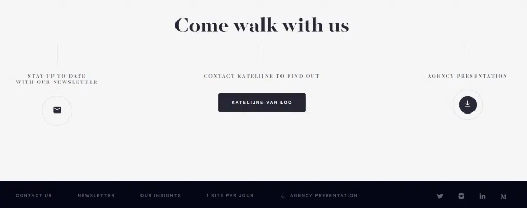
The footer design on this website immediately displays a prominent CTA. An example of a footer design like this is perfect for those of you who prioritize website conversions. In fact, the CTA button in the footer was able to skyrocket conversions by up to 50%. But still, you have to understand the design of a CTA so that it really works.
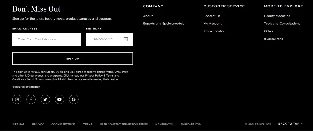
We often get messages or emails from a brand, where the goal is to achieve brand awareness by updating information to users via email. So, the way they do to get customer email data is to design their website, especially in the footer section, by installing an opt-in form to collect contact leads. Prospective customers only need to enter their email and automatically, the contact book will get fatter. These tips must also be accompanied by good copywriting skills so that visitors actually provide their data voluntarily.
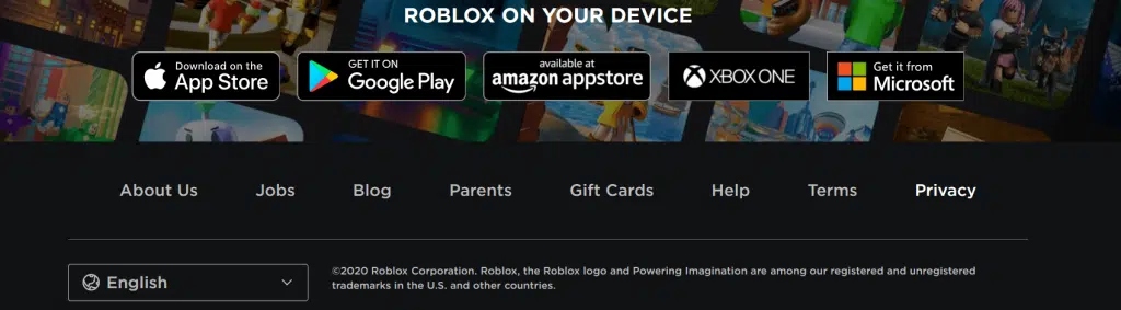
If your goal is to make a design so that many visitors download your product, then an example is the footer design from Roblox. The most interesting thing you can find is that Roblox places the main menu in the footer instead of the header.
This will encourage visitors to scroll all the way to the end until they find the main menu. Before reaching the end, visitors will inevitably find several application download buttons. But the thing to note is, don’t make your website pages too long.
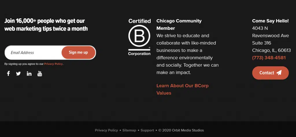
On the L’Oréal Paris footer, you will find an opt-in form, social media buttons, copyright, a footer menu, and even a sub footer. Not to forget, there is a back-to-top button so visitors don’t have to scroll up manually. Then, what is a sub-footer?
The sub-footer is the last line before the footer is finished. At L’Oréal Paris, you find an area filled with menu lines and copyrights.
Using a sub-footer, additional menus can appear as complete as possible without making the footer look cramped. Interesting right? The thing that must be considered is that the space needed must be large, otherwise, the design will look cramped.
• What is the main purpose of your website? Is it to increase conversions, or show new content or products? Or to collect visitor contacts?
• Once you’ve defined your goal, you can define the proper elements to use in your footer.
| Brand Awareness | Additional information | Additional Widgets | Spend time | Conversion | Engagement dan leads |
| Company logo; Taglines; Google Reviews; Achievements. | Menu list; Contact list; Copyright; Privacy; Terms of Use; Disclaimer. | Sitemaps; Google maps; Site search tools; Navigation buttons; Language switch button. | Sitemaps; Google maps; Site search tools; Navigation buttons; Language switch buttons. | CTAs button; Advertisement. | Social media buttons; Social media posts; Opt-in form. |
The back-to-top button is a feature that functions to bring visitors back to the top of the website without the need to scroll one by one.

This is an important widget especially if your website has long pages. With just one click, visitors can immediately return to the top.
Doormat Navigation is a grouping of menus according to their categories. The child menu is arranged in the form of a list with the category title at the very top.
Doormat navigation is important because it makes it easier for visitors to navigate the website. Because the menu is in the header and footer of the website.
That means, maybe this navigation is the first thing the audience sees when they open the website, as well as the last thing they see when they leave.
With doormat navigation, visitors can quickly navigate to other pages without scrolling or pressing the back-to-top button. The contents of the menu are also visible so that visitors can immediately click on it.
There’s nothing wrong with trying to adapt the footer design of some of the websites above. First, determine the goals you want to achieve from your website, then choose which design you want to try.
Also, visit our website and find various kinds of website design theme inspiration according to your needs.
Source: niagahoster.co.id
Website: www.rometheme.net
Instagram: rometheme_studio


