The Vintage Message
Vintage design techniques can give a unique feel if we can use them in the right way. However, some designers do not want to use vintage design techniques because they feel old or outdated.
Meanwhile, there are also some designers who are trying to embrace it in a new way to be accepted. It should be noted that the use of this vintage technique should not be excessive in your project so that your original design does not lose its authenticity and is easy to remember.
The vintage design has three quite distinct design characteristics: color, effect, and typography. Designers can create a vintage style using any of these techniques. (Mixing and matching are also an option).
Vintage Colors
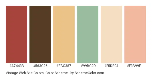
Vintage color palettes can be vulnerable due to the nature of the colors they use. Often these vintage themes include lots of beiges and beige tones (which can be difficult to work with and print) along with some brighter hues. Often, these other colors are quite desaturated.
Common color choices include darker and lighter blues, greens, teals, and peach tones. Rarely do these palettes borrow from primary colors along with the color wheel and when they do, the colors are often dramatically muted.
Vintage color choices can almost even be correlated with a specific time period, giving you the ability to incorporate subtle visual cues in color choices alone. This is due to several factors, for example, due to the available technological capabilities. Decades earlier used the faintest tones and the smallest overall color palette due to limited printing capabilities. Decades later in this range tend to feature brighter color options.
Tip: To create a vintage color palette, start with a neutral base color and one color to use as the primary hue. Desaturate your main hue by adding white to the color mix. (You can also add black if you want to create a darker theme.) Then add two similar colors to the palette, one much darker than your main hue and one much lighter.
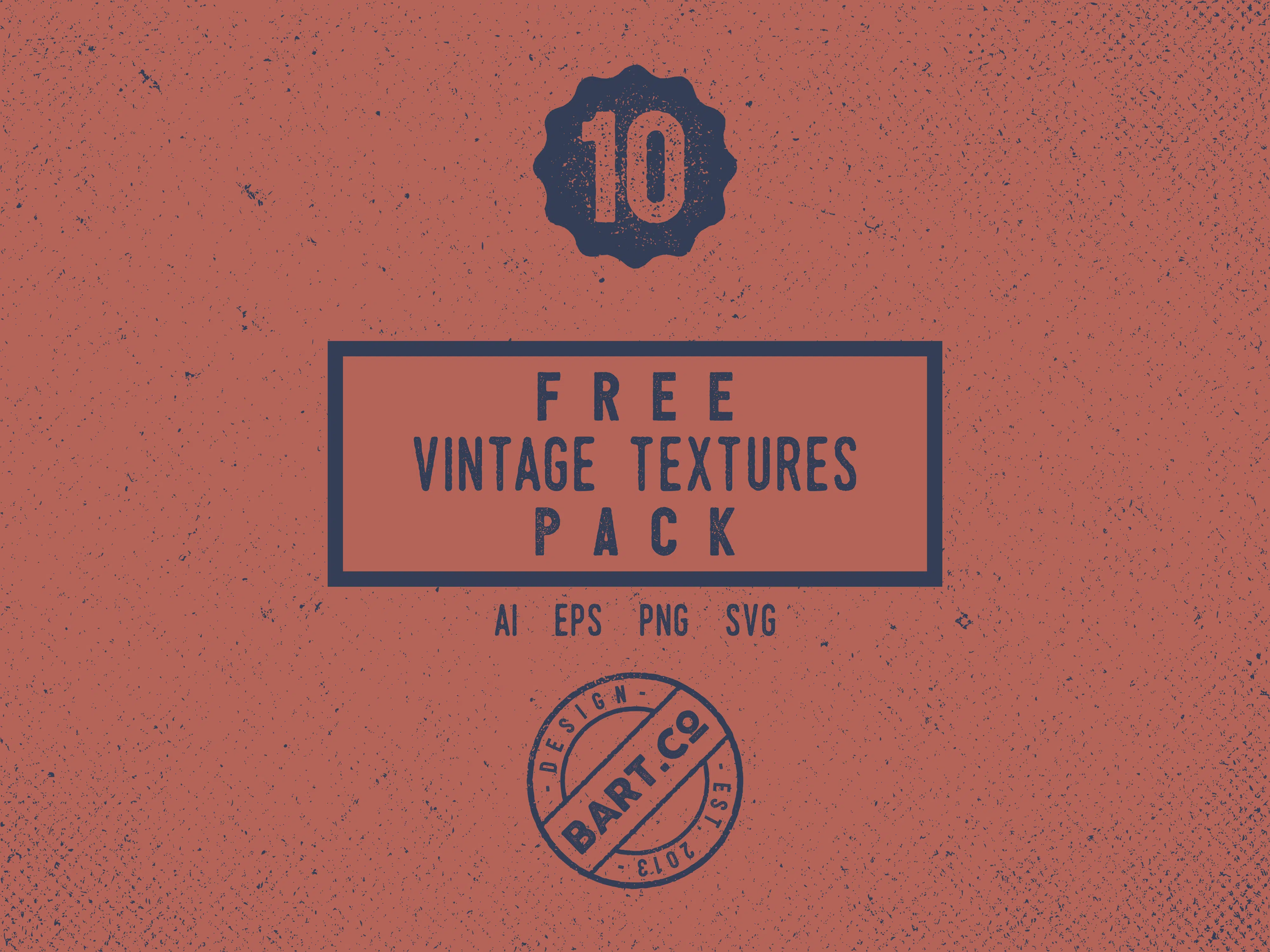
Vintage Textures
The texture is another element that is often used with other vintage design techniques. Vintage-style textures often have a stiffer or rougher look, like gritty paper or chalkboard.
The resulting effect of vintage engineered textures is influenced by the print media that existed at that time. What vintage textures lack is subtlety. Often vintage textures will include spots in the background, faded or “rough” patches, and an asymmetrical appearance of the texture. The effect will appear random and often appears as natural wear on the surface.
When creating vintage-style textures, also consider color. Many projects that use this design technique include background textures that are quite bold in color and coverage. The background can be light or dark, with the most common color choices being beige or dark blue. Tip: Textures are a powerful piece of the vintage design puzzle. Create a background that looks rough or worn. Consider the speckling effect to create depth and the appearance of wear. Pay attention to the details so that the texture doesn’t repeat itself and looks original.
Vintage Typography
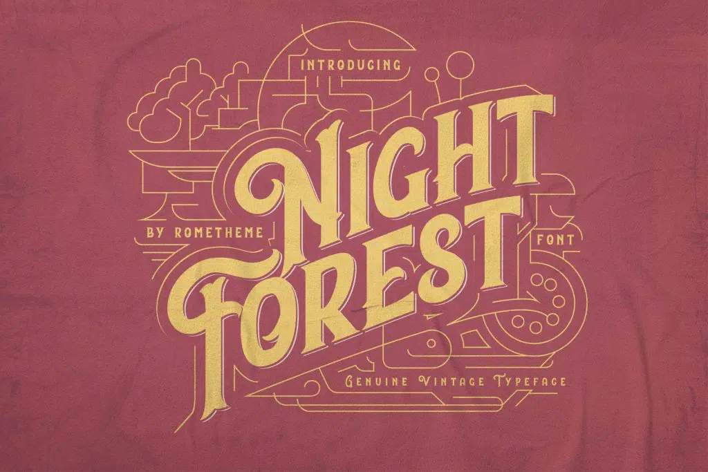
Vintage type is designed to look like letters made in pre-computer times when letters were printed using wood or metal. The results include sometimes imperfect letterforms that are often more ornate in design.
Not only should you look for typography from the old type category when working on a vintage look, but you should also consider adding a hint of texture to shapes. Often vintage and retro styles include scripts and serif typography with long tails, intricate curves, or special lettering.
Bold vintage typography and on your face. This is not the place for condensed or compressed letterforms or includes thin strokes. You might also think about adding dark shadows or even embossing to sharp letterforms for an extra sense of impact and boldness.
The type of detail around it is also an important consideration for creating a vintage typographic look. While the letters are often quite ornate, so is the area around them. Letters should feel like part of the canvas, not sitting on it. Smooth blending or opacity techniques can help you achieve this look and feel.
Tip: When considering typography for a vintage project, first look at roman, italic, and bold styles. Choose a bold font that almost looks like it’s pounded into the background you’re working on, just as the letter you’re trying to imitate is pounded with ink when the style first became popular.
Dare to try this vintage design in your design project to make it look unique, but be careful in choosing colors, textures, and typography so you don’t lose your design identity.
Source: designshack.net