Knowing what’s trending and staying up to date helps show your clients and visitors that you can take advantage of the latest technology and create a website that performs looks great and achieves its goals.
This year we will continue to see the emergence of no-code web design tools that will make creating your website easier. Starting from content, images, and descriptions to the design of the website itself, it will be very easy for you to create.
Without further ado, let’s dive into some of the top web design trends for 2024.
1. AI Content & Image everywhere
Let’s see what this artificial intelligence can do
a. Written AI Content
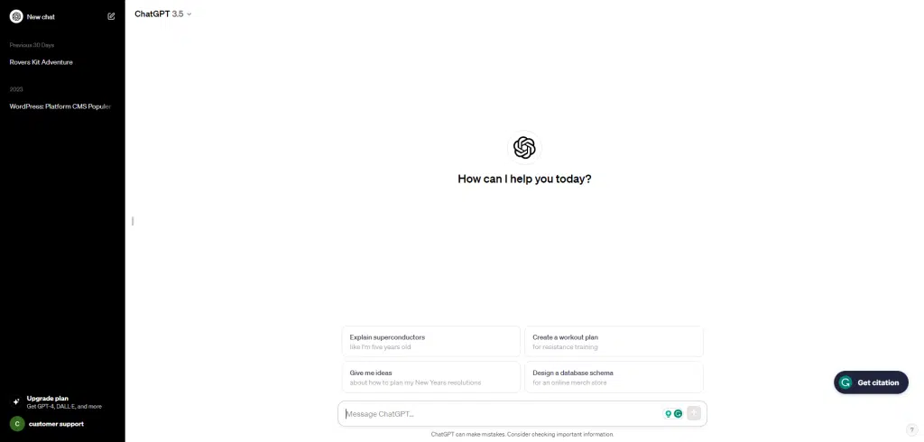
With the power of AI at almost everyone’s fingertips, we’re seeing a lot more content where AI played a role at least partially, if not outright. Blog posts, landing pages, website content, social media updates, it’s all fair game.
AI can dynamically optimize content based on how users interact with a website. For example, if a user frequently reads blog posts on a particular topic, AI can highlight similar content on the home page.
b. AI Images
AI rulers don’t just stop at text; they are also adept at producing visuals. Services like Canva now come with their own image AI.
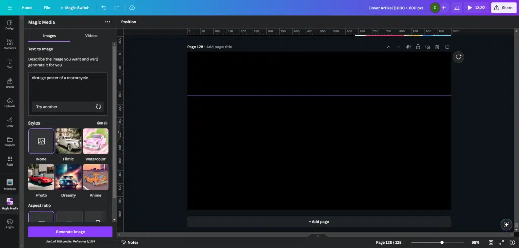
Even WordPress companies, like Elementor, are starting to offer AI image generation within their products.
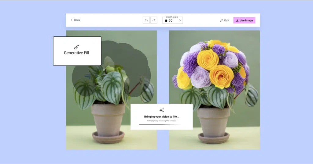
Also read: Elementor AI For Image Creation
2. Chatbot integration
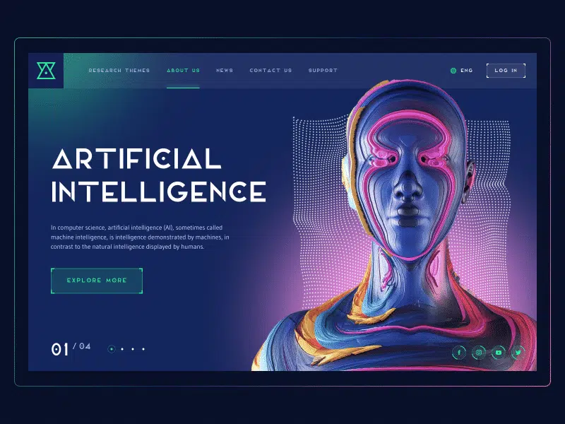
Chatbots have come a long way, both in terms of natural language processing and contextual understanding. These AI-powered assistants are becoming increasingly sophisticated, capable of handling complex queries and providing detailed answers or solutions. This significantly enhances the user experience, particularly in customer service scenarios.
3. Interactive & motion effects
As for motion effects, we have already seen how they were used in tandem with typography and graphics. With storytelling experiences where motion effects thrive, showing no signs of stopping, expect to see more of that approach in 2024.
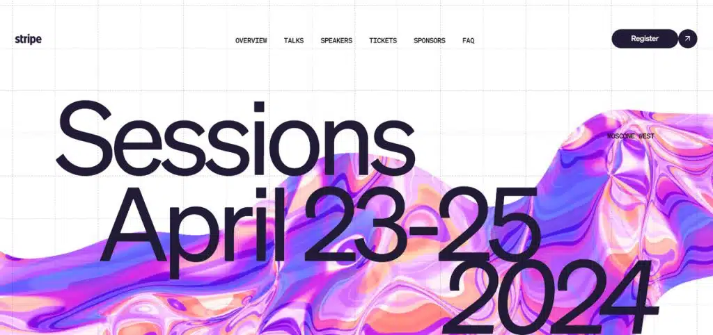
However, it is important to note that this trend has another side of the coin. Websites have become overly animated and interactive, causing visual overload. Some of them even have a bad and inaccessible user experience. Therefore, digital artists might consider interactivity and motion effects as complementary tools that support the meaningfulness and intuitiveness of the user experience.
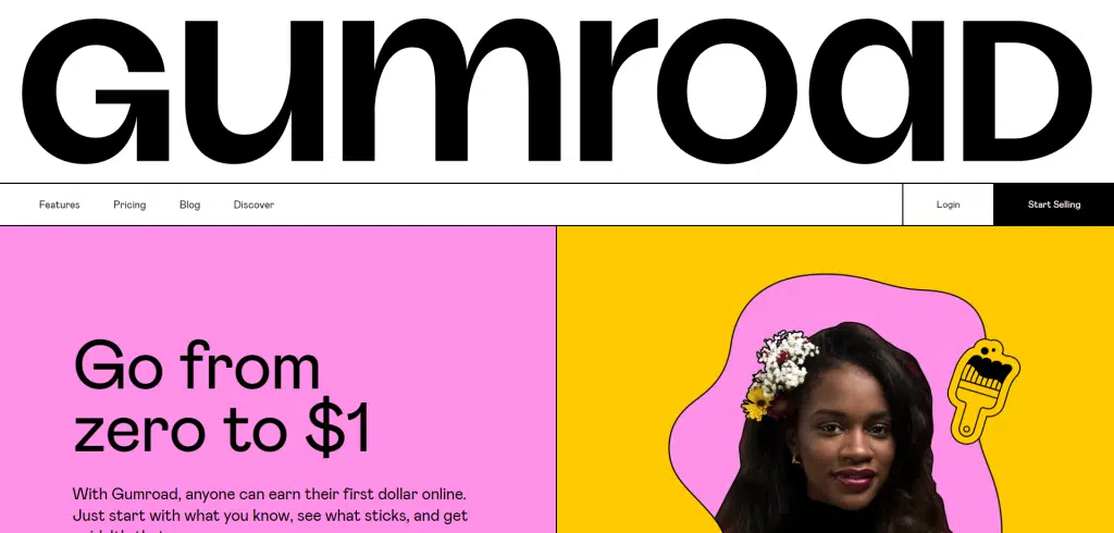
4. Massive & experimental typography
Typography has always been a crucial web design element, but 2024 is the year for bold and experimental typography. Web designers are turning to oversized typography, bold fonts, and even retro typography to stand out from the crowd. Besides adding a visual interest, these typographic layouts enhance user experience by making the website easier to read and navigate.
Typography is a time-tested way to speak directly to a target audience, add a creative edge to a website’s aesthetic, and create an impactful message. 2023 is no exception, and 2024 is no exception. After all, everyone loves playing with letter shapes. There’s something satisfying about developing a way to display information, convey brand value, and connect text to the overall aesthetic through just one UI element.
5. Parallax scrolling
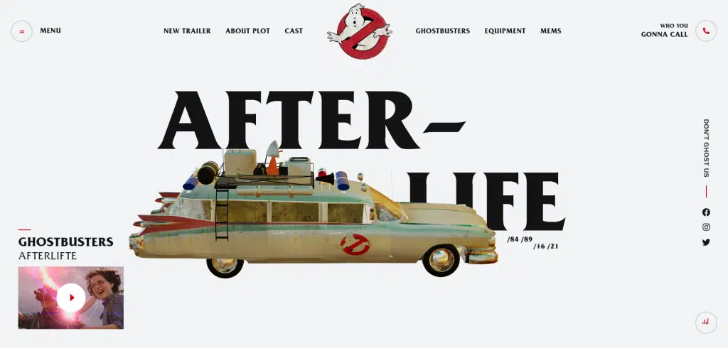
Parallax scrolling is a technique where background content moves at a different speed than foreground content, creating an illusion of depth and a more dynamic visual experience.
Parallax scrolling isn’t a new concept in the design world; in fact, it was incredibly popular roughly 10 years ago. However, in 2024, it’s on the rise again — this time, with a twist. Instead of static designs and imagery, now parallax scrolling will incorporate more live and video content.
One example is the fan-made Ghostbusters site Mike Desling, created by members of the Webflow community. In it, parallax scrolling is taken to a new level with various animated, video, and gif elements incorporated into the design.
6. Bento grid
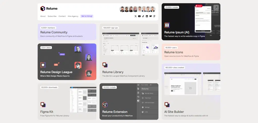
Visible grids and borders in general are a trend you can see more of in web design in 2024. They provide clarity and structure, making websites easier to navigate. Plus, they help with responsive design as they help visualize how elements will rearrange.
However, like anything, there are pros and cons. The major downside is that it can get a bit overwhelming and messy if not used carefully — like a cluttered desk. So, it’s crucial to use this approach sparingly and not overload the user with too much.
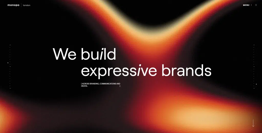
7. Gradient
Gradients are returning, adding depth and visual interest to otherwise flat designs. This web design trend is visually appealing and aids in directing website visitors’ attention to crucial elements on the page.
This is a great way to add a splash of color to a website design. You can use it for images, backgrounds, buttons, and many other elements to make them stand out and introduce color in a very subtle way.
As someone involved in the field of websites, as a designer, developer, or simply a website owner, it is important to always know what is trending in the field of web design for 2024. That way you can ensure that you stay ahead of what is happening this year.
Will you use all these trends in your website design? Or will you only include one at a time in your web design? Make sure this trend suits your needs and the purpose of your website.
Visit our website to browse our stuff and follow our Instagram for great content!
Website: www.rometheme.net
Instagram: rometheme_studio

