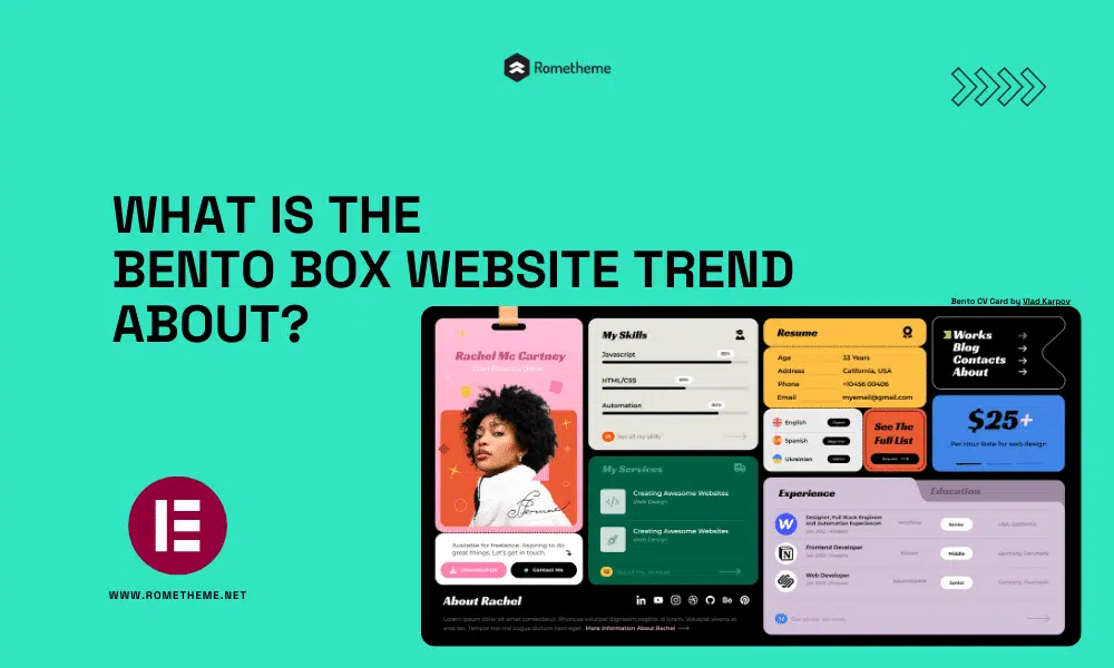

The bento style design trend gets its name and inspiration from the traditional Japanese bento box, a compartmentalized container used to package individual portions of food. This translates into graphic and web design by arranging content or elements in distinct and neatly arranged compartments or sections.
Some people believe that it was Apple’s promotional video that started it. They showcase product specifications and features in a neat grid-style layout that is attractive and informative.
Then there’s another group that thinks Microsoft may be the pioneer here. When they launched Windows Phone 7 with the Metro design language, it was a breakthrough. This approach greatly challenged the design norms of the time.
1. Structure: It can be easy to organize content in a visually appealing way.
2. Modern: It’s a trend picking up traction right now so using bento box web design will help position you as a forward-looking company.
3. Familiar: With many users used to the bento box UI thanks to companies including Apple and Microsoft, many people know how to interact with this design system.
4. Navigation: This familiarity helps with navigation, it’s easy for users to find what they’re looking for quickly and easily.
5. Versatile: Within this type of layout, content can be structured successfully for different devices including mobile, tablet, and desktop.
1. Purposeful Compartmentalization
Consider how you want to showcase content and how it can be logically organized. Avoid overcrowding.
2. Visual Hierarchy
Establish a clear hierarchy within each compartment with size, color, and typography. This helps guide the viewer’s attention to the most important elements first.
3. Grid System
A grid-based layout can help maintain consistency and alignment throughout your design to create a unified feel and visual harmony.
4. Play with Roundness
You’ll see from the examples that some designs have a greater degree of roundness for curved edges. There’s no set rule, play with it to find the spot that works best with your overall design scheme.
5. Whitespace
Don’t forget about the importance of whitespace. It helps to reduce visual clutter and gives the design room to breathe, contributing to a balanced and elegant look.
6. Playfulness with Purpose
While the bento-style trend can be playful it should serve a purpose and align with the content and target audience. Avoid overdoing it if it doesn’t fit the brand or message.
7. Don’t Overdo It
You can use this style for every element, but in some cases that can be too much. It is acceptable to mix and match curves and straight edges.
8. Accessibility
Don’t forget accessibility guidelines when designing with this style.
But remember, this style is not just about putting things together; it’s about creating a space where every element, no matter how small, has a purpose and a place. It’s a reminder that in design, as in life, simplicity and order bring not only beauty but also functionality.
Source:
Visit our website to browse our stuff and follow our Instagram for great content!
Website: www.rometheme.net
Instagram: rometheme_studio


