


Although it is difficult to choose a font that fits the poster design, here are some tips that you can use to choose the font.
When compiling poster titles, website headers, banners, etc., you can try fonts using large sizes and bold font weights. Of course, in accordance with the goal so that the poster can attract attention, choose a large and bold font, but it must be remembered that not all fonts will be good if used in large sizes.
Of course, in making posters, we have a theme in the message to be conveyed, which is then adjusted to the poster design and the font to be used. Choose a font that has the same theme as your poster design. For example, use colorful and cute fonts for children’s themed posters.
Don’t forget the subtitles and body text in your poster. Choose a font that matches your large title font so that the poster looks good and is comfortable to look at.
Very closely spaced fonts are also suitable if the poster title is too long so as not to spoil the poster’s design. However, you still have to be careful in choosing the right font with it so that it is still pleasant to see.
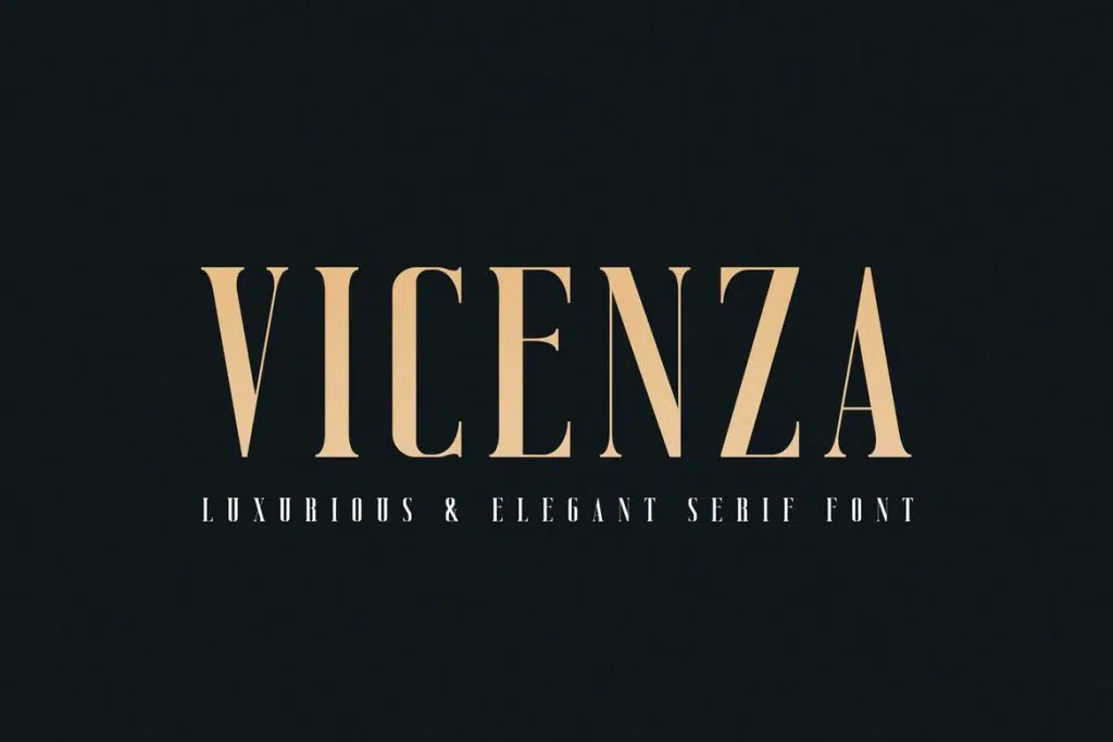
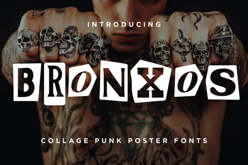
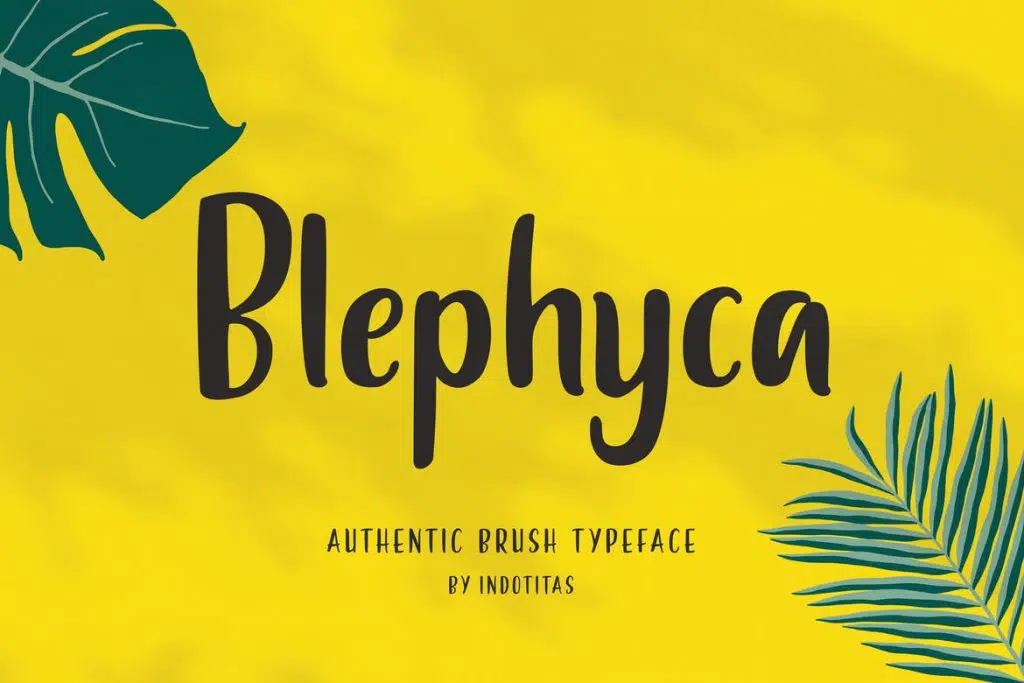
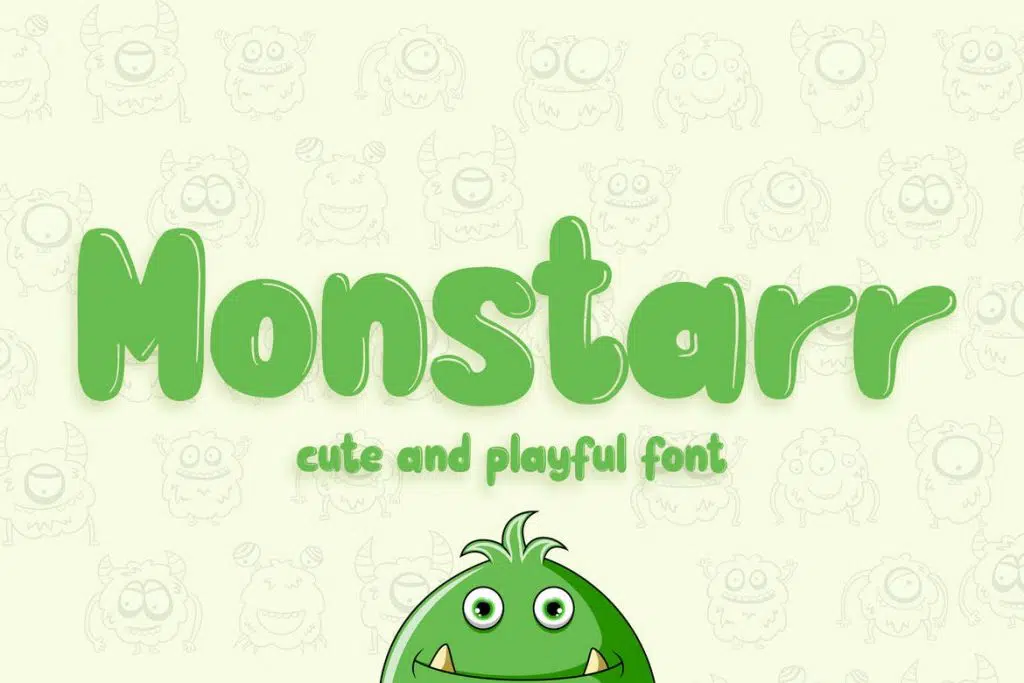
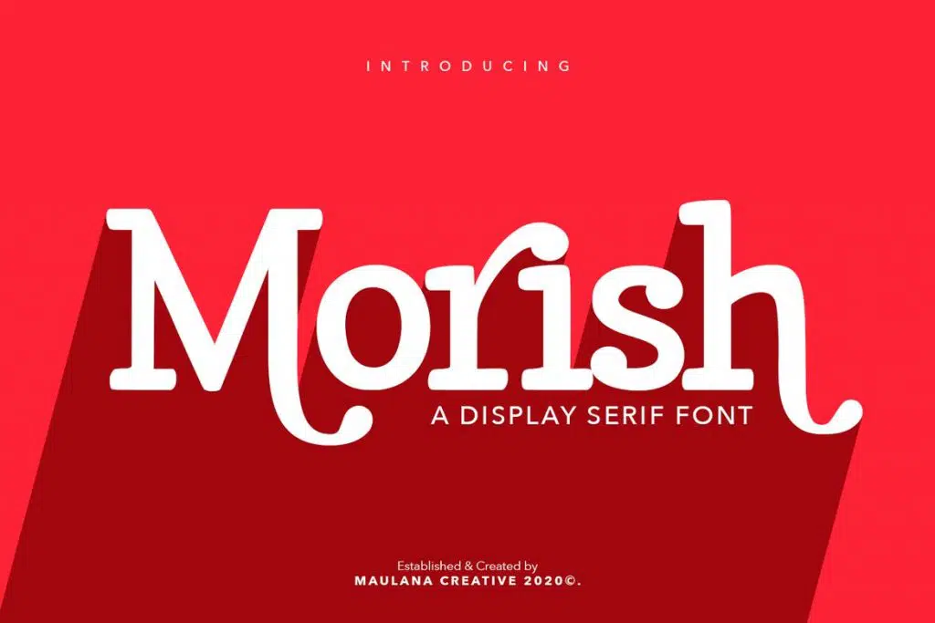
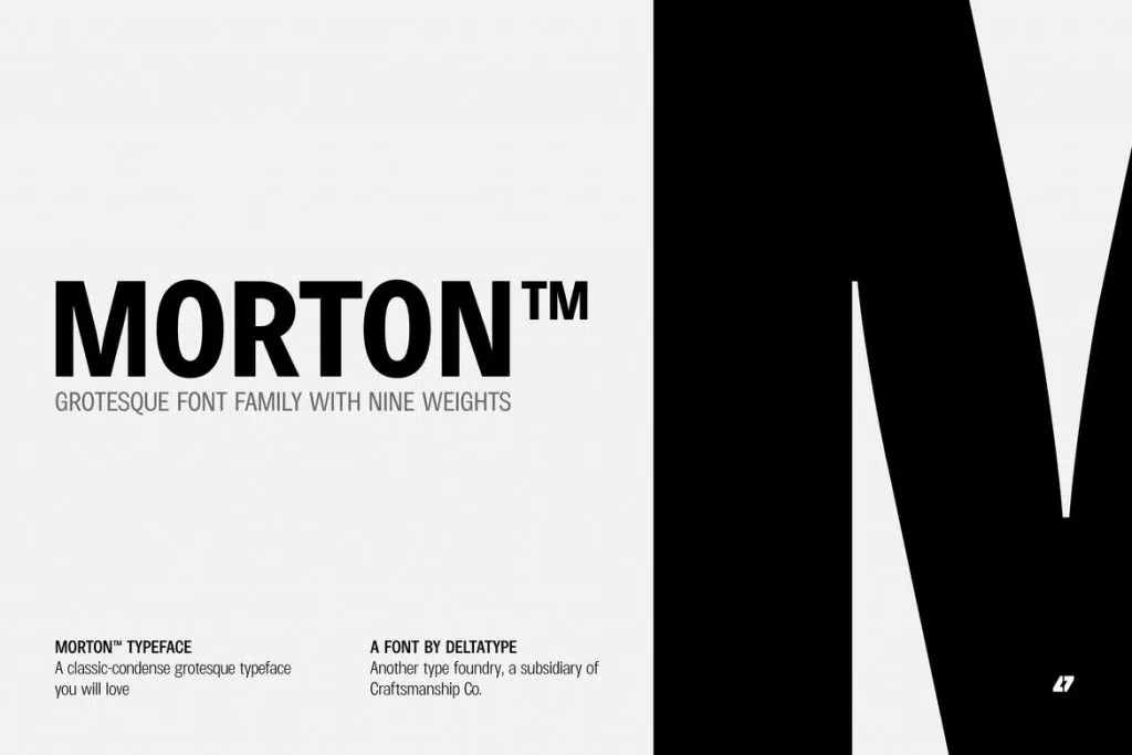
Here are some recommended fonts that are suitable for posters.

Get more fonts from Rometheme here.


