1. Have A Clear Goal for the Flyer
What are you trying to show the user? Where will it be distributed? What type of budget are you working with?
From the questions above, you can determine the purpose of your pamphlet correctly, the right goals and strategies can help you determine the content you should use in your design so that it gives meaning to users.
The most common mistake when it comes to brochure design is thinking that you can customize everything. You may have to make targeted strategic decisions about key content. Maintain elements that correlate with design goals and for the targeted audience. Throw away everything else.
2. Amp Up the Contrast
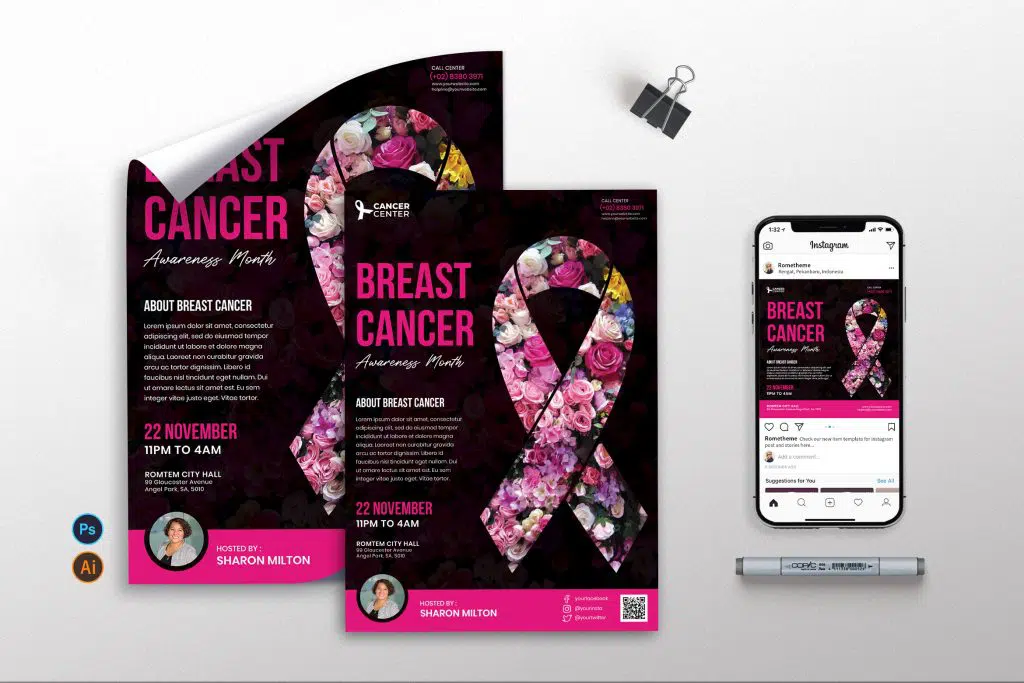
High-contrast visuals are easy to see at a glance and can be eye-catching. Unlike a website, where the user chooses to view it by clicking on a link or typing in an address, a flyer must.
The high-contrast visuals in your pamphlet have a strong appeal to get users drawn to it quickly. Let’s say you see a pamphlet from a distance, if the design catches your attention then you will continue to be curious and continue to see it until a close distance, then you read the contents, then the message in the pamphlet will be conveyed to you.
3. Put Emphasis on Key Words
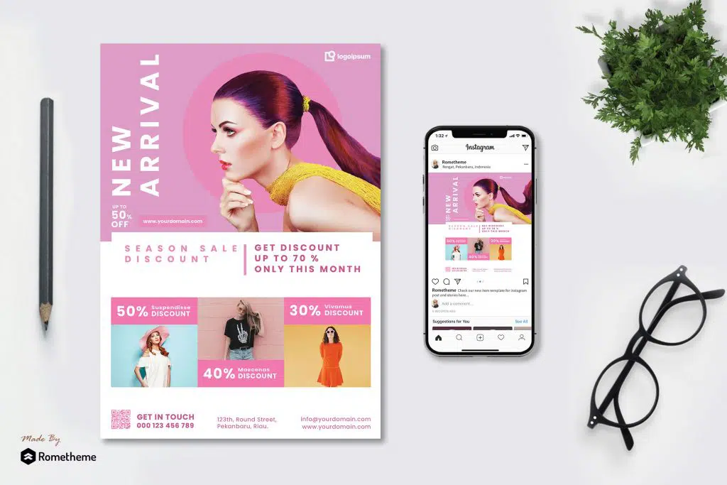
You should also think about the keywords you use in your pamphlet design. Make them bigger, bolder, or lighter than the other letters to create a different emphasis. Make sure the information is correct and benefits the reader.
What kind of words attract attention? Consider the following words if they are part of your strategy: TDP – (time, date, place), New, Free, Easy, Save, Now, Guarantee, Limited.
4. Think About Viewing Distance
You should think about your readers before making a pamphlet design. Where are potential users when they see a flyer design? Is it a flyer or poster hanging in the window? It’s a tri-fold that you’re going to share? Postcard to be picked up or sent?
Everything in the design must be scaled for this use. The size types and elements on the poster (wide viewing range) will be much larger in proportion to the elements on the postcard. This is due to the viewing distance, the size of the printed item, and the distance from which the words will be read. (Anything you hold to look at will likely be closer than anything you don’t actually touch to read.)
Sometimes the best way to judge visibility is to print a test version, hang it up and run it a few times. Did it catch your attention? Is it easy to read?
5. Include a Call to Action
Just because you can’t click on it, doesn’t mean a call to action isn’t necessary. Quite the opposite is true. Create distinct – and easy – items that are actionable for everyone who sees the flyer. This can be anything from visiting a website to calling a phone number to show up at a certain place. Make it as easy as possible for users to act. Shorten URLs and make all instructions clear and concise. So that the reader is not lazy to act.
6. Opt for Full Bleed Flyer
Full bleeding means that the design reaches the edge of the printed paper indefinitely. While the entire design doesn’t have to line up, these designs that have a borderless look often stand out from designs that are more like office copy.
But don’t force it. Not all projects have the elements or graphics (or budget) to justify the full bleed. This is a decision you should think about early in the process to ensure that you are designing for the printing process you plan to use.
7. Design Top Down
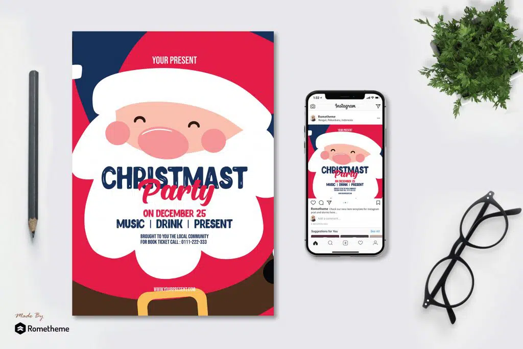
People usually read flyers from top to bottom, so your design should follow that flow. Start with the most important information at the top of the design and move down the page to the least important information.
The size and scale of text and design elements will likely follow this same hierarchy. The key image should also be, with the most striking or impactful image or graphic in the upper third of the design.
Use color and scale to help draw users to the page. Much like an inverted pyramid, the most important things are at the top and the least important details at the bottom follow.
8. Use High-Quality Imagery
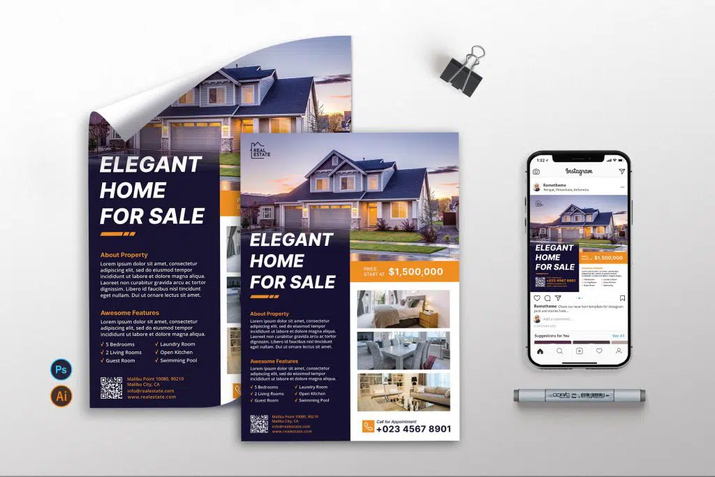
The perfect flyer design has high-quality images that relate to the information on the page. Images have many keys in this design.
Images should be easy to “read” and understand at a glance and help users connect to elements in the flyer design. The image should be something one would expect from what the flyer is showing – the event or product or sale.
Images must depict an accurate representation and must be sharp and clear. Don’t make users guess to find out what they’re looking at. They will only be frustrated, confused, and think you are not working professionally on this design.
At the same time, be sure to use high-resolution images. The same specifications you use for online or digital images may not apply to printed images. Resolution requirements are often much higher to ensure adequate printing.
9. Integrate Branding
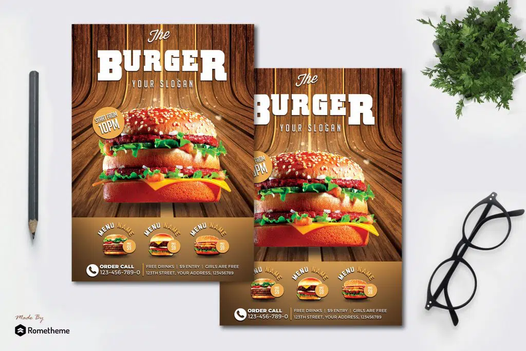
Don’t forget to make the flyer your own. Incorporate brand visuals, colors, fonts, and overall design style into a flyer so users familiar with your company or product know the design is yours.
The flyer is just one more element you can use to help build and maintain a brand identity. Don’t forget to maintain a sense of who you are when switching media.
10. Use a Printer’s Template
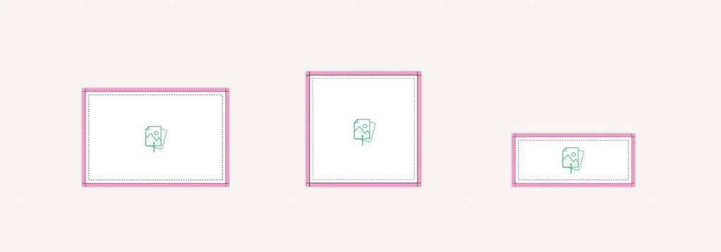
While it’s not always possible to start the design process with a printer or printing company in mind, using a printer template will help streamline technical considerations later.
The printer template will show the bleed and trim lines and a safe area for printing. Staying within these guidelines will ensure that print designs appear as intended and that nothing is left behind from the final print job by accident. While many printers have similar specifications based on print or page size, they can vary. You’ll save a lot of time, money, and headaches by making sure that your designs match the print templates before shipping.
Source: designshack.net

