


Are you a designer? Surely you’ve made a brochure, right? Brochures for clients or brochures to promote yourself. If you are creating a brochure for a client, it is very common for them to request a printed brochure with a shareable digital file with the same design. Therefore, it is very important for you to pay attention to the design of a brochure so that it is as good as a printed brochure and a digital brochure.
The first step in creating a brochure design is to consider the shape, size, medium, and folds. All of these tactile properties of brochure printing contribute to the design style you choose and how to combine text, images, and other elements into one.
When it comes to creating brochures, there are some common options including:
As said at the beginning, pay attention to the design of printed brochures with digital brochures. Sometimes a printed brochure design will look strange when viewed from a digital brochure. When you want to move a printed brochure to digital, consider making each page or fold of the brochure into a separate page in the digital version. Message them in a way the content should be read. This will make the brochure easier to read regardless of the format.
What’s great about designing brochures is that you can get creative with effects and textures.
Several design trends can be used in brochure design as well, including using high color options, lots of sleek typography, and simple images.
Modern and trendy brochure design techniques that always look great include:
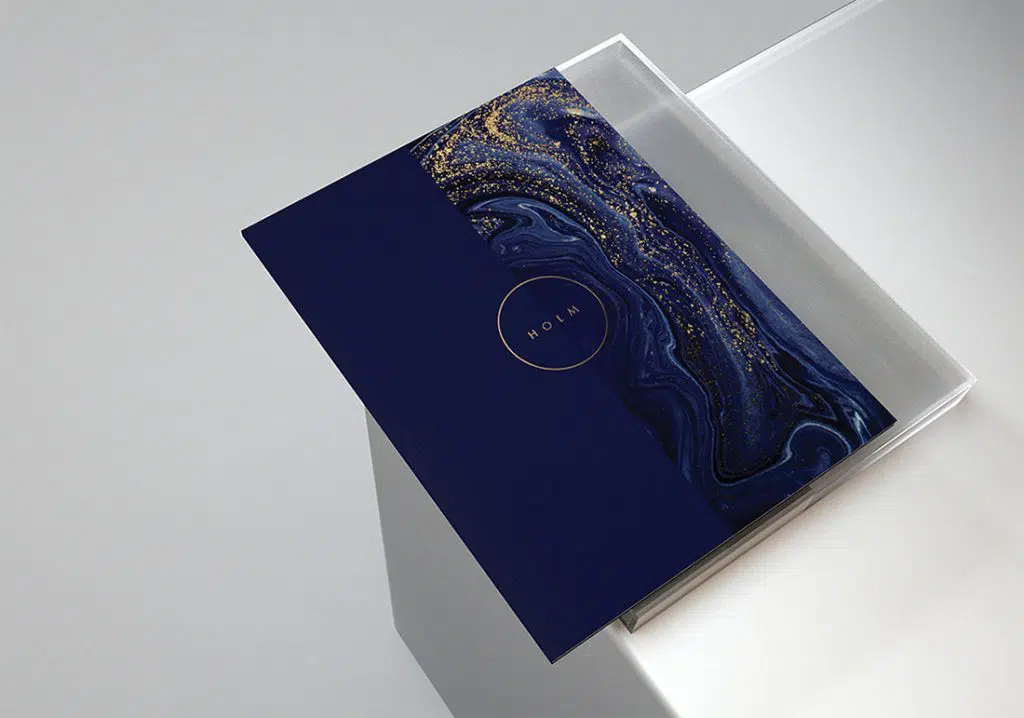
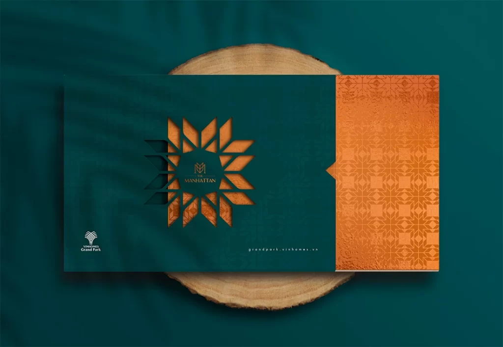
Geometric shapes can add a lot of pop to a brochure design, including the cover. The right combination of shapes can serve to direct the eye through a design, help create focus on the main content, or serve as a key visual device.
In some of the trendiest uses, geometric shapes are paired with a monotone color palette for a unified look and feel.
If you don’t have a lot of graphic elements, this geometric design is perfect for you to use in your brochure. Or you can also use a smaller image or a black and white image with a geo shape as it can create visual interest to carry your design.
When working with geometric shapes in brochure design, try to choose consistent shapes and use them throughout.
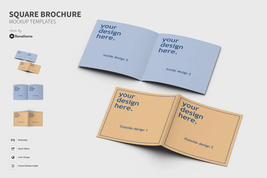
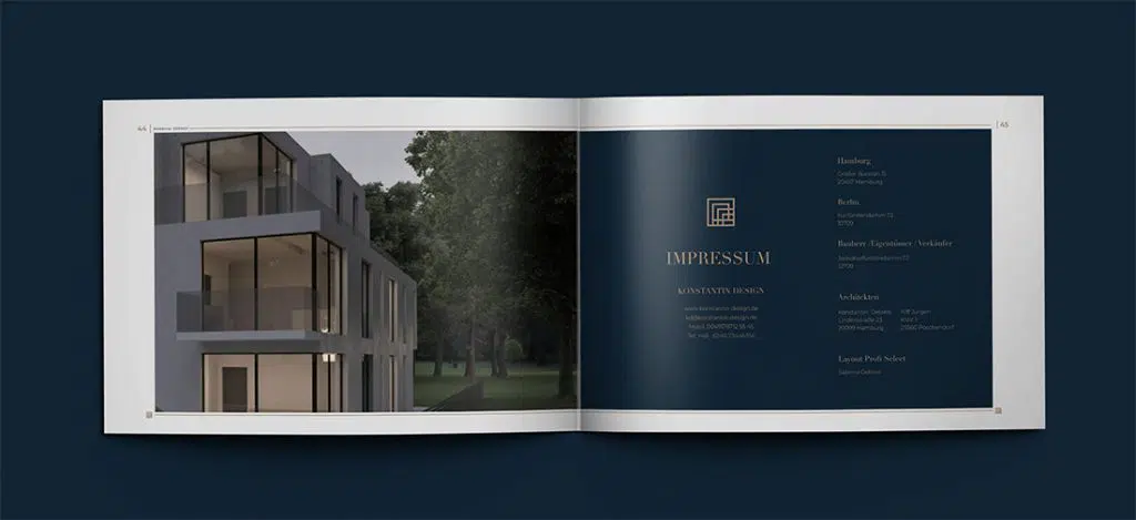
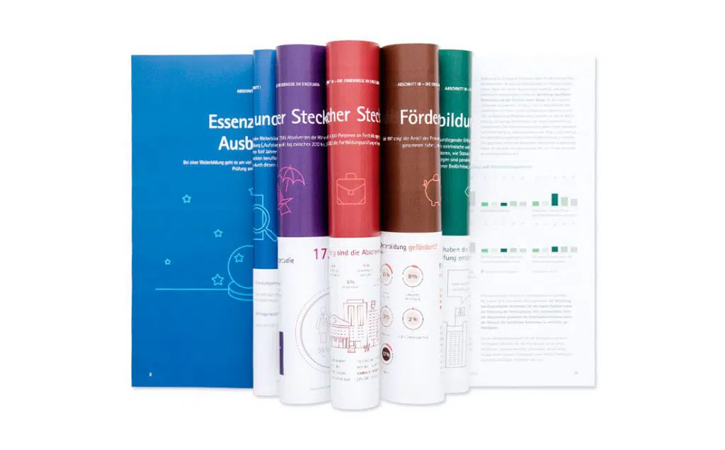
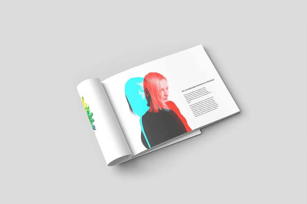
Some of the most important things in print design are the paper, the publishing technique used, or the orientation. But using a landscape orientation can make your brochure design stand out a bit more. It can also provide a completely different tactile experience for the person getting the brochure.
While these brochures can look awesome, they get complicated if you force a concept with the wrong type of content. So pay attention to your brochure design concept before putting it into landscape orientation.
Another bonus: Landscape orientation for printed brochures can work very well as PDF brochures can be viewed in digital format too because each page mimics the orientation of a desktop screen.
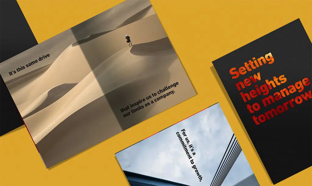
As we know, in the world of design, color can play an important role in the design, as well as brochure design. It can also be tricky.
When it comes to bold colors and bleeds, it takes the right mix and print to get great results. Be careful with creases and blends to ensure that your design comes out right every time.
In terms of the actual color, neon and bright colors are popular styles. They can be fun, interesting, and stand out. The goal of bold color choices in a brochure design is to draw the audience to a printed product and keep them looking at it after it’s picked up.
If you want to make an impact, consider turning your portfolio or website into a printed brochure.
There are various ways to do it – foundries have been doing it for decades – but your main goal is to create the right impression. Showcase works and works that look great in print. This tangible item can be a great venue for a networking event or job interview.
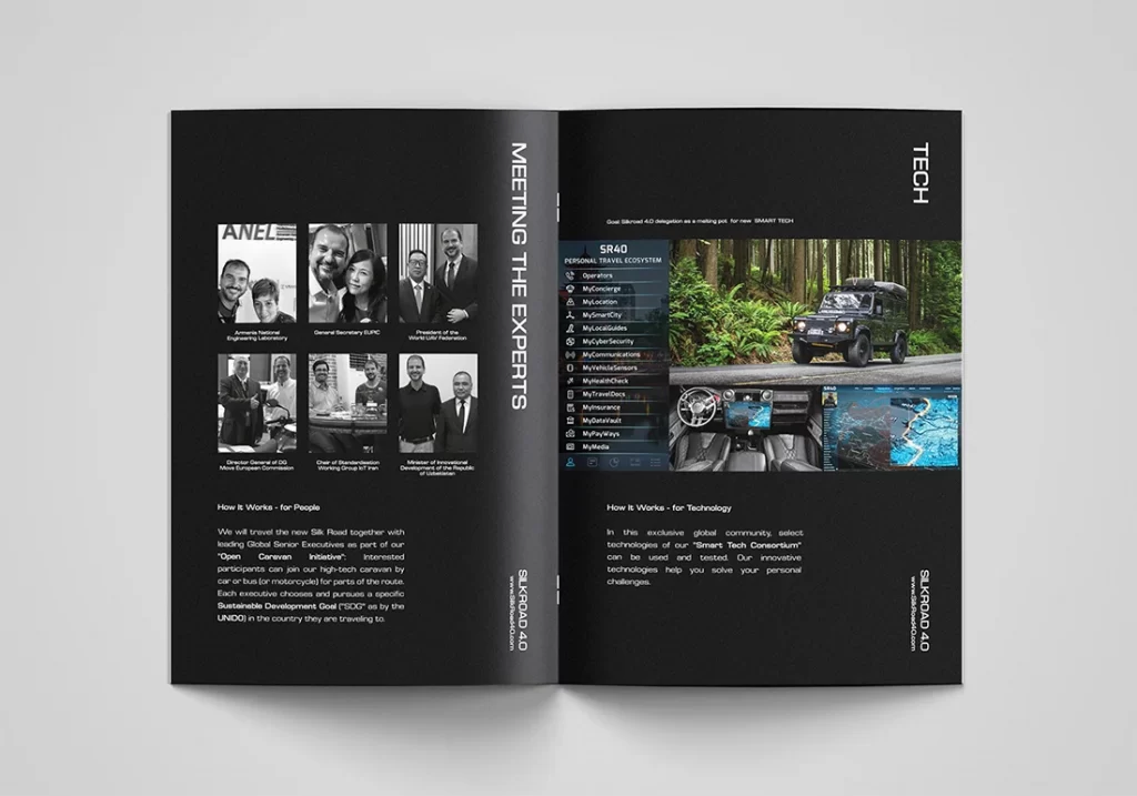
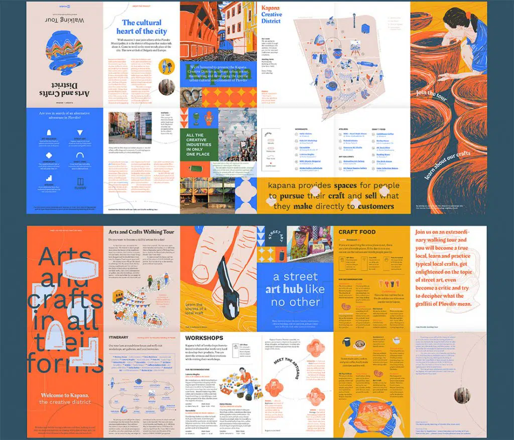
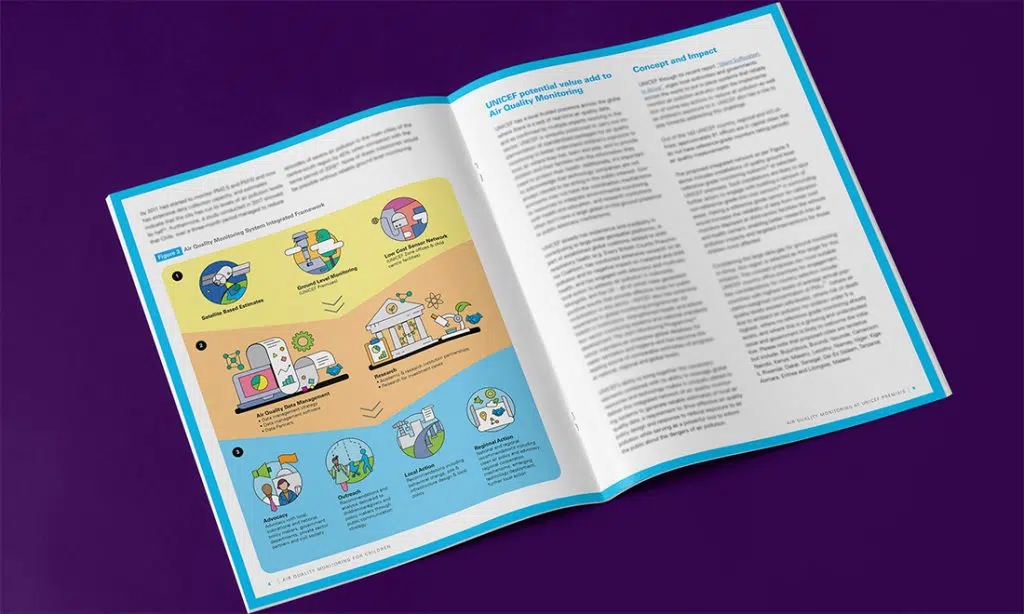
Infographics are a great brochure option because they can help explain what your message is about. Infographics are also very visual and attractive.
There are two routes that can be taken: Detailed, immersive graphics and simple, graphics and pictures to convey meaning.
All are equally effective and can give energy and understanding to the content. Brochures can contain stand-alone infographics or as part of an overall design scheme.
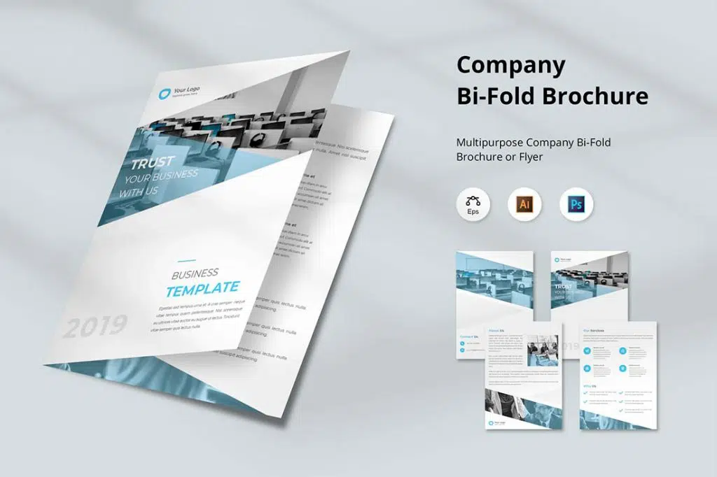
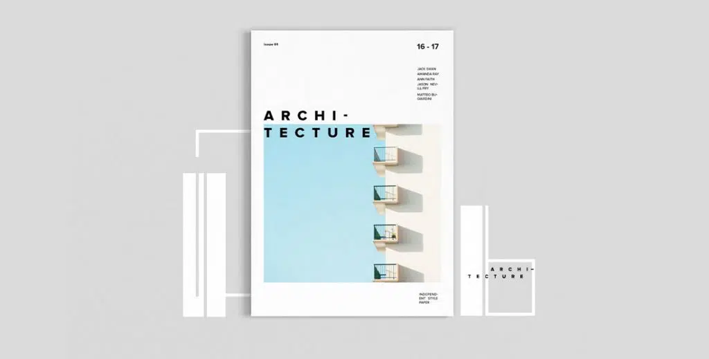
If you’re just going to create a brochure design to share digitally, highly visual elements with images and color are perfect.
High color, high image designs can work well and are also quite impactful in print. Be sure to check with your printer to make sure that the colors, images, and colors will work well with the paper and printing selections you have made and adjust as needed.
When it comes to brochure designs with lots of color and imagery, look for visual elements that are easy to understand at the displayed sizes. Images should not be overly complex and communicate a single message.
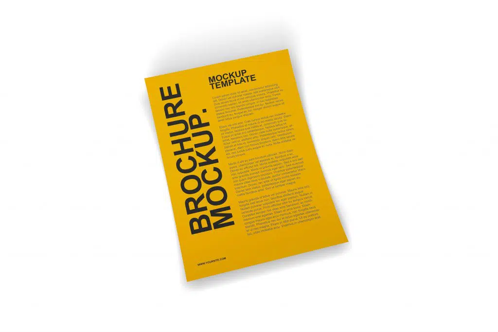
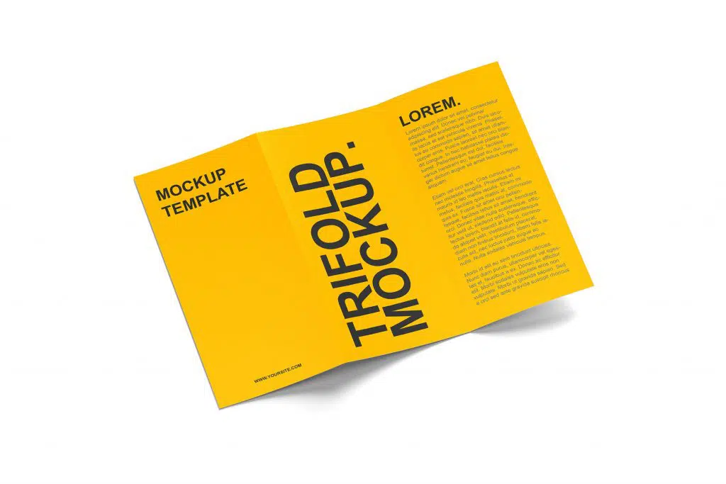
A great way to handle brochure designs without a lot of images or other “designed” art elements is with large type. Fun uppercase letters can make a lot of impact and help users know exactly what the brochure contains.
Be creative with your choice of type and the way you make words. Attractive word separations for long words (such as syllables per line), different headings, colors, and alignment can add a lot of visual interest to letters.
When choosing to design a brochure that only displays letters, be careful to include plenty of white space and a defined type hierarchy so the eye can easily navigate through the content.
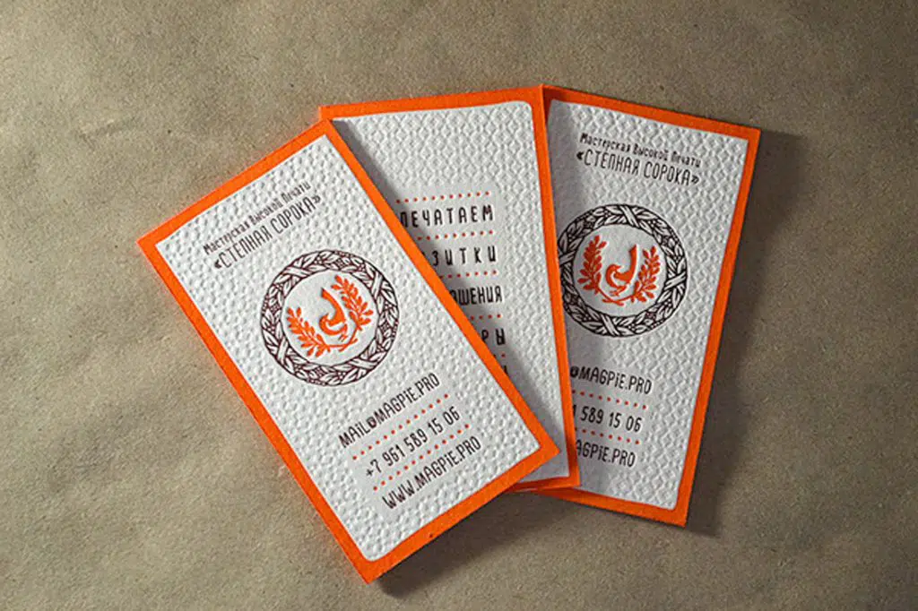
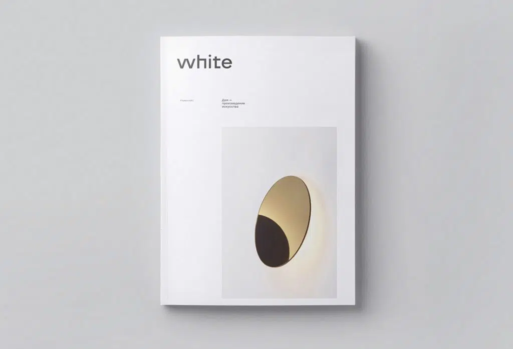
The minimal design style is popular with brochures because there is nothing to worry about in terms of printing and quality control. Avoid inverted type and you won’t have to worry about the legibility of light text on a dark background. Choose a white background or canvas and no more ink to worry about smudges.
The minimal style gives you a bit more choice with paper stock too. You can actually use lighter paper when you don’t have a lot of print jobs overall. What’s more, the minimal design style is both classic and modern. They never seem to go out of style.
Have you decided which design catches your eye? Share this article with your friends too.
Source: designshack.net


