If you’ve read the previous article about what the design trend is, it’s time to take a look at some websites that are implementing this design trend!
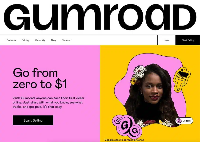
1. Gumroad
Check out the muted, clashing, gradient-free colors combined with thick black outlines. Typography is modern and easy to read, setting it apart from the often clunkier styles preferred within the brutalist design. Animations also help to modernize the brutalist design.
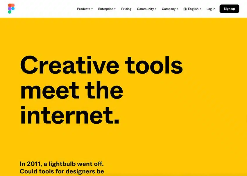
2. Figma
One of the most famous examples of neubrutalist web design, Figma avoids shadows across all imagery, instead opting for sharper, darker black lines surrounding the shapes. Clashing hues such as orange and yellow also feel a little challenging on the eye which helps them to stand out.
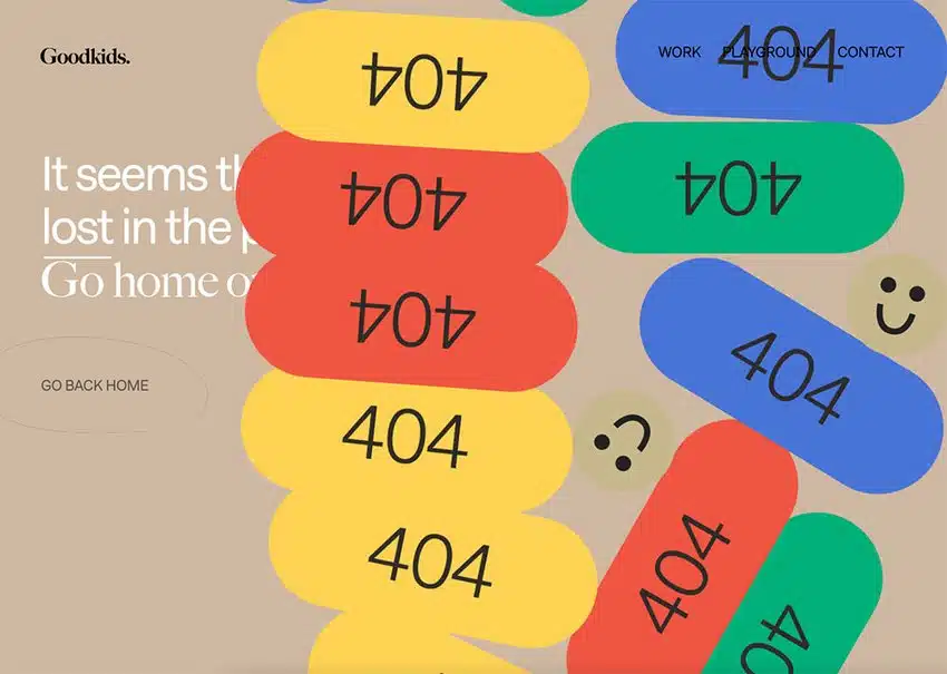
3. Goodkids Agency
As soon as you set a foot wrong on the Goodkids website, it’s impossible to miss the oversized 404 animations which unevenly pile on top of each other to fill the screen. Smiley emojis are in a similar tone to the website’s beige background, making them feel slightly jarring and therefore weirdly eye-catching.
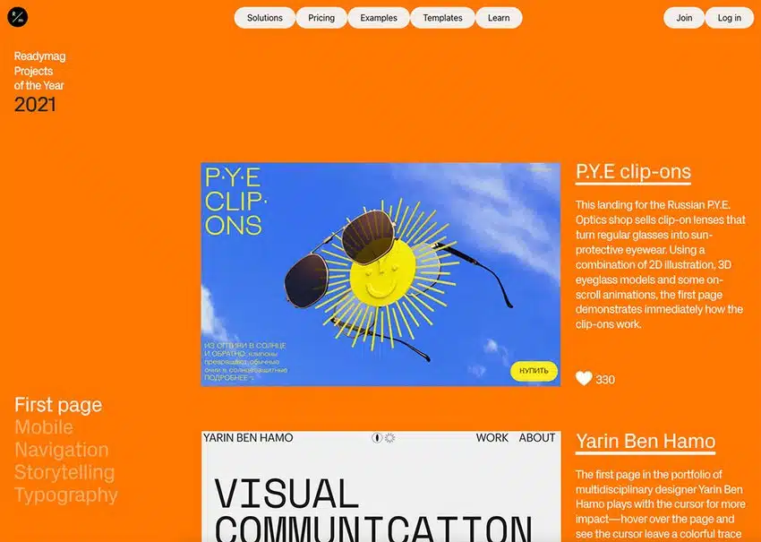
4. Readymag
Channeling retro design trends, you’d be forgiven for thinking Readymag’s website comes straight out of the 90s. Subtle animations help to remind the user this is in fact a modern design choice! The flat grey navigation buttons are eye-catching in their simplicity.
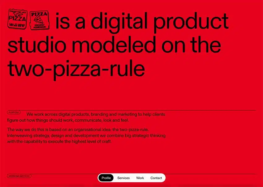
5. Pizza Pizza
Confident in its simplicity, Pizza Pizza opts for a flat red against black—it feels a little difficult on the eye, but you can’t help but carry on looking. The lack of imagery on the homepage also goes against most image-rich websites.
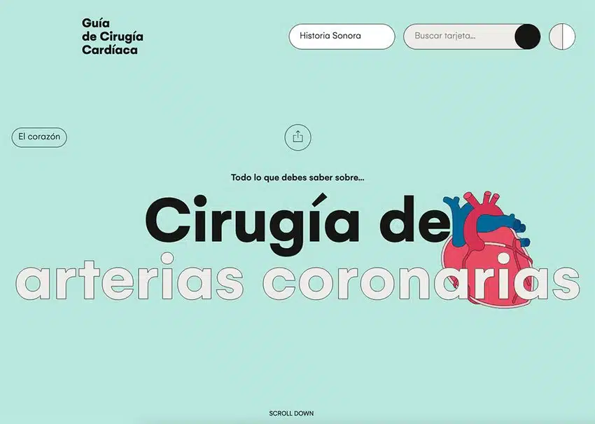
6. Guiacirugiacardiaca.com
Flat, muted imagery against minimal and modern typography, the Cardiac Surgery Guide is a classic example of neubrutalist web design. Striking simplicity meets modern touches like the cursor when you scroll over content pieces and the logo that spins when the user scrolls.
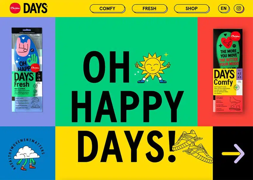
7. Christou 1910 Days
The bold white text against clashing colorful blocks is challenging to read—hence you pay extra attention! Modern animations like happy walking clouds fill this fun website, a great juxtaposition against the flat color scheme.
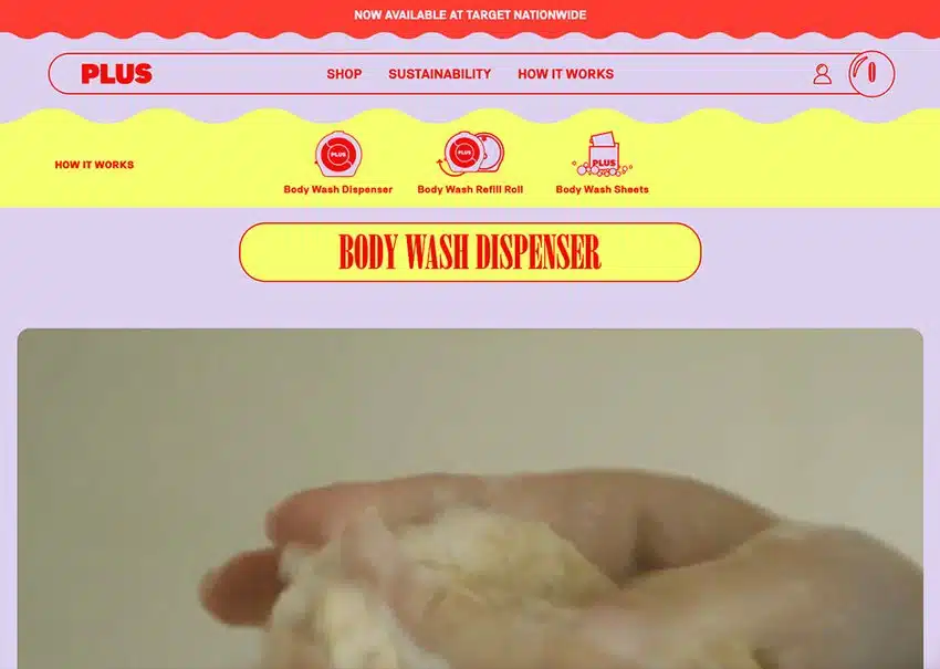
8. Plus
Orange and lilac? Lemon yellow and royal blue? Daring combinations, but Plus’ website combines them all for an undeniably neubrutalist look. Bold animations and novelty cursers almost gamify this edgy site.
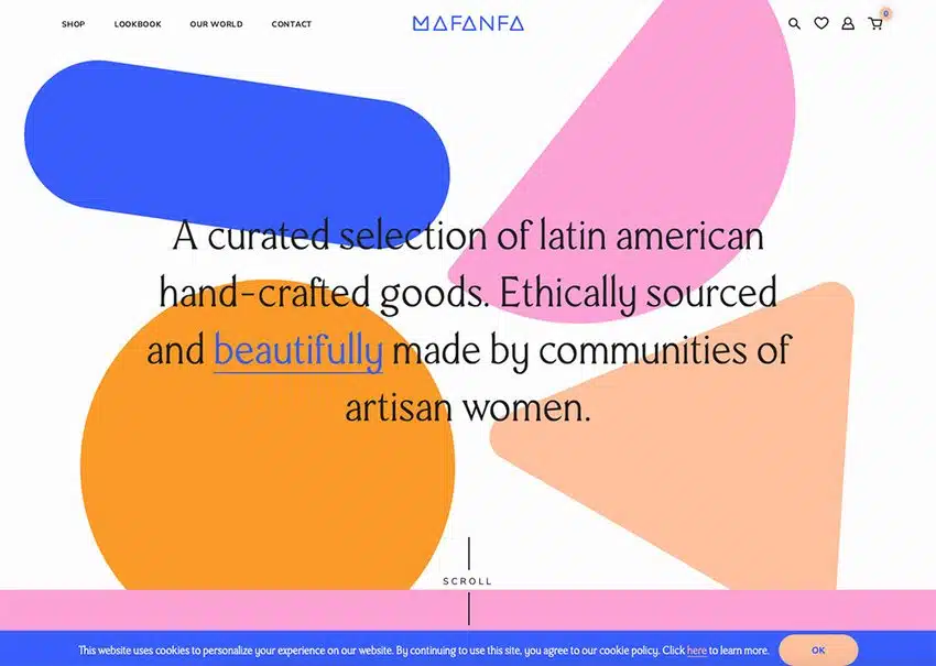
9. Mafanfa
As you scroll, fun animations burst into action within this neubrutalist website. A lot of thought has gone into how the user interacts with the site—when the mouse hovers over certain elements, many change color or move. To a certain extent, the user creates the website they’d like to see.
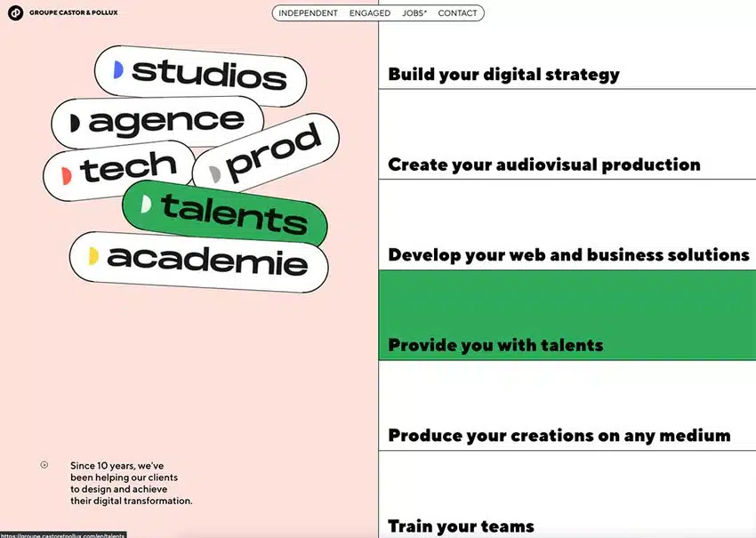
10. Castor & Pollux
A text-heavy site, the Castor & Pollux is sprinkled with color as the user scrolls. Even the social sharing buttons avoid the classic iconography you might expect in favor of simple text signposting.
Are you interested in following this trend? I think this trend should be tried at least once in your design life. Good luck!
Source: webdesign.tutsplus.com