At first, in design, there was a trend called brutalism. Brutal design says “I’m different, I’m cool,”
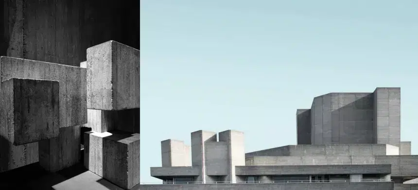
The first known brutalism was an architectural trend of the 1950s that abandoned all decor and created brutally simple buildings made of concrete. They are often not even painted to emphasize their brutal nature. So big, brutal concrete blocks.
Within its own design, Brutalism seems to deliberately violate the rules of clean, safe, and easy-to-use patterns that are standard for web design today.
Brutalism refers to a brutal architectural movement that emphasizes the raw materials of design. Digital style trends are defined by open grids, strong typography, layering, a limited color palette, and a barely stylized HTML appearance. Turn century-inspired web graphics with blank HTML or a glitchy grunge feel. In fact, very “anti-design.”
Brutalism creates interest and grabs attention at a time when everyone is competing for short attention spans.
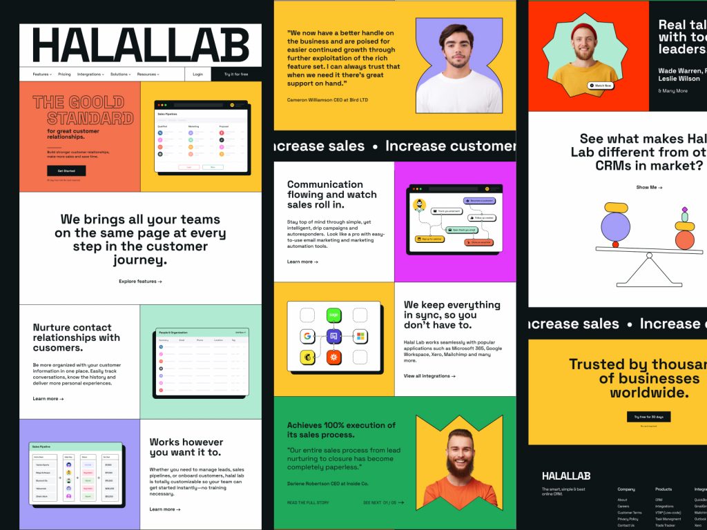
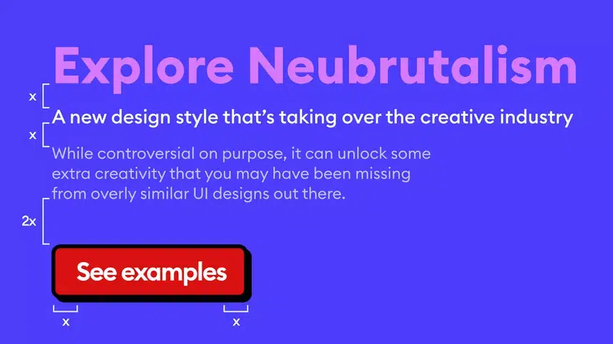
Neubrutalism, or Neobrutalism as some call it, is a mix of the usual brutalism in web design and the more modern minimalist standards of typography, illustration, and animation.
This design trend is great for brands whose products are meant to entertain or try to stand out in the consumer goods space.
Neubrutalism takes the latest website trends to the next level. Even though neobrutalism is an unofficial term nowadays, it’s already talked about in the web design world and it’s an inherent thing, so it’s great to be on the cutting edge!
Considerations when applying trends:
To properly implement trends, it’s important to find a design team that understands advanced UX and user interface (UI).
If done incorrectly, hierarchies can become a problem, and overly chaotic designs can cause anxiety for end users. Due to its unconventional nature, it can cause difficulty finding a way for those who may not be tech-savvy. Calls to action and navigation aren’t always in the obvious place, so this may not be the best choice for an industry like healthcare, where time is of the essence and a quick search could mean saving someone’s life in minutes.
But this design trend is great for brands whose products are meant to entertain or try to stand out in the consumer goods space. It’s also great for an audience interested in art, design, and fashion because of the “shout” to past design trends within that community.
But how does it transfer to the web?
Some forms of brutality have existed in graphic design before, but they often violate most common layout rules, with large blocks of text often invisible. It’s mostly popular in poster design/graphic design but some attempts to use it on the web date back to the late 90s.
Neo brutalism ditches most of that and combines traditional layout concepts with super high contrast, solid, often deliberately clashing colors and simpler but unique typography.
If you want to try this design trend in your work, some things you should include in your design that will make it ‘neubrutalism’ include the following:
Contrast
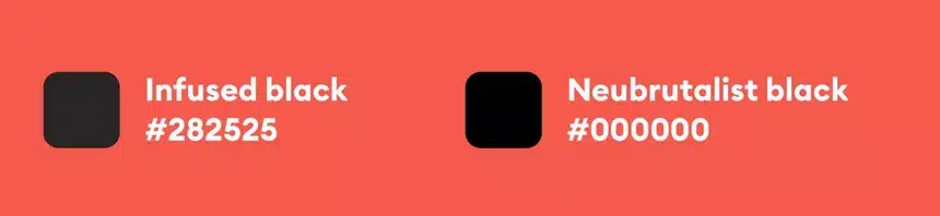
Neo brutalism is not afraid to combine pure black (#000000) with other colors, which is a practice that most other design styles try to avoid.
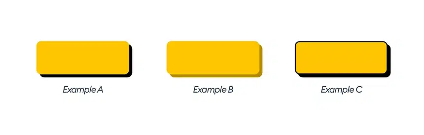
Shadows
The main rule of neubrutalist shadows is to avoid using blur on them. We want them to be as sharp as possible.
Instead of a soft shadow, this applies to the hard black rectangle under the card. Instead of a barely visible border, this applies to bold, dark, and bold lines.
While this is pretty good for accessibility, it also adds a few more objects for our brains to process. I haven’t tested this on multiple users, but I’m sure the design weighs a bit on our brains.
One thing I’ve also noticed is that most of the shadows or fake 3d objects use an isometric view. This is practically always in the form of a 45° angle.
Colors
The color goes in a direction that most other styles find ugly or clashing, such as mixing red with blue or green.
The main difference, however, is that now these colors are also desaturated. They are “in your face” without going overboard with contrast.
Color rarely exceeds 80% saturation
There is a primary color in every case — which serves as the brand color, and often dozens of secondary or accent colors. They often accompany certain sections of a website or app — such as color-coded categories.
Windows
One thing that is also very popular is the use of computer window patterns – either mimic Windows or Mac with minimize, maximize, and close buttons placed on especially distinguished title bars.
Of course, windows don’t have to directly copy OS trends, they can create their own little icons, or remove them completely from the top bar.
However, it is important to only use the concept if it fits the product category. This works for Software, but will definitely not work for most physical products or consumer-facing services. Metaphors won’t work when the product in question doesn’t actually use any “windows”.
Ugly on purpose
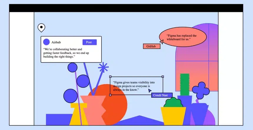
As you can see in this Figma example.
There are three cards visible on this screen and they are intentionally inconsistent. What’s even more striking, though, is that the most distinctive-looking cards also have slightly misaligned buttons. The text in the Post button is too far to the left, and the button itself has also placed a different distance from the right, than from the top.
This way of styling normalizes the ugly and makes them more approachable for beginners — they’ll think “I can do it myself!” and I believe this is the exact reason why some brands choose this style. It’s not threatening and anyone can do it.
Typography
Typography plays a very important role in this style, but it behaves in a much more conservative way.
There is enough spacing, and the fonts are generally quite bold, which fits with the overall typographic trend. The same rules you use in Modern Minimal also apply here.
Illustration
Illustrations in this style usually incorporate colors that wouldn’t really work in a modern minimal — oftentimes they don’t work well together like red and blue, or red and green. The colors are also quite bright, with high contrast and clear edges.
There don’t seem to be any rules here — some lines are thick, some are thinner, and all seem random — adding to the “I can do it myself” attitude too.
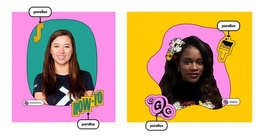
Gumroad also combines a variety of illustration styles with photography, fake 3D, and some great parallax scrolling effects.
These effects, especially parallax, act as a counterbalance to the generally low fidelity of the image itself. Without animation, the attractiveness of this website would be much lower.
If you are still confused about how the visuals are produced by this trend, we will provide several examples of websites that have implemented neutralism on their website pages in the next article.
Source: blog.perficient.com, hype4.academy, webdesign.tutsplus.com


