


Did you know there is one method you can use to make your designs better and more pleasing to the eye? Namely the c.r.a.p method. C.R.A.P is one of the design principles that designers often use to make their designs better, this design principle was created by a non-designer named Robin Williams.
C.R.A.P stands for C=Contrast, R=Repetition, A=Alignment, P=Proximity.
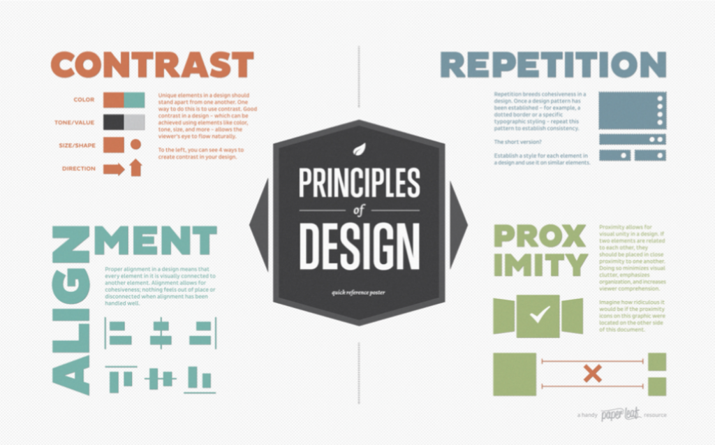
Contrast is the difference in value between the colors in your design. Value is how light or dark the color (ink) is. The contrast in design means a stark difference. This means that each design element must be ‘differentiated’ from the others.
Using contrast can be by using design elements such as colors, patterns, sizes, or shapes that can be different.
Contrast function:
Good contrast in your designs goes hand in hand with your color choices.
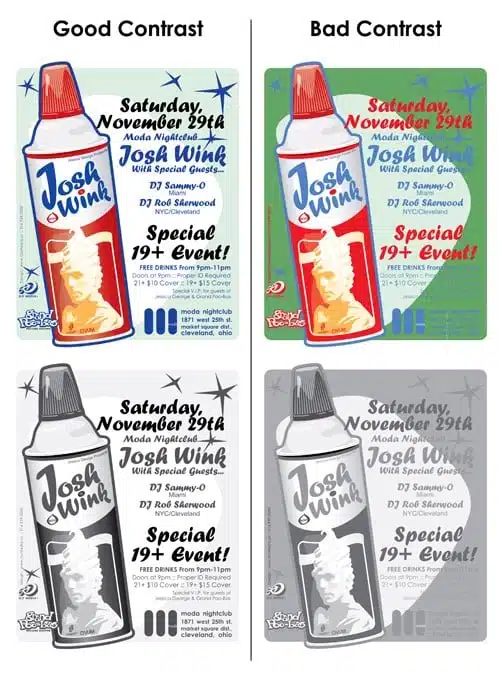
If you’re creating a design, one easy way to define contrast is to add a black-and-white filter to your design. If it is difficult to read in black-and-white mode, the contrast is still poor, as in the example above.
You can clearly see how much easier it is to read the text in the design on the left, especially when it’s grayscaled. The design on the right uses less contrast and more color difference to define shapes.
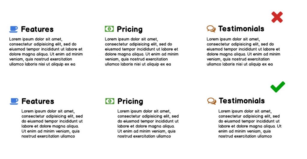
Repetition here means how we repeat the same elements in the designs that we make. For example, we must consistently use the same color, font type, or pattern on each design element that we make. The point is that in every design we make, it must be consistent — don’t vary.
By repeating on-screen design elements such as titles, layouts, color schemes, and so on, we can give users a visual cue that they are still on the same product or design.
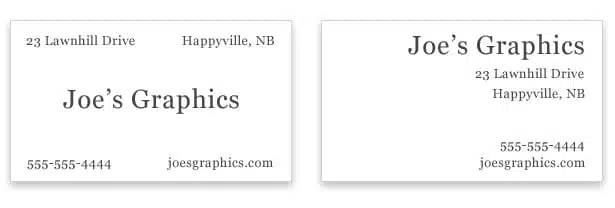
Alignment determines how each element is placed in the design.
By using this alignment, our designs will look neater and easier to read or understand by users.
By using alignment, there should be no elements in the design that are positioned arbitrarily. Each element is visually connected to other elements, The two basic types of alignment are edge alignment and center alignment.
Alignment is one of the things that come together when working with grid systems. The subject of alignment isn’t just a matter of choosing whether you want to align text or images to the left or right of the design (though that decision obviously still matters), on the contrary, we use alignment to improve our designs. Proper alignment in your design will make it more visually appealing and will also make it easier for users to scan the page, subconsciously offering a quieter reading experience.
All elements in your design should be aligned in some way, whether this is just plain text on your page, images mixed in the text (or even header images or heroes), videos, buttons and calls to action, links (in text or in modules like navigation section) or any other element you may have.
Grids will help you solve alignment or decision problems in your designs, but what we need to focus on here is how different elements, groups of elements, or specific modules in your design work together. I’ve emphasized from the outset the importance of a cohesive user experience, and getting the alignment right is one of the most important things that can help improve the user experience.
Alignment also allows us to make conscious decisions about where elements are placed and how they interact with each other. Creating good alignment bridges the visual gaps between each element in your design, helping us to create relationships between the elements we have. Otherwise, we’ll have a design that has blocks of text and images all over the place, making no sense without structure.
Proximity here means how the relationship between the components of a design must provide visual unity so that it can show consistency between layouts. If there are two elements that are related, they should be placed close together. Thinking about the right proximity, will avoid design confusion and will certainly make it easier for users to understand our design.
By using the right proximity, the information that will be read by the user becomes easier to understand.
This C.R.A.P is just one of the design principles that we can use to make it easier for us to make better designs, remember there is no right or wrong in designing something.
Keep practicing your skills and be consistent in making your designs.
Source: webdesign.tutsplus.com, medium.com, gomedia.com, www.webdesignerdepot.com