Minimalist design uses only one or two colors that are not too many layers or patterns so that the elements displayed do not disturb the eyes of the reader and easily convey the message. Minimalism can make your website look smart, intelligent, modern, effortless, and capable of achieving much more with less. Therefore, here are 4 important things in a minimalist web design.
1. Negative Space
Use negative space to draw attention to the element you want to convey. Space is also a place for elements so that they do not lie in their own places so that the eye is directly focused on the elements to be conveyed and provides a balance between elements so that they are easily accessible. Like text that is shorter and separate is easier to read than text that is too long and piled up in one place.
2. Visuals
Large visuals and contrasts support and build upon a minimalist design. For a minimalist website, striking, original visuals of high quality create appeal. Unique visuals can also be used for site backgrounds with brightly colored spaces so that they attract attention.
3. Typography
Each typography has its own style, size of spacing, and attributes. The use of the right typography can affect the visuals of your website and have an impact on the reaction of readers. Apart from being very eye-catching, good typography also makes navigation and understanding easier. Choosing the right font can improve readability by creating a clear hierarchy of your messages, which helps users enjoy their experience.
4. Colors
The color spectrum used in minimalist designs is usually neutral-pastel and primary-neon. Color also gives the reader an emotional attachment to your web design so that readers can understand the intent and message conveyed. The right color is also able to bind the reader personally with the website.
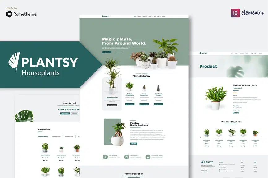
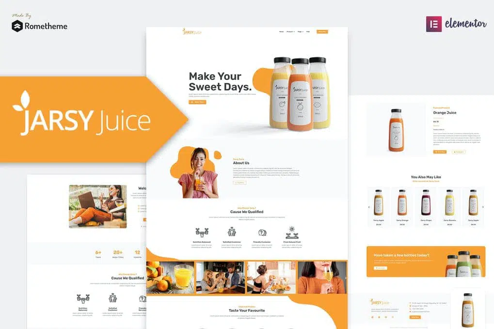
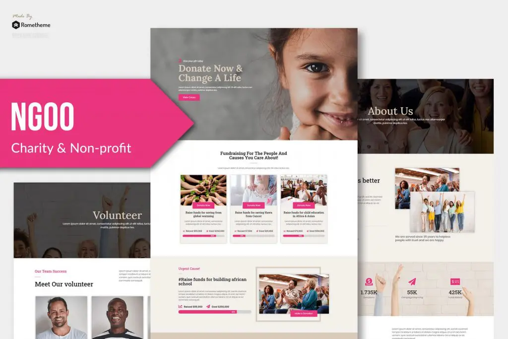
Here’s a minimalist web design recommendation from Rometheme :
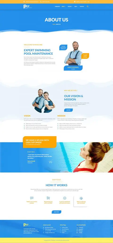
Source: 99design.com

