

A website has an average lifespan of 3 years to update. Design elements such as colors and typography are updated frequently even more so that the website is not out of date. It is very possible to make small changes to follow the existing design trends.
In this article, we help you to make a design change plan for 2022 by combining some of the existing trends.
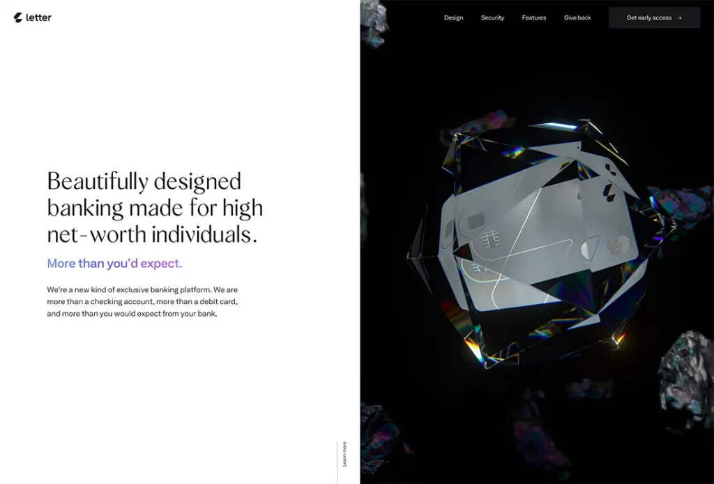
If you don’t have the perfect image or video or you’re just not in the mood for it, this design trend focuses on pairs and stunning typography sets to help push designs forward. With just a text element and maybe some color blocking in the hero area, this project focuses on what people need to take immediately from the design.
A beautiful combination of font styles and a secondary typeface to bring it all together is essential to making this trend a success. Everything should be very readable and the typography should have a distinct flair without being overwhelming.
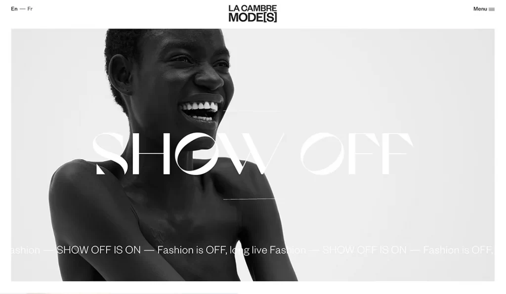
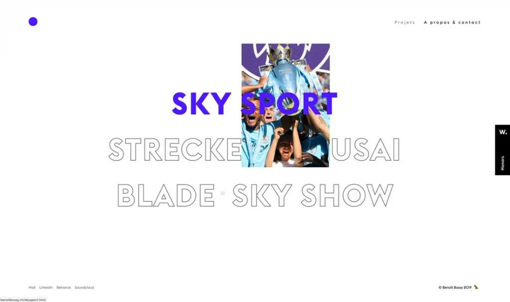
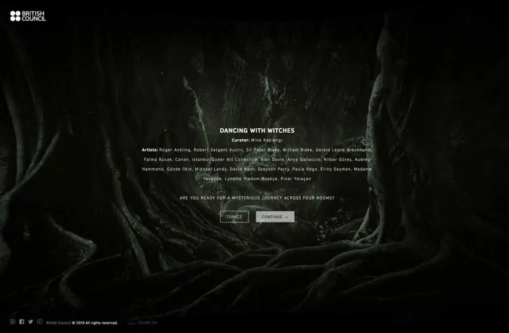
A cinema-style homepage featuring full-screen video stories and little else could be your go-to design for 2022.
This design style makes users feel like they are part of the video and immersed in the scene. Therefore, the text element to the navigation element is minimized and placed in the corner of the screen to make room for the video so that the user focuses on the video being displayed.
Here’s another thing these projects have in common: They also use cinema-style effects, such as slow-motion (as seen above), vignettes, or other effects that often feel unique to videos or films.
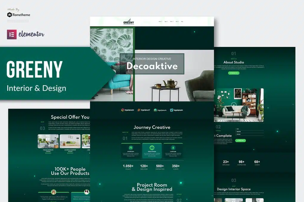
If your design has a lot of content or even very few elements, you can use this block or grid pattern to help bring it all together.
The nice thing about this trend is that it can take on so many different options, from minimal block styles with text (above) to more complex grids of images that bring together visual elements.
You have to be careful. To take advantage of this trend, think about how blocks or grids can be put together and help organize information. Use design to create additional click elements, entry points, or how website visitors interact.
The ability to switch between dark mode and light mode is a feature you may not have ordered. Users love being able to control the visual base of a website or app, and most allow their phones. upgrading to your website only improves that user experience.
Keep in mind that in light and dark mode, simply switching from black to white or vice versa is not enough. Your design schematic should contain a palette for the second mode.
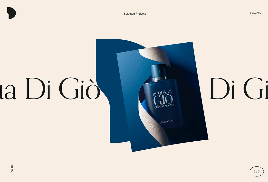
Split-screen design is a growing trend. What’s great about modern split screens is that they provide more interactivity and encourage engagement. The example below is a great display of how to use this design aesthetic with lots of interactive elements that have video-esque and three-dimensional elements.
The trick to making this trend work is to make it your own. Split screens can provide users with this-or-that interaction option or just provide a bit of visual balance between text and image elements.
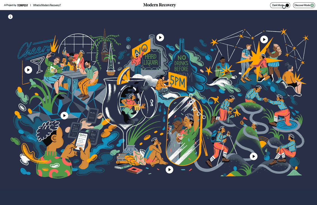
Sometimes what makes a design interesting is what you can’t see. This trend is best suited to simple elements that are easy to understand because it encourages website visitors to actually look at the design and think about what they see and what it means. On the other hand, if too many messages occur, they can be lost.
Off-screen element trends play up this idea with moving graphics, text, or other elements that seem to move right off the screen. Gestures can occur on or as a result of hover or scroll interactions.
New, different, funky, and quirky typography can push design to the next level. With more projects using visual patterns with a focus on typography, experimental typography is a must-have design tool.
The main characteristic of experimental typography is that they are different. Some may even be unfinished designs that typists put out earlier or can be custom-made.
You may see shapes and lines that you didn’t expect, three-dimensional fonts, animations or colors, and very different shades. Experimental fonts work best for large homepages, hero headlines. They are not often suitable for body text or smaller blocks of copy.
Each design element doesn’t have to have its own container. They can actually overlap. Overlapping design elements create depth and dimension and provide an eye-tracking path from one element to the next in a design project.
Here’s the catch to this design trend: You have to create and layer elements in such a way that they remain readable and “collapse” in a way that maintains that readability on mobile devices. Otherwise, this trend could fall off quickly.
A clean homepage can help encourage users to explore other designs. The super minimalistic aesthetic, especially for the veranda, is a trending style.
Options range from a flat background with text, like the example shown above, to a photo or video homepage with almost no navigation and just a title.
This super minimal aesthetic removes almost everything from the design. The trendy look is sleek and clean but you’re taking a risk with so few interactive options.
The combination of filled and outline typography (often in the same typeface) has full effect. This trend features a typographic duo with and without interactive features.
The website above, for example, uses filled text as a hover state to signal to the user that the element is clickable. The outline state is for non-hover elements.
The result is very interesting and creates a fun typographic effect that you can use in many different ways. Plus, it makes installing fonts easy because you use one font in two different ways.
Serif typography – once considered “unreadable” on the web – is popping up everywhere. From simple short serifs to complex letters with longer strokes and tails, this type is designed to be read.
The biggest contributor to this trend is probably high-resolution screens (and their dominance in the market). There is no blur or distortion with this typography.
Serifs from almost any style can work beautifully, including modern styles and transitions to slabs. Serif is appropriate for display text as well as body copy.
The minimal style becomes increasingly minimal with excessive white space in the design. One of the reasons white space is so popular is because it can help bring focus to a specific part of a design – the space that is occupied by something, rather than nothing.
White space also has a beautifully classic feel that is easy to adapt to any number of projects.
Thanks to all the cool little gifs in Instagram stories, the website features even more micro-animations in the form of sticker-style gifs.
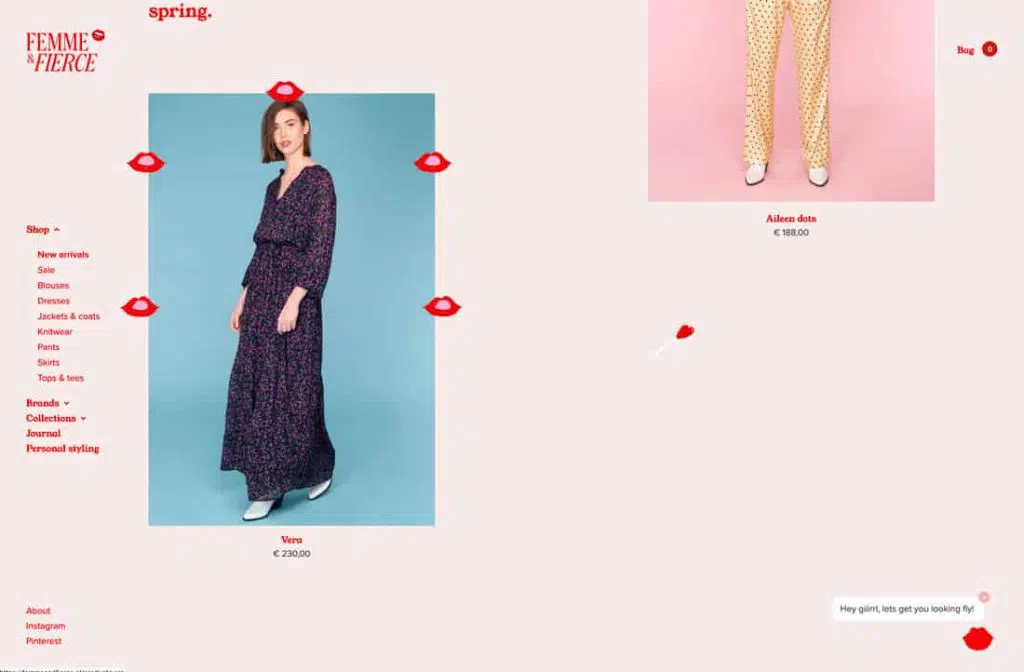
Even websites you wouldn’t expect, like the e-commerce design above, use this style to grab the user’s attention. It can be anything from a small image that appears on the screen to a moving text element.
If you haven’t used video in a website design project, this is the year it might be. The video content is huge. And it becomes more accessible all the time.
From the moving backdrop above to video stories that are design-driven content, this type of storytelling is the wave of the future. Users love it. There’s no denying that. And for that reason, its popularity will continue to increase.
The simple, streamlined logo design replaces some of the more complex options that served as full-screen branding elements in the past. Maybe it’s because other screen elements are getting more complicated or maybe it’s just a fad. Either way, simple logos are everywhere.
The nice thing about this logo is that the icon types and elements are simple and easy to read at a glance. The only caveat is that they all seem to have the same look and feel.
To make it easier for mobile users, large buttons in a thumb-friendly style are also the default for all versions of the website. This includes everything from calls to action to navigation.
Everything should be easy to tap with your thumb or finger without interacting with the wrong elements.
These buttons often come in different colors or card styles to make it easier to see what action should occur and what element will do something with a touch.
Notice in the example above that each square or card is a giant button. And in the mobile version, each card falls into a vertical pile.
We see a lot of websites moving beyond the standard website text model + some still images. Instead, web designers are enthusiastically embracing 3D design, animation, AR, VR, and large-scale video and imagery, along with interactive features, to make their websites more engaging and entertaining.
Make your design plan for 2022 so that your design stays up to date with trends and doesn’t go out of style!
Source : designshack.net & creativeboom.com