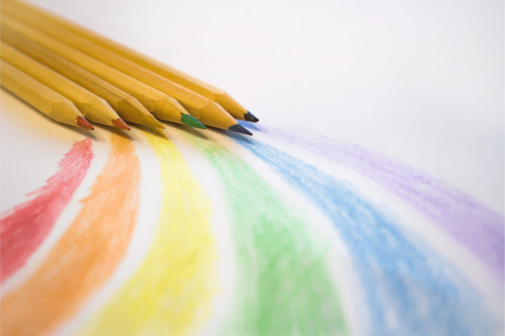
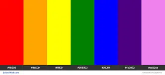
Like the arrangement of the rainbow we know, this color consists of red, yellow, green, blue, and purple.
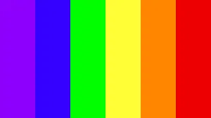
It’s perfect for summer branding projects or vintage illustrations.
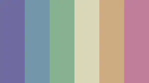
This palette is a soft and subtle rainbow scheme. These colors look especially effective when blended into a gradient design, and can give a dream-like effect to packaging, stationery, or social media posts.
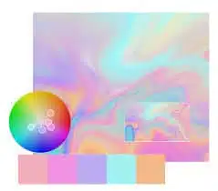
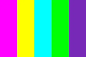
This palette is inspired by the TV-friendly colors that characterized the 1980s style.
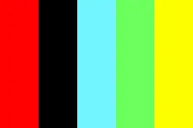
This sunset-inspired mix combines cool and warm tones, but the colors are deeper and richer.
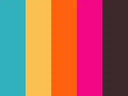
A rainbow of pastel tones combines a plain, nostalgic atmosphere with the upbeat personality of a colorful palette.
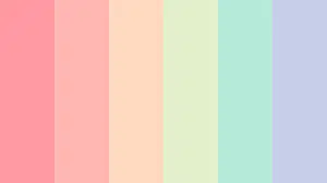
This palette will make a cheerful scheme for any tourism business, cafe, or holiday.
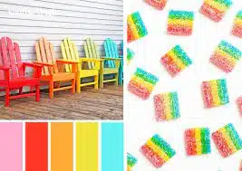
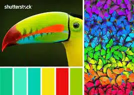
The tropical rainbow scheme incorporates more tones of green and jade, with sharp bursts of yellow and red, mimicking the vibrant colors of a bird of paradise. This palette is perfect for summer and soothing.
