

Layout is a tricky design aspect for a designer, especially a website designer who must be able to make the layout of the website look comfortable in the eyes of visitors. Sometimes a designer can create an amazing layout in minutes and sometimes that same designer struggles all day with the same task.
We provide the following 10 layouts so that you can help a little to avoid the difficulty of finding ways to organize your website content.
Sometimes many website designers choose examples of pages that come from strange sites that violate the rules, but keep in mind, that the majority of visitors are not designers, they are just visitors who are looking for their purpose through your site, the clients who use your services also just want something that they can use. used clean and professional, keep it simple.
If you are a web designer, bookmark this page and come back when you have difficulty organizing the page. Keep in mind that each of the following layouts represents basic suggestions for you to print and modify. I encourage you not to use it as is, but use it yourself based on your project needs.
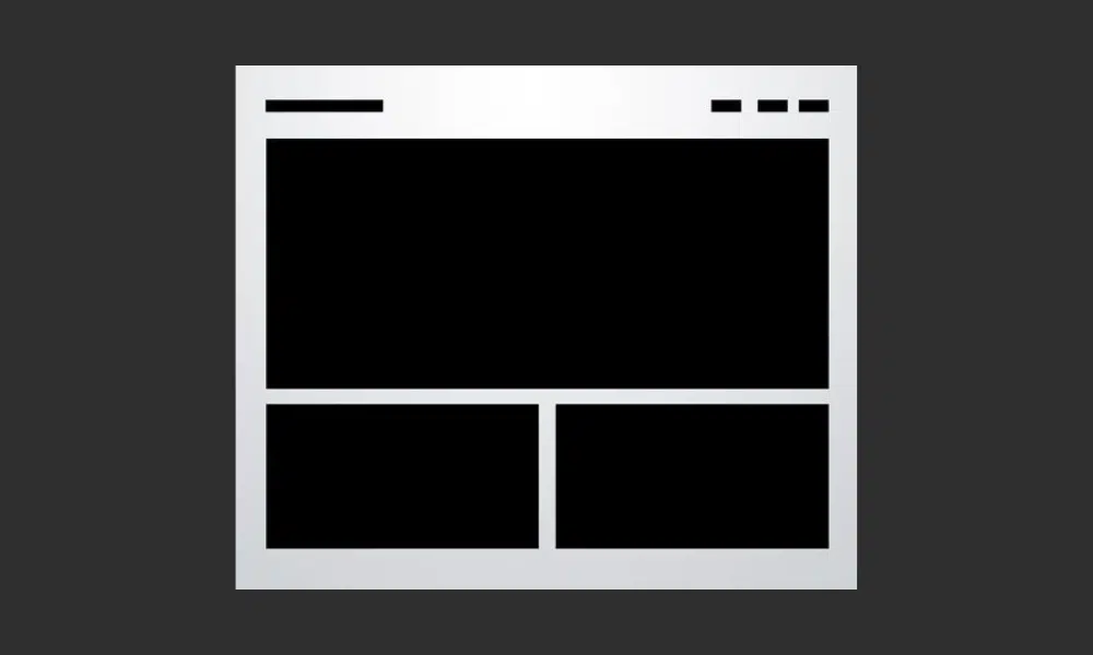
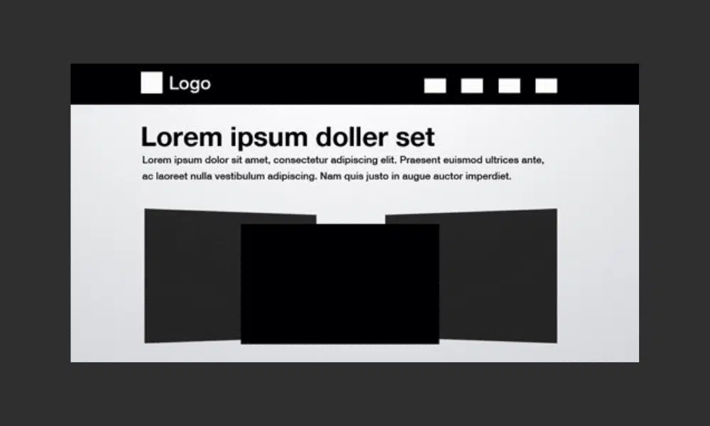
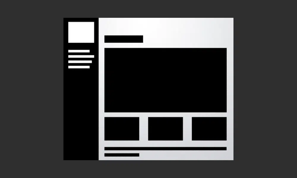
The three-box layout features one main graphic area followed by two smaller boxes beneath it. Each can be filled with graphics, blocks of text, or a mix of both. The main box in this layout is often a jQuery slider, capable of displaying as much content as you want!
The silhouette shape at the top is an area that can be used for logos, company names, navigation, search bars, and other informational and functional content typically found on websites.
This design is ideal for portfolio pages or anything that needs to show off some graphic examples. Each image can be a link leading to a larger, more complex gallery page.
As developers continue to create an endless collection of web applications, 3D screenshot layouts, or some of their variants, are becoming increasingly popular. The basic idea is to place your page at the top with a title and then include some stylish previews of your app. These often come with reflections, heavy shadows, large background graphics, or even elaborate decorations like vines crawling all over the screenshot, but the core idea is always very simple.
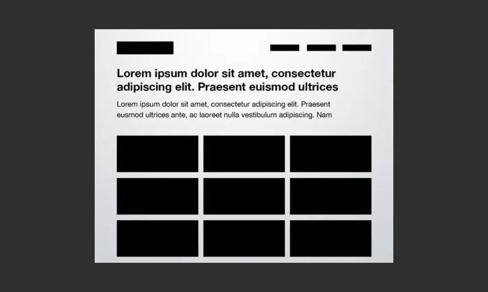
Many of the layouts you’ll see in this article follow fairly strict grid alignment. However, for the most part, they don’t just suggest a page full of uniform thumbnails. For example, the layout below mixes image sizes to avoid redundancy.
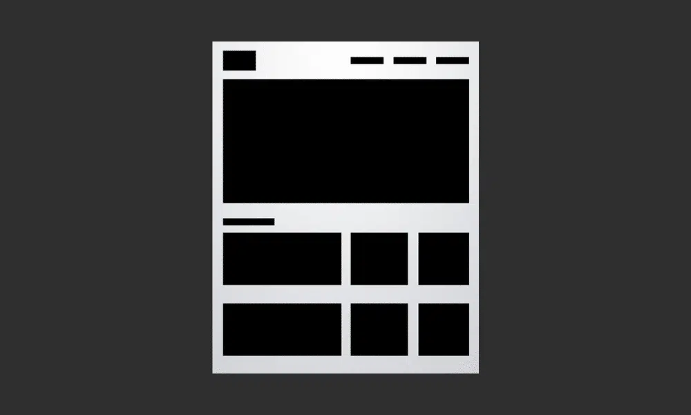
Like the three-box example, there is one main image leading to the top of the page. This was followed by a simple change to the idea of a uniform thumbnail grid. The space would allow for a span of four squares horizontally, but instead, we combined the first two areas so that the left half of the page is different from the right.
As we mentioned in the first layout, blocks do not have to be images. For example, you can imagine this as a block of text on the left flanking a square image on the right.
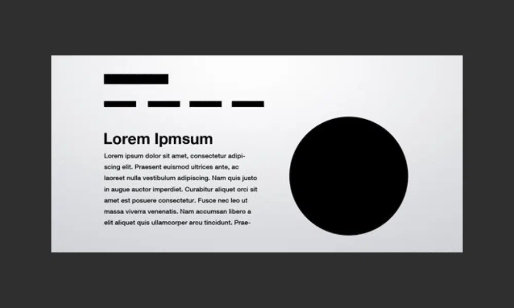
Sometimes you don’t have enough content for a full page of images. So what do you do if you want to display a single icon, photo, or even a symbol like an ampersand? The layout below is a super easy solution that is quite popular and easy to read due to the lack of distractions.
The result is a page that is bold, yet minimalist and clean. The statement it makes is powerful and impossible to miss, just make sure your graphic is good enough to display prominently!
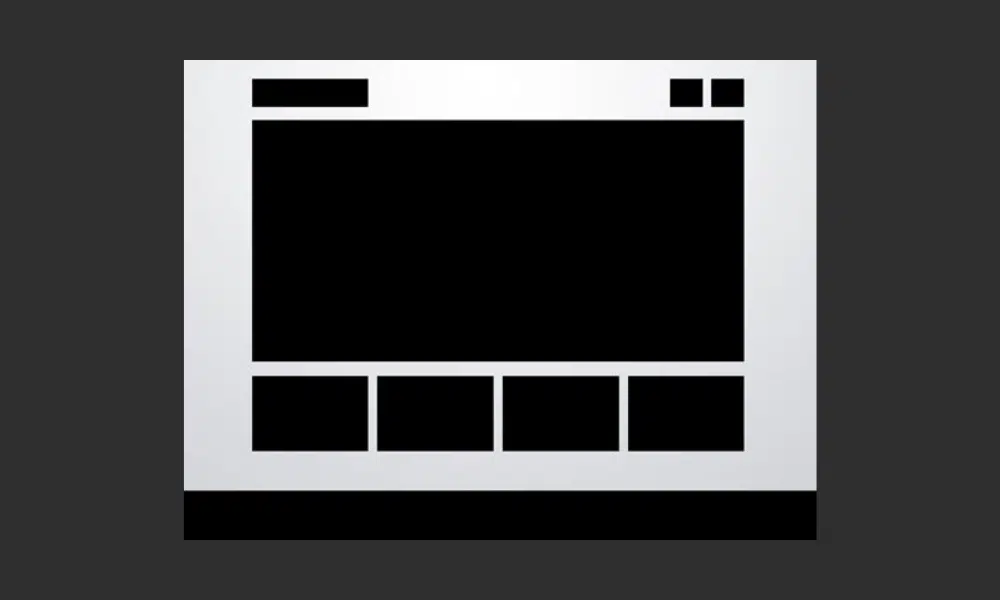
The five-box layout can be said to be the result of the evolution of the three-box layout. The rules are the same, except that you include more content, but secondary items will appear smaller compared to when using a three-box layout. You can also use four squares, but five seems to be the limit.
Just like the three-box layout, this layout is so versatile that it can be used on almost any type of site. Ideas for modifications include adding large background graphics, rounding corners, adding shadows and/or reflections, or perhaps even adding interactive elements to smaller thumbnails. You can easily add a button that causes it to rotate horizontally.
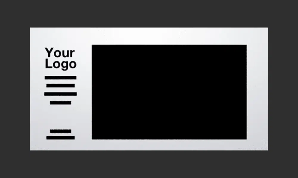
So far all the sites we’ve looked at have horizontal navigation on the top side. Another popular choice is of course vertical navigation, which is great for creating a strong vertical column on the left side of the page. Often these are fixed elements that stay in place while the rest of the page scrolls. The reason is to keep navigation easily accessible from any point on the site.
The rest of the content can be borrowed from any of the other layouts on this list. In the example in this article by Designshack, they have modified the three-box layout again, this time in a four-box layout. After you finish reading this article, look back at all the layouts and think about how you can mix and match ideas to create new layouts.
Everyone loves a good gallery page. From a layout point of view, what could be simpler? All you need is a solid, uniform grid of images and space for a title with optional sub-headings. The key here is to make your title big and bold. Feel free to use this as a point of creativity and include crazy scripts or typefaces.
This example uses a squeezed rectangle to reflect the actual site below, but this can and should be modified to fit whatever you’re showcasing. The point here is to get you to think outside the box and not use squares by default, maybe you could use vertical rectangles or even circles in your own galleries!
The layout below is extremely common, especially among the photography community. The basic idea here is to have a large image displaying either your design or photography (anything really), accompanied by a left-side vertical navigation.
The power grid is the most complicated layout in this article, but it is one of the most effective layouts I’ve seen for pages that need to contain all kinds of related content. From images and music players to text and videos, you can cram anything into this layout and it will still be strong.
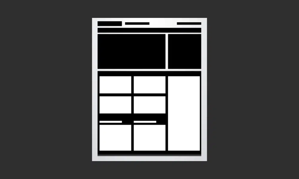
The key is located at the bottom of the preview above. Notice that there is actually a large container holding a series of rectangles. These containers give you space limitations, and all the content you place inside them should be formatted in a strong but varied grid, unlike the advanced grid layout at the beginning of this article.
The final layout on the list is another that is ideally suited for photographers but will work on any site with a big, attractive background graphic to display and a limited amount of content.
It can be really hard to read content when it is laid over a background image, so the basic idea here is to create an opaque (or nearly opaque) horizontal bar that sits on top of the image and serves as a container for links, copy, logos, and other content.
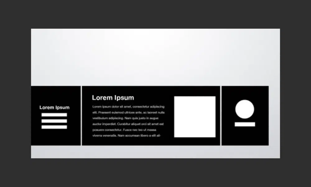
Rather than using the bar as one really wide content area, try splitting it into a few different sections. This can be done by varying the background color, adding some subtle vertical lines as dividers, or even actually breaking the big box into smaller disconnected boxes as I’ve done above.
The key to successful implementation of these ideas is to remember that they are not made up. Each should be tweaked to suit your specific project and can even be mixed and matched to create new ideas.
Furthermore, the layout ideas presented above also don’t necessarily result in cookie-cutter websites that all look the same, but rather just give you a basic canvas to build a truly unique final design.
Source: 10 Rock Solid Website Layout Examples by Designshack
Visit our website to browse our stuff and follow our Instagram for great content!
Website: www.rometheme.net
Instagram: rometheme_studio