If you are going to create a header from a website, make sure the following elements are included.
Logo
The logo design stands out beautifully from the rest of the header with its bright colors and high character. And because the logo is sized just right for the space, it doesn’t overwhelm other elements or force the header to take up excess white space.

Navigation Links
Navigation should improve your visitor’s understanding of what’s on the site as well as how each page relates to one another. If they can easily get a glimpse of what’s going on, they’ll feel more confident when exploring what’s out there.
Depending on the size of your website, you will have to decide how much and what type of navigation you need. There’s the primary navigation, like the one you see here in Dollar Shave Club’s header:

But notice that DSC also has a hamburger menu on the left. Here’s what visitors find under this secondary navigation:

The links above the line are more or less the same as what’s in the primary navigation, but this time they include second-level links.
The links below the line allow DSC to make all of the other pages accessible from the navigation without cluttering them up. What’s more, by placing them under the hamburger icon, users don’t have to scroll to the footer to find useful pages like Contact Us, Careers, and FAQ.
CTA
Every website has a single action or goal that directs visitors to it. While a website will include an attractive call-to-action throughout its pages, it’s a good idea to keep the CTA in mind for visitors by putting it in the header as well.

The CTA should be designed like the one on the site. If you use Elementor’s Global Site Settings to define your global button design, that will apply here too.
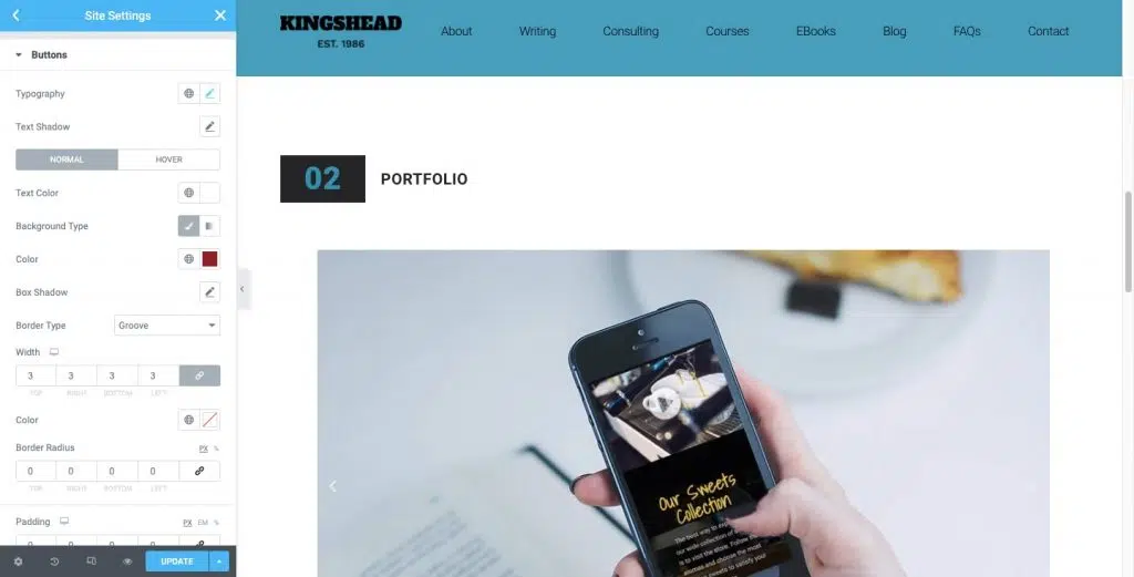
Your CTA should also be placed at the far right of the header. These eye-catching links will not only bring visual balance to the header but also serve as useful shortcuts for conversions.
This is explained by the design principle of the Serial Position Effect, which says that people remember the first and last items in a series more than others. So when they’re ready to convert, they don’t have to hunt down the CTA within the site’s content. They’ll know they can go straight to the header to do it.
Search Bar
Websites with very large content archives or product inventories will greatly benefit from having a search bar in the header.
There are a few things to note here.
The first is that the search bar is not only represented by a magnifying glass. It is paired with the word “Search”. While this may be a fairly recognizable icon for many, it’s best not to assume that everyone knows what it is. It may also be too small on its own for people to easily find it.

Also, notice how Mashable doesn’t push users to a new page to do their search. The search bar automatically populates the results based on the query, which can lead to a better user experience.
Ecommerce
Websites with ecommerce functionality should always have an ecommerce element in their main header or utility bar. Here’s how Sephora does it:

There are three ecommerce elements in the far right corner:
- Login/Account (persona icon)
- Wish List (heart icon)
- Basket (shopping bag icon)
Oftentimes, these ecommerce links are simply represented by icons. However, if you’re not sure if the icon you’re designing is easy to spot or if it would benefit from pairing it with a label, test A/B.
Source: elementor.com

