Many of us see website headers as a way to help us achieve our goals. Like their use, headers are very important for a website because they make navigation easy, showcase the brand, and present a CTA.
One other important reason is that our eyes are naturally drawn to the very top of the page. It’s like watching a movie or reading a newspaper article. You want to start at the story’s beginning, not in the middle.
there’s a lot you can tell about a website from its header. You will find his branding there. You will get a high-level overview of the content. You may also find calls to action and additional company info.
Of course, you want to maximize the usability of your website according to your wishes.
For starters, you don’t want to use the basic header design provided by your WordPress theme or template. This is a good starting point, but there’s a lot to think about in terms of what to include, how to put it in place, and how to design it for ultimate usability.
Before you start, know what a website header is and the types of web headers.
What is a Website Header?
A website header is the top part of a website where the logo, navigation, and sometimes other information, links, and buttons are located.
The header is a valuable part of every website as it:
- Serves as the home for the brand’s logo (and might be the only place where visitors encounter it)
- Offers visitors a first impression of the website
- Works as a table of contents for the site
- Makes it easy to explore the site with one click or search query
- Includes quick-action buttons for people who are ready to take the next step
- Offers additional info related to the company, how to contact it, and more
While headers serve the same purpose from site to site, there are different types of headers you can create. It all depends on the type of website you are creating, the style of the brand, and how much information you want to store there.
Types of Website Headers
1. Single-Line Header With Left-Aligned Logo
The logo is on the far left of the screen and the navigation menu, e-commerce icons, and CTAs are on the far right.

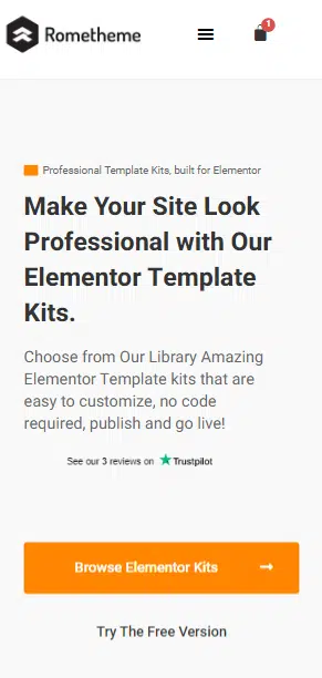
2. Mobile-Optimized Header With Hamburger Menu
Again, the logo is on the far left. In this case, however, the navigation and other links are tucked under the hamburger icon.
3. Desktop/Mobile Hybrid Header
Looks like a typical one-line header. However, the hamburger menu icon stores additional navigation links for desktop visitors.

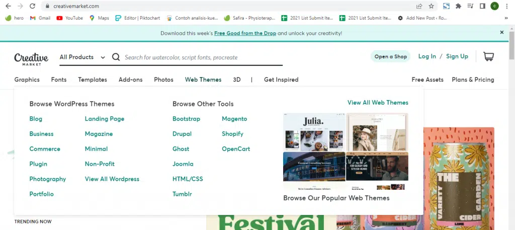
4. Header With Mega Menu
Websites with a lot of content don’t always get to choose which category or page goes into the header.
Like the Creative Market website provides various categories of menu options that they display.
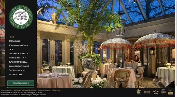
5. Left-Aligned Vertical Header
This vertical header design tends to be a popular choice on websites for hospitality and other service-based businesses.
6. Header With a Utility Bar
This is useful for companies that want to provide the location, contacts, accessibility, social media, and other company info or links that don’t easily get to the main menu.

7. Header With a Notification Bar
While the promotion bar can appear below the header, it’s more common to place it at the top and make it closeable with an “X” in the right corner.

8. Header With Multi-Site Navigation
Websites that are part of a family of sites — which are common in retail — can add an additional bar above the header with quick links to their other stores.

Decide what type of header you want to use on your website. That way visitors will be more comfortable browsing your website and reach their destination quickly.
Source: elementor.com

