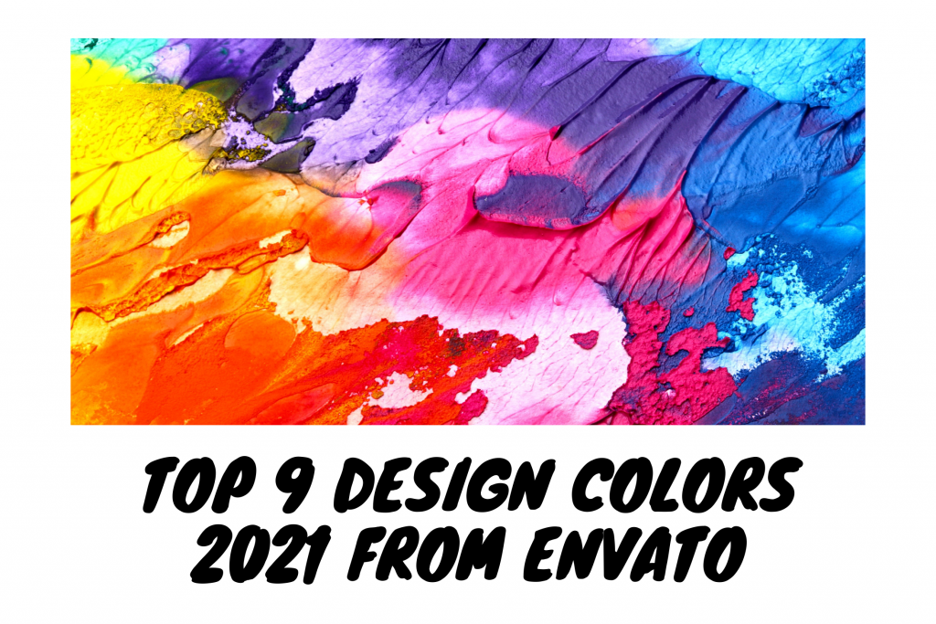
Each color has a meaning that can affect emotions, thoughts and feelings which is commonly called color psychology. Color psychology also studies how color affects how we perceive the world around us. Color can have a powerful effect on our emotions, as well as consumer behavior. Therefore, before making a design, you should understand the psychology of colors. Here are the top 9 design colors for 2021 according to Envato.
1. Red
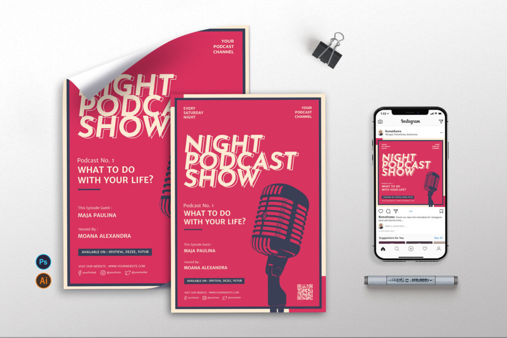
Red hints at passion, romance and danger, and its ability to attract attention is the reason why it is often used in signage, branding, and even to warn people of impending risk or danger. Red is also associated with excitement, passion, impulsivity and spontaneity. This is why red is fantastic for sales, limited-time offers, or countdowns – it pumps blood and inspires action. The effect of super stimulating color on the soul isn’t subtle, so if you want to integrate it into your design or brand, it’s important to be discreet and aware of how you use it.
Positive associations :
- Power
- Passion
- Energy
- Fearlessness
- Strength
- Excitement
Negative associations :
- Anger
- Danger
- Warning
- Defiance
- Aggression
- Pain
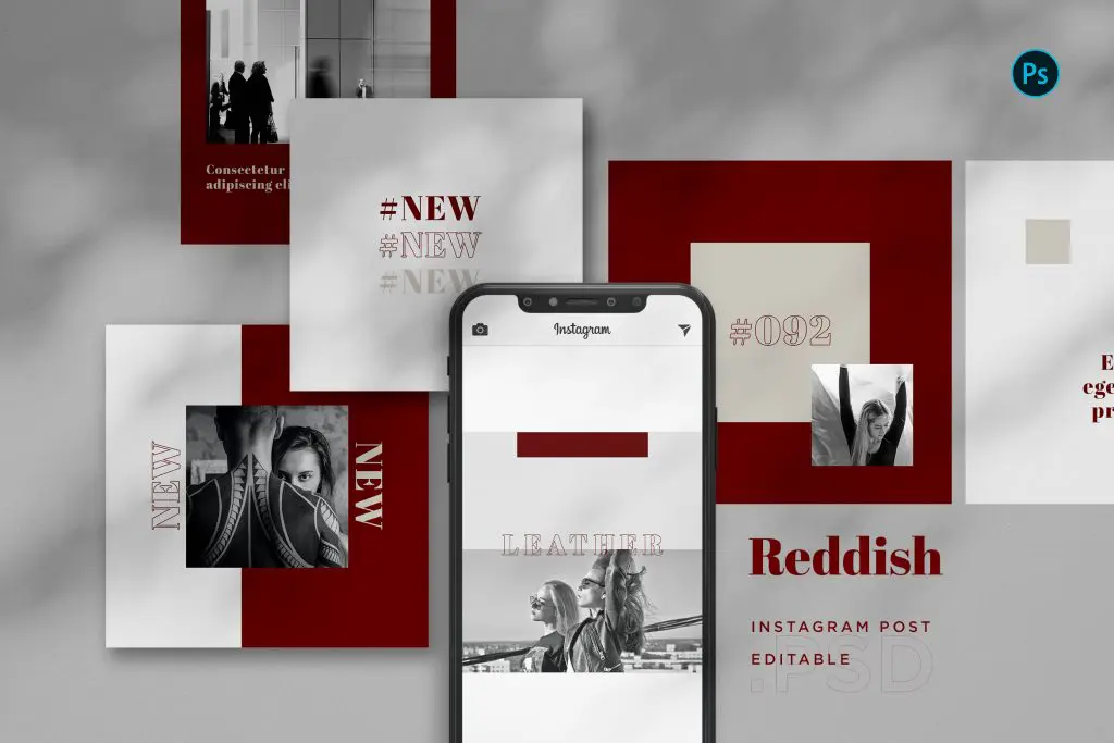
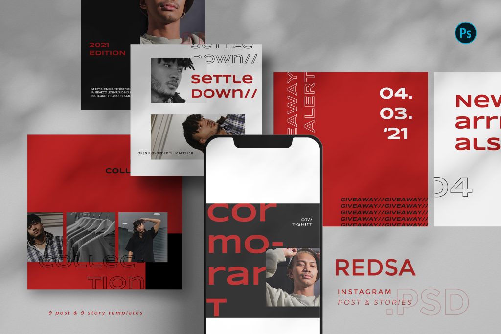
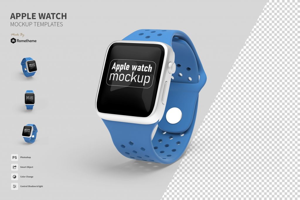
Recommendation from rometheme :

2. Blue
According to color studies, blue is the most common favorite color among the world’s population. It is the color of the sky, ocean and is associated with clarity and communication. In fact, people are found to be more productive, calm, and focused when working in a blue room. Many successful brands such as Facebook and American Express have chosen blue as the cornerstone of their visual identity, as it is considered a sign of stability and reliability.
Positive associations :
- Trust
- Loyalty
- Dependability
- Logic
- Serenity
- Security
Negative associations :
- Coldness
- Aloofness
- Emotionless
- Unfriendliness
- Uncaring
- Unappetizing
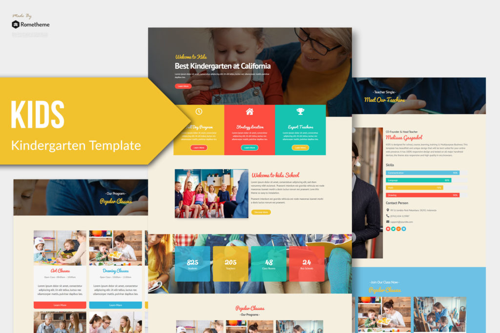
Recommendation from rometheme :

3. Yellow
One of Pantone’s Colors of the Year for 2021, yellow is a happy and hopeful hue. The color of sunflowers, citrus fruits and sunshine, it sparks hope, creativity and new ideas. Being the lightest color on the spectrum, yellow is uplifting and enlightening, and evokes feelings of joy and pleasure. However, too much yellow can also trigger anger, frustration, and anxiety. Due to the fact that it has one of the longest wavelengths on the spectrum, it is one of the most difficult colors to accept. But, when used properly, yellow is the perfect color to lift your mood and lift your self-esteem. As the most visible color, it stimulates and attracts attention.
Positive associations :
- Optimism
- Warmth
- Happiness
- Creativity
- Intellect
- Extraversion
Negative associations :
- Irrationality
- Fear
- Caution
- Anxiety
- Frustration
- Cowardice
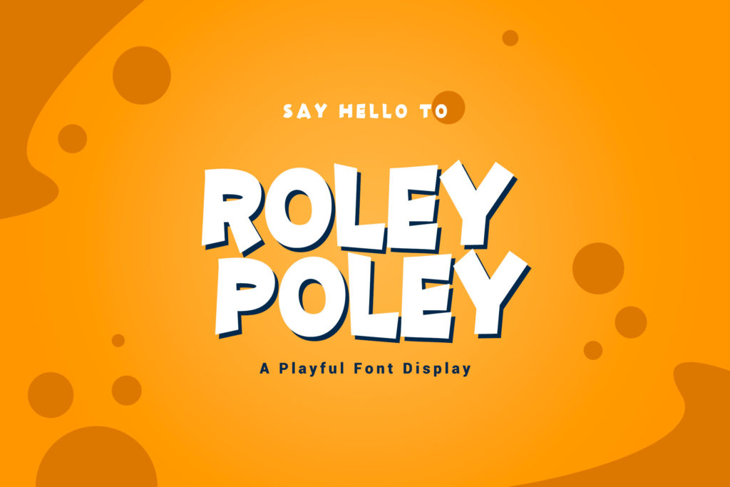
Recommendation from rometheme :
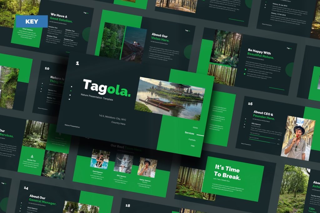
4. Green
Green is the color of balance. Representing nature, health and freshness, like blue, green is considered calming. Green is also the easiest color on our eyes because it requires no adjustment when it hits the retina. In fact, green can actually improve vision, and is used in night vision because our eyes can distinguish most colors. Green is often used in branding because of its calming and reassuring effect.
Positive associations :
- Health
- Hope
- Freshness
- Nature
- Growth
- Prosperity
Negative associations :
- Boredom
- Stagnation
- Envy
- Blandness
- Enervation
- Sickness
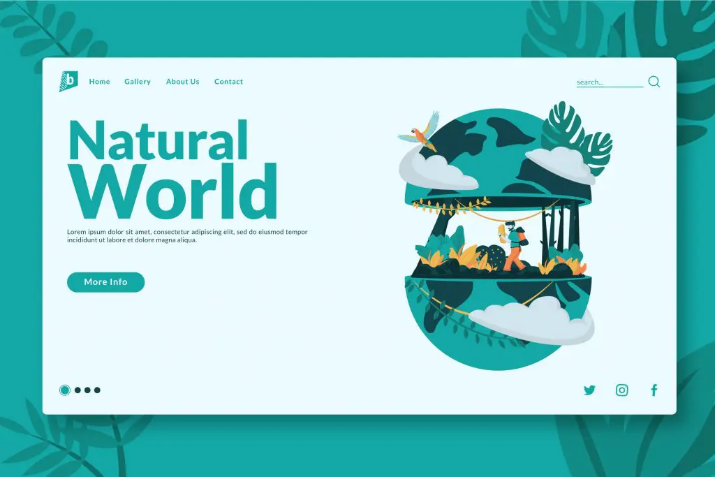
Recommendation from rometheme :


5. Pink
A color associated with love and romance, pink usually represents traditionally feminine attributes such as tenderness, kindness, and affection. In addition to emotional depth and compassion, pink is associated with support, encouraging the birth of new thoughts and ideas. For branding, the color pink is currently a trend. Millennial Pink – as first labeled in mid-2016 – has been used everywhere from Instagram posts and Tumblr pages to branding and catwalks, and Pastel Pink can give any design a youthful, fresh feel.
Positive associations :
- Imaginative
- Passion
- Feminine
- Creative
- Innovation
- Balance
- Trendy
Negative associations :
- Flippancy
- Childish
- Raw
- Impulsive
- Eccentric
- Ephemeral
Recommendation from rometheme :

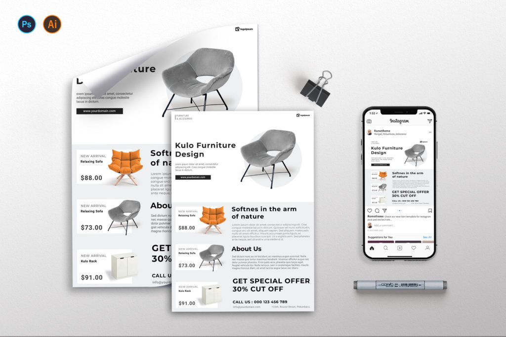
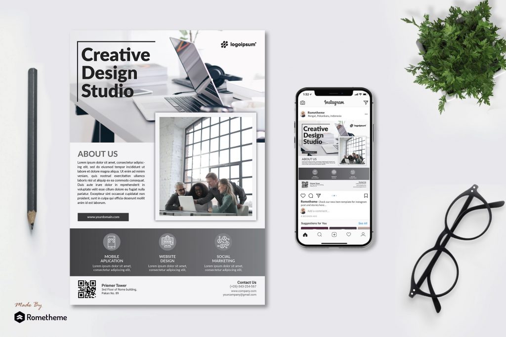
6. White
The color white has long been a symbol of purity and innocence. When used incorrectly, white can bring to mind feelings of sterile, cold, empty, and isolated. However, recently it has taken in the minimalist movement to represent simplicity and sophistication. Leveraged by brands like Apple to evoke chic and sleek styles, white is the most modern and minimal of colors, and is great for creating space in a design.
Positive associations :
- Cleanness
- Clarity
- Purity
- Simplicity
- Sophistication
- Freshness
Negative associations :
- Sterility
- Coldness
- Unfriendliness
- Elitism
- Isolation
- Emptiness
Recommendation from rometheme :

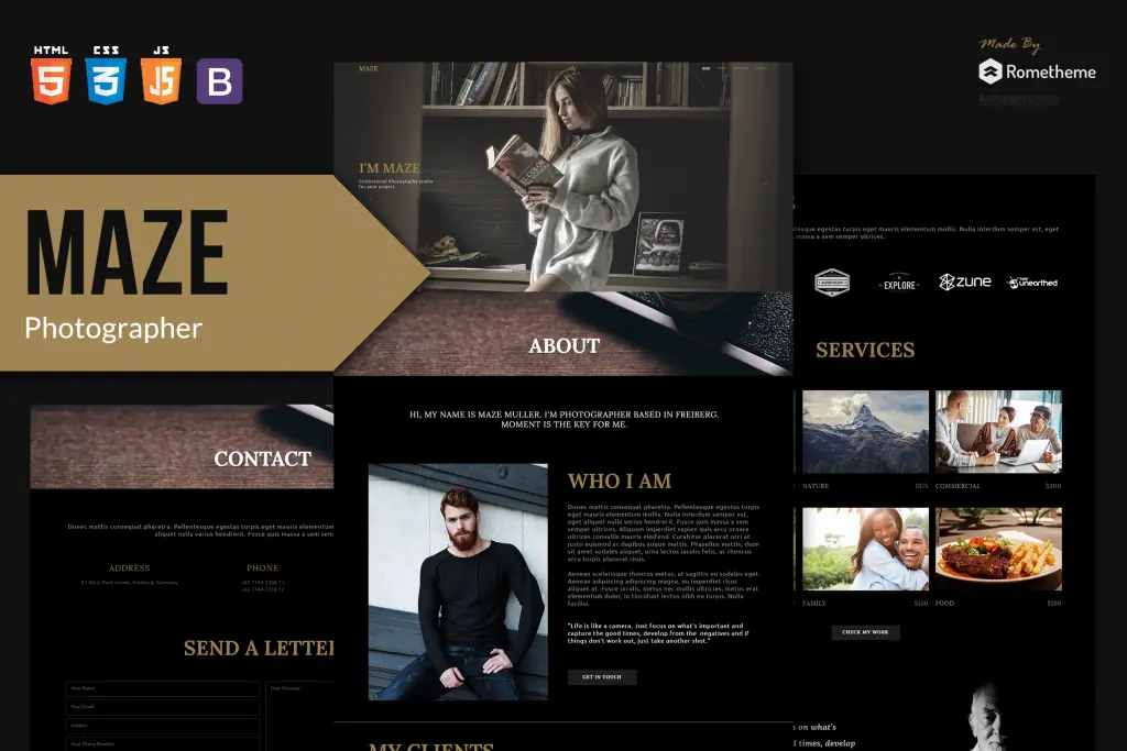
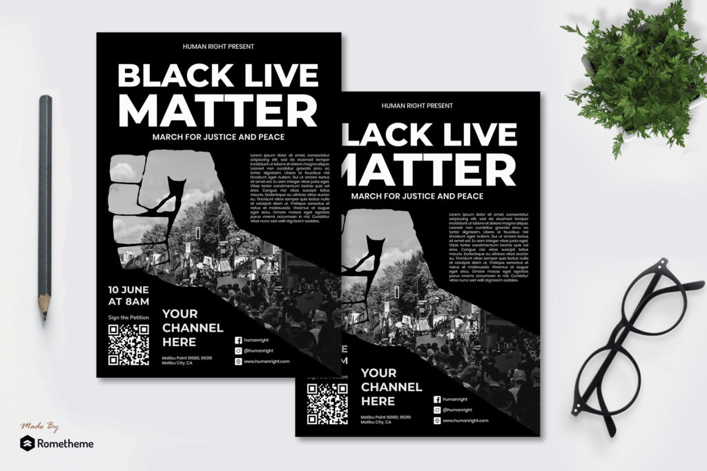
7. Black
Black symbolizes power, darkness, seriousness and sophistication. black has been used by brands such as Chanel, Nike and the New York Times to imply classic style and sophistication, but black is also the color of death and mourning, and is associated with oppression, suffering and evil. When used in design, black is timeless, chic and effortlessly stylish. With the recent introduction of dark mode, black has become very popular in web and graphic design, replacing white as the primary color for creating spaces.
Positive associations :
- Sophistication
- Security
- Power
- Elegance
- Authority
- Substance
Negative associations :
- Oppression
- Coldness
- Menace
- Heaviness
- Evil
- Mourning
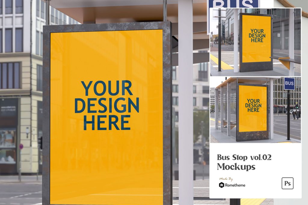
Recommendation from rometheme :

8. Gray
It is a solid and dependable color, representing a solid foundation on which to build, evoking feelings of serenity, steadiness and resilience. If used properly, gray can be a very sleek, strong and powerful color for design. But if used in the wrong context or in excess, gray can be a very boring color and evoke feelings of depression, bland and monotonous.
Positive associations :
- Timelessness
- Neutrality
- Reliability
- Balance
- Intelligence
- Strength
Negative associations :
- Lack of confidence
- Dampness
- Depression
- Hibernation
- Lack of energy
- Blandness
Recommendation from rometheme :

9. Gold
Gold is the color of success and victory. Gold old implies prosperity, wealth and luxury. Optimistic and positive, the color gold illuminates everything around it, representing higher ideals, wisdom, understanding and enlightenment.
Positive associations :
- Success
- Abundance
- Wealth
- Wisdom
- Luxury
- Passion
- Charisma
Negative associations :
- Self-centred
- Demanding
- Ostentatious
- False
- Greedy
- Shallow
Recommendation from rometheme :

Learn the meaning of color well, so you can wisely determine the color for your design.