


In designing a website, the first thing that catches the attention of users is the layout of your design. Even if you have good quality content, if the first thing they see on your website is clutter, then they will leave and will not fully appreciate the articles, service pages, or even products you display.
But the best web design layout guidelines change depending on your industry, brand, and technical capacity; it can be difficult to find the right layout for you. Below, we round up 5 of the most common and most effective website layouts, with examples and expert tips to help you present yourself the right way.
Our first web design layout guide is for a simple page that has one distinct section that needs all the attention. All other elements on the page are positioned to provide focus on one main element, be it a call to action (CTA) such as an email signup, or an image such as a logo or product photo. This type of website layout is typical for homepages and landing pages—the first thing a visitor sees is a suggested action or a highlighted image, with everything else (including the navigation menu) secondary.
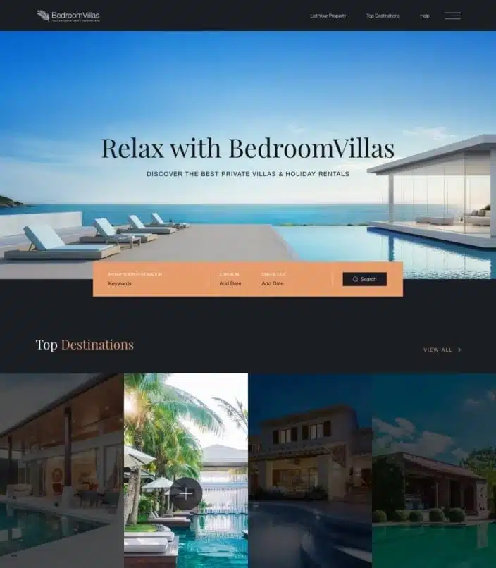
For example, the BedroomVillas design above by Limuntus encourages people to enter their ideal destination and date right away, with relaxed visuals to further attract visitors to their site.
Similarly, Ananya Roy’s Copper Compass design entices visitors to register immediately with a prominently displayed form.
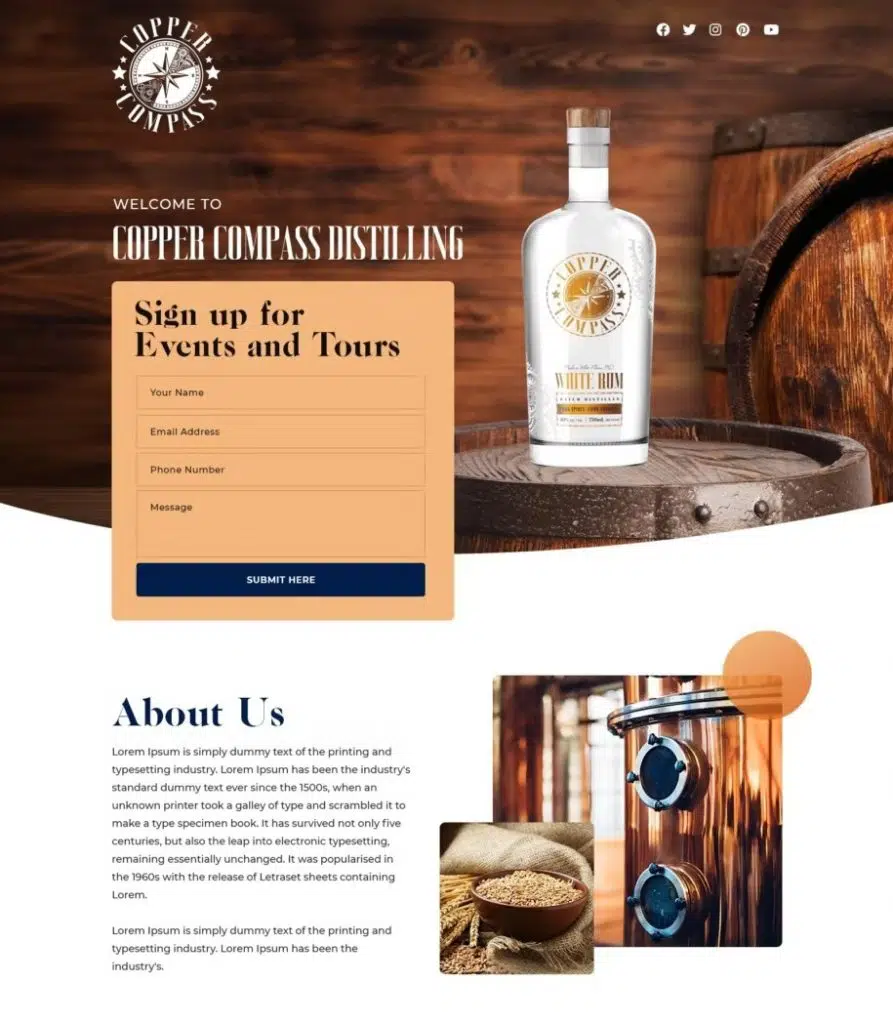
Both of these website layout examples use the same strategy: offset the main focus with a grid background of a contrasting color. The main CTA button is also offset by strong, eye-catching colors, such as navy blue to stand out from the softer orange.
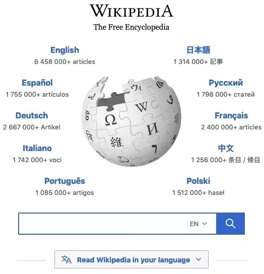
Look at how the Wikipedia homepage organizes its language menu around its detailed logo, while still drawing attention to the search bar, its main CTA. This layout style is also suitable for radial, circular, or spiral patterns. In this case, you can arrange secondary page elements around the main element, such as a logo or other standalone image.
Recommended for:
– landing pages that revolve around a single high-priority call to action
– a single image-focused homepage or call-to-action
– radial, circle, or spiral pattern
A highlight layout works well if you’re only promoting one thing, but what if you want to promote multiple things at once? For that, using an organized grid works best: you can display multiple things at once and let visitors search for what they’re looking for.
Grids typically use design elements called “cards”, which are like self-contained boxes that include all the necessary information. Usually, the card contains an attractive image, a title, and sometimes a short textual description.
In addition, the card and grid layouts are perfectly organized for responsive designs, giving them a huge advantage for mobile devices. Cards have great flexibility, making them easy to rearrange to fit any screen size on the device, as opposed to fixed-dimensional layouts that need to be resized for each new screen setting.
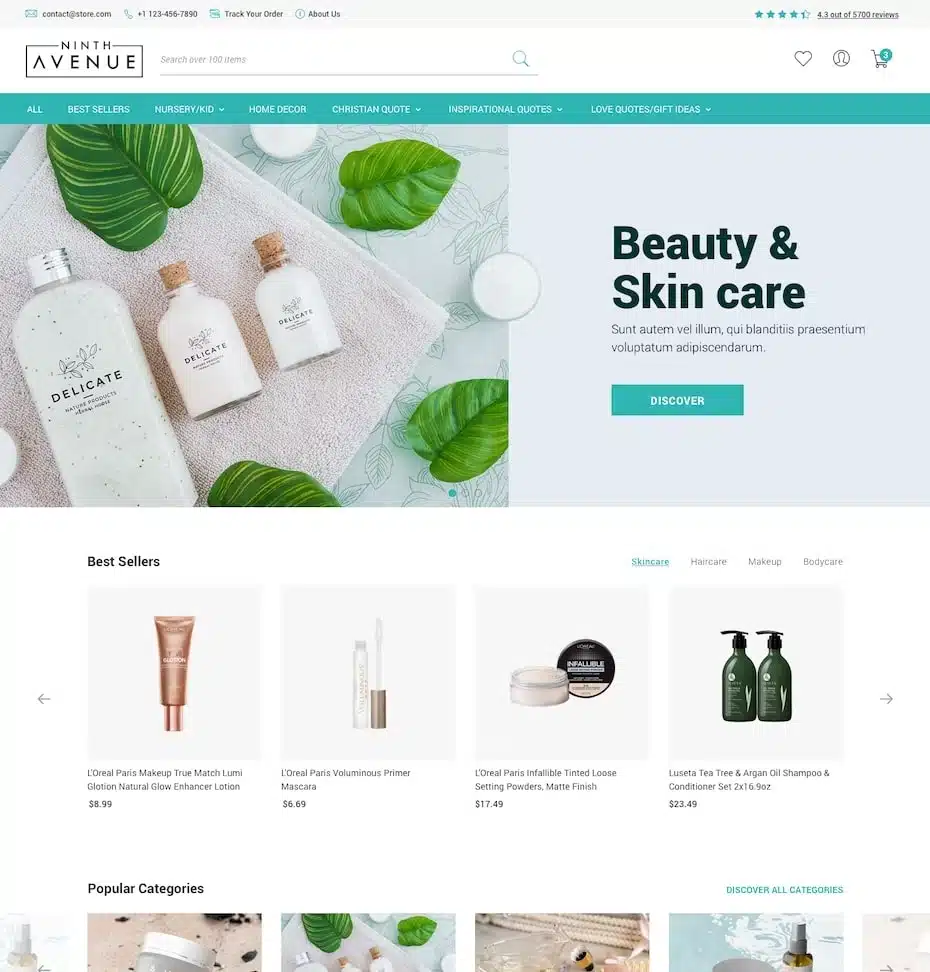
For e-commerce, such as the Ninth Avenue design by ThyDesigns, the card also often includes a sale price. The online beauty shop Bliss even includes product ratings to better help shoppers decide what to buy.
The downside of grids is that they can look a bit boring, especially if there are a lot of cards to scroll through. You can bring your grid layout to life with a little creativity.
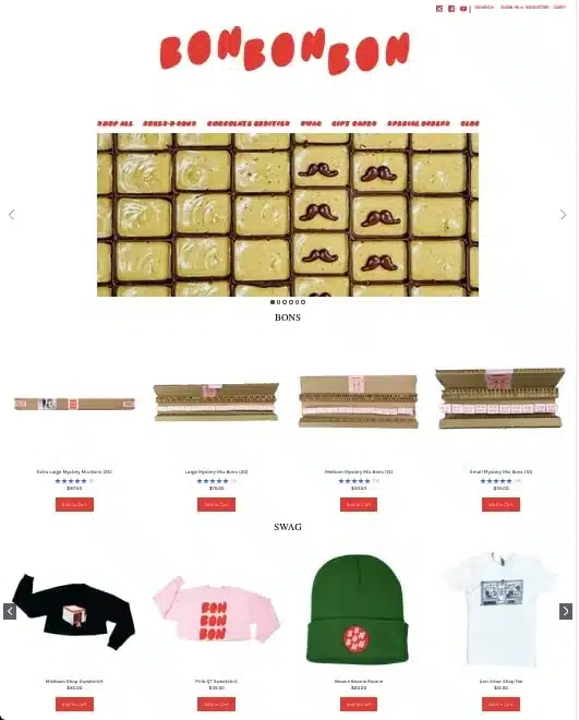
For example, Bon Bon Bon treats remove lines so that each card blends into the background and creates a looser, freer feel. Some brands can even traverse the grid with an asymmetrical layout (described below) for a more edgy and dynamic look.
You don’t have to be an e-commerce site to take advantage of a grid layout. Just take a look at the Brain Wellness Institute website below, designed by the Smashing Boys. The site organizes its standard business pages such as ‘Mission’ and ‘Services’, into easy-to-read boxes, including strong imagery for each. The use of this layout not only helps them stand out from other commercial websites but also accentuates their business theme of stability and organization for mental health.
Recommended for:
– e-commerce product catalog
– large content galleries such as articles, blogs, or work samples
The Z-pattern gets its name from eye-tracking studies in past web design. By monitoring where people view websites, they found that most people look from left to right in a row, then move down and start a new row from left to right.
When visualized, their eyes seemed to trace the letter Z, repeatedly from the top row to the bottom row. Web designers find that they can take advantage of this natural eye pattern by designing appropriate web page layouts. Information is displayed in rows from left to right, and then there is a small “pause” between the rows as the user looks down to start a new row. It works well as an organic method of breaking down information into digestible bits.
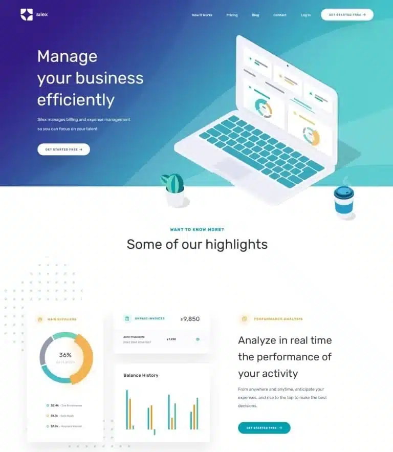
There are various strategies for separating rows, depending on your personal style. Denisa M.’s designs for Silex pair images with text on each line, but alternating which side the text is on makes the page more dynamic.
Web app design by KR Designs takes a similar approach, although they change the type of information that goes on each line to keep the visuals appealing.
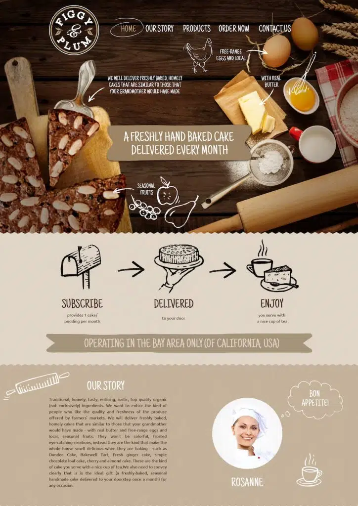
DSKY Design for Figgy & Plum breaks the line by changing the background color in addition to changing the way content is displayed.
Recommended for:
– business website
– pages designed to explain or introduce new ideas
Another common type of website layout is the single-column site, popular on most social media sites like Twitter, Instagram, and Facebook for facilitating long-term browsing. It’s a very simple mechanism, but it works really well by keeping people entertained for hours on end.
The standard procedure is to list content vertically through the cards, with only one fully visible on the screen at a time. This encourages users to focus on one content at a time, without burdening them. It also makes responsive design easier because all cards use the same width, so you don’t have to worry too much about what device visitors are using.
The layout worked so well for social media that it has since been co-opted by businesses and commercial sites. While these sites don’t display postcards, they still break down their content into individual screens that are only visible one at a time. This allows businesses to communicate what they want without burdening visitors.
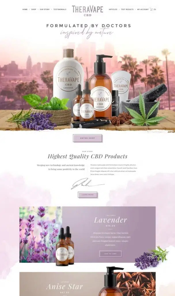
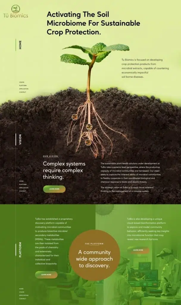
The TheraVape site designed by Arosto and the Tu Biomics site designed by Yagnik K are both excellent examples of how to use this layout for a business site. Both sites break their text into small, easy-to-read sections, and then separate these sections with different backgrounds and visual changes. This allows visitors to pick up points one at a time, improving memory and later recognition.
Recommended for:
– social media and forum sites
– long scroll business site
– pages with lists such as notifications or messages
The last type of website layout is one that avoids organization and includes clutter. Asymmetry, by definition, creates an atmosphere of deliberate imbalance or chaos. It’s a poor choice for traditional and highly formal brands, but for brands that want to come across as edgy, counter-cultural, or ahead of their time, this is the perfect match.
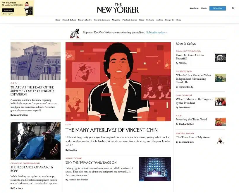
For example, look at how the New Yorker organizes news on its home page. The New Yorker has a branding reputation for being an “alternative” mainstream medium (despite its popularity), so the asymmetrical layout helps establish the desired atmosphere.
Recommended for:
– edgy or cutting-edge brand
Using the type of website layout depends on your goals and brand, so there are no rules as to which type of website layout is best. Your branding personality should also determine not only the layout but the style you use with your layout.
The more you study and explore other website layouts the maybe you will find one you like or maybe your target customer too.
Source: 99designs.com


