When you create a website, you always want to make sure your website design leaves a good first impression so that visitors stay with your website longer. One opportunity you can take advantage of is your hero section. If it’s wrong, your visitors may leave your site in less than 15 seconds. The tactics that you can use appropriately are high-quality hero images, unique fonts, and good layouts. You can create a hero section that makes your visitors feel more at home.
Well, in this article, we have summarized several sources and want to explain several methods that you can use when designing a hero section that makes a good first impression when expressing your product, service, or company. We have also prepared several examples that we ‘stole’ from dribble.
What is a hero section?
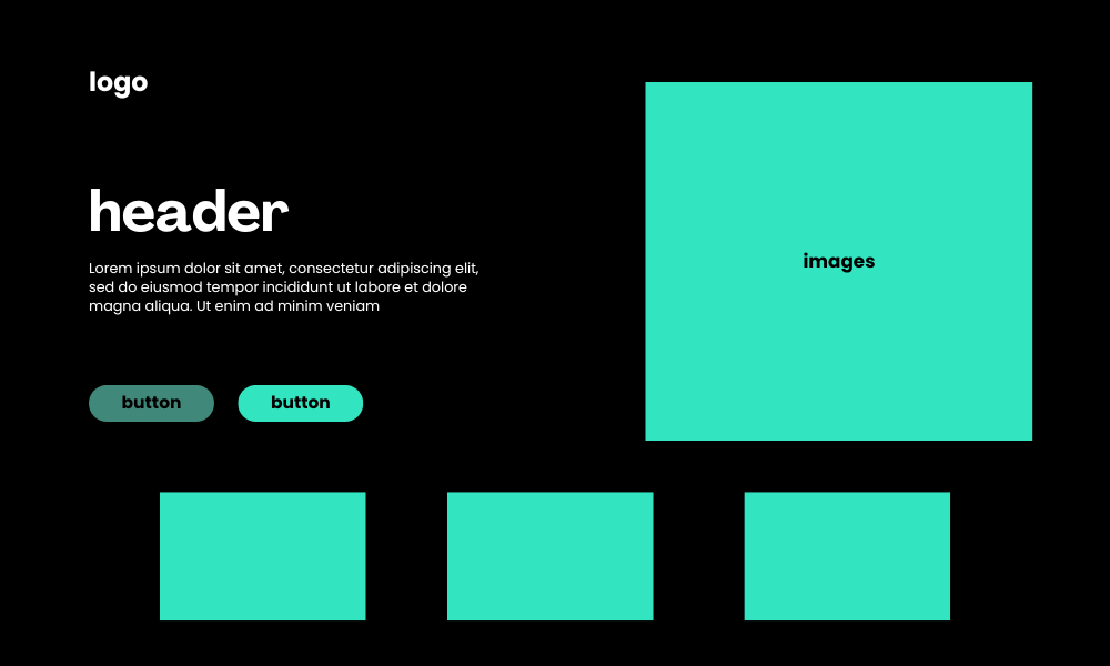
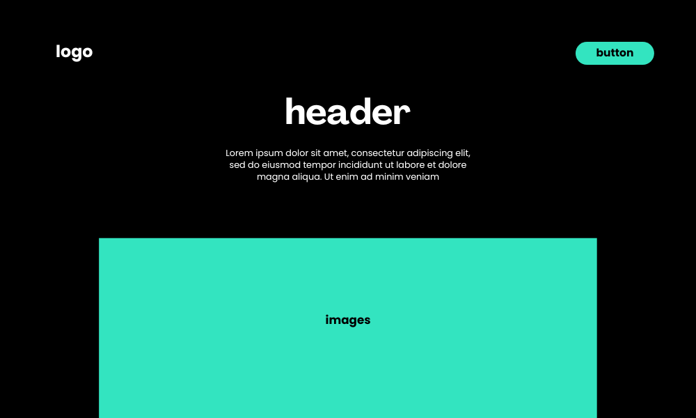
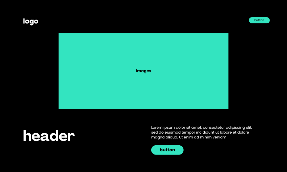
The website hero section is a large banner displayed above the fold of the website. It’s usually the first thing visitors see when they enter a website. The hero section usually consists of a visually prominent image, video, or graphic, some text dedicated to grabbing the user’s attention, and a call to action.
You’ve probably seen them everywhere. To better understand what a hero section is, let’s take a look at the anatomy of a typical website hero section.
The Anatomy of a Hero section
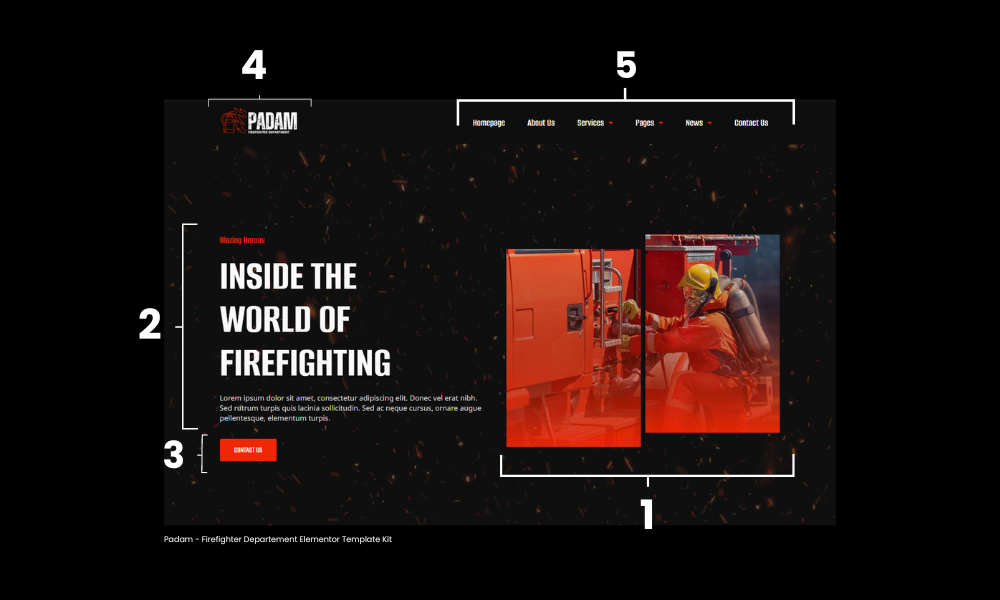
1. Hero image/graphic
A hero image is a key visual element, usually an image, illustration, graphic, or video, used to communicate a website’s main message at a glance. Ideally, the hero image should inform visitors about the purpose of the website.
2. Text block
A text block consists of two main parts: title and description. The headline conveys the website’s core message or value proposition, while the description provides additional supporting text to provide more context about the main message.
3. Call to action button
A button (or buttons) that prompts visitors to take a specific action, such as “Sign Up,” “Learn more,” or “Get Started.” Depending on the purpose of the website, there may be more than one CTA button.
4. Logo
This is a company or brand logo, usually placed at the top left of the page. In addition to communicating the brand, it also serves as a navigation tool, allowing users to return to the homepage from anywhere on the website.
5. Navigation menu
The navigation menu allows users to jump to other parts of the website from the homepage.
After knowing what is in the hero section, also look at some of the elements that you should include in your hero section to make your hero section the best.
8 hero section best practices for a standout introduction
1. Use high-quality images
When you first open a website, the first thing visitors see is the image in the hero section of your website. Therefore, you need high-quality images. Additionally, make sure that your hero image has a clear meaning to your target audience, rather than being abstract or merely decorative.
The ideal hero image grabs users’ attention and supports your value proposition. The most experienced designers conduct in-depth user research to understand their target audience and carefully consider how their images relate to their products or services. You should consider your goals for the hero image. Your goal could be to evoke emotion, promote a product, or enhance your brand identity. Images can also guide your users with directions.
Depending on your conversion goals and budget, you can create professional images or use stock photos. To get high-quality free stock images, use a platform like Unsplash, Pexels, Freepik, or Envato Element if you have a special budget with a subscription.
2. Choose your words carefully
You don’t need to explain all the features of your website in your hero section. Simply highlighting what is useful to your target audience is a great way to keep your users’ attention. One thing you can use is language or words that represent it.
Remember that prospects come to your site because they have a problem. By putting forward your value proposition, you can offer them a solution to the problem in just a few words. This will make them want to know more.
3. The call-to-action button should be visually prominent
CTA buttons give users clear direction on what action to take. Therefore, it must be visually clear and easy to find. Visitors really avoid too many tasks.
Remember: because your CTA button asks users to take action, use clear, easy-to-understand verbs for the label. Verbs like “Join”, “Create”, and “Register”, etc. are very good for labels.
4. Don’t overuse call-to-action buttons
Ideally, you should only have one call-to-action button in the hero section, and this button should connect to the main action you want users to take.
However, if you have two potential actions, prioritize the more important action as the primary button and assign the other action as the secondary button. Make sure the two buttons have different visual weights to help users identify the main action.
5. Be mindful of space
While hero sections should aim to grab the user’s attention, they should not be a sensory overload. Therefore, make sure to maintain sufficient distance between elements in your design, which we sometimes refer to as negative space. You don’t need to fill every space in the hero section.
Additionally, make sure you organize the information in a way that is approachable, logical, and easy to understand. This will reduce the cognitive load on your users.
6. Use legible fonts
You want your users to understand your message easily. Therefore, you should use clear and easy-to-read fonts to complement your branding. Additionally, minimize the use of font styles and weights to avoid visual clutter.
7. Incorporate a video
It doesn’t always have to be images, consider using video in your hero section. This is a great way to capture user interest, considering how limited people’s attention spans are. However, make sure what you use is a short video and a video that contains it. Short videos that show how a product works, showcase a service, or even share customer testimonials are a fun and quick way to convey information.
When incorporating videos, make sure they are high quality, relevant to your value proposition, and optimized for a great user experience.
8. Test your design decisions
And lastly, don’t leave anything to chance. Testing different versions of your hero section design using A/B testing will help you determine what resonates with your audience.
This way, you can make informed decisions, refine your design, and ultimately create key pieces that attract and retain your users’ attention.
Multiple variations of the hero section layout to inspire you
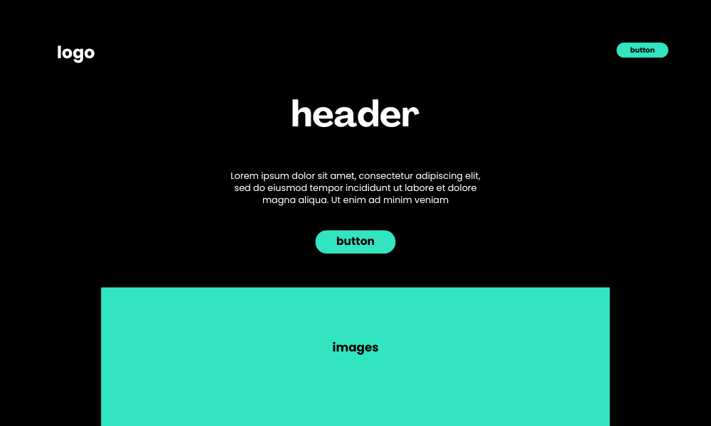
1. Hero Section Interaction by Happy Tri Milliarta for Odama
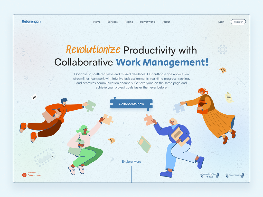
2. Bebarengan – Revolutionize Your Collaborative Work Management by Maulana Reza Prasetya for Visual Kreasi
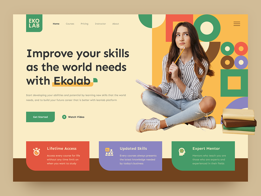
3. EKOLAB – Online Course Landing Page by Yasin Hasyemi for SLAB Design Studio
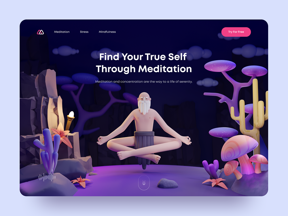
4. Meditation – Hero Section by Rizki Agus for Paperpillar
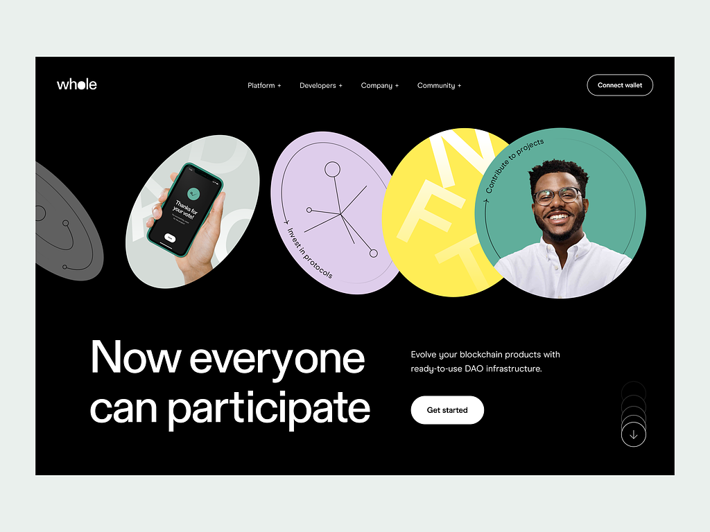
5. DAO for blockchain: hero section by Artem for Implse
Source: What is a website’s hero section? Best practices, tips, examples by LogRocket
Visit our website to browse our stuff and follow our Instagram for great content!
Website: www.rometheme.net
Instagram: rometheme_studio