Ever wondered why some websites look amazing on any device? The secret is responsive web design, a strategy that ensures your website adapts easily to a variety of screens. Responsive web design refers to the approach of making web pages display well across a variety of devices and screen sizes. As more and more people access websites via mobile phones and tablets, responsive web design has become an important part of web development.
With responsive website design, you can serve an increasing number of mobile users while providing a consistent and user-friendly experience. Responsive design also improves SEO rankings, as search engines prioritize mobile-friendly websites in search results. Additionally, mobile-responsive design can increase conversion rates, as users are more likely to engage and make purchases on websites that are easy to navigate on mobile devices.
Responsive design is more than just a technical requirement; this is the key to unlocking a website’s full potential. This ensures content can be viewed easily on any device, from desktops to smartphones. Here are some potential benefits that responsive design can bring to your site:
- Improved SEO: Search engines like Google prioritize responsive websites. This means that these sites are more likely to rank higher in search results, leading to increased visibility and more traffic.
- Increased Conversions: Responsive design ensures a seamless user experience, regardless of the device used. This can lead to higher engagement rates, more time spent on your site, and ultimately, more conversions. Whether it’s making a purchase or signing up for a newsletter, a responsive design makes it easier for users to take the desired action.
- Enhanced User Engagement: Nearly three-quarters of web designers believe that a non-responsive design is among the top reasons making visitors leave a website. This statistic highlights the importance of a responsive web design in keeping your audience engaged and interested. But how? A responsive website is considered user-friendly, easy to navigate, and quick to load. These factors contribute to a positive user experience, encouraging visitors to stay longer and engage more with your content.
In this article, we show you several website design styles that you can use to make your website design more responsive in 2024.
1. Media Queries
Media queries are an important tool in responsive design, allowing you to apply different styles based on device characteristics. By setting specific breakpoints, you can redefine the layout and style of your website for various screen sizes, ensuring that your design remains visually appealing and functional across the spectrum.
Why it’s useful
- Media queries allow tailoring your design for different devices, providing a user-friendly experience.
- Maintains design consistency regardless of the screen, enhancing brand identity.
- Media queries can load different images based on device resolution, optimizing performance.
- Optimizing images and styles for specific devices saves bandwidth and improves loading times.
- Design adjustments through media queries prioritize users’ needs and preferences.
2. Fluid grids & adaptive layout
In fluid design, web designers use a percentage-based grid system to create page layouts, so that web pages can be automatically resized to fit the size of the user’s screen or device. Additionally, flexible images and typography adjust automatically based on the size of the viewport thanks to the use of CSS properties. This approach ensures that the website layout is flexible and adapts to the screen being viewed. Thus, the website can provide an optimal user experience on various devices.
Using an adaptive layout is also another method used in responsive web design. Unlike fluid grids, adaptive layouts use some fixed layout sizes. In adaptive layout, a website uses media queries to detect the device type and provides a predefined layout for that device. This can include scaling images and adjusting typography to fit the layout. With an adaptive layout, designers can adapt the user interface to specific device sizes, providing a more tailored user experience.
3. Mobile first design
A mobile-first approach involves designing your website primarily for mobile devices and then gradually improving it for larger screens. This strategy recognizes the increasing dominance of mobile users and prioritizes their experience. By starting with the smallest screen size, you ensure your design remains sleek and focused, with only the essential elements. This approach naturally encourages simplicity and efficiency in design.
By November 2023, more than 55% of website traffic will come from mobile devices. Recognizing the importance of mobile usage among users, Google prioritizes mobile versions of website content for indexing and ranking, a method known as mobile-first indexing.
To ensure a mobile-friendly site and the best user experience across devices, Google recommends responsive web design as it is the simplest design pattern to implement and maintain. By initially designing for mobile devices and then gradually improving the experience for tablets or desktops, designers can ensure their websites reach the widest possible audience.
4. Responsive image for different device
Large, unoptimized images can lead to slow loading times, frustrated users, and, ultimately, lost conversions. This is where optimizing images for different devices becomes a delicate process between maintaining visual quality and ensuring a smooth user experience.
Here’s what you need to do:
- Compress Images: Reduce file size to improve loading times and accommodate various devices Lossy compression reduces file size by removing some data, potentially affecting image quality. The lossless option preserves all data but offers less size reduction
- Use Responsive Images: Use the srcset attribute to serve different image sizes based on device capabilities.
- Implementing Image Elements: Leverages elements to provide alternative image formats for different devices
- Optimize Image Formats: Choose image formats wisely, JPEGS is great for photos, PINGS for graphics, and WebP offers superior compression for both. Choose the right format for each type of image
- Lazy Loading: Only loads images that are actually visible on the user’s screen, delaying loading of other images until scrolled down. This significantly improves page load times
By balancing quality and speed, you can create engaging, responsive visual experiences that keep users engaged and coming back for more.
5. Relative typography
Unlike fixed units such as pixels, relative typography ensures text scales proportionally to screen size, maintaining readability and aesthetics.
Why this is useful:
- Relative font sizes ensure text remains legible across screens.
- Prioritize user settings and preferences, thereby improving user experience.
- When the screen size changes, the text scales well without manual adjustments.
- Relative typography maintains a consistent look and feel across devices.
- Helps in creating content that is accessible to a wider audience
6. Keep the design simple & clean
When it comes to responsive web design, simplicity reigns supreme. Keeping it simple and clean isn’t just a matter of aesthetics; it’s about creating a user experience that is intuitive, efficient, and ultimately enjoyable.
This is what you have to do:
- Minimize Clutter: Emphasize important elements and trim unnecessary components to increase visual appeal and simplify the user experience.
- Use White Space Effectively:
- Use ample white space to create a simple, clean layout, allowing content to breathe and improving readability.
- Consistent Design:
- Maintain uniformity in design elements such as color schemes, typography, and spacing for a cohesive, polished look.
- Optimize Navigation:
- Simplify navigation menus and ensure user paths are intuitive to facilitate smooth interactions and minimize user confusion
7. Regular updates
Keeping your responsive design up to date is essential to accommodate new devices and technologies. As technology develops, new screen sizes, resolutions, and capabilities emerge. Regular updates ensure your designs remain compatible and work across devices.
Why this is useful:
- Regular updates allow your site to stay up to date with the latest device trends.
- Updates may include optimizations to improve loading times and responsiveness.
- Keeping up with technology prevents your site from becoming outdated.
- The latest design provides users with a modern and relevant experience.
- A well-maintained and updated design differentiates your site from legacy competitors.
Mastering responsive web design isn’t just about adapting layouts to different screen sizes; it’s a holistic approach to creating a seamless, user-centric experience across a broad landscape of devices and user preferences.
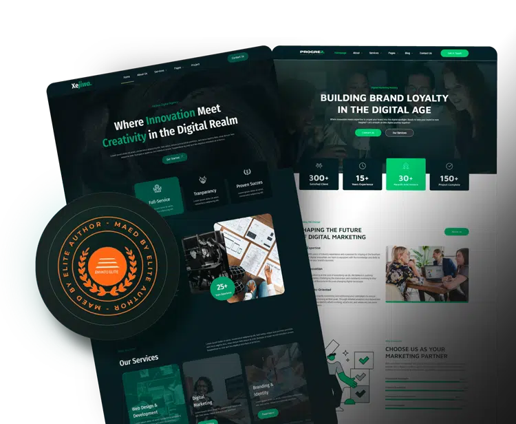
If you are looking for a responsive website, try exploring our themes and find what you are looking for.
Source:
- Top 20 Responsive Design Tips in 2024
- Top 7 Responsive Web Design Examples for Inspiration in 2024
- Responsive Web Design Tips: Key Strategies for Optimal User Experience
Visit our website to browse our stuff and follow our Instagram for great content!
Website: www.rometheme.net
Instagram: rometheme_studio


