Introduction to Landing Pages (and Why You Might Want to Create One)
Landing pages are designed with a clear focus or purpose, and will almost always have a single Call to Action (CTA). Unlike most web pages, landing pages often actively discourage exploration in an attempt to drive visitors toward the CTA. This is why so many landing pages hide the regular website menu or remove links from the header and footer areas.
You can create a variety of different landing pages. For example, you might raise awareness of an upcoming event, or share information about a new product. However, landing pages are most often used to drive conversions in marketing and advertising campaigns, including email and Pay Per Click (PPC) campaigns.
You can direct them to landing pages that are customized specifically for certain campaigns. This page will encourage visitors to convert by guiding them to one compelling CTA. By creating effective marketing landing pages, you can help drive conversions and ultimately create more successful campaigns.
You can change the landing page on the website according to the goals you want to get from visitors at any time.
The Anatomy of a Landing Page
1. Above the Fold Elements
The portion of your page that is visible to users without scrolling or clicking is considered ‘above the fold’. Since this is the first content that visitors see, you’ll want to take advantage of this valuable real estate.
In the following example from Miro, you don’t have to scroll to understand what the business is offering and reaching:
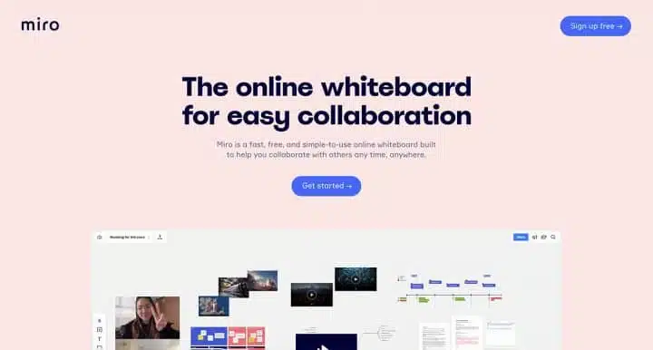
You will often find that the ‘hero section’ is placed above the fold. The hero section is usually a large banner image at the top of the page, although it’s not limited to static images. You can use animations, sliders, or even just eye-catching typography.
2. Content
Your content is likely to make up the majority of your landing page. Content is used to speak to your audience and persuade them to take action on what you offer.
You can include a description of the features and benefits of your product or service, as well as prices and other information.
While the content may be text-heavy, remember that you can include other media as well. You have a lot of freedom as to what to include in your content, but there are some elements you don’t want to leave out.
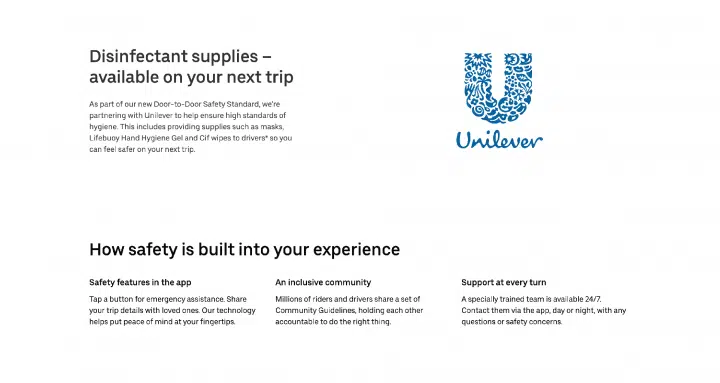
For example, you might want to mention your Unique Selling Point (USP):
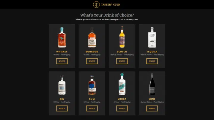
This is where you can show off a bit and let your audience know why your offering is superior to the competitors. Unilever promotes guidelines and commitment to safety:
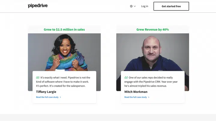
Social proof is another useful content type that can build credibility and trust. This social content can take several forms, including positive reviews from customers or press coverage from reputable publications in your niche.
For example, Pipedrive displays statistics as well as user reviews:
3. Conversion Elements
The conversion element plays an important role in converting visitors into customers. The type of conversions you aim for will depend on your landing page goals.
If you have an e-commerce site, you most likely hope to sell products. However, if you want your landing page to build your email list, a successful conversion could be a newsletter sign-up.
No matter what type of conversion you’re looking for, a strong Call to Action (CTA) can help you achieve your goals. CTAs are your opportunity to ask visitors to take a specific action.
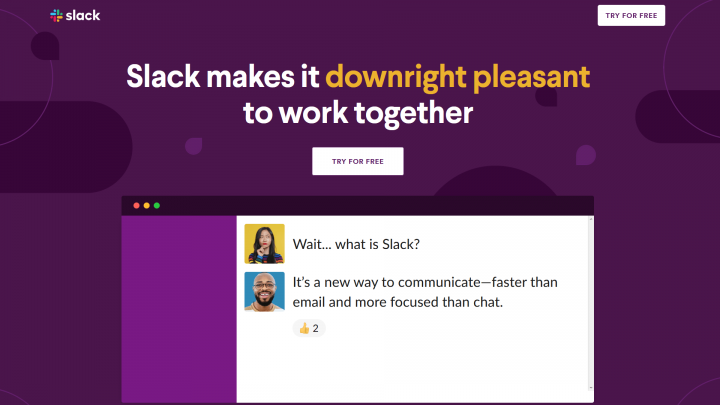
If you’re trying to build an email list, your CTA could be a button asking users to “Sign Up Now”. You can also make your buttons more attractive by using words like “free”, as Slack does here:
4. Footer
Many people ignore the footer, but it plays a very important role in conversions. You can include additional information and lead generation forms for newsletter sign-ups or even social media links like in the examples we see below.

Design a custom footer for your landing page, and limit menu links that lead users away from it. Having no distractions, visitors are more likely to complete the CTA successfully.
How to Avoid Common Landing Page Mistakes
1. Low-Resolution Images
If you use a minimalist design for your landing page, your images are likely to attract a lot of attention, so they need to be as clear as possible. For this reason, it’s important to ensure that you use high-quality images and use image software such as Adobe Photoshop or GIMP where appropriate.
However, large image files can negatively affect the performance of your WordPress site. This can be disastrous for your conversion rate. Your website will run longer and make visitors wait, or maybe make visitors think that your website is not done in a professional manner.
You can compress your images using the TinyPNG website or a WordPress plugin.
There are also many additional steps you can take to improve the performance of your landing pages, including Content Delivery Networks (CDNs) and caching. As an added bonus, this technique will improve the performance of your entire website, not just your landing page.
2. Cold Outreach Messages
Language on the landing page can convey brand personality. If messaging is cold or flat, it won’t do much for customers. Try to keep it language-friendly and engaging, as Constant Contact does:
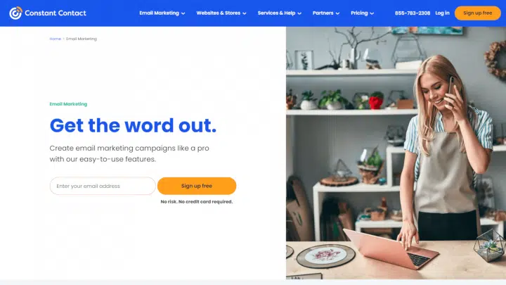
The Constant Contact CTA as seen here is quite inviting, mentioning that no risk or credit card is required. The page also emphasizes that the product is easy to use.
In essence, just adjust the language in the message you want to convey with the personality of your brand or company, and be consistent but still communicative.
3. Broken CTAs
If the CTAs don’t work correctly, you will likely lose prospects. Even a well-designed CTA is useless if it doesn’t work properly.
When you’re setting up a CTA, there are a few issues to be aware of. If you offer lead magnets, you’ll want to make sure the downloads work properly. If offers come via email, make sure your site sends emails reliably. Customers who don’t receive the promised gifts are likely to get a bad impression of your business.
Also, it’s important to ensure that contact form entries are directed to the right people. This is especially important if you’re designing a landing page for a client, and won’t be receiving these notifications yourself.
Lastly, make sure all CTA buttons are clickable and working as expected. Buttons that users can’t click are confusing and can hurt a site’s UX.
The best way to make sure that your CTAs are working is to test them yourself. You might want to list all the CTAs you include on your landing page, so you don’t miss them during testing.
Also read: Three Design Principles Of Button Design, Common Styles Of Buttons In UI
4. Non-Scannable Copy
Since people tend to skim content on the internet, you should make your copy as attractive as possible. Large chunks of text can be an eyesore and can prevent users from receiving your message.
keep text scannable, and try to keep your sentences and paragraphs relatively short. You can also use frequently used headings and subheadings to break up the text further. Finally, remember that bulleted lists attract attention and are easier to read.
Designing an Effective Landing Page
1. Keep Your Landing Page Simple
First, try to include lots of white space. This can encourage users to focus on the important parts of your page, without feeling overwhelmed by lots of input.
You may also want to get into flat design, to keep your landing page minimal but still functional. Flat design uses safe and simple typography, a grid-based layout, and an intuitive interface. You can also make your interactive elements stand out a bit by adding some shading.
Symmetry is another important aspect of minimalist design. It’s fun to look at and can help guide your users where you want them to go.
2. Show Your Customers That You Can Be Trusted
To gain potential customers’ trust, you may want to include trust signals on your landing page.
As with an online shopping site, you may want to display the logo of a payment processor you accept, such as PayPal, to let shoppers know their information is protected.
If you offer a money-back guarantee, you may want to include it in a prominent place on your landing page.
3. Write Concise Headlines
Keeping titles short and to the point can help users find the information they are most interested in. A clear title can also summarize and emphasize the main benefits
In addition to the headline, you may want the rest of your content to be scannable evenly. One way to do this is to use subheadings frequently and keep your paragraphs short.
4. Optimize Your CTAs
It is an important part of your sales process, as it is used to get your audience to act. When writing copy for your CTA, try to be as specific as possible. Your users are more likely to take action if they know what you’re asking them to do.
It’s smart to pay attention to where you place your CTAs. If your landing page is long, you’ll want to incorporate it throughout your content, so that it’s always easy to find when a user decides to take action.
5. Make Your Landing Page Engaging
One way to get viewers to see what you have to offer is to include animation. You can use this to draw attention to your main points or keep them subtle with a parallax effect. If you’re concerned about the amount of text needed to describe your offer, you may want to opt for a video-only landing page.
When it comes to navigation on your landing page, you may also want to include few to no links leading outward. This link can be a privacy policy, terms, and conditions, or even the main link of your logo. It’s very common, especially for campaigns, to see the main menu removed from the landing page. This promotes engagement and helps minimize distractions for your potential customers.
6. Build Forms With User Experience (UX) in Mind
While you can apply UX principles to your landing page, you may want to pay special attention to your forms. Forms are important for meeting many types of conversion goals, so you’ll want to fill them out as easily as possible.
Start by keeping your form simple and requesting only the information you need. You can also minimize the required fields. This allows users to enter more information if they want, without forcing them to enter it.
7. Be Sure To Use Contrasting Colors
Using contrasting colors doesn’t just make your landing page visually appealing; it’s also an important part of accessibility. This can be a challenge when you include text over an image.
Therefore, you might use a background image overlay. To ensure sufficient contrast between your colors, try viewing the landing page in grayscale.
8. Use Legible Fonts
When choosing fonts, we recommend keeping the following tips in mind:
- Limit the number of different fonts you use across your site and landing page.
- Choose a font that can accommodate different screen sizes.
- Increase the white space between letters to improve the readability of your content.
- Remember that serif fonts work well for large chunks of text.
Remember that landing pages are important on a website, especially if users of your site just want to explore your site for the first time. For that, design your landing page well and work for users. Pay attention to the important components in it, and avoid mistakes on your landing page.
Source: elementor.com

