You don’t need a huge budget or fancy coding to build a site that feels polished. With a few smart Elementor tweaks, you can take any basic WordPress website and turn it into something that looks world-class—something that earns trust right away.
It doesn’t matter if you run a business site, a portfolio, an agency page, a blog, or an online store. Tiny visual upgrades can completely change the way people see your brand.
Let’s jump in—here are 10 Elementor tricks that help your WordPress site look premium in just minutes.
1. Stick To Consistent Global Colors and Fonts
You want consistency. That’s really what separates a pro site from a messy beginner project. When every section uses a different font, color, or button style, it just looks off. Elementor solves this with Global Design Settings.
How To Do It:
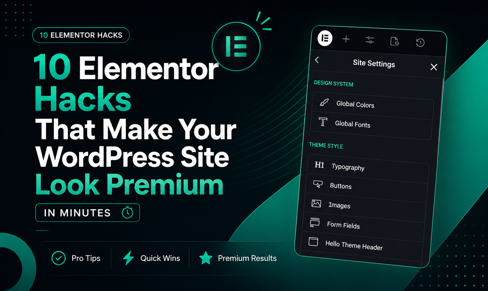
- Go to Elementor → Site Settings.
- Set your colors: primary, secondary, accent.
- Pick your typography system.
- Use the same font family for headings and body text.
Pro Tip:
Only use 1 or 2 font families, stick to 3 or 4 brand colors, and keep your button styles consistent. Your site will look clean and trustworthy.
2. Add Glassmorphism Effects
Glassmorphism is all the rage—think frosted glass. It’s everywhere in modern SaaS and landing pages, and Elementor makes it super easy.
How To Create It:
- Add a container or section.
- Set a semi-transparent background.
- Put on some backdrop blur, add border transparency, and a soft shadow.
- Try subtle gradients behind the section.
Best Places to Use It:
- Hero sections
- Pricing cards
- Testimonials
- Login forms
- CTA blocks
Just a touch of glass effect makes your site feel more modern and expensive.
3. Use Entrance Animations—but Don’t Overdo It
A little animation helps your website stand out. But if you go wild, things get messy and distracting.
Do It Right:
Add subtle motion to headlines, CTA buttons, feature cards, and images.
Best Elementor Animations:
- Fade In
- Fade In Up
- Zoom In
- Slide In
Remember, animation should grab attention without overwhelming people. Minimal motion feels smoother and a lot more luxurious.
4. Add Custom Shapes and Dividers
Flat sections are boring. Shape Dividers in Elementor break that up and add depth.
Easy Ideas:
- Wave dividers between sections
- Angled backgrounds
- Layered gradients
- Curved transitions
Why It Works:
Shapes guide the eye smoothly from one section to another. Pages feel finished—like a real designer worked on them.
5. Use Tons of White Space
Honestly, this is where most amateur sites mess up. Luxury brands and modern tech companies use lots of white space to make things easier to read.
Quick Fixes:
- Increase section padding
- Space out widgets
- Don’t cram content together
- Keep text blocks short
Common Mistake:
Trying to shove too much info above the fold. Instead, stick with clean spacing for that high-end magazine feel.
6. Upgrade Your Buttons With Hover Effects
Default buttons feel stuck in 2015. Hover effects give your site some life.
Elementor Button Upgrades:
- Gradient backgrounds
- Smooth transitions
- Icon animations
- Animated borders
- Slight scale-on-hover
Best Practice:
Keep hover effects smooth and fast. It’s just enough interactivity to feel modern without being too much.
7. Use Background Overlays For Contrast
Ever put text on top of an image and notice it’s tough to read? Add an overlay and boom—your site looks way better.
How To Apply It:
- Add a background image in Elementor.
- Use a dark or gradient overlay.
- Knock down the image opacity a bit.
Result:
Headings pop without losing that cinematic vibe. This trick’s so simple, but it instantly makes your design sharper.
8. Create Depth With Box Shadows
Flat designs can look lifeless. Shadows add hierarchy and depth—just don’t go too heavy.
Where To Use Shadows:
- Cards
- Testimonials
- Pricing tables
- Images
- Nav bars
Premium Shadow Tips:
Stick to soft blur, low opacity, and big spreads. Avoid harsh black shadows. Soft shadows make your site feel refined.
9. Use Good Icons and Images
Bad visuals tank your credibility. Even a slick layout won’t save you if your images are blurry or your icons feel mismatched.
What To Do:
- Use SVG icons
- Compress images the right way
- Keep styles consistent
- Use pro photos
- Steer clear of obvious stock pics
Recommended Style:
Stick with visuals that match your brand—minimal, corporate, creative, luxury, or tech. Strong images instantly boost your website’s perceived value.
10. Nail Your Hero Section
Your hero section is the first impression. Make it premium, and people trust your brand right away.
High-Converting Hero Structure:
- Headline that’s clear and bold
- Short supporting text
- Strong CTA button
- Quality image or mockup
- Lots of spacing
- No extra distractions
Bonus Tip:
Animated gradients or floating shapes behind the hero add polish. A great hero section drives engagement and conversions.
Final Thoughts
You don’t need custom code or expensive devs to get a premium-looking WordPress site. Elementor lets you make small tweaks that totally change how your site looks and feels.
Start with:
- Better spacing
- Consistent type
- Smooth animations
- Modern overlays
- Nice hover effects
Even one or two of these can make your site feel cleaner and more professional. The trick is subtlety—premium design isn’t about adding stuff, it’s about careful choices that boost clarity and elegance.
FAQs
Is Elementor good for premium sites?
Absolutely. It’s got all the design tools you need to build a modern, high-quality WordPress site without any coding.
Do I need Elementor Pro?
Some tricks work in the free version, but if you want advanced styles, motion, theme building, and layouts, Elementor Pro is worth it.
Can too many animations slow my site?
Yeah, they can. Keep it light and minimal for the best mix of looks and speed.
What makes a site look premium?
Consistency, spacing, great type, solid visuals, subtle effects, and clean layouts. That’s what users look for.
Can beginners do these Elementor tricks?
Totally. Most of them take just a few minutes with Elementor’s drag-and-drop editor.