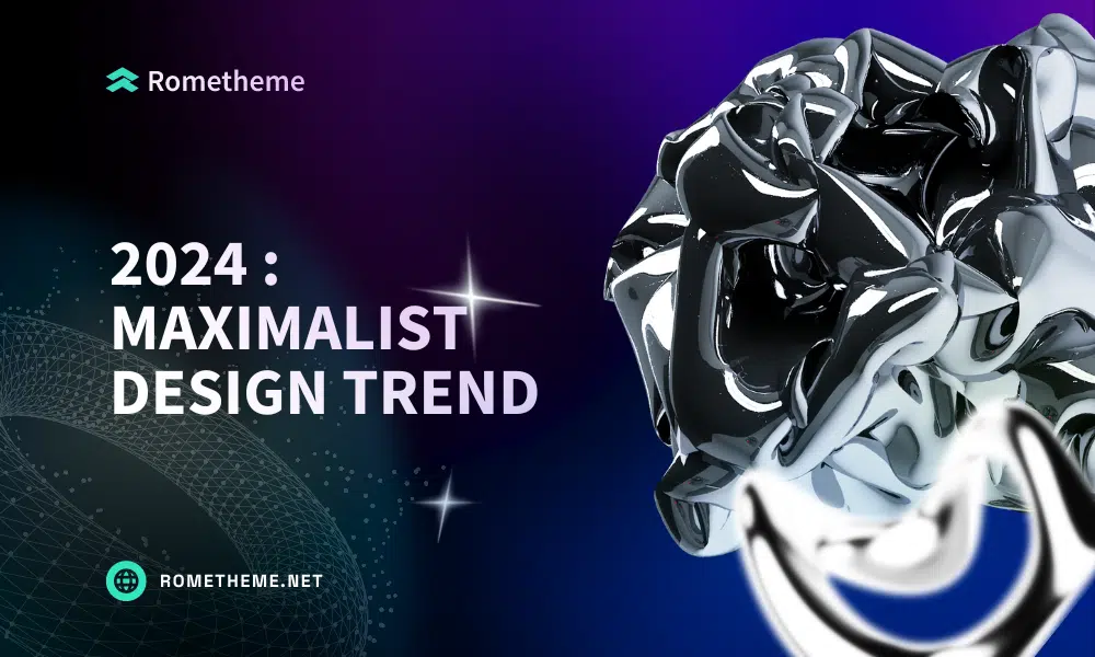
This new maximalist design isn’t just about putting things together. It’s about telling stories, evoking emotions, and catering to the diverse preferences of website visitors, Lots of bold colors, patterns, shapes, and typography.
But what is maximalism, and why is it taking over web design in 2024? Maximalism isn’t a set of fonts or colors or a particular vibe — it’s more about the volume of application. Let’s jump in and find out.
What is Maximalism?
Of course, you know that maximalism is the opposite of minimalism, right? This is also the meaning of maximalism in this year’s UI design trend. This trend embraces “more is more”, enjoying excess, complexity, and excitement in abundance. Bright color schemes, eclectic typography, rich textures, and overall aesthetic diversity. Encouraging designers to branch out from the confines of white space, fill the page, and offer interesting things.
Key Trends in Maximalist Web Design for 2024
Maximalism thrives on abundance, complexity, and lots of visual and interactive elements working together. It’s not just about adding more to a design. It’s about meaningful excellence, where every element has a purpose in creating an immersive experience.
Now let’s look at the main trends in maximalist web design for 2024.
Bold Colors and Patterns
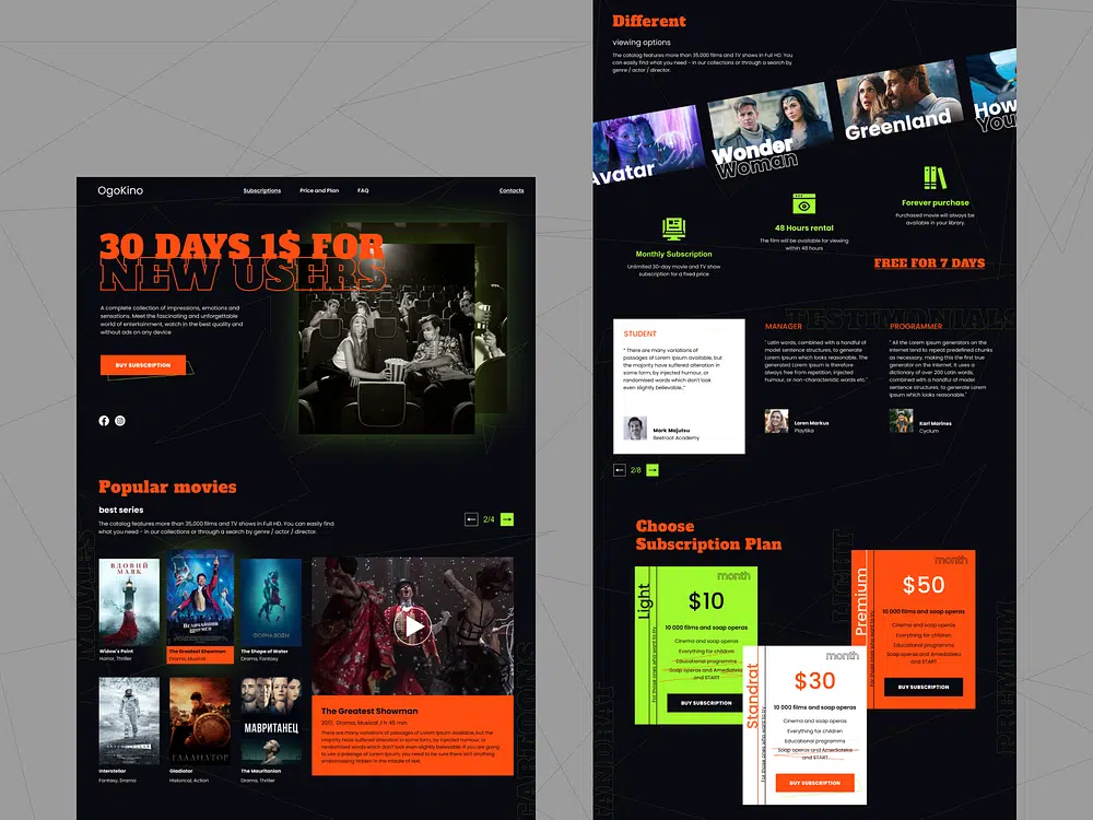
Maximalist design in 2024 is very bright. Bold color schemes and intricate patterns are the best choice for creating a website that leaves a lasting impression. This approach is about generating energy and excitement and making every visit to the website unforgettable. However, the use of colors and patterns in maximalism is not arbitrary. This is a deliberate choice to communicate brand identity, mood, and message.
Design from Nestoras Tsonas implements it. The color scheme looks almost aggressive, but also attracts attention and attracts visitors.
Dynamic Typography and Kinetic Text
Typography in maximalist web design breaks away from conventional norms. The trend toward eclectic, bold typography and kinetic text introduces movement and personality, turning static pages into dynamic stories.
This trend underscores the importance of text not only as a way to convey information but also as an integral part of a design’s overall aesthetic and narrative structure. Dynamic typography in maximalism is about grabbing the user’s attention and keeping them engaged with moving, evolving text that plays an active role in the storytelling process.
Embracing Digital Art and Multimedia
Digital art and multimedia elements are other key players in the use of maximalism in web design. This is where the web experience becomes truly immersive, combining elements such as high-definition video backgrounds, interactive 3D elements, and complex animations.
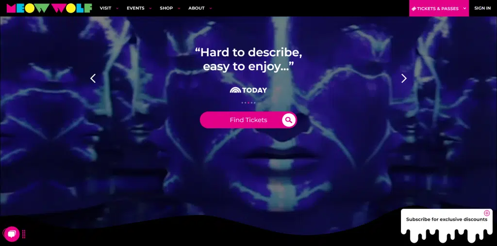
If you haven’t heard of Meow Wolf, they exemplify all that is maximalism. From their cheeky take on consumerism with their Las Vegas Omega Mart to their mind-bending and immersive art installations, there isn’t anything about them that’s subdued.
Retro and Nostalgic Influences
Retro and nostalgic influences in maximalist design tap into a collective longing for the past. Of course, redesigned for modern sensibilities. This trend sees a revival of design elements from previous decades, such as neon colors, pixel art, and vintage typography, all integrated into modern design in a way that feels both familiar and new.
In particular, design elements from print media of the 80s and 90s are making a comeback, as is Y2K web design.
Practical Tips for Embracing Maximalist Web Design
You need to remember, that implementing a maximalist web design requires a mature approach and ensuring that every detailed element does not overwhelm visitors with your site.
Here are some practical tips for effectively incorporating maximalism into your web design:
1. Balance Complexity with Usability
While maximalism emphasizes a rich layering of patterns, colors, and graphics, maintaining clarity of navigation is essential. Whatever design you create should not allow complexity to interfere with the site’s usability.
Always use clear, intuitive navigation and organize content in a way that guides users through the site without confusion.
2. Curate Content Thoughtfully
Maximalist design is not about cluttering your space with every possible element. We took inspiration from Y2K-era sites but did not copy them completely. You must craft content and visuals that tell your brand story in a compelling and cohesive way. Choose elements that suit your brand identity and organize them in a way that adds value to the overall narrative.
3. Use Color Strategically
Color is a powerful tool in maximalist design. Use bright, contrasting colors to draw attention to key areas of your website and guide the user’s journey. However, make sure your color choices align and reflect your brand personality. A well-thought-out color scheme can unify disparate elements and create a visually cohesive – albeit “loud” – experience.
4. Experiment with Typography
Maximalism offers the freedom to experiment with bold and creative typography. Mix and match different typefaces to create interest and visual hierarchy. Consider custom or expressive fonts for titles and accents, kinetic fonts, or even animations. However, keep readability in mind, especially for body text.
5. Incorporate Interactive Elements
Interactive elements such as animations, hover effects, and scroll-triggered changes can also enrich the user experience in a maximalist design. These elements invite users to actively engage with the content, turning passive browsing into something more engaging that keeps visitors on the site longer.
6. Optimize for Performance
A common challenge in maximalist design is ensuring a website remains fast and responsive despite the heavy use of graphics and multimedia. Optimize images and videos, utilize lazy loading, and consider performance implications when adding interactive elements to shorten loading times.
7. Be Mindful of Accessibility
Accessibility should never be an afterthought. Make sure your website is navigable and readable by everyone, including those using assistive devices. This includes using alt tags for images, ensuring adequate color contrast, and providing keyboard navigation.
Conclusion
Web design maximalism is about how you can express your creativity, go wild, and utilize every pixel of a website while still maintaining functionality. Try experimenting to build your brand’s individuality and offer your visitors a more immersive experience with this trend.
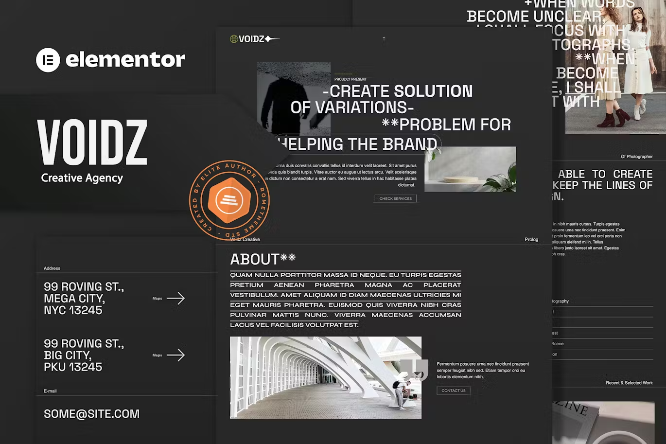
Maximalist design from Rometheme:
Source:
- Maximalist Design Trend: What to Know for 2024
- Maximalism: How designers are turning up the volume of their work
Visit our website to browse our stuff and follow our Instagram for great content!
Website: www.rometheme.net
Instagram: rometheme_studio

