When creating a website, there are several website components that you should always keep in mind. read this article to know what those parts are.
Header
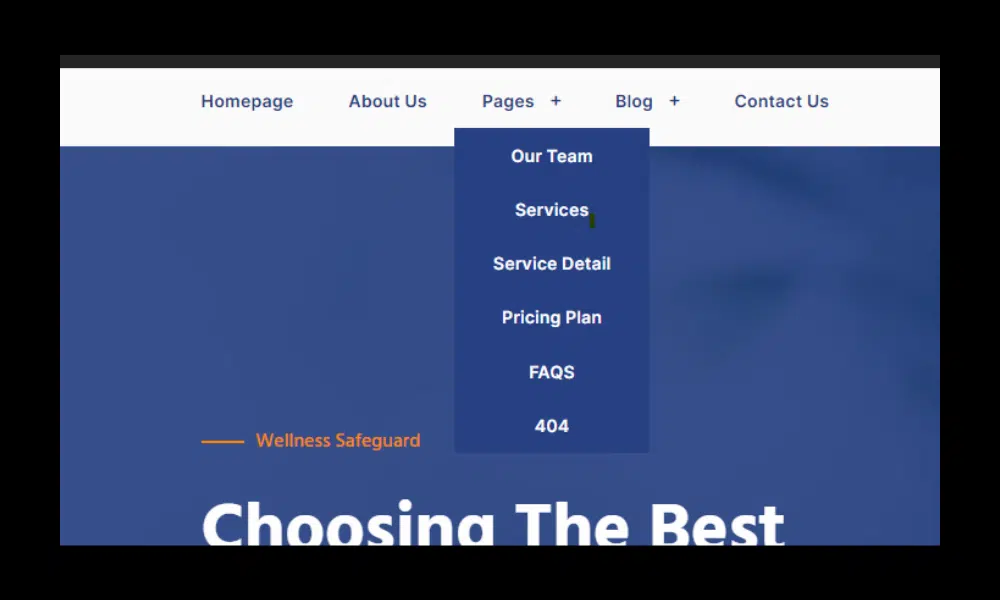
The header is the very top part of a website. It is often the first thing visitors see when entering a site and almost always contains the brand logo and website menu. This website menu is a site map that helps visitors find what they are looking for, whether it’s details about your products or information about your company.
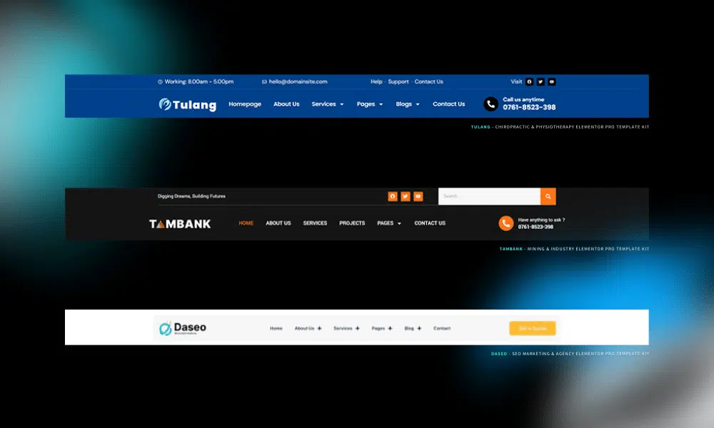
A general header includes your most important web pages, which may vary depending on the type of website you are creating. If you have an online store, for example, you can divide your header into categories based on the types of items you sell. On the other hand, if you have a non-profit website, a donation page in the header may be more appropriate. Frankly, including the right categories in the header is crucial in helping visitors find your most important pages and can ultimately make the difference between a successful website and not.
A properly formatted header can significantly improve a website’s SEO or search engine optimization. Additionally, website headers also help load specific CSS files, or Cascading Style Sheets, to help style the actual layout of your website. A website header is a must whether you are developing a one-page website or if you are creating a large online community.
Navigation
Navigation of a website is an important element that cannot be left out, especially if your website has more than one page. Without navigation, your visitors will be stuck on the page they landed on, unable to browse or explore anything else your site has to offer. Choosing how to display the navigation sections of your website is another big decision that should not be taken lightly. Although some navigation menus are formatted horizontally, others are displayed vertically as sidebars.
Banner/hero section
What is the Hero section?
The Hero Section is the first thing your visitors see on the page without having to scroll. It’s called a “hero” section because its purpose is to help people place themselves in your story, for example by showing how you solved their problem in the first place.
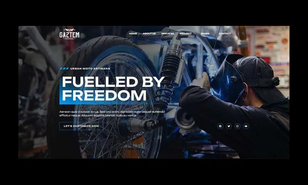
The hero section is not a “header”. As explained earlier, headers are reserved for the bar that sits at the top of your page – your navigation bar. Therefore, it should not be used as a synonym for the hero section.
Buttons/CTAs
CTAs, or calls to action, are short texts that help customers take the next step in your business and move down your sales funnel. CTAs are usually displayed on buttons and contain actionable words like “Start now” or “Buy yours.” This type of text directs users to take a specific action and tells them what to expect when they click a button.
Images
Just below the header is some form of image, series of images, or sometimes a video. Together, the header and main image make up the top of your website – often referred to as above the fold – and are critical in creating a good first impression. The visuals displayed, in particular, make a big difference in whether users stay on your website or leave seconds after logging in.
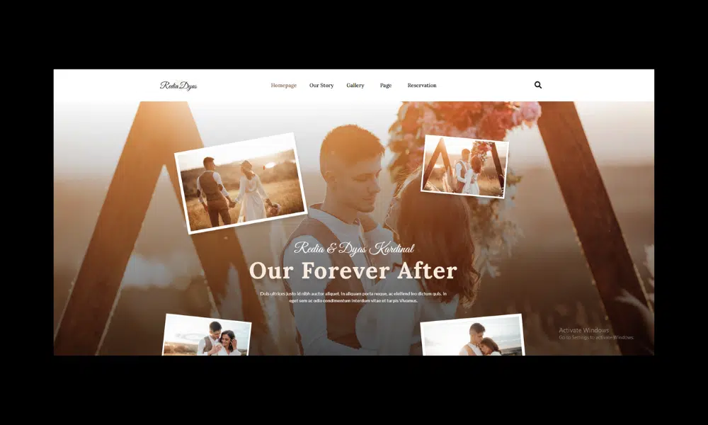
Therefore, these visuals should convey something important about your company. Whether it’s showing images of your products or services, or just giving users an idea of your brand, what’s important is that it relates to your site as a whole.
Website content
All sites contain content. Content usually means the words written on your site that explain what your website is about, what you offer, and how site visitors can take advantage of your offerings.
Website content covers a wide range of things. This often refers to the paragraph that explains your site’s mission, but it can also mean a single word placed on your button.
Take the time to carefully plan your website’s content and pagination, meaning the division of web content into pages, to ensure that every site visitor can understand your brand as well as you do.
Logo
An important element of any brand, a logo is also a standard part of a website. A logo represents a company and makes it easily recognized and remembered by both current and potential customers.
Typically the logo can be found in the top left corner of a website header and is usually clickable to help visitors return to the site’s homepage. To get started creating a logo and easily embed it on your site, you can use a logo maker that automatically creates a custom logo for you.
Blog
A website is usually not considered complete these days without the addition of its own blog. Creating a blog section for your website is a great way to expand your online reach and visibility while strengthening your professional reputation.
A blog is basically a grouping of articles or posts on various topics that are all related to your business. Today, it is increasingly common for businesses to add blogs to their sites. While blogs can stand alone, they can also be added as an additional part of an existing website, serving as a marketing asset for your company.
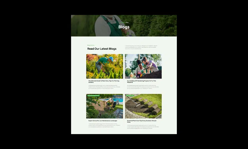
Adding a blog to your website is a good way to achieve several goals. First, it provides your customers with more in-depth information about your offering or industry. By providing this information, you nurture customers and help them understand your business better.
A blog can also help bring more traffic to your website. By covering a variety of topics in-depth, blogs can provide answers to many of the questions people search for on Google. When you answer these questions, you help attract people who might not otherwise have discovered your business.
Forms
Using forms can help you collect information about your website visitors while helping your website appear more professional, credible, and authentic. On websites, they can be embedded and used for a number of different purposes. For example, you might consider including a contact form, which allows visitors to contact you directly from your site. Other types of forms, such as registration forms, can help you collect leads by asking visitors for their information.
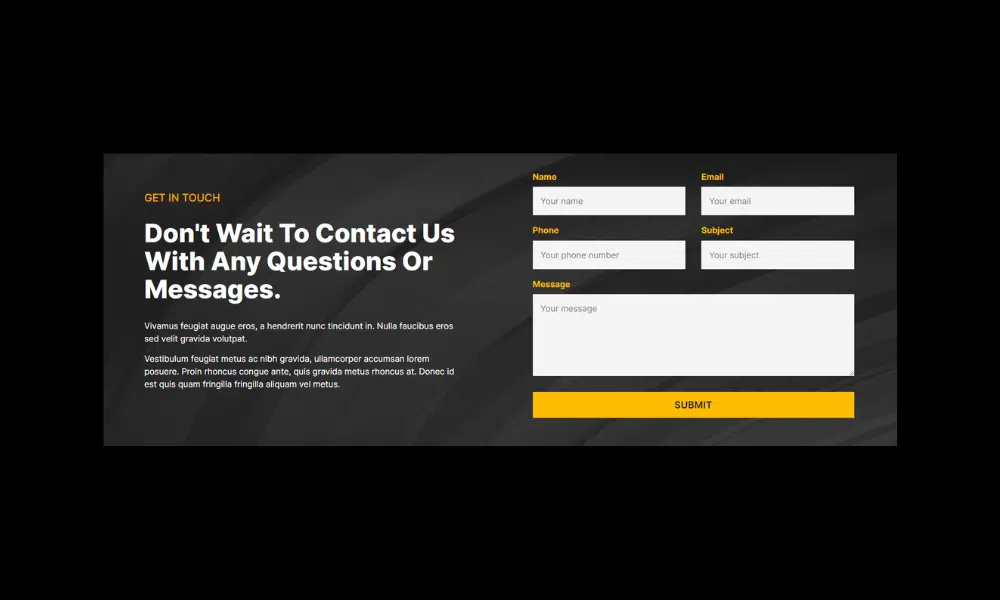
Depending on the type of form you choose to use, you might consider placing it in different areas of your site. In general, a form may be a little too aggressive for a home page, but it can be placed on a separate web page or perhaps at the bottom of your site.
Whether you offer a support form for visitors who need help or if you provide customer support for your online customers, forms can help you do it with just a few scripts and in just a few minutes. From asking for email addresses for a newsletter you’re launching to asking for feedback from loyal followers and customers, forms can serve many purposes in building a successful website today.
Footers
Another one of the most important website parts required when developing a new website is the website footer. The footer on a website is similar to the header, only the footer is included in the coding of a website after the body and contents of a page. Footers may contain closing tags, scripts, and even contact information that will appear at the bottom of each page when users visit it. Footers are also necessary to ensure that a website is coded and formatted correctly for today’s web standards.
Simply put, the footer is the very bottom of any site. It usually contains a sitemap with hyperlinks to available pages on your site. This can help visitors discover all of your offers, including those that may not be suitable for your header.
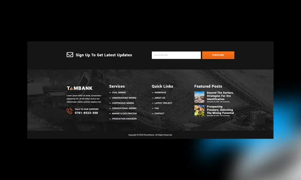
Often website footers also contain basic contact information, allowing users to contact you or find your physical storefront. This type of information is critical to business success.
The footer may also include a social bar containing small but recognizable icons that direct users to your social media pages. This can help you gain followers on social media platforms, ultimately resulting in greater brand awareness and potential business growth.
Conclusion
Creating a website from start to finish doesn’t have to feel overwhelming, especially once you understand the most important parts of website layout.
What you get when you understand part of the website:
1. You can better understand the structure of your website and how users navigate it and understand its contribution to the overall user experience.
2. You can assess the effectiveness of headers, hero sections, content layouts, sidebars, and footers in achieving website goals and providing a positive user experience.
3. Helps you identify usability issues that may be hindering user navigation and interaction.
4. Guides you in creating content tailored to each section’s goals and audience. You can create a clear and concise title for the hero section, an informative and engaging body copy for the content section, and a compelling CTA for the footer.
5. Allows you to communicate more effectively with website designers and developers. You can clearly articulate design goals, content requirements, and user experience expectations, ensuring that the website aligns with your vision and goals.
Source:
- Essential parts of a website
- The most important parts of a website – 8 essential web design terms
- 15 Key Parts of a Website Layout
Visit our website to browse our stuff and follow our Instagram for great content!
Website: www.rometheme.net
Instagram: rometheme_studio

